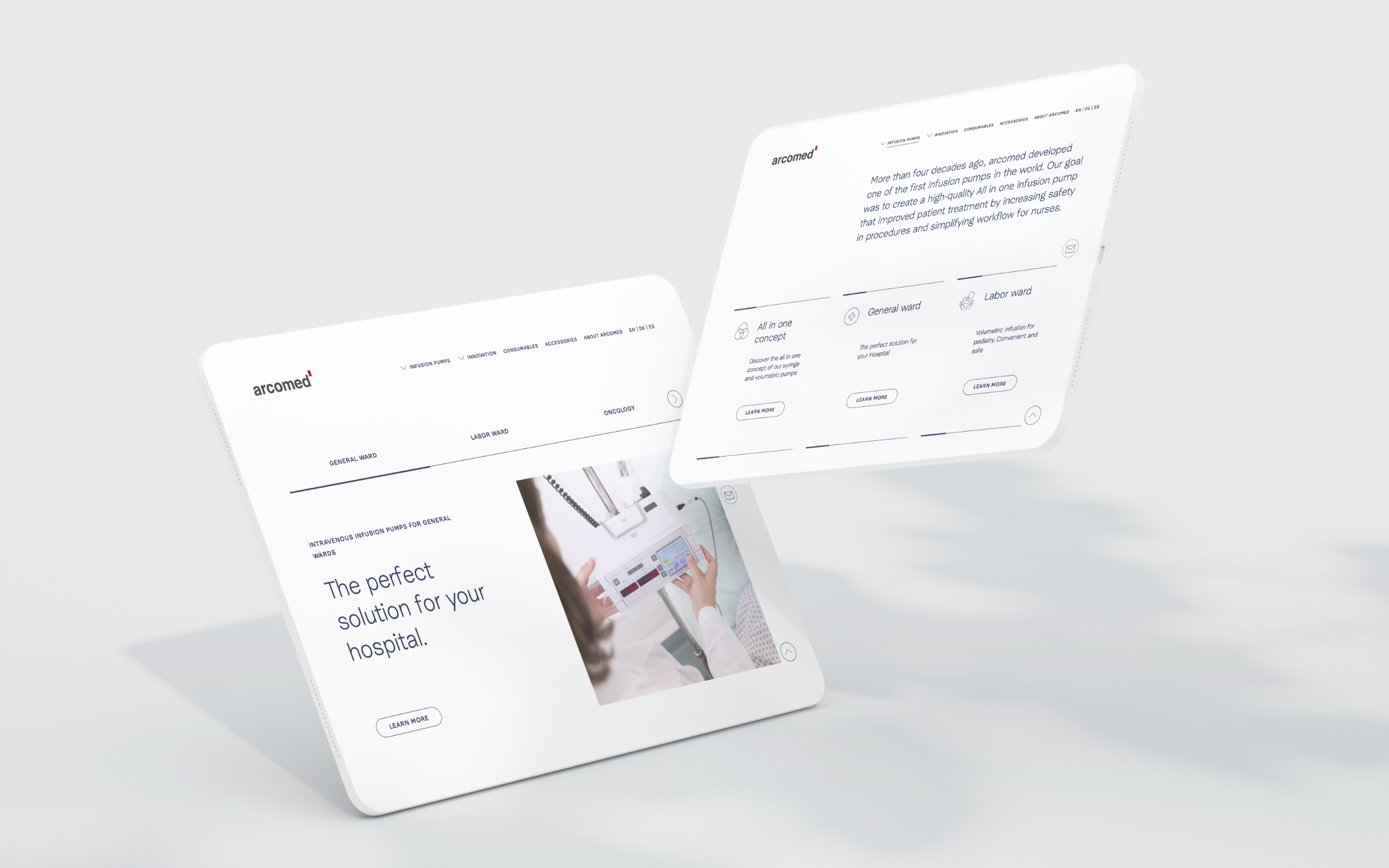
oday, Arcomed supplies an international customer base via a worldwide distribution network. As the world of medicine is becoming increasingly more complex, Arcomed’s Managing Director Thomas Moeckli understands many of the challenges it faces for the future: “Translating this complexity into a simple but powerful solution for customers and end users is of great importance to our company.” The brand has, therefore, had a new corporate design developed under the direction of the Konstanz-based art director Florian Rhiemeier and brand strategist Eduard Helmann (Sichtweise).
Arcomed
Literally international
T
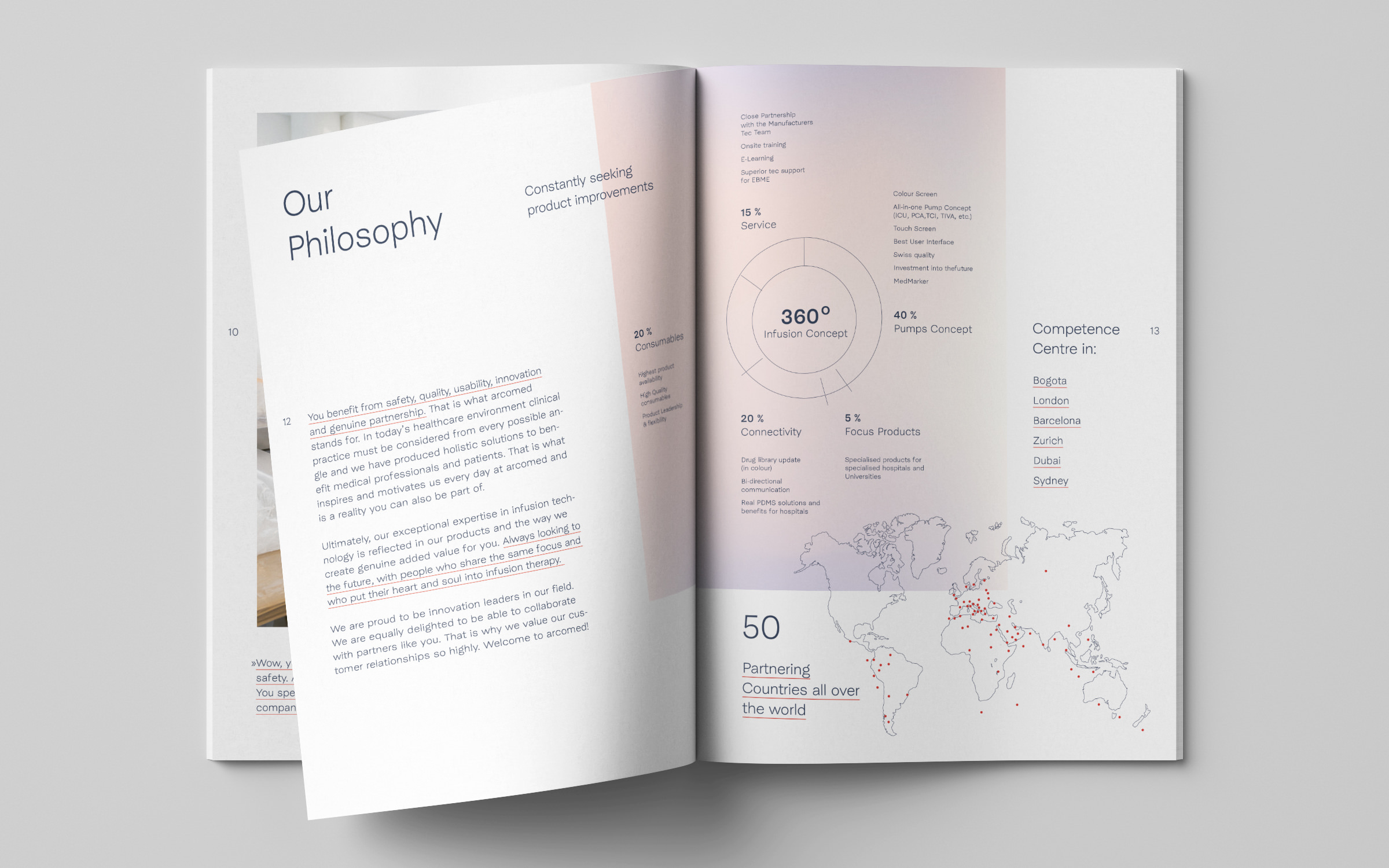
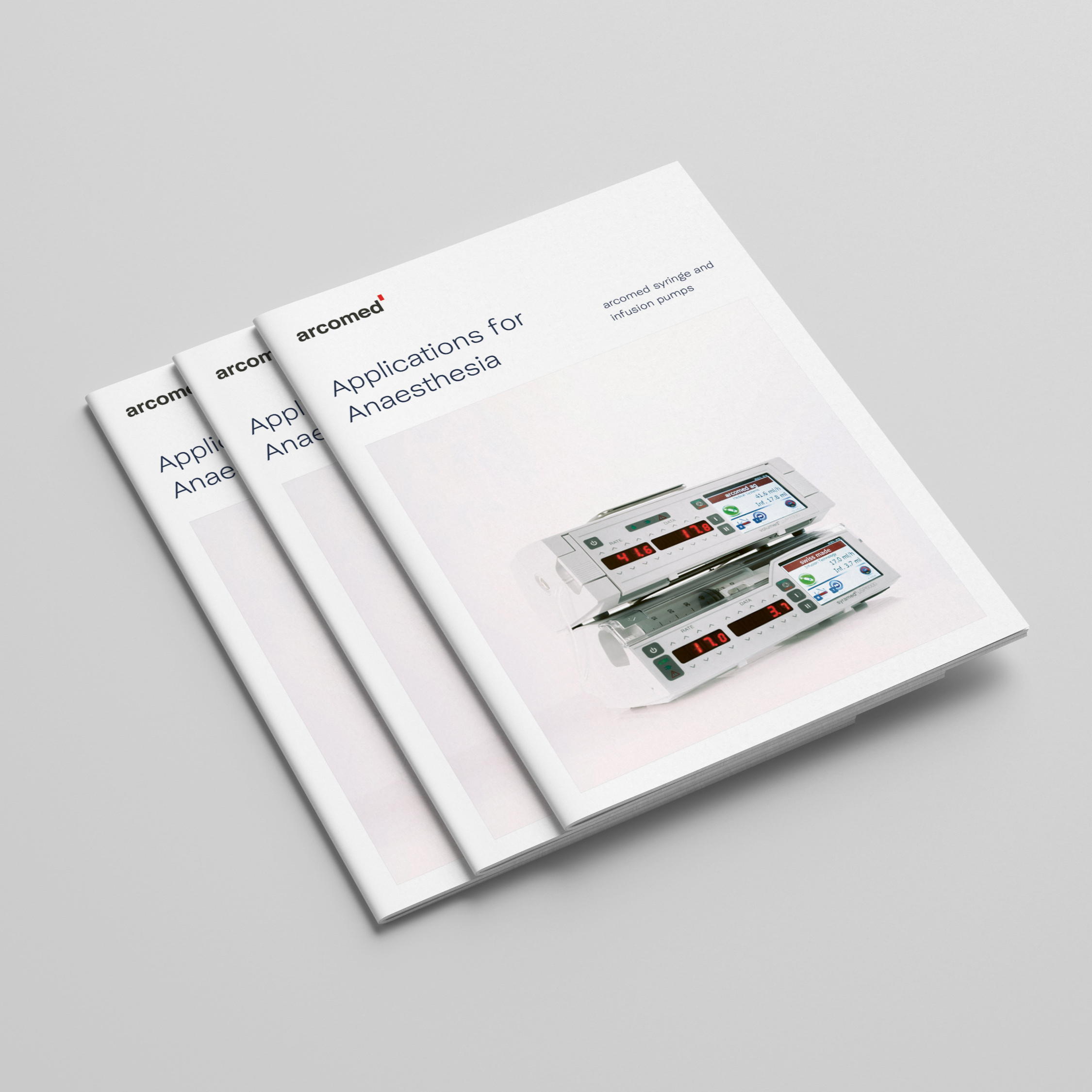
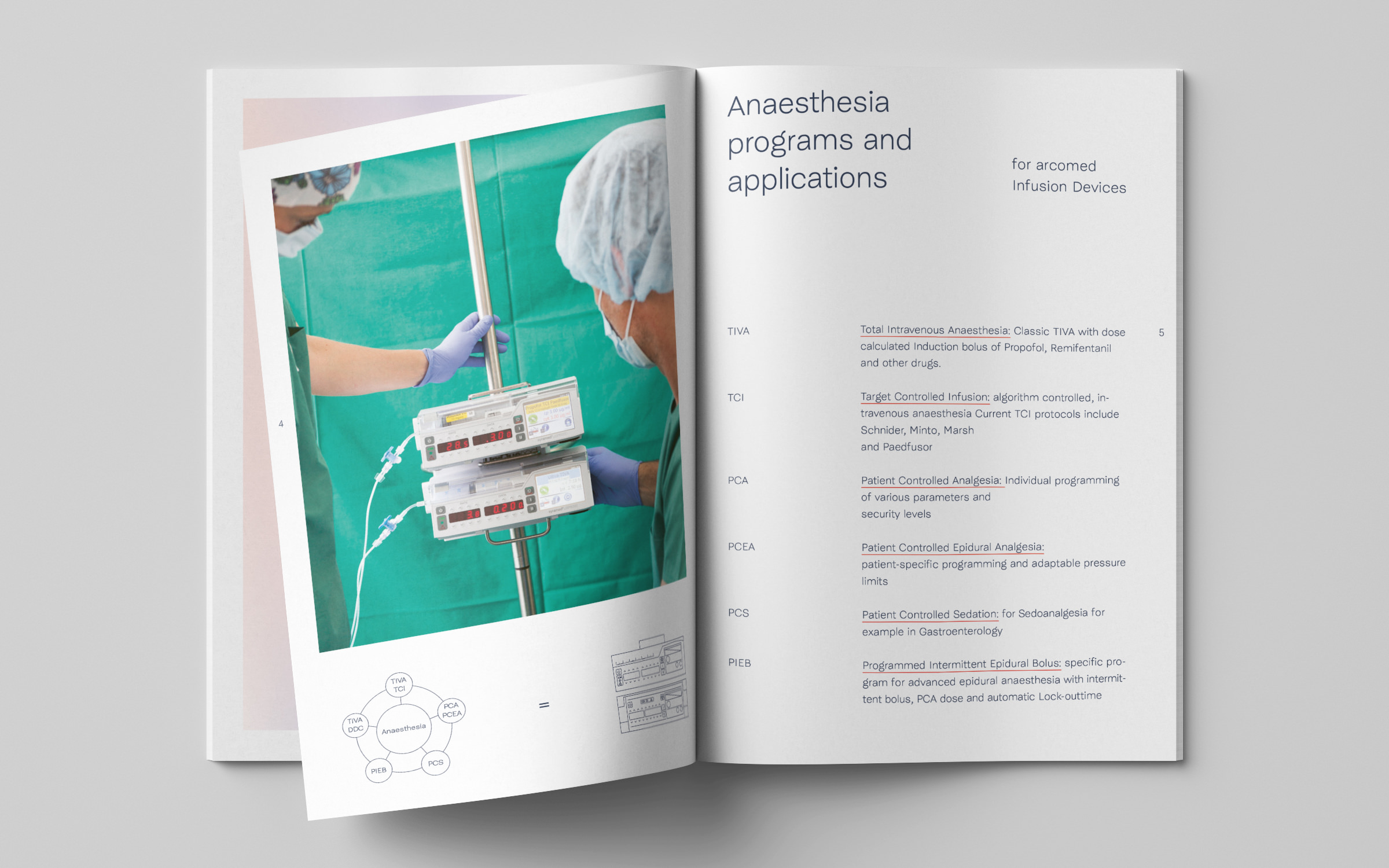
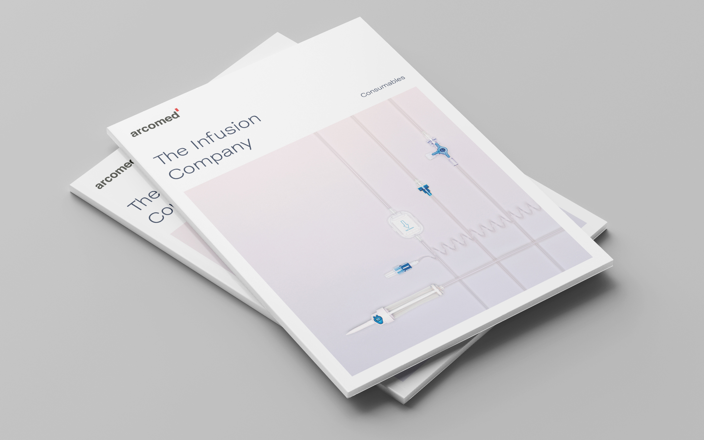
Complicated medical technology, presented in a simple and understandable way: a new Arcomed brochure, set in McQueen Grotesk Light and Medium
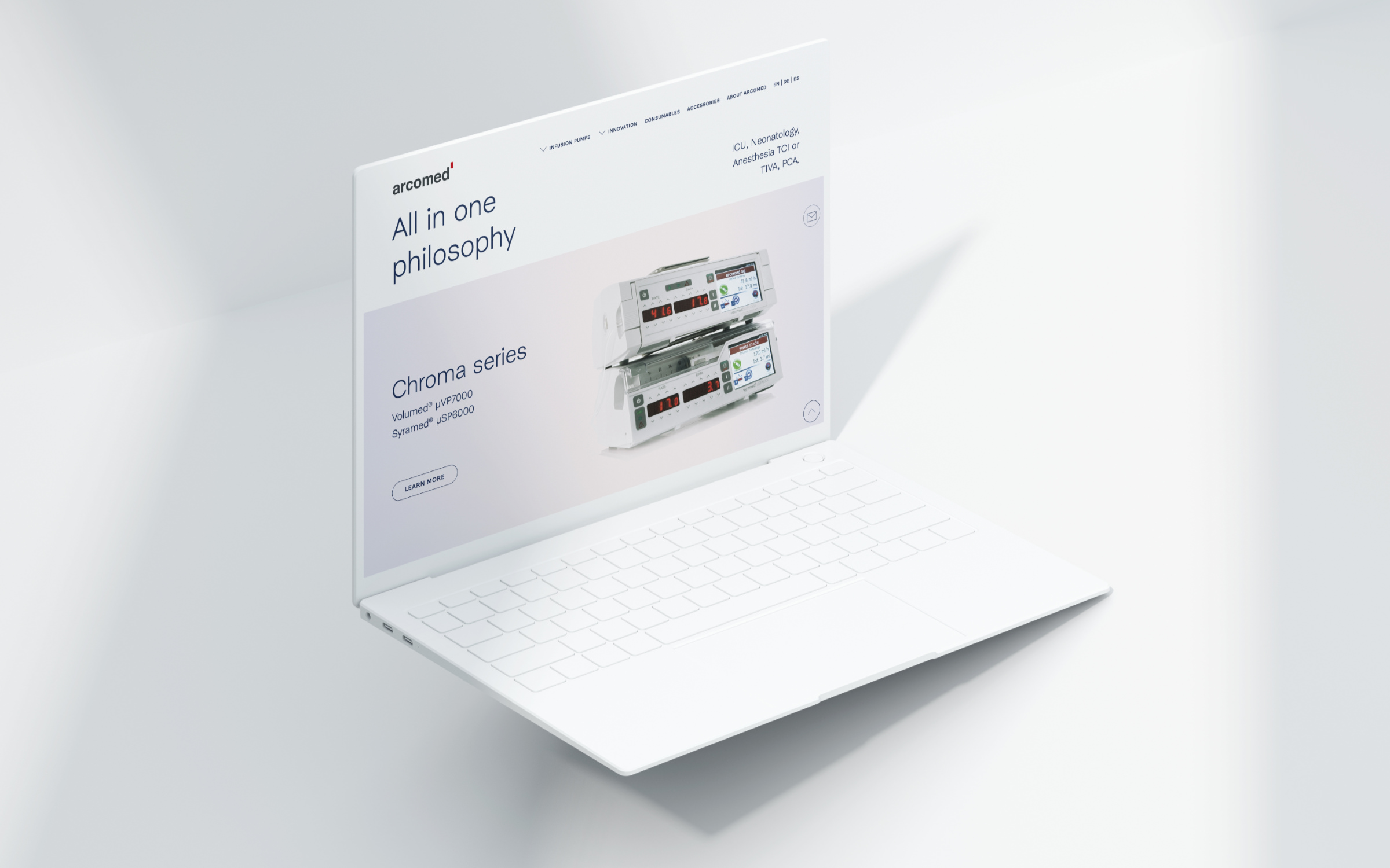
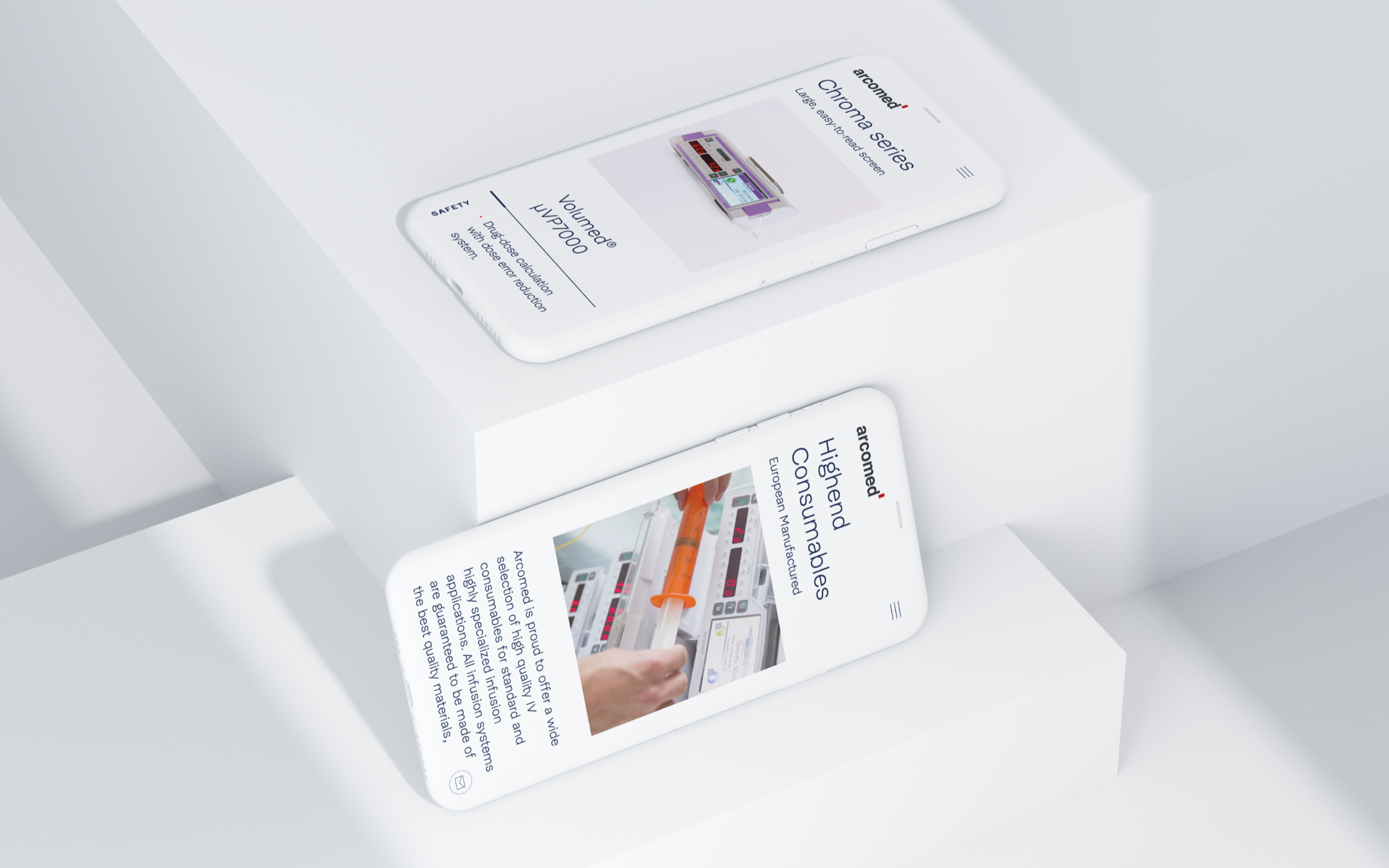
The typographic basis of the redesign is formed by the two fonts McQueen Grotesk Light and Medium, designed by Loris Olivier, Noheul Lee and Katja Schimmel. They ensure a light, unmistakable appearance both in printed material and on the website. The fonts support around 100 languages, which is very much in line with Arcomed’s international aspirations. Eduard Helmann describes the development of the new corporate design as follows:
When redesigning Arcomed AG, we first sharpened the brand and were then on the lookout for a typeface that had a technical feel, exuded precision and symbolized stability. With McQueen, we found exactly the typeface that expresses this.
