Written by Jürgen Siebert
Is your logo still fresh?
How a logo can add value

Only global icons such as Apple, Adidas, or Mercedes-Benz can rely solely on their logo. For almost all other brands, the lettering is the logo. And that is by no means a weakness. Typography conveys tone, attitude, and brand values—even if no message is formulated. A brand without a typographic profile has a weak voice. Even the most beautiful colors and animations won’t help much.
A good logo creates clarity: Who are we? What do we promise? What is our visual profile?
The fact that so many logos look the same today is never due to the brand name, but often the typeface chosen. The selection of fonts has never been as large as it is today. And never before has the technical and aesthetic quality been better. But if you use the same typeface as dozens of other companies in the industry, don’t be surprised if your brand is confused with others.
Using a generic sans serif font may be efficient and a safe bet, but it does not emphasize the USP. And a logo from the most commonly used Google Fonts is like a suit from a discount store: it works, but it doesn’t stand out.
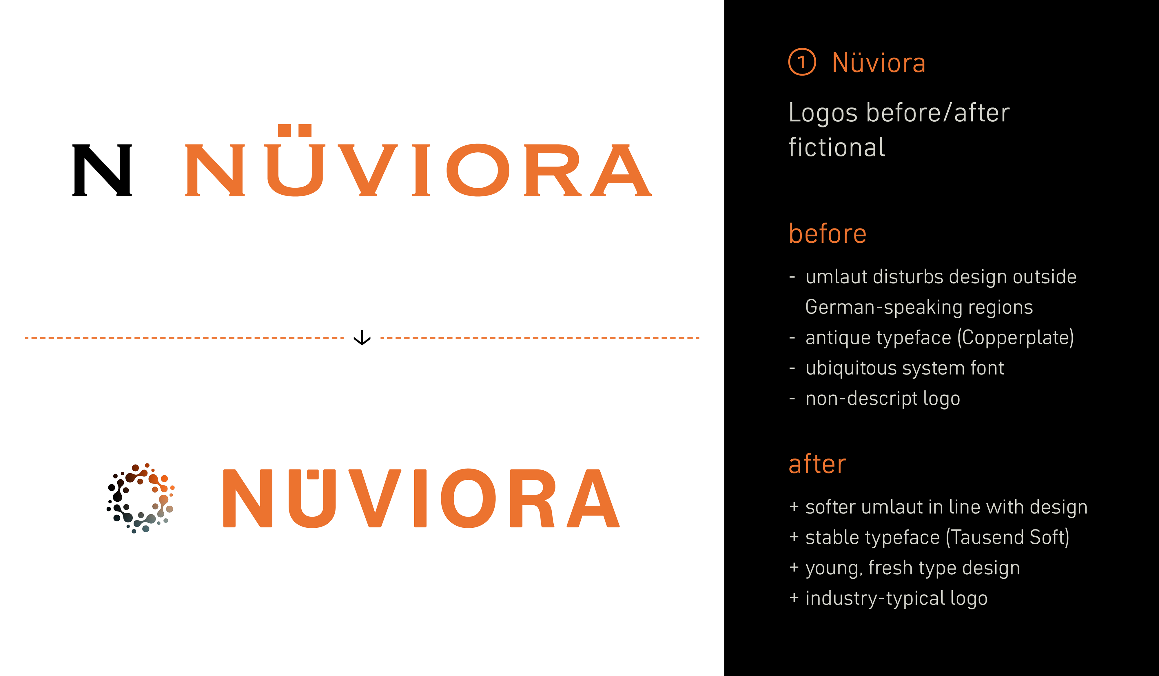
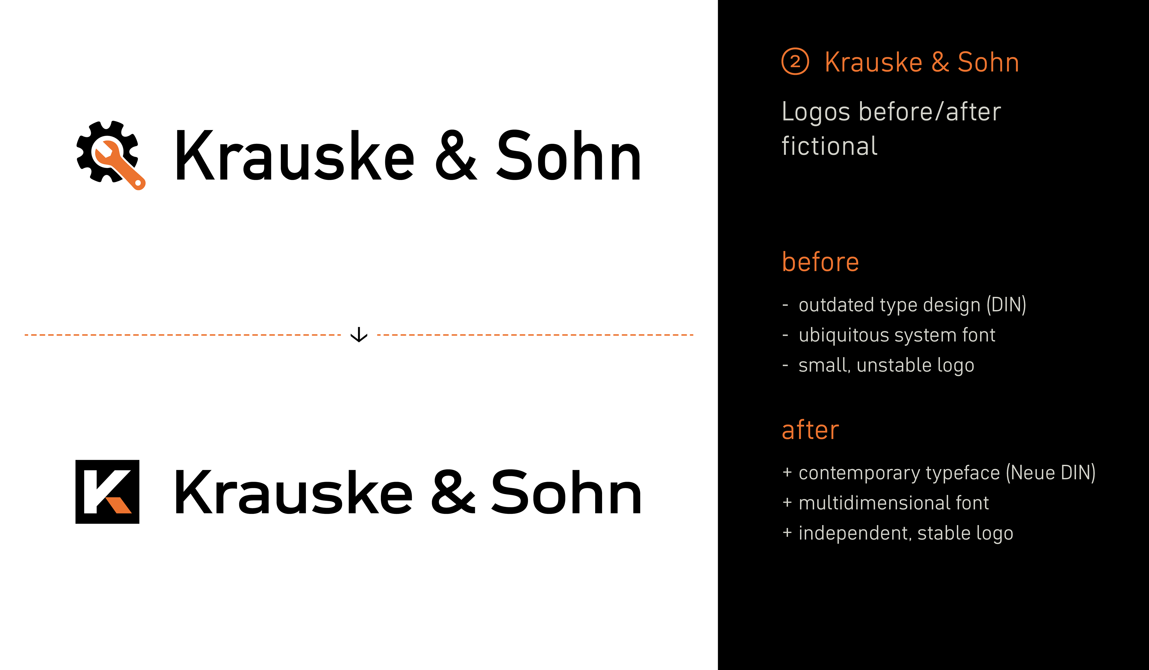
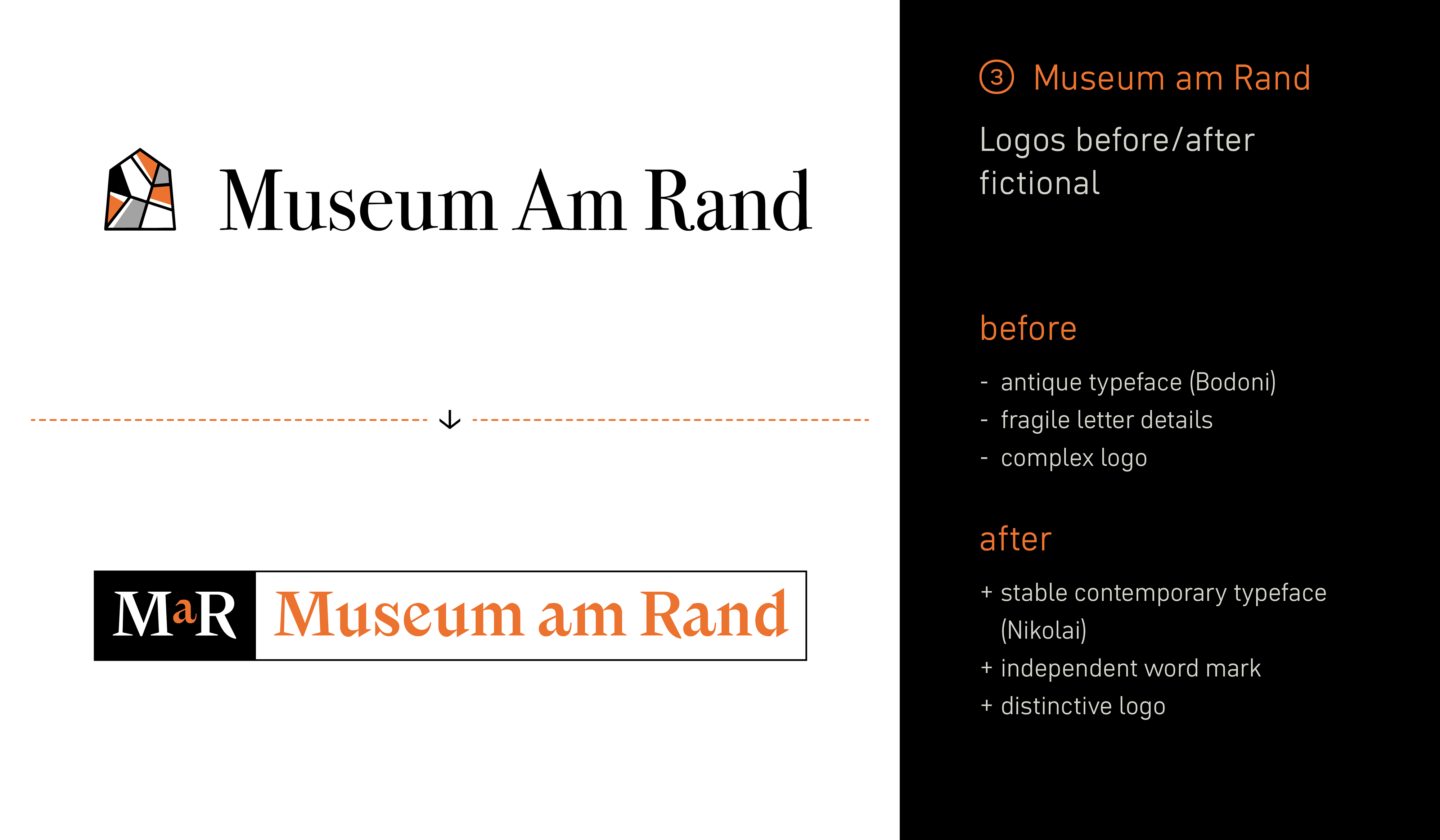
“A good logo must be timeless,” is something you often hear. But timeless doesn’t mean neutral or out of fashion. Rather, it means it’s embedded in its expression. Many strong logos have been adapted over the years: sometimes just a letter, sometimes the color, sometimes the structure. Subtle, but effective. And this is not a sign of weakness, but of mindfulness.
Because if you don’t change anything, you quickly appear outdated. Even logos with iconic status only remain relevant if they move with the times.
For the people who work with the same logo every day, they often age slowly or without them noticing. That’s why it’s worth taking a fresh look every now and then. When a logo starts to blur, appears too narrow, too small or somewhat “pale” then it’s time for a mini-audit.
But you don’t have to do it alone, an objective outside perspective often helps enormously.
Checklist for decision-makers
- Is your logo over ten years old?
- Do other logos appear fresher or clearer?
- Does your logo struggle to cope in digital environments?
- Does your logo blur when it’s a profile picture, in black and white, in small sizes or on changing backgrounds?
If you answered yes to any of the above, it might be time to take a closer look. But don’t worry, sometimes a gentle revision is all it takes.


Good typography isn’t just a bonus feature. It’s the key to brand recognition and identification. Whether it’s a carefully revised word mark or bold lettering, the right font often makes the difference between “okay” and “really good.”
Fontwerk supports brands in remaining visible and standing the test of time with a clear typographic profile.
Take for example the pet accessories brand Trixie, which is active in over 100 countries. They recently turned to us to update their logo. While for the software company, the Seibert Group, we developed two logo fonts in record time.
For Iberdrola, the fifth-largest energy company in the world, we modified the corporate font Pangea so that the leaf logo and logotype were built into the font and can be typed very easily.
A final example is Australia’s largest real estate platform, operated by the REA Group, whose rebranding was made possible with an enterprise font license.
Our license models are transparent and customer-friendly—and now even include a special logo license—so that fonts become a design opportunity rather than a distraction.
After all, a functioning logo is not just another cost but is a value adding factor.