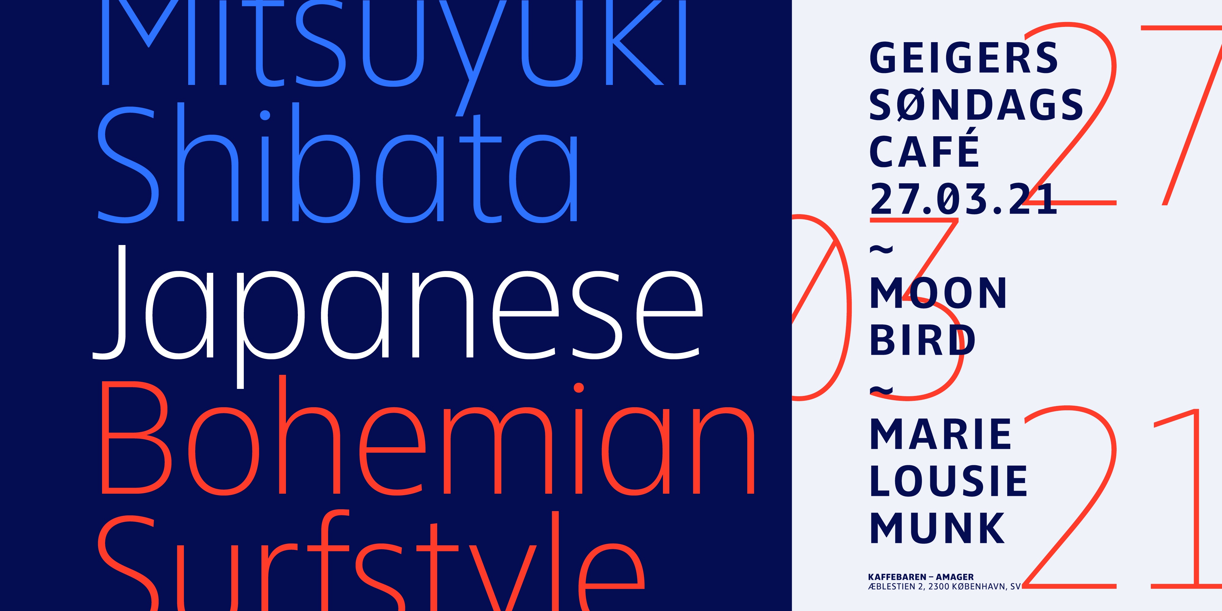
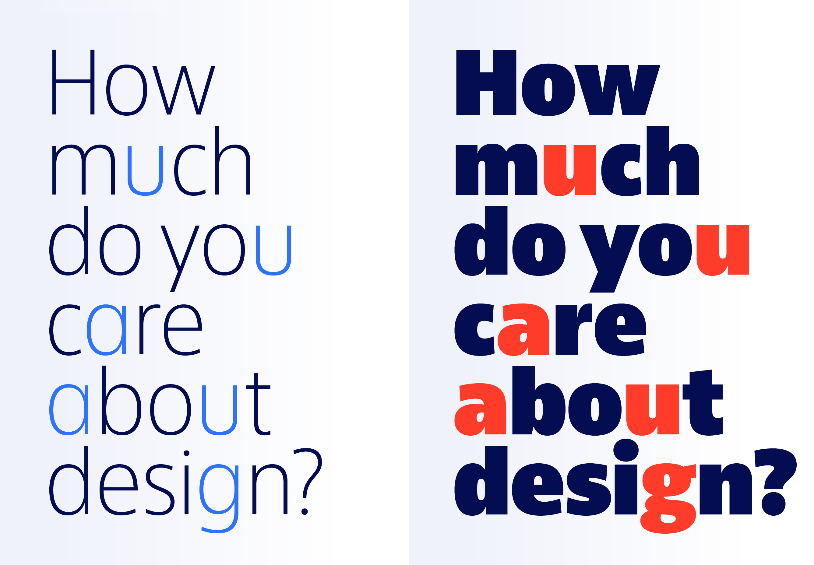
Ika is such a typeface. Its appearance is drawn in equal parts from humanistic, constructed and geometric influences. Its clear, open and balanced forms, the distinguishable characters according to DIN 1450 “Lettering – Legibility” and a perfectly balanced gray value also make this sans serif one of the most legible fonts in the Fontwerk library. It is the first choice for campaigns where a Frutiger may seem too soft or a Myriad or Corbel may seem too ordinary. As a modern alternative, it is as elegant as Frutiger (but has more of its own character), as simple as DIN (but appears more balanced) and as striking as Gotham (but runs more economically).
Ika
One of our most legible typefaces


The character traits described also explain the typeface’s surprisingly short name: “Ika” is an Esperanto term and derives its meaning from the words: solid, transparent, modern and elegant. Should anyone be reminded of the mythological figure Icarus, they would be wrong, because in contrast to the myth, the design does not fly too high or too low.
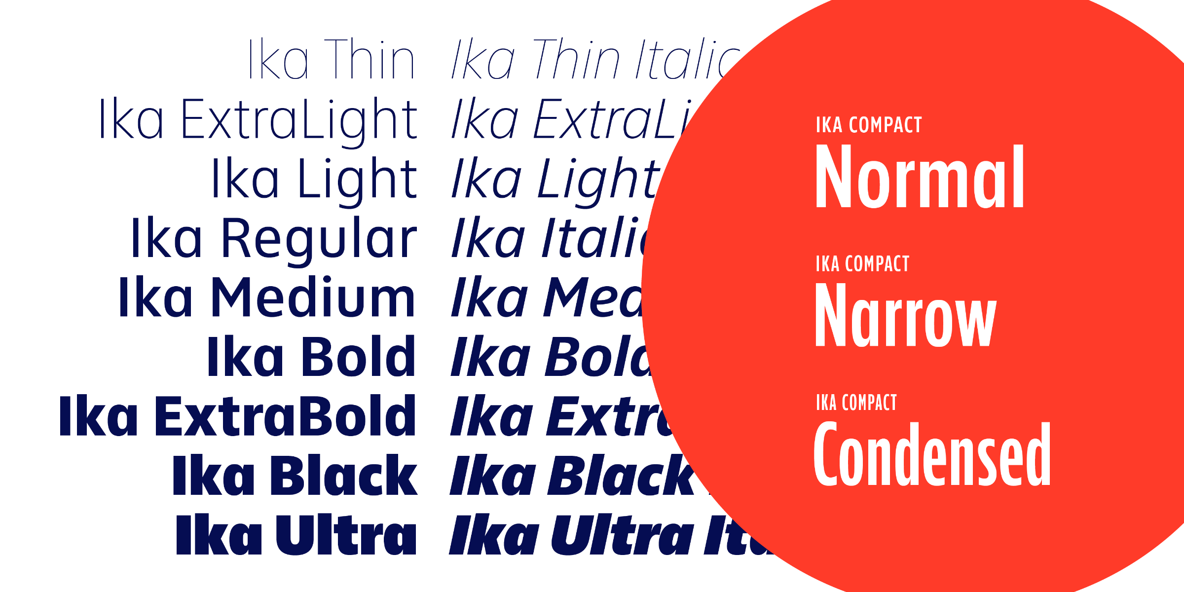
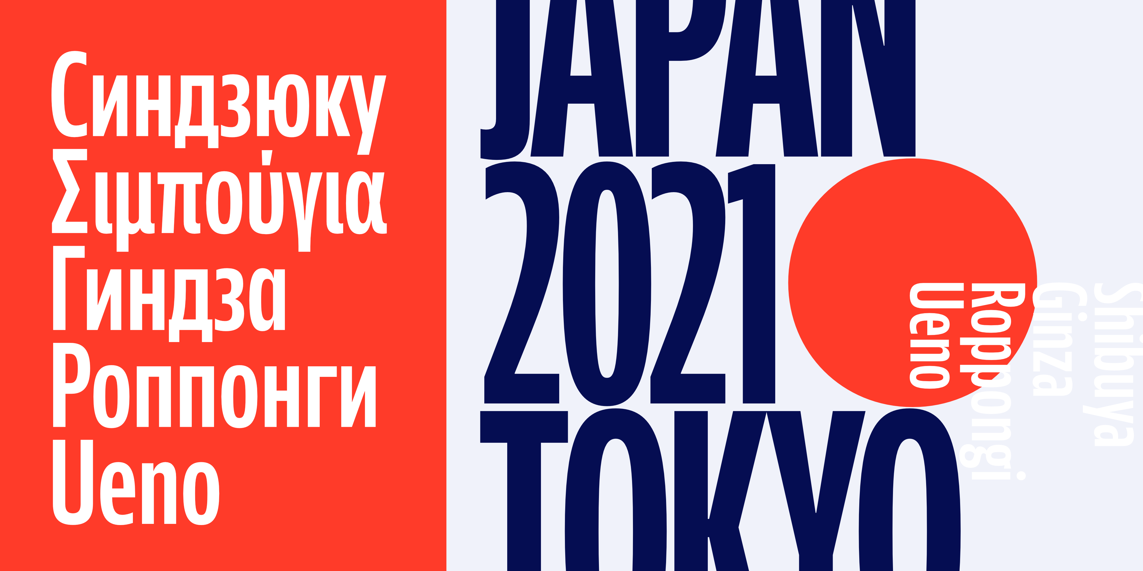
Ika’s designer Jörg Hemker has already struck a chord with designers with his FontFonts, FF Sero, FF Nort and FF Zwo, not least because of the timelessness of these beautiful typefaces, all four of them defy and buck any trend in order to ensure their longevity. Ika is also a timeless family and, like its predecessors, leaves nothing to be desired in terms of its size. All nine weights from Thin to Ultra are equipped with the appropriate Italics and in addition to the extended Latin language support, the typeface also has Greek and Cyrillic alphabets. Speaking of languages, it is in fact Hemker’s largest family to date, covering 107 languages. Complex branding projects also benefit from a good number of extra characters, four different digit sets (with lining figures as default) and all the relevant OpenType features.

Ika is an ideal candidate for use in logos, branding, corporate design, posters, billboards as well as for wayfinding systems and texts, especially in small sizes. In addition to the main Ika family, Jörg Hemker also drew a Compact version that is perfect for when the typeface has to leave its ideal altitude and climb a little bit higher for display purposes.
While its sister consistently subordinates itself to the content of a text, the compact variant pushes more to the fore, but without losing the characteristic humanistic, constructed and geometric elements of its sibling. Ika’s extensive language support (expanded Latin range with Greek and Cyrillic alphabets) is still there, as well as its clarity, balance and timelessness.

The similarities end with the glyphs and their contrast. They are significantly narrower and the contrast is less. The x-height is lower, the ascenders and descenders are shorter and the terminals are vertical. All of this results in an extreme compactness and a somewhat more decorative and striking character, but also a little more static character. What is actually intended for tight headlines works also well in small texts as well as in interface design, especially in call-to-action buttons and UI menus and the three widths are perfectly suited to such usage.
Stylistically, Ika Compact moves in the direction of tightly running American grotesque fonts with a rational form principle such as Alternate Gothic or Trade Gothic. Thanks to its open forms and the distinguishable characters based on DIN 1450, it is more elegant, accessible and clearly legible. Although she sees herself primarily as a family member of the Ika family, the Ika Compact also plays out its strengths as a display font independently of her sister.