 | NEUE DIN BREAKS NEW GROUND AGAIN WITH ITALIC & RETALIC |
|---|
|
Usually, the main topic of our monthly newsletter more or less writes itself. This month, however, we had to choose between two equally important news items. Number one: the ever-growing Pangea is our first typeface to support Thai. Number two: Neue DIN is – true to its name – breaking new ground once again! Also this month, we received a fabulous use case from Vietnam and we have a few interesting side notes to share. So buckle up and get ready, as our upcoming newsletters will be similarly eventful. This new year, we’re firing up all our cylinders and getting ready to blast off. We can’t wait for you to join us on this ride into 2026! |
|
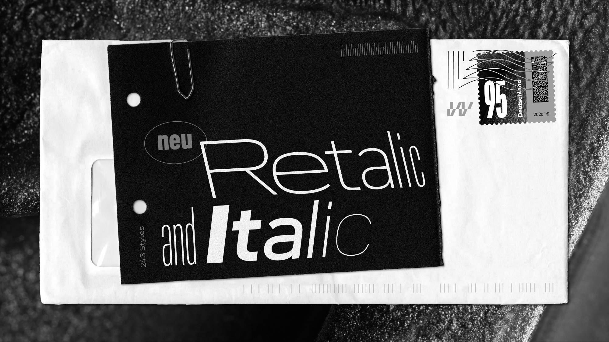
 | | The Italic and Retalic update increases the number of static fonts to a whopping 243. This doesn’t even takes into account the infinite number of options the variable version provides. | |
|
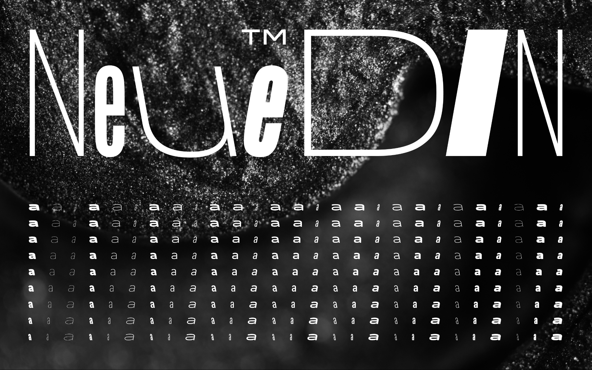
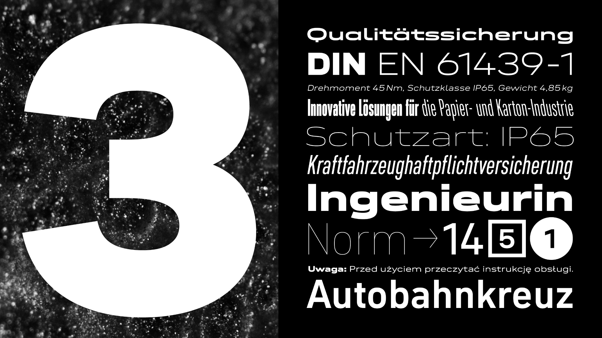
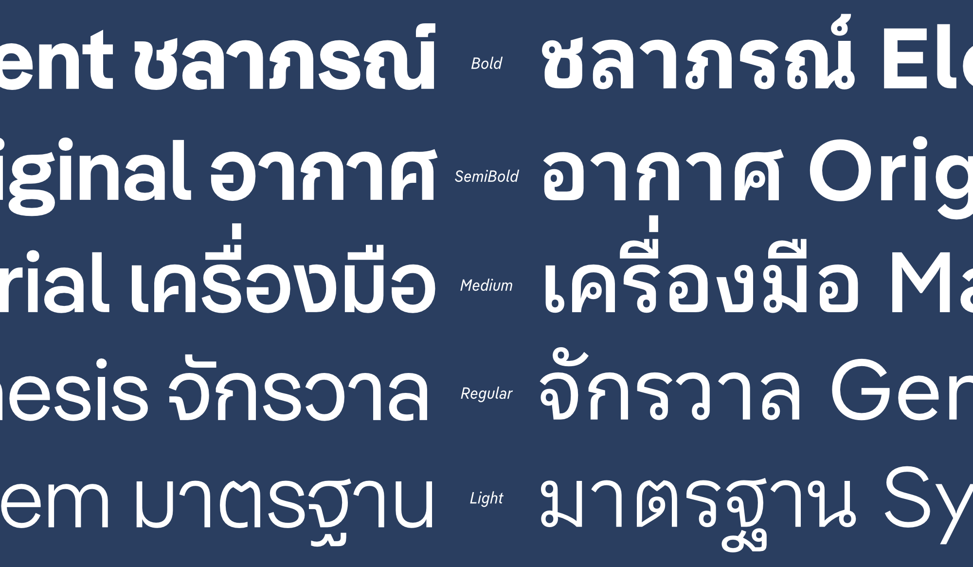
| | Introducing 162 (!) oblique styles of Neue DINWhen we published Neue DIN, it caused widespread astonishment. That was not entirely unintentional, because its name is part of its DNA and reminds us to explore completely ‘neue’ avenues with it. Aside of its variable-first approach, the most obvious unique selling point is the stringent interplay of nine weights (Thin–Black) and nine widths (XXCondensed–XXWide). The enormous bandwidth paired with the flexibility of the Variable Fonts technology creates a thoroughly new DIN feeling, also because the extreme widths feel unfamiliar at first. Three years later, the existence of these extremes seem absolutely logical in a digital world. When we – designers Andreas Frohloff, Hendrik Weber, Olli Meier and project lead Ivo Gabrowitsch – rethought the popular DIN typeface, it also meant starting from responsive environments. That is why the 81 styles correspond to those specified in the CSS specification (the style sheet language used for designing websites). Despite the large size of Neue DIN, italics were missing. Not only because we wanted to design them with care, we also wanted to break new ground when it comes to something natural as italics. So we added not ‘only’ the 81 normal oblique fonts, but also the same number of backslanted variants. These Retalics offer novel possibilities in display contexts, for example. This latest update increases the number of static fonts to a whopping 243. For those who prefer a more manageable approach, the variable font has been given a third axis for slanting in both directions. This one is especially fun. Try it out for yourself! If you have licensed Neue DIN before and want to upgrade, please get in touch for a special discount. | |
|
 |
 |
 |
 |
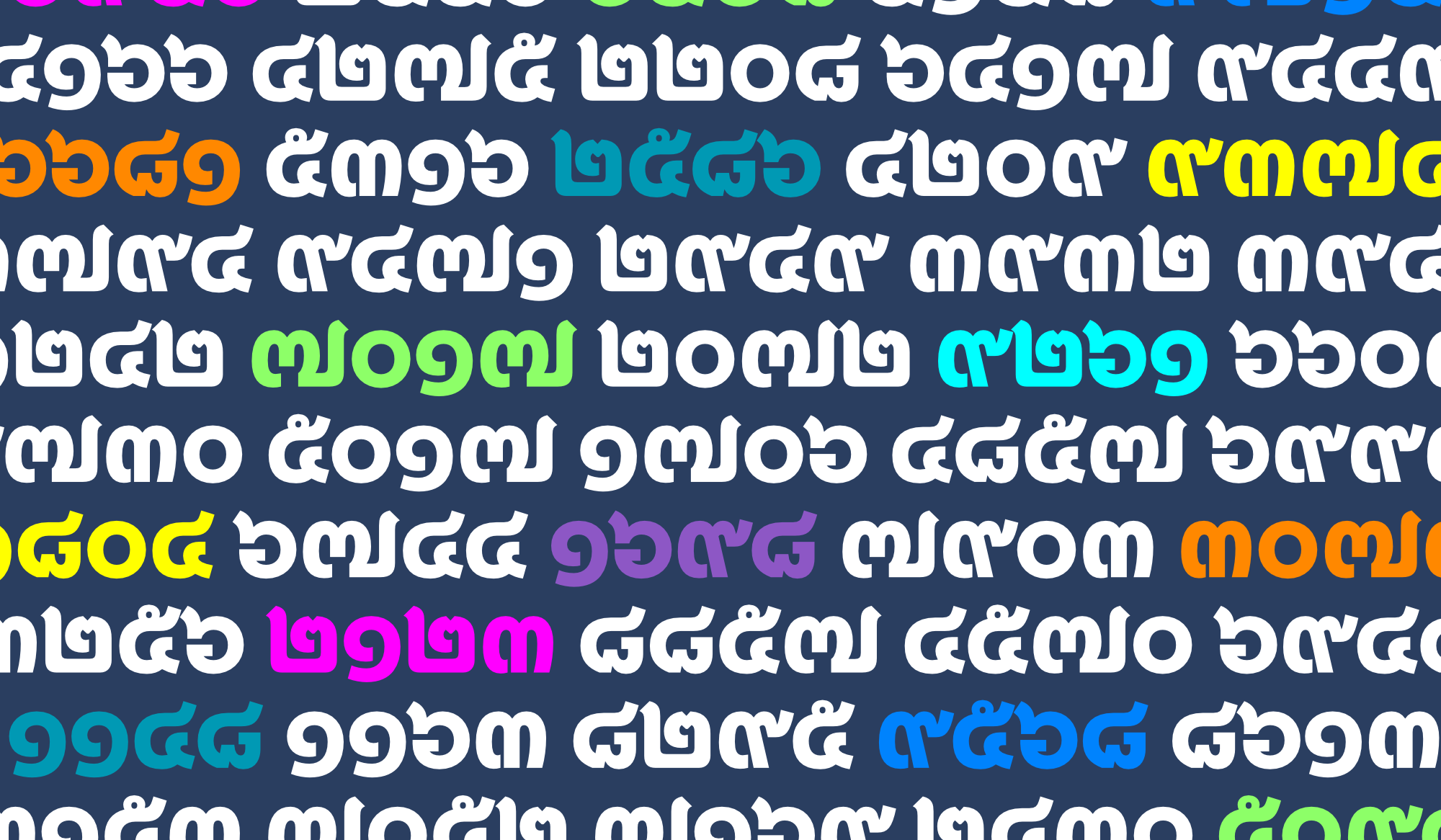
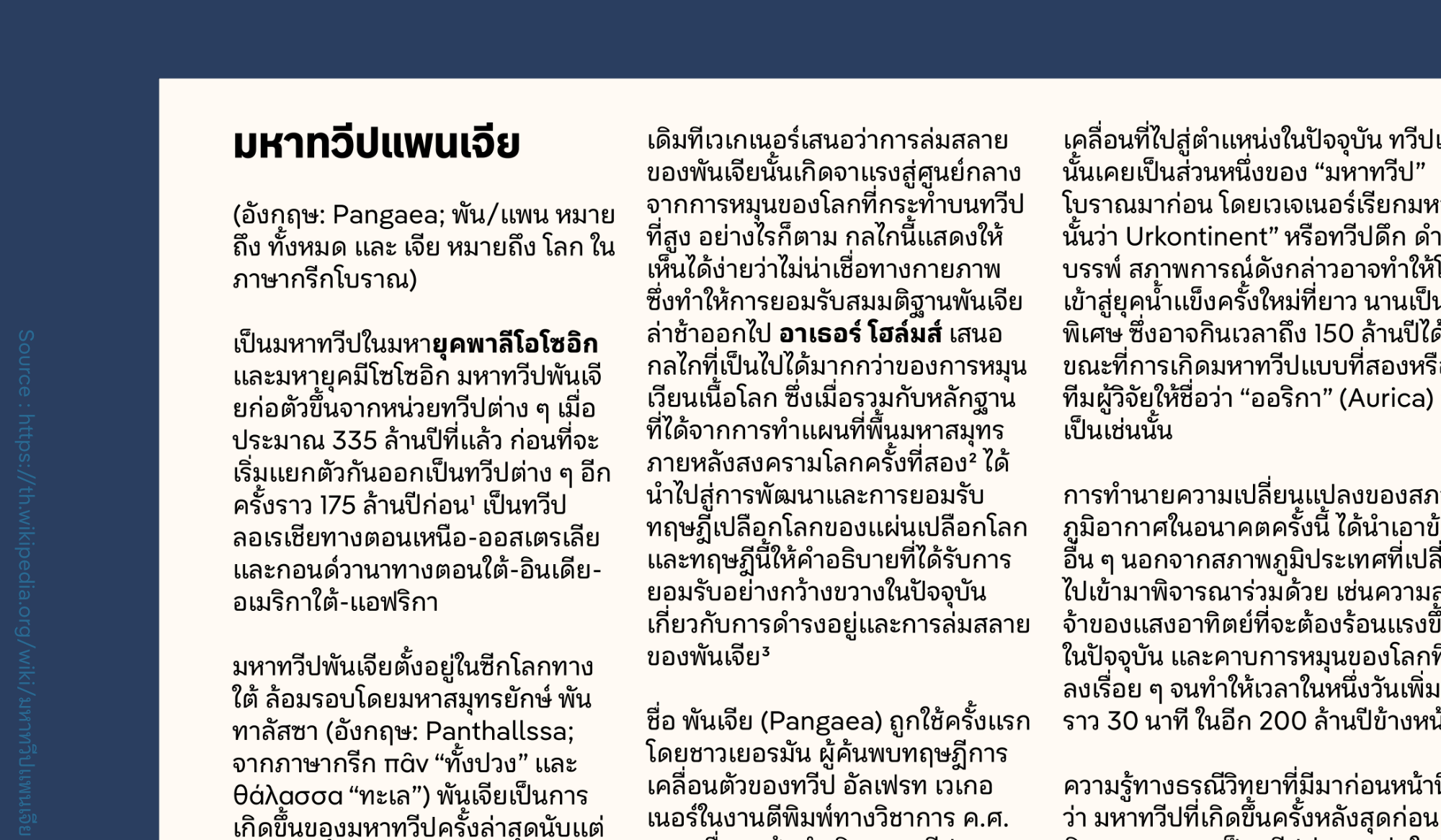
| | Introducing Pangea’s sixth alphabet, ThaiWith his Pangea Collection, Christoph Koeberlin is on a mission to make the world a better place through typography. Not only does he donate a quarter of his earnings from the fonts to rainforest reforestation projects involving the local population, but he is continuously expanding the range of foreign languages supported by the fonts. What sounds ambitious is working: thousands of trees have already been planted, and thanks to the active support of international colleagues, Pangea now includes characters for all (!) Latin languages as well as Cyrillic, Greek, Arabic, and Hebrew. With the help of Bangkok-born designer Boom Promphan Suksumek, the sixth alphabet is now being added: Thai. This writing system has a special feature: there is a Looped and a Loopless variant. There is no dogmatic rule as to when which variant should be used. In addition, readers’ preferences vary greatly depending on age and context. Our friends at Typotheque conducted a scientific study on this topic, investigating how loops influence reading – both in terms of legibility and perception. Based on this research, Boom and Christoph interpreted the results to mean that Loopless is better suited for display sizes, short texts, and expressive applications, while Looped is better for body text and longer reading. They therefore decided to design the more expressive Pangea as Loopless and the more reader-friendly Pangea Text as Looped. The crowning glory of this stringent decision: the variable font switches between these styles via the optical size axis. All registered users can download the language-expanded fonts free of charge from their Fontwerk account. For new customers, the price stays the same – with one exception: thanks to the Regional Pricing introduced a few weeks ago, customers based in Thailand receive Pangea at a 61% discount. The idea behind this is to better reflect the realities of life in different regions (more on this here). But that’s not all: additional languages are currently being designed, and Pangea will not be the last typeface in our portfolio to support Thai. | |
|
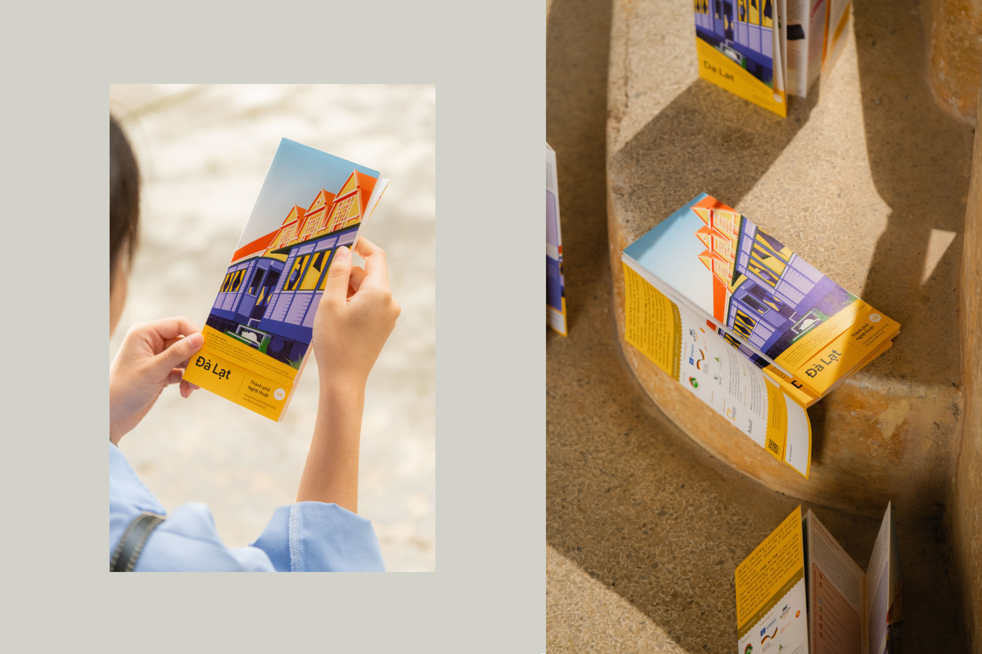 |
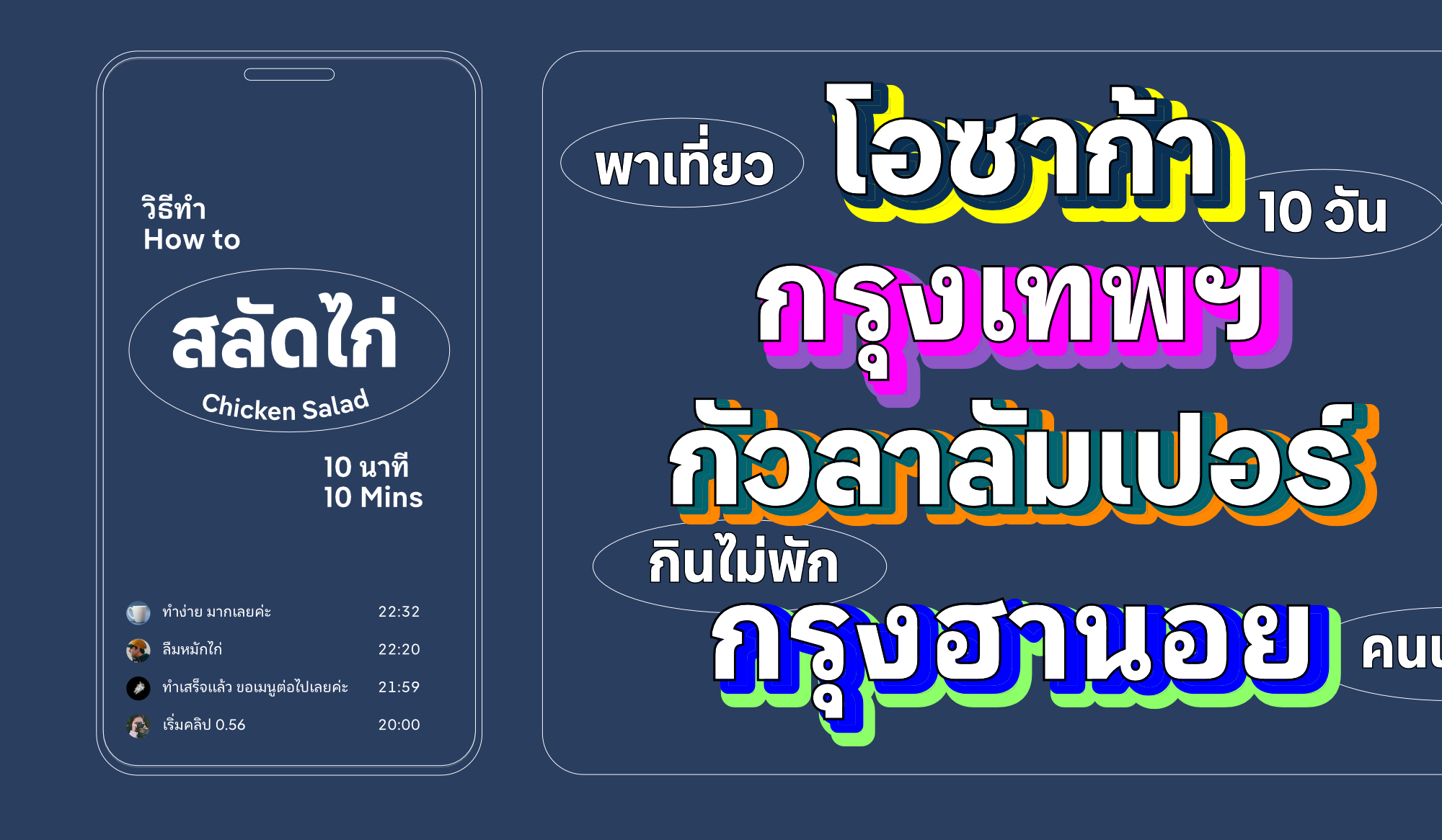
 | | ‘We had to play with spacing, sometimes even compressing words slightly – but Pangea managed all of this, its resilience is impressive’, says Creative Director Giang Nguyen; © Images by Vinh and Mắt Bét | |
|
| | Pangea: the art festival wayfinderHaving just praised Pangea’s foreign language skills, here is another fabulous example of it, which reached us from Southeast Asia. Pangea Text was picked as part of the branding for the City of Arts Project for the Vietnamese city of Đà Lạt. The project transformed Đà Lạt’s cultural heritage into a visual experience and art exhibition that took place in the city. Behalf Studio, who are based in Hanoi and are known for their conceptually strong, typography-driven design, were in charge of the branding. Lead Creative Director for the project was Giang Nguyen and they knew very early on that Pangea Text would be a strong contender that could get to grips with all the requirements of the complex and unique brief. Typographically, the project was really quite demanding, with many multi-column layouts and lots of short text passages in small font sizes. As Giang Nguyen remembers: ‘We wanted an aesthetic that was inspired by signage systems and their functionality: clear, minimalist, but not too technical. Pangea combines all these requirements with its friendly, humanistic tone.’ The fact that Pangea also speaks Vietnamese was the cherry on the cake for the team. | |
|
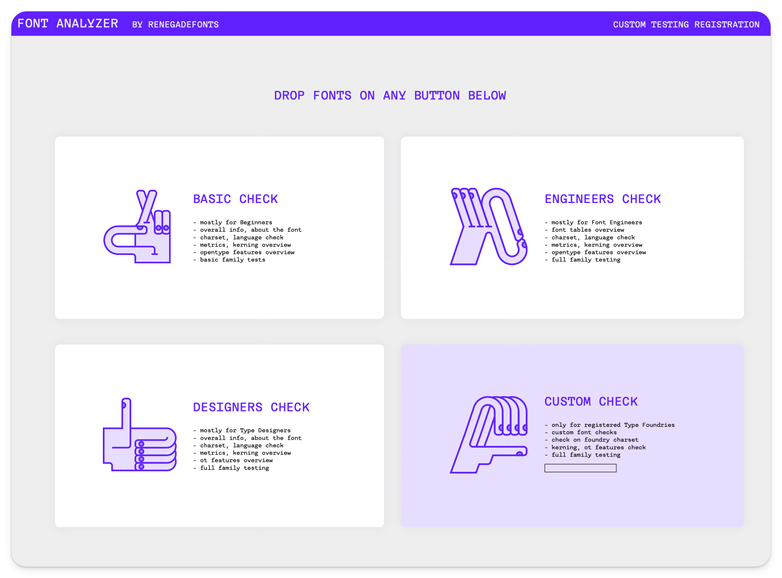 In addition to the Fontspector online tool presented in the October newsletter, which we support with our own test profile, there are of course other ways to check fonts for quality. Czech type designer and font engineer Jan Charvát, aka Renegadefonts, offers an exciting tool called Font Analyzer, which provides four different options: a basic check, an engineering check, a design check, and a custom check. By the way, we are happy to fix any problems that arise within the scope of the licensing options. ↗ |
|
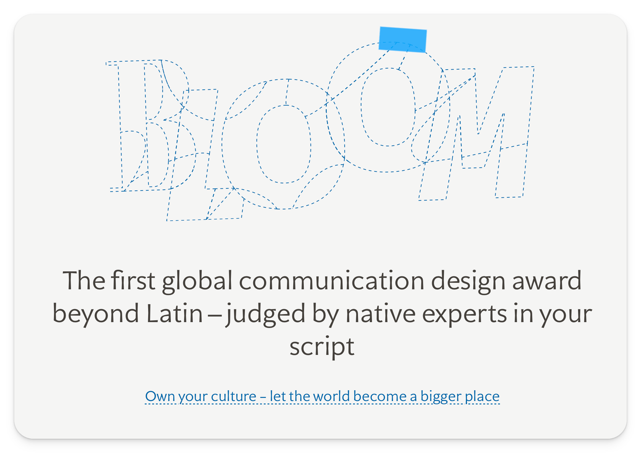 As you can probably tell by the content of this newsletter and our overall approach, we are obsessed with languages and strive as an organization to ensure that our fonts speak as many languages as possible, not just Latin ones. So it’s great to see that entries are now open for the first ever Granshan Bloom Awards which are the first global communication design awards, that focus solely on Global Scripts beyond Latin. The early bird phase is open now, so if you have some work (we’re looking at our international designers) you’re keen to submit, we encourage you to do so! ↗ |
|
We are always on the hunt for original designs – from the wild to the one-off, from the wacky to the serious and sensible. If you have a design that you think might fit our collection, we would love to hear from you. In return, we offer a close working partnership, one where we take care of all the time consuming and tricky things so that you can focus on what you do best. Interested? Read more over on our website and find out more about the process. |
|
|
|