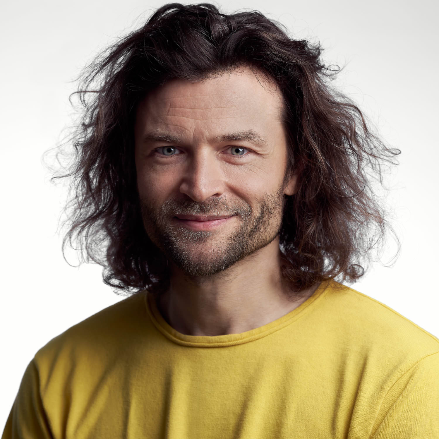
Simple is the best. Hendrik Weber has been guided by this seemingly uncomplicated yet in reality rather challenging design principle for the past 20 years when designing in public spaces.
As the Type Director of KMS Team – one of Germany’s leading agencies – Hendrik sees his work as inextricably linked with neighbouring disciplines. He strives for a constant exchange with designers from the fields of motion, 2D/3D, interactive and print and his exclusive typefaces for top brands such as Porsche, Bentley, BMW Motorbike, Santander and Canyon bikes, as well as his retail fonts for TypeBy and Monotype (Lirico, Edward, Unitext) are proof of his determination to create visible quality even in demanding environments. One of his dreams came true while working as Type Director for the DACH region at Monotype, where he led the team that worked on the revision of the most popular typeface in the western world (Helvetica) which resulted in the creation of Helvetica Now.
The foundations for his impressive CV were laid during his studies at the Leipzig Academy of Fine Arts. His patron Fred Smeijers, Professor of the then newly founded specialist class for type design, recognized his talent and has regularly relied on Weber’s services since he graduated.
The final phase of his studies was dominated by research on cursive typography and culminated in a book on the subject. “Italic – What gives Typography its Emphasis” is regarded as the first detailed treatise on the subject. It has since been translated into English and the second edition is available from the Swiss publisher Niggli. Since graduating, Hendrik Weber has passed on his knowledge and experience to students at the Weißensee Academy of Art Berlin, the Academy of Fine Arts Nuremberg, the Munich University of Applied Sciences and the Augsburg University of Applied Sciences.
Together with Andreas Frohloff and Olli Meier he took on Fontwerk’s challenge to rethink the German design icon, DIN. With clever design ideas, precision craftsmanship and following his design principle of simplicity, they came up with a solution that allows for a completely new feel – Neue DIN. Following in the footsteps of its predecessors, Neue DIN has a strict overall impression but it has been completely revitalized and reimagined to incorporate extreme widths, a variable-first approach and an extra special touch of elegance.