To change or not to change your logo? Thankfully, in his first essay for us, we have Jürgen Siebert to answer this question.
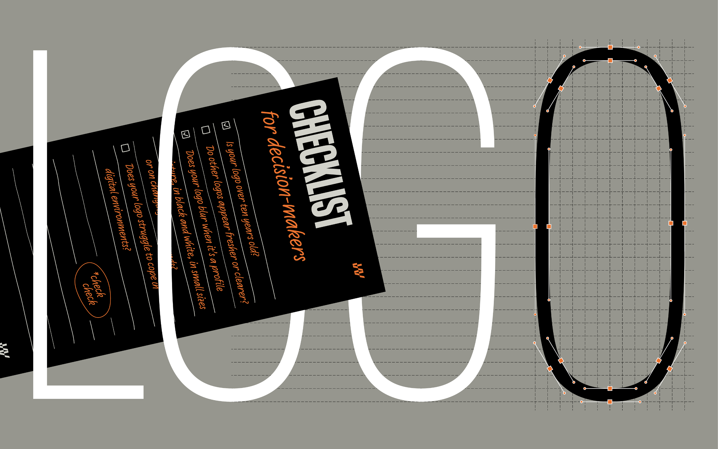 | IS YOUR LOGO STILL FRESH? |
|---|
|
To change or not to change your logo… Now that is a big question for any brand, big or small. Thankfully, in his first essay for us, Jürgen Siebert guides you through the process. Also this month, there’s a beautiful use case for West, Hamster features in a fabulous new book and we’re delighted to contribute a small (yet mighty) part to a new font QA tool. |
|
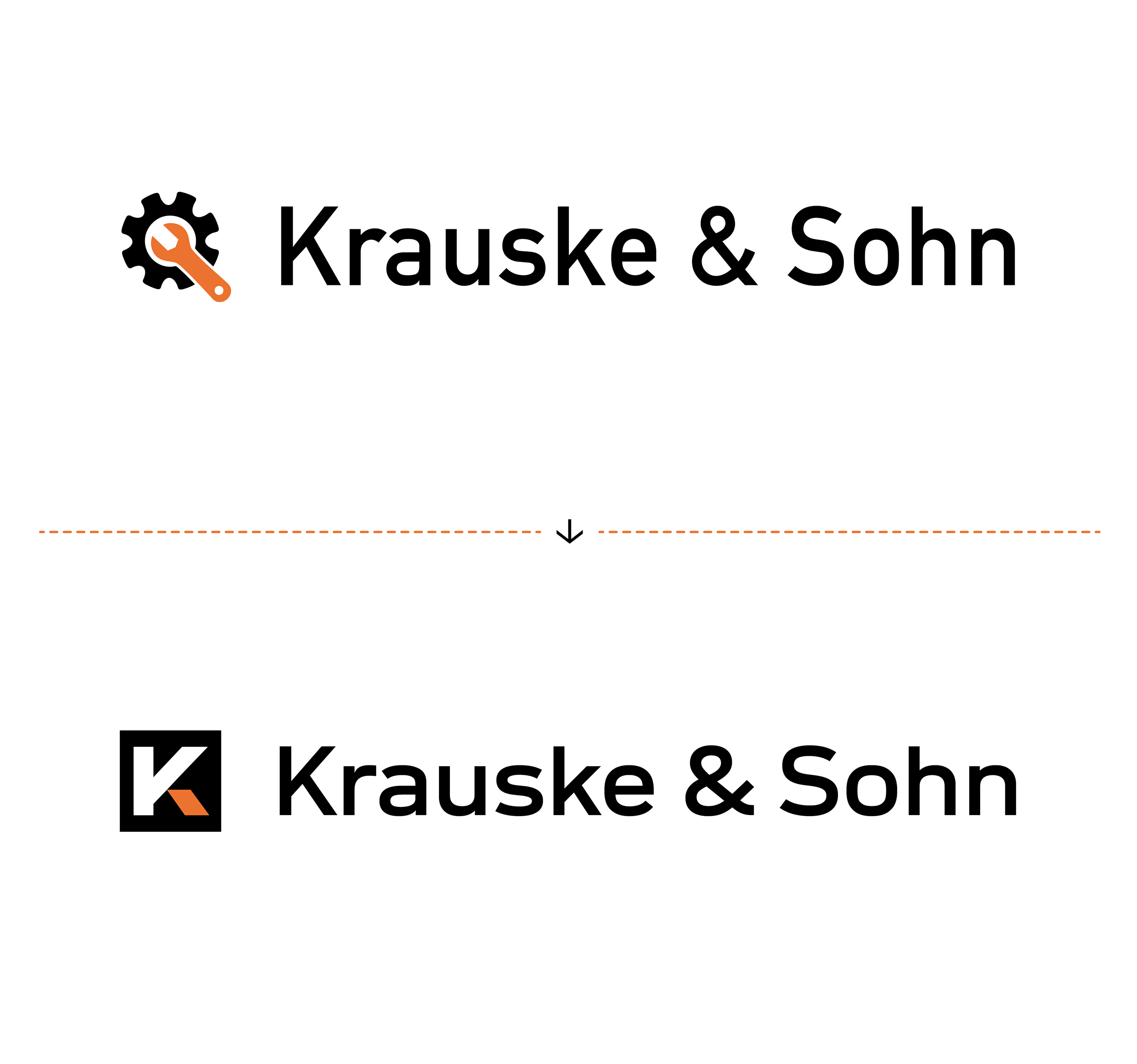 | | A fictional example that proves, the right font often makes the difference between an ‘okay’ and a ‘good’ logo or word mark (traditional DIN typeface compared to Neue DIN). | |
|
| | When should I update my logo?These days, the shelf life of a logo or word mark is surprisingly short. A logo is no longer a monument (and never was). In fact, it is a vital element of a brand identity and one that needs to be kept up-to-date. Now more than ever, logos age faster than you think. They can often appear weak, quiet, or simply interchangeable—not because they were poorly designed, but because the environment has evolved. Unless you are a brand icon (e.g. Apple, Adidas or Mercedes-Benz) and can rely upon your reputation, your logo will often have to work hard and this is where great typography can help. A good logo that uses the right typeface creates clarity, purpose and adds immeasurable value to your brand. In his first in-depth article for us, FontShop veteran Jürgen Siebert shared his top tips and ultimate logo checklist to help you work out if it’s time for a redesign. | |
|
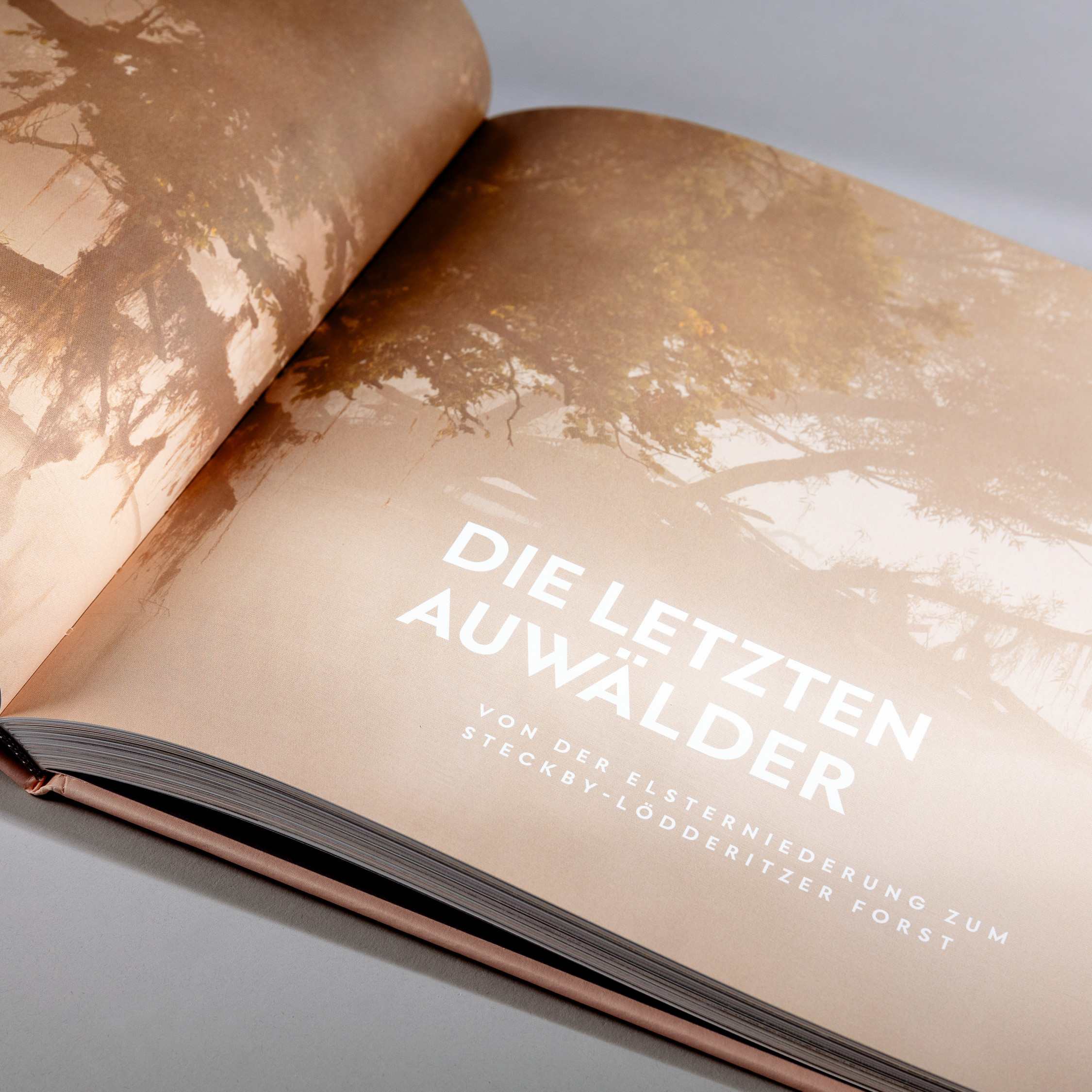 | | Wild photos, calm typography: The photo book ‘Wilde Elbe’, set in West | |
|
| | West out in the Wild(e Elbe)West by Daniel Perraudin takes headline and caption center stage for a beautiful new book produced by the German Society for Nature Photography. For more than two years, 29 passionate photographers went on the road traveling the length and breadth of the River Elbe. The resulting publication, ‘Wilde Elbe’ by Knesebeck is a unique portrait of the river, its landscapes and biotopes. Designed by the Munich design office of Schmid/Widmaier, the team was enthusiastic from the start: “The book shows the last wild and remote places around the Elbe. The pictures sometimes make you think that you are somewhere in another, distant country.” The headlines and captions are set in the Regular, Bold and ExtraBold weights of West. Thanks to their lightness, West’s subtle typographic accents interweave with the photographs to form a harmonious flow. | |
|
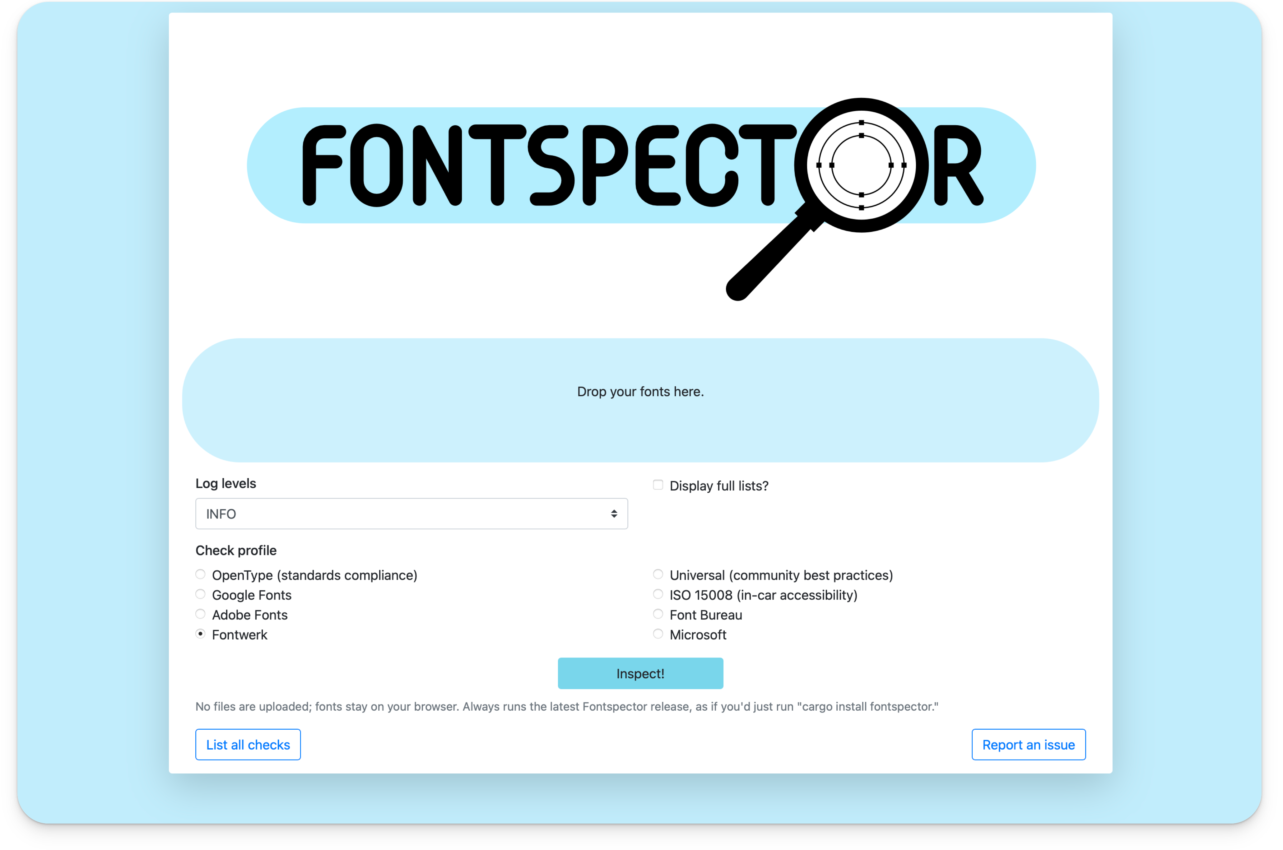 | | Browser screenshot fonttools.github.io/fontspector | |
|
| | A small but mighty contribution to font QARecently we asked AI what it thought of Fontwerk. As far as it was concerned, we stand for aesthetically pleasing, technically sound and high-quality fonts. We don’t disagree, because not only do we do this with our own fonts and on commission—it’s also our mission to improve the overall quality of font software across the industry. With this in mind, we recently contributed a relevant part of our own internal testing procedures to the public QA project Fontspector. Alongside test profiles from Microsoft, Adobe, and Google, there is now also a Fontwerk profile. It is a further development of the Fontbakery program, which is a popular quality assurance tool for fonts. While Fontbakery could take several minutes to test a single font, Fontspector can evaluate entire type families in a matter of seconds. Font files can be conveniently tested through drag and drop without any prior programming knowledge. As a small independent foundry, to be part of this feels both wild and wonderful, and proves that with a little commitment, even small players can have a big impact. | |
|
 In last month’s edition of Werknews, we shared that the Hamster family had expanded! Hamster was our first ever color font by Joe Stitzlein and was first released back in 2023. Since then it has attracted a lot of attention, from a TDC Award (Certificate of Typographic Excellence) to lots of press and articles around SNASK’s unique ‘Hoarding all the nuts’ release campaign, this cute and colorful font is a veritable playground for designers. We were over the moon to see it featured in this beautiful book all about Three Dimensional Type that was recently published by Counterprint Books. ↗ |
|
With our free Trial Fonts you get access to all characters and features of our fonts (except for currency symbols). So you can take all our typefaces for a spin before you buy. And for the eager beavers amongst you, you will also get exclusive access to our brand new (yet to be released) fonts from time to time (currently Sukoon by Yanone). So, why not try before you buy? |
|
|
|