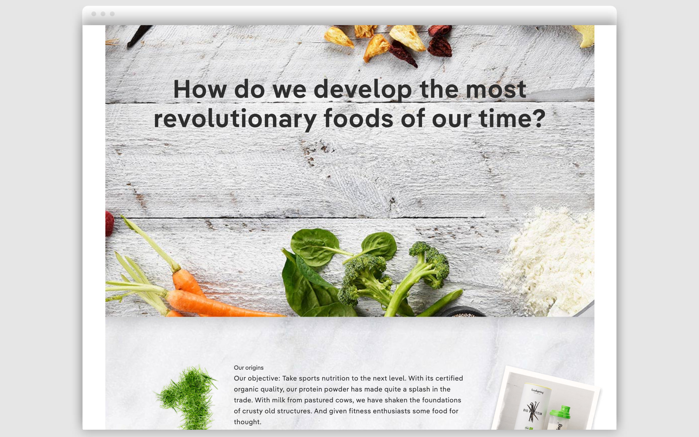
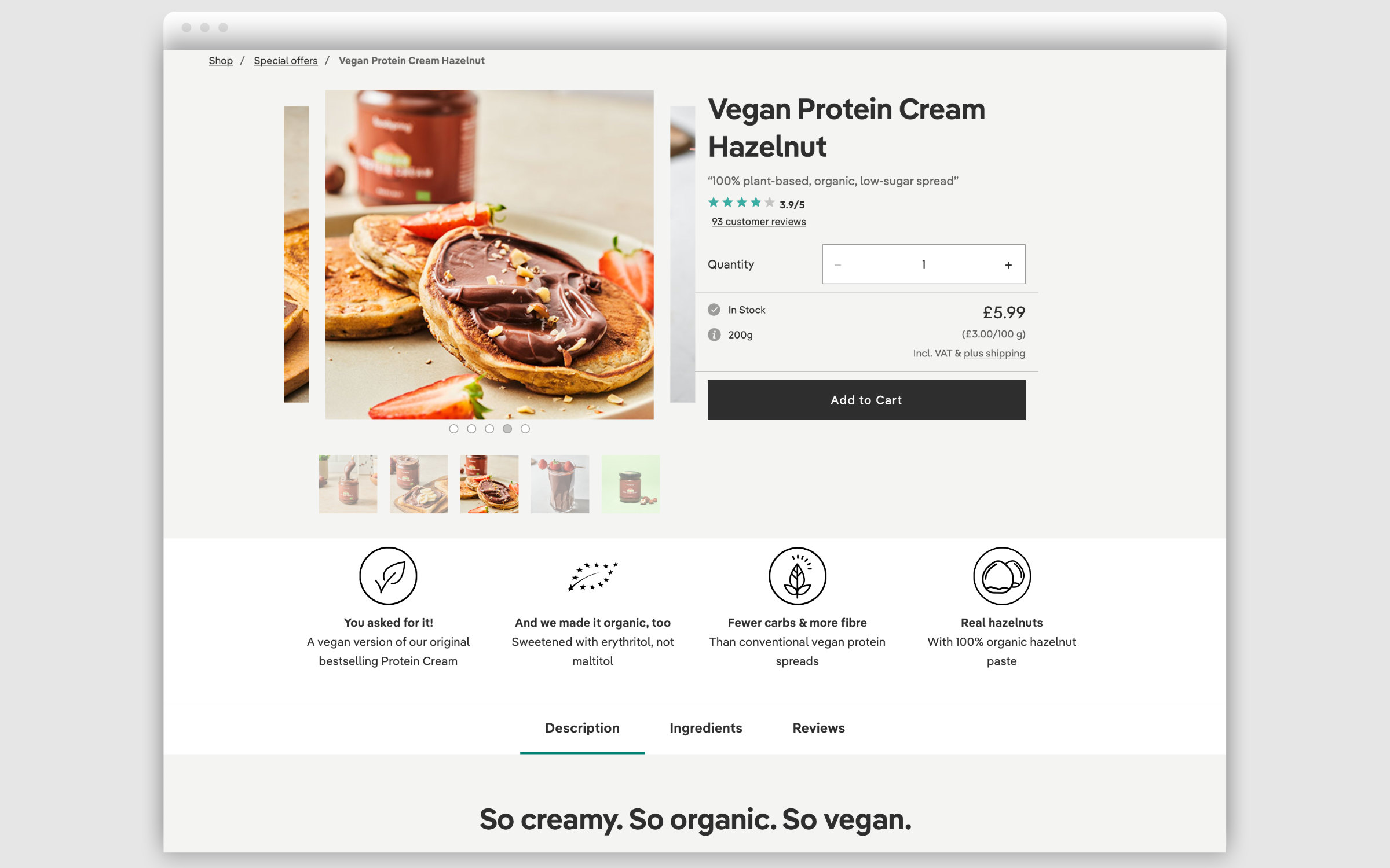
Fonts in Use: Pangea Text for Foodspring

Typographic Body-Check

In summer 2013, Philipp Schrempp and Tobias Schüle founded Foodspring, a direct-to-consumer brand for sports nutrition. Six years later the confectionery giant, Mars acquired the Berlin Startup. Currently available in twelve target markets and with over 100 employees, Foodspring is now considered to be one of the largest companies for targeted nutrition in Europe.

W
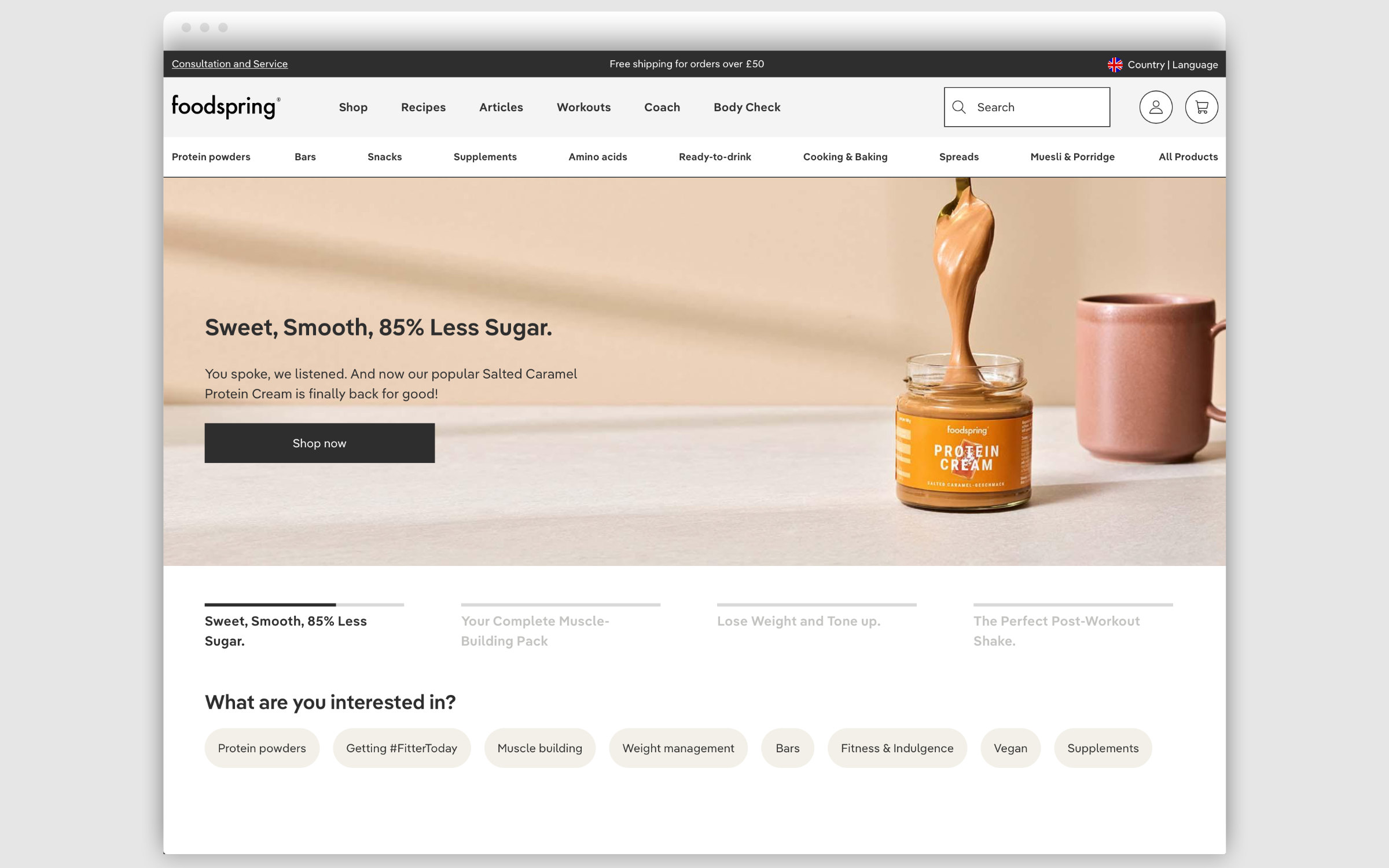
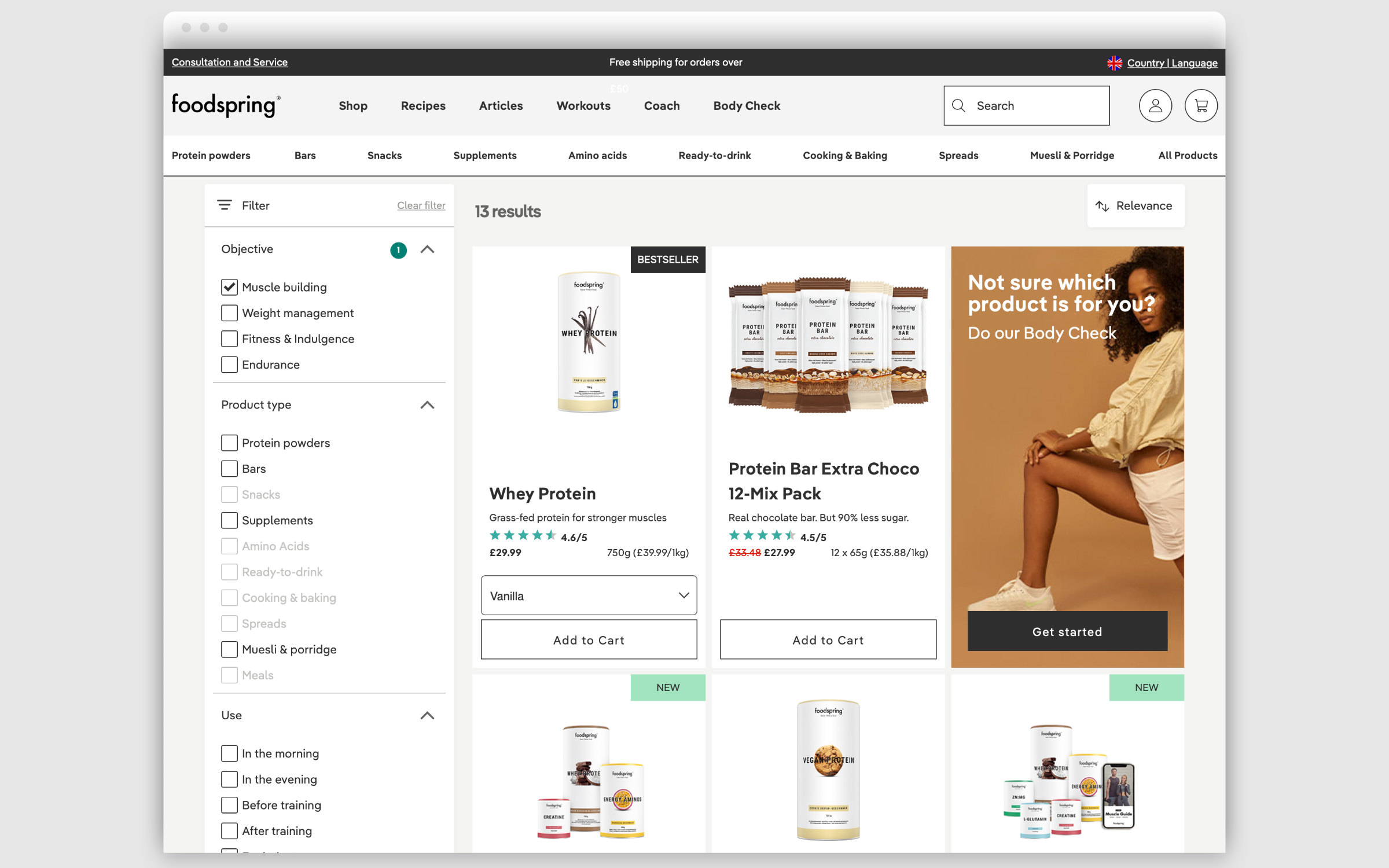
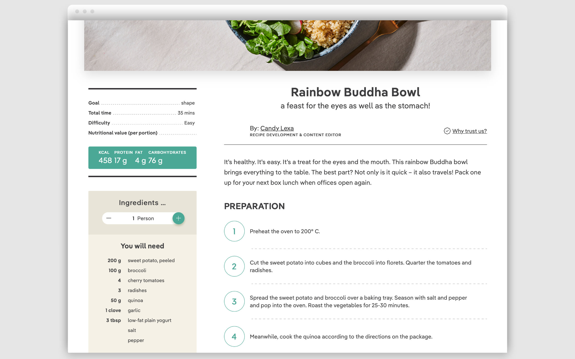
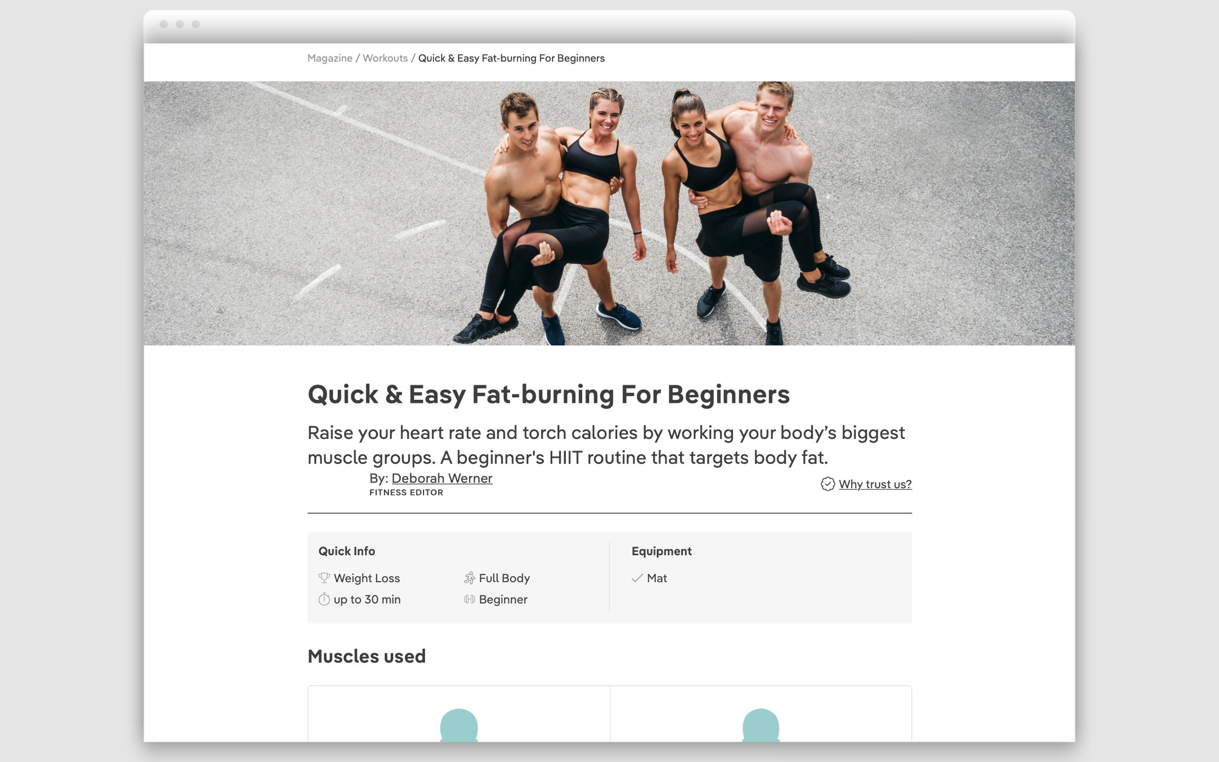
ith a product range of Shakes, Bars and Snacks, Foodspring has built a nutrition and fitness platform that creates a personalized customer experience. In addition to a special Coach offer, customers have access to recipes, the free “Body Check” which generates personal product recommendations and many workout videos.

Fonts in Use: Pangea Text for Foodspring

A young, dynamic font is part of the visual magic of a young, dynamic brand. The website team opted for Christoph Koeberlin’s Pangea Text, more precisely for the Regular and SemiBold weights. Interestingly, the actual Foodspring house typeface remained Radomir Tinkov’s Gilroy, which also gave the brand a strong, brand-compliant stamp, but did not stand up to the interface design’s demands for legibility and readability.

“I love Pangea, it’s not so easy to find a font family with both a high readability and a strong personality.”

Sara Furlani

Sara Furlani, the in-house designer at the time, then tested geometric sans serifs with a similar look and feel and chose Pangea Text because of its better reading characteristics. She provides insight into this and other decision-making processes for an eCommerce design system on Behance.

Try Pangea Text

Fonts in Use: Pangea Text for Foodspring