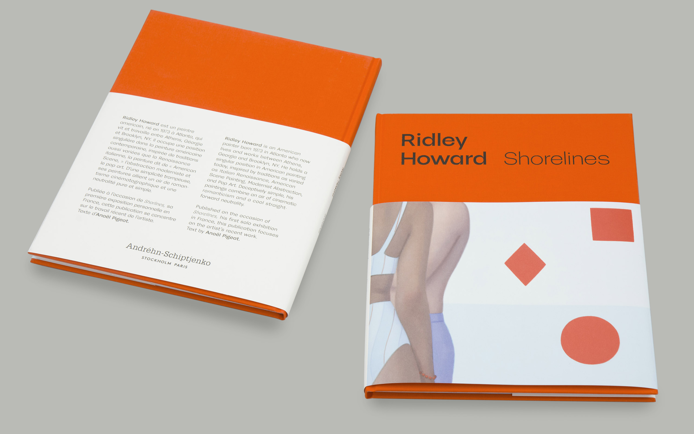
Ridley Howard ‘Shorelines’

Fonts in use: McQueen

McQueen meets American painting

Fonts in use: McQueen typeface for Ridley Howard Exhibition Book ‘Shorelines’

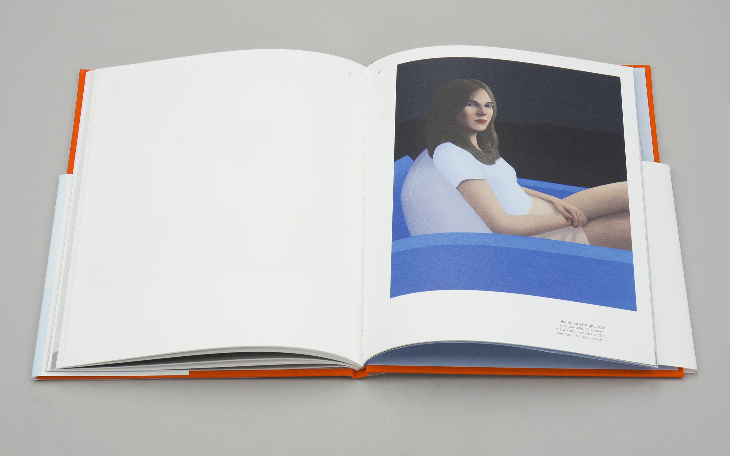
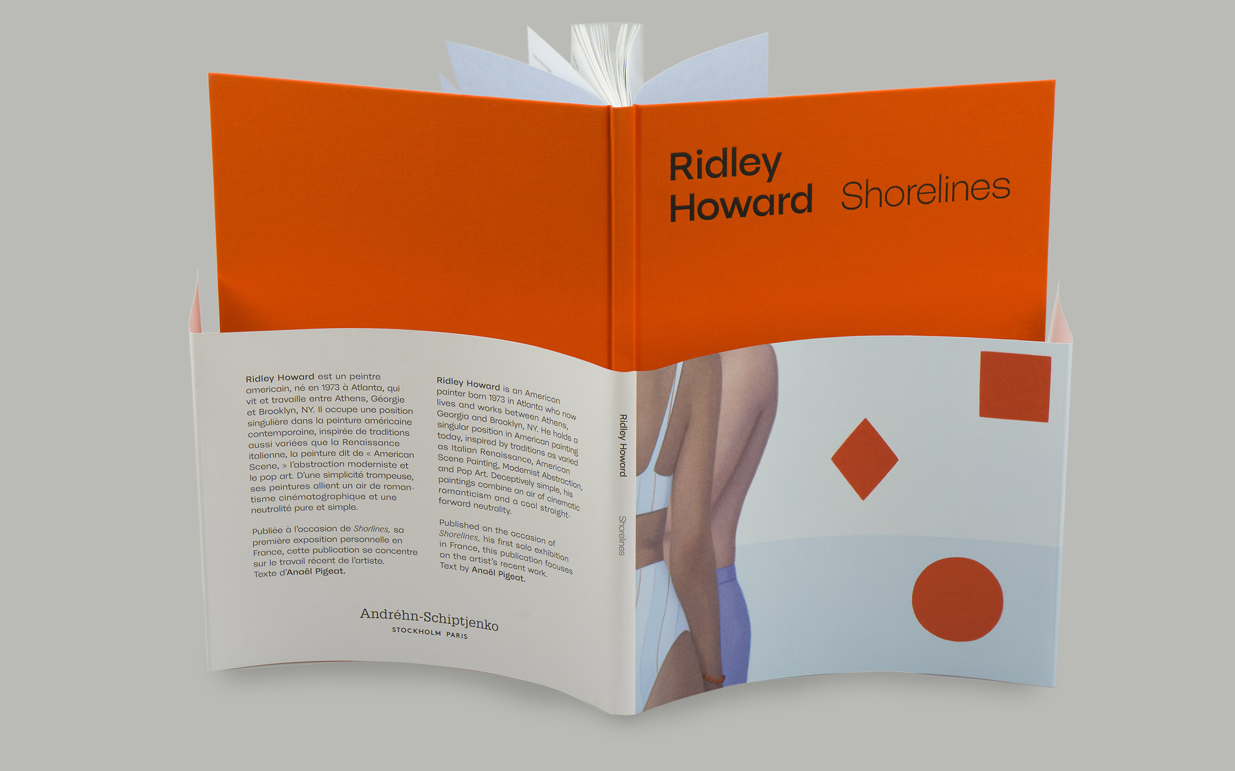
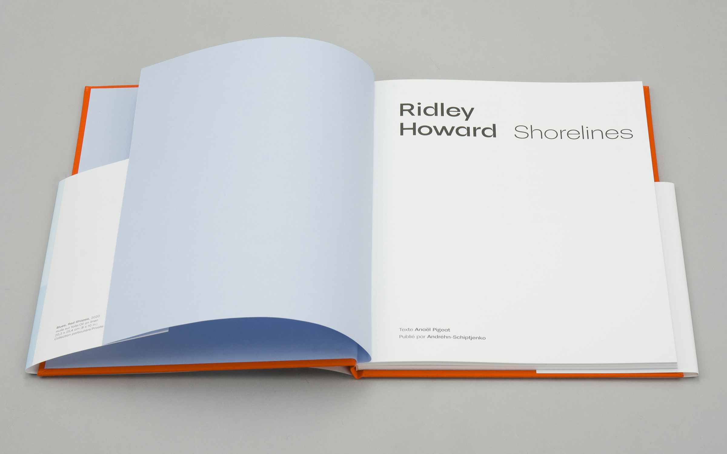
When Creative Director Magnus Naddermier was hired by the Paris-based gallery Andréhn-Schiptjenko to design ‘Shorelines’—the first publication covering the works of American painter Ridley Howard—he decided to use the Display variant of the McQueen family.

U

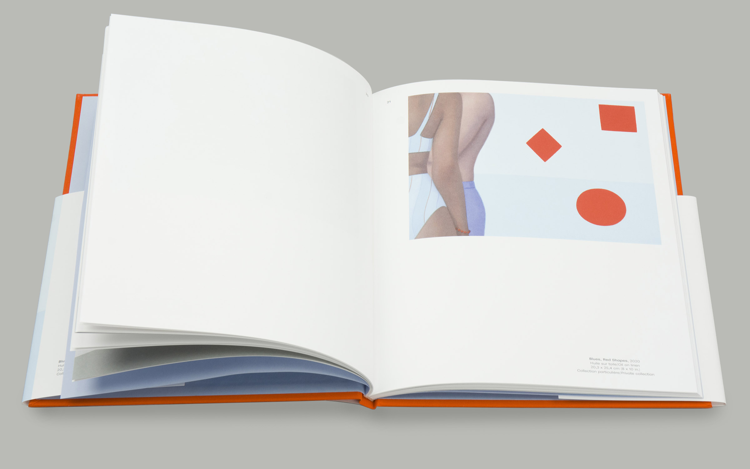
sing a lot of white space to let the pictures work, the high-contrast typeface acts as the perfect counterpoint to the romantic yet neutral paintings.

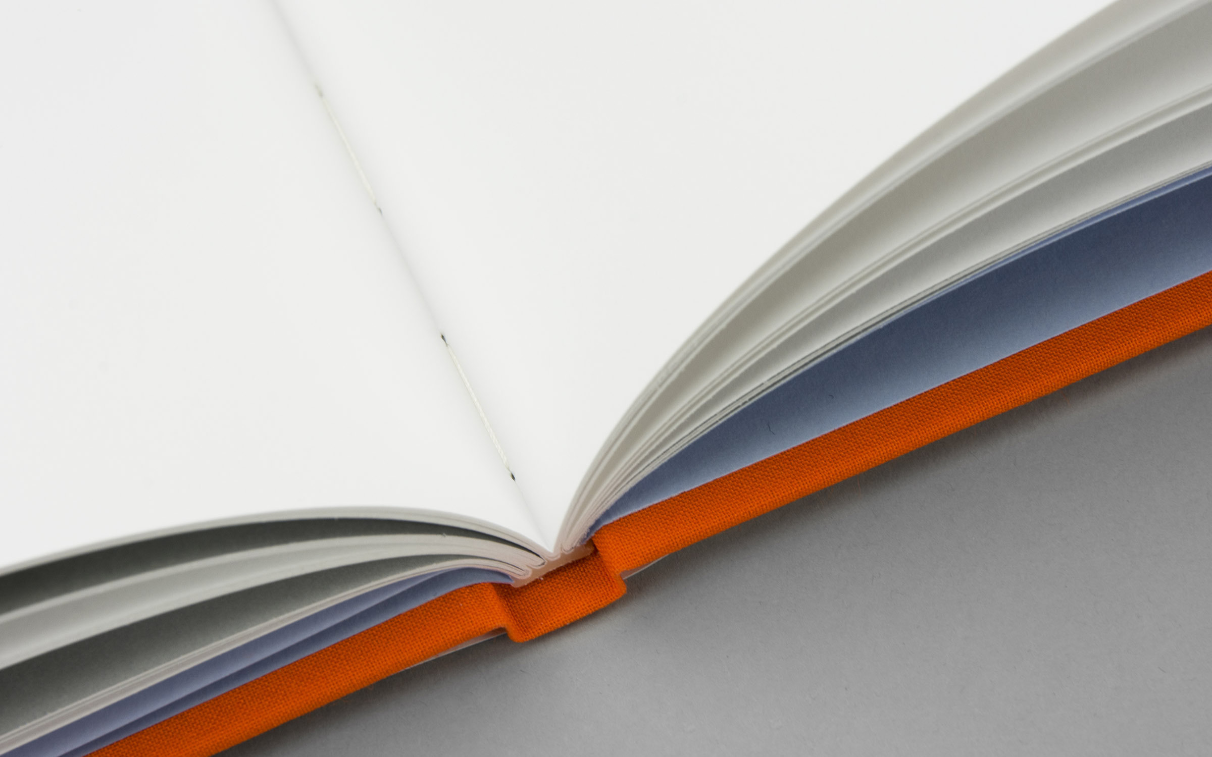
It was printed by the Swedish Göteborgstryckeriet as a thread-bound hardcover book with flat foil-stamping on the cover and an offset printed dust jacket (specifically for all the print nerds out there, they used Munken Polar paper 150g combined with Finesse 66010 for the cloth, Scandia 2000 for the inlay and Geltex 251 LS the endpapers).
Test McQueen

Fonts in use: McQueen typeface for Ridley Howard Exhibition Book ‘Shorelines’
© Photos: Göteborgstryckeriet (gbgt.se)