What to say when your Boss says “Why should I pay for fonts?”

Nine reasons why you need to invest in a good font

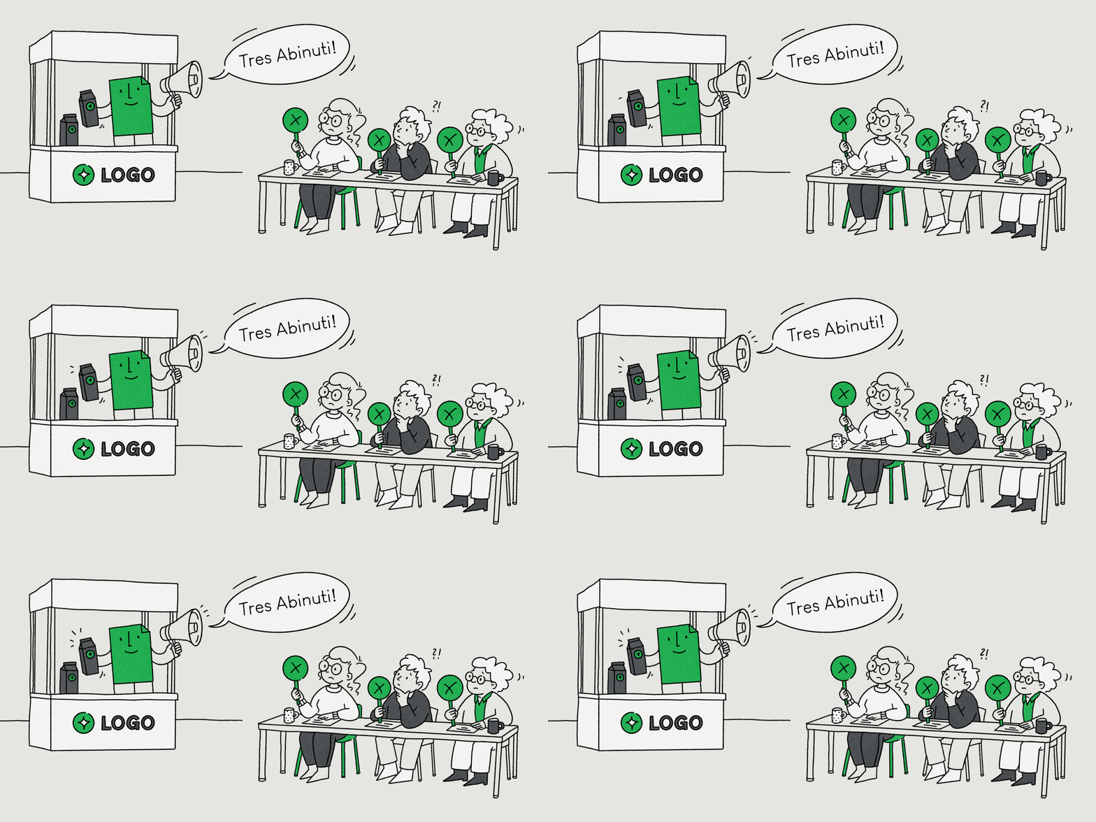
Nine arguments to help you convince your boss to buy a font
OR Nine responses to objections to a well-considered typeface

Picture this, the presentation has finished and the new visual identity has been well-received. The new logo, corporate colors and beautiful new visual language all align with the marketing strategy. Everyone around the table agrees that the brand new corporate typeface has the potential to leave a lasting impression and create a distinctive voice and compelling visual impression for your brand.

B

ut then comes a question from your boss, that all creatives fear, “What does this font actually cost?”. And suddenly, the tables turn and instead of the meeting being about a design discussion it turns into a debate about budgets. But there’s no reason to be nervous! It’s no surprise that your boss wants to know why they should spend money on a typeface, especially when there are free alternatives out there and they can’t see an immediate return on investment. 

So let’s dive deep into the top objections to type that Agencies, Design Teams and Marketing Departments have to contend with. Some arguments are valid, yet others are often due to misunderstandings. All are easy to refute when you start regarding a typeface as a building block that is key to good organizational infrastructure and foundations of any brand.

1 — “Why do we even need a new font?”

This is a very good question and the answer, ‘Our current font works just fine, why do we need change?’, on the surface, also seems very valid. In actual fact, a font change isn’t like an annual spring clean, that needs to happen every year. If your current typeface works well and stands the test of time, it should stay. 

Yet it should still be subject to the same stringent tests and scrutiny that any other building block of your brand faces. Whenever you’re looking at a new brand or a relaunch of any brand, you must consider the logo, colors, tone of voice and the visual language. Each element must be put to the ‘Time Test’, to see if it represents your brand not only today but also tomorrow. So it goes without saying that this also applies to your choice of font too. As independent studies have shown, typography shapes your brands personality.[1]  

Therefore, the crucial question to ask is “Does our current font still work?” and if the answer is “But we’ve always used it”, then it’s time to consider a change. In any redesign, keeping a typeface is as much a design decision as changing it.

To any critics or skeptics, you can say “Just because we’re doing a redesign, doesn’t mean that we have to change the typeface. But, whilst we’re looking at the whole brand, it makes sense to review the font choice at the same time and see if it still fits?”.

2 — “Our Logo says who we are, why do we need our own font?”

Without doubt, a Logo is important, but it has an enviably very simple job to do, it signals who the ‘Sender’ is, like a stamp or seal of approval. A great typeface, on the other hand, does so much more. It acts as a kind and consistent messenger, carrying all the brand’s messages, in a considered and consistent manner. Guiding the audience through products, apps, websites and all manner of touch points where a customer or your audience may encounter the brand. 

In short: a Logo signals the speaker while the typeface sets the tone. A Logo is like a signature while the font is the voice. While we encounter a signature occasionally, in every conversation, we hear the voice. 

So it makes no sense at all to pit the Logo against the Font. Both are brand assets with their own unique role to play. However, there’s one tangible and compelling advantage of a good typeface, it’s always used whenever the brand has something to say. 

So the next time you’re faced with a skeptic or critic, here’s what you have to say: “Our Logo shows who we are. Our typeface makes sure that we are heard and recognized, even when our Logo is out of sight.” or “Our Logo is our stamp while our typeface carries and delivers our message.”

3 — “We can change our fonts at a later date!”

Yes of course, you can absolutely change your brand’s fonts at any time (unlike any IT infrastructure!). But don’t forget that any corporate font is used across the company and they aren’t simply stored in a single folder on a single server. The fonts will be embedded in the websites and apps, they will appear in presentations, company templates, PDFs, on packaging, signage, adverts and reports and much more. The longer a font has been used, the deeper it’s left an imprint and penetrates a company’s infrastructure. 

Imagine you’re trying to change the location of a plug socket when building a house, when you’re still in the blueprint phase it’s really easy to do. But once you’ve built a house and moved in, it takes contractors time, money and a lot of patience to move it. 

So when it comes to fonts, there are some important questions that need to be considered. “Does the replacement work in all languages? Will all templates, websites and apps need to be switched and updated? Has everyone been told about the change? Will all the documents that have been in circulation for a long time?” So, instead of “We’ll do it later” being the cheaper option, it could actually work out to be a really expensive and an inefficient use of time. 

In the face of such criticism, here’s a great response “Of course we can change our font later, but if we decide to do that today, we’ll just have to confront the problem later, costing more time and money and will have to tinker with it in thousands of places.”

Nine arguments to help you convince your boss to buy a font — “We can change our fonts at a later date!”
Of course we can change our font later, but if we decide to do that today, we’ll just have to confront the problem later, costing more time and money and will have to tinker with it in thousands of places.
4 — “Our customers don’t buy from us because of our fonts!”

Absolutely not! But people don’t buy cars because of the sound that their car door lock makes when it’s shut. Nevertheless car manufacturers will employ people to focus just on that sound. The sound reinforces the perception of quality and offers the customer a level of reassurance. It’s highly unlikely after a test drive that someone will say “The sound of the car locking sounded so convincing, I just have to buy this car!”. The sound and the reassurance it offers works at a subconscious level and once the car’s been bought, that special sound reinforces the conviction of the customer, day after day that “I made the right decision”. 

With fonts it’s a similar story. Customers don’t need to recognize or even know the name of a typeface for it to have an impact. Typography is one of the few signals that can subtly yet powerfully convey a brand’s identity. When the typeface feels out of place, it can weaken and lessen the impact of the brand. The tricky thing about type is that it works at a subconscious level, you can’t escape its influence and this is precisely its superpower.

So the question isn’t whether someone buys a product because of the typeface used, but rather: Should a company leave the impact of its most important communication medium to chance?

Here’s what you could say to management: “No, our customers don’t buy because of the typeface. But every time they read something from us, our typeface communicates with them. Whether we want it to or not.”

Nine arguments to help you convince your boss to buy a font — “Our customers don’t buy from us because of our fonts!”
No, our customers don’t buy because of the typeface. But every time they read something from us, our typeface communicates with them. Whether we want it to or not.
5 — “No one will notice the difference!”

Otherwise translated as “What’s invisible or can’t be consciously perceived can’t have an effect!”. But again this is the magic of how our perception works. For example, in a restaurant, we usually won’t notice the lighting until it makes us feel uncomfortable. In a cinema, when watching a film, we won’t notice the music until it triggers an emotional response in us. And, very often, we can’t explain why a particular piece of packaging or branding looks ‘high quality’ to us. Despite not being able to ‘see’ any of these things, all these signals have an impact on our feelings.

In fact, with typefaces, you can actually measure this effect. In a series of perception studies[2] identical messages were displayed/set in different typefaces. The results were startling, a well-chosen typeface can increase a positive reaction by up to 13%, it can improve memorability by up to 10% and it can improve trust by 9%. None of the test subjects were expected to recognize the typefaces or understand typography. 

For brands this means: fonts don’t actually have to stand out to make a difference. They are always working in the background, every time someone encounters or reads something by a brand. 

Here’s what to tell your boss: “Our customers and audience don’t need to be able to ‘tell’ the difference but they do need to ‘feel’ it!”

6 — “Why should I pay for a font when you can get them for free?”

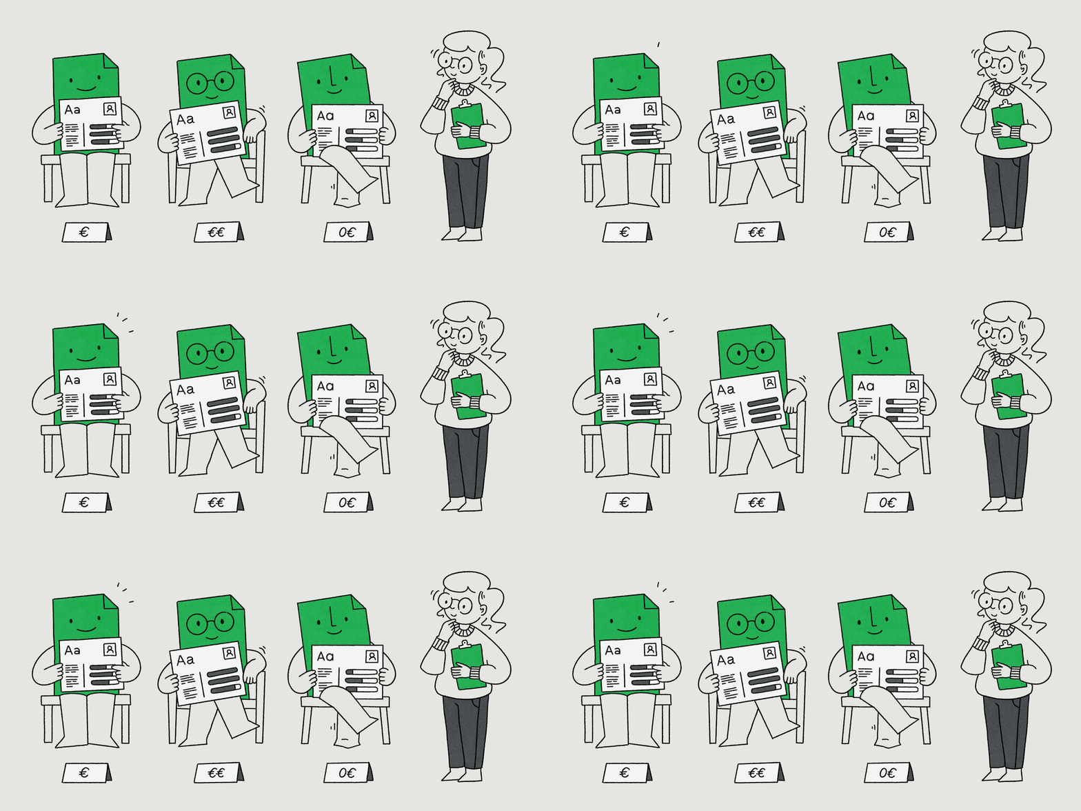
In actual fact, there is a myriad of Open-Source-Fonts. Many are well-designed, technically flawless and are even suitable for international projects. But is FREE a selection criteria for a brand? Certainly no more so than ‘EXPENSIVE’. The key question brands should be asking is “Which typeface best suits my company’s needs and requirements?”, not the cost.

Many large organizations and brands use Open-Source software. But when choosing a core CMS, integrated Booking System or secure Payment Platform, no CEO in their right mind would say “Let’s go with the free option, it should definitely work!”. In actual fact, they would test the function, security, expandability, support and sustainability and how well the system can be integrated into the current infrastructure. 

With fonts, it shouldn’t be any different! Some typical questions here would be “Does it fit with our brand personality? Does it stand alone and is it distinctive enough to improve and encourage brand recognition? Does it support all languages and characters that we need? Does it work in Print, Web, App, Social Media and Office? Can all staff use it in a legally compliant way? Will it be further developed? And most importantly, is there someone I can call when it goes wrong?”.

A free font might be able to answer ‘yes’ to all the above questions, and if it does then maybe it is the right choice. But the decision would not actually be based on whether it is free or not but if it fits your requirements and is able to deal with all the tasks at hand.

When faced with the people who have purchasing power and make the decisions about budgets and cost, here’s how you could answer: “There’s nothing wrong with a free font but let’s not confuse ‘free’ with ‘fit for purpose’. We should choose the font that best meets and suits our requirements. If that solution happens to be free, then that’s great, but it shouldn’t be the only deciding factor.”

Nine arguments to help you convince your boss to buy a font — “Why should I pay for a font when you can get them for free?”
There’s nothing wrong with a free font but let’s not confuse ‘free’ with ‘fit for purpose’. We should choose the font that best meets and suits our requirements. If that solution happens to be free, then that’s great, but it shouldn’t be the only deciding factor.
7 — “What could possibly go wrong with a free font?”

Well, actually quite a lot, if employees are given free rein and free range to go off and start finding free fonts on the internet on their own.

The problem isn’t so much to do with Open-Source fonts from a reputable and trustworthy source. It’s actually more to do with when a font isn’t available internally and someone hunts down a free copy from a download or piracy site. A few weeks down the line and no one can trace the source, knows if it is actually technically sound or even if it’s actually permitted for commercial use. 

So what started as a typographical problem soon escalates to a topic for IT, Legal and Compliance. This also happens when employees modify font files on their own (for example, when trying to add or alter additional characters). Any modifications can violate license conditions and bypass and corrupt established approval and security processes. 

Prioritising approved and properly licensed fonts is also a matter of IT security. The company knows where the font comes from, who is allowed to use it and who is responsible for it and who to contact if there are technical problems or questions.

So you can reply to the optimists: “When it comes to fonts, we should apply the same rules as we do for any other type of software. We need to know where it’s come from, who’s allowed to use it and who is responsible for it.”

Nine arguments to help you convince your boss to buy a font — “What could possibly go wrong with a free font?”
When it comes to fonts, we should apply the same rules as we do for any other type of software.
8 — “The Font is too expensive!”

Don’t get cross with this question or take it the wrong way, the person asking simply hasn’t recognized a font’s value yet. A few thousand Euros for a font is a lot of money! Yet the amount on the invoice reveals very little about the true cost of the investment. To determine that, we need to understand for how long and how intensively the organization will use the font as an asset. 

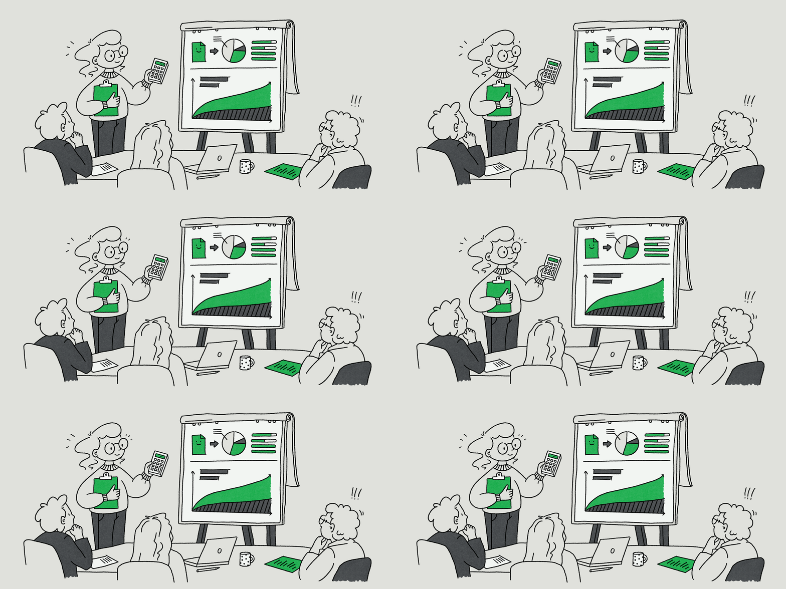
It’s very rare that someone can appreciate and evaluate the value of an office chair or piece of software based solely on its initial cost. Companies often factor in the duration, frequency of use and overall utilization of the asset. So why should a different logic apply to fonts? Here’s a real life example: A font license for €3500, which is used as part of a five year long campaign and presentation costs around €1.90 per day, which is less than the average cost of daily consumption of coffee in an office.

This calculation becomes really compelling and convincing when you compare the cost of a font to the lifespan of other ‘brand investments’. A campaign can last two weeks, then there’s a new one. A conference or event stand is used just a couple of times and then is changed. A corporate film becomes outdated after 24 months. In contrast, a well-considered font choice works day in, day out over many years across every one of any brand’s communication touchpoints. Therefore, the crucial question is not, “What does a font cost?” but rather, “What does it cost us annually? And what value does it deliver during that time?”. 

So when you’re standing in front of the Board, this is how you can answer that question: “Let’s not regard this investment in isolation. If we use the fonts for five years, they’ll cost us just a few Euros a day, and, in return, they will represent our brand every single time our audience or customers interact with them.”

Nine arguments to help you convince your boss to buy a font — “The Font is too expensive!”
Let’s not regard this investment in isolation. If we use the fonts for five years, they’ll cost us just a few Euros a day, and, in return, they will represent our brand every single time our audience or customers interact with them.
9 — “Why do we have to pay for our fonts each year?”

First things first, you can’t actually ‘buy’ a font in the traditional sense because they are legally protected as software and intellectual property. Whenever you spend money on a font, you are acquiring a License to be able to use it (aka End User License Agreement) that grants you the right to use the font software under specific conditions.

Font Licensing is complicated and differs from foundry to foundry. Although many foundries distinguish between similar types of usage, such as Desktop, Web or App, the actual terms and prices can vary hugely. This will vary hugely when the price depends on the number of users, amount of traffic and other variable metrics, so it’s really worth paying attention and checking the terms!

And this is where Font Licensing becomes more a case of risk assessment and risk management. Companies should not only ask, what the cost of the font is today or on an annual basis, but if the license will evolve alongside any potential future business growth or expansion. Fair licensing models often take this into account and allow for some degree of flexibility, so that in the event of adding an extra employee or when traffic spikes or there’s an extra app, the license isn’t immediately violated. 

So to answer this question, you can say: “We’re not paying for the same typeface each year. We are in fact ensuring that our User licenses evolve and align with our own company growth and development, thereby ensuring there are no nasty surprises!”

Nine arguments to help you convince your boss to buy a font — “Why do we have to pay for our fonts each year?”
We’re not paying for the same typeface each year. We are in fact ensuring that our User licenses evolve and align with our own company growth and development, thereby ensuring there are no nasty surprises!
Conclusion

To return to that very first question, “Why should we pay for fonts?”… Perhaps your boss or the management team should assess and evaluate the cost of the investment in fonts in the same way they would invest in hardware and infrastructure. So then, instead, the question becomes “What does this purchase achieve? How often will it be used? How long does it hold it’s value? Are there alternatives?”. 

A typeface only becomes expensive when it doesn’t deliver value relative to its price and if it will eventually need to be replaced. In contrast, a well-considered and well-chosen font at a reasonable license fee can be a surprisingly cost-effective and worthwhile branding tool and investment that does the job for years.

—

[1] Using Type Font Characteristics to Communicate Brand Personality of New Brands, Journal of Brand Management, Springer Nature, 2012
[2] Why fonts make us feel: A scientific study exploring the emotional impact of type. Neurons × Monotype, London 2021