Ina Müller ‘6.0’

Straight to number one with McQueen

Fonts in use: Ina Müller’s latest album, 6.0, reached number one in the German charts for the first time. The central player in the artwork is the McQueen typeface.

For two decades, Ina Müller has been one of the defining personalities of German entertainment culture. As a Cabaret Artist, Lyricist, Singer and Television Presenter, she moves confidently between music, humor and attitude.

S

he is best known to a wide audience through her ARD late night show ‘Inas Nacht’, in which she has combined music, conversations and North German directness since 2007. At the same time, she has established herself as a musician with several successful albums in which she combines personal lyrics with musical authenticity.

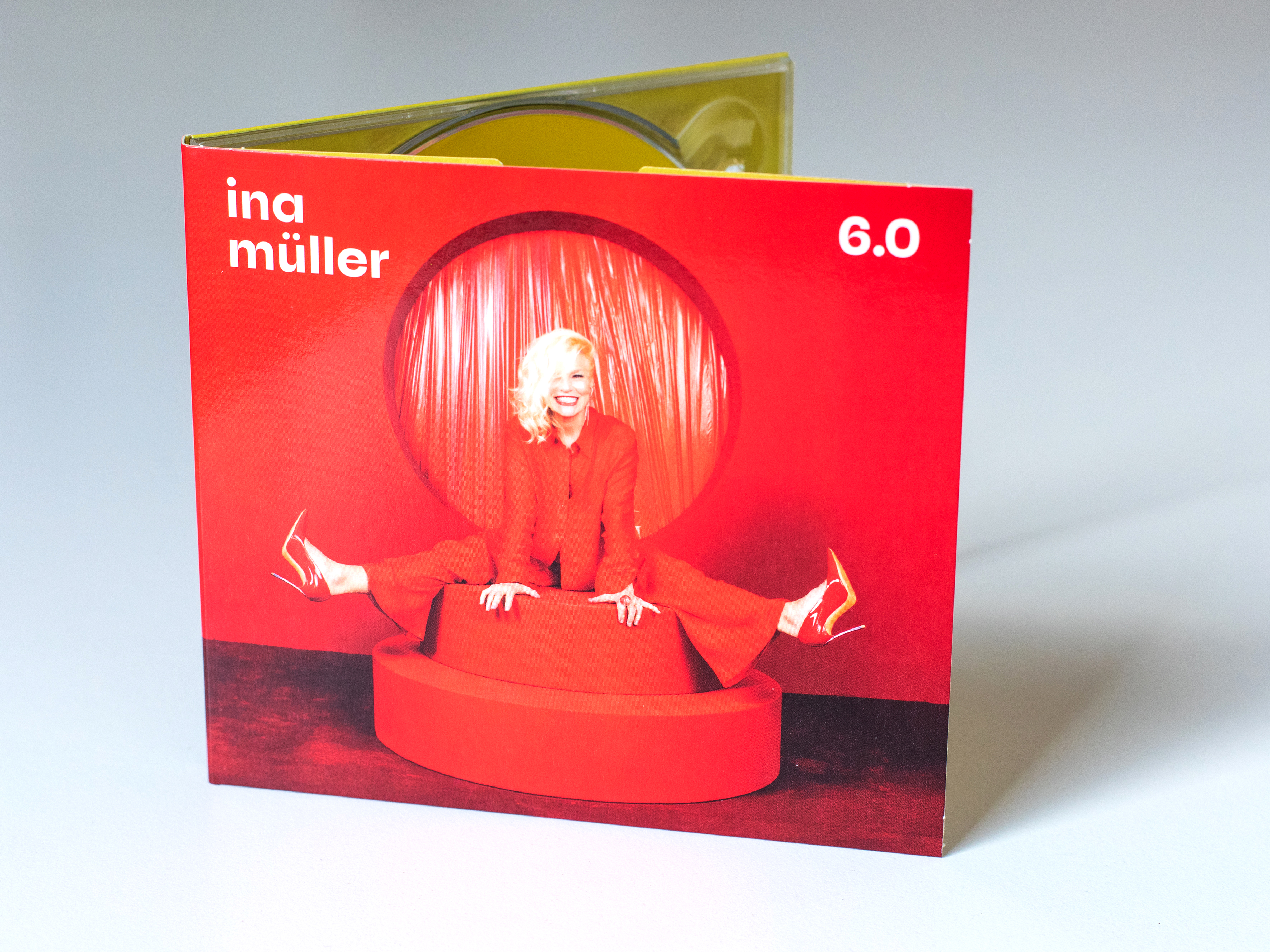
Her most successful album to date, 6.0, was released on November 14, 2025 and Müller reached number one in the German charts for the first time. The album cover is decorated in bright red and is dedicated to love in all its facets, from the beautiful to the humorous to the bittersweet moments. 6.0 marks not only a commercial peak, but also an artistic moment of intensification: reduced, self-confident and clear in expression.
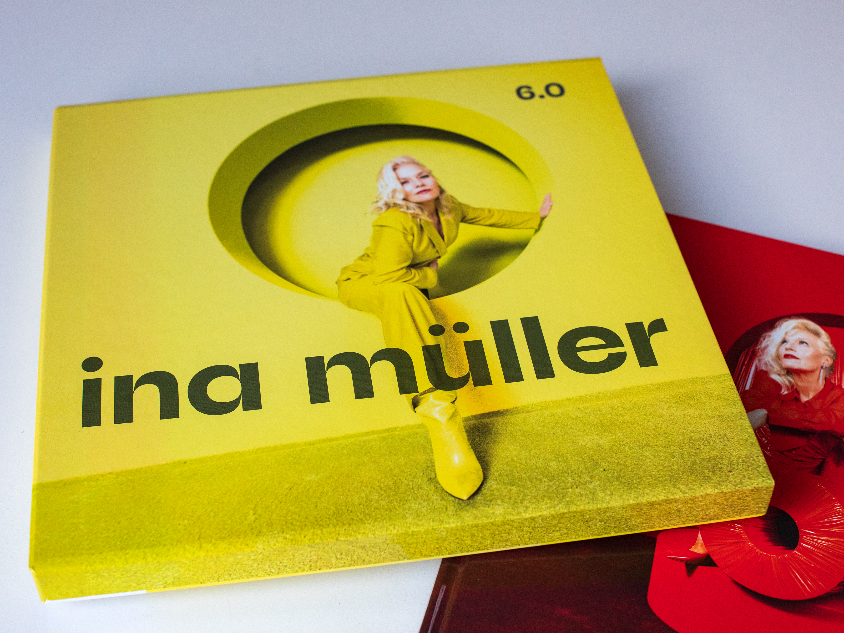
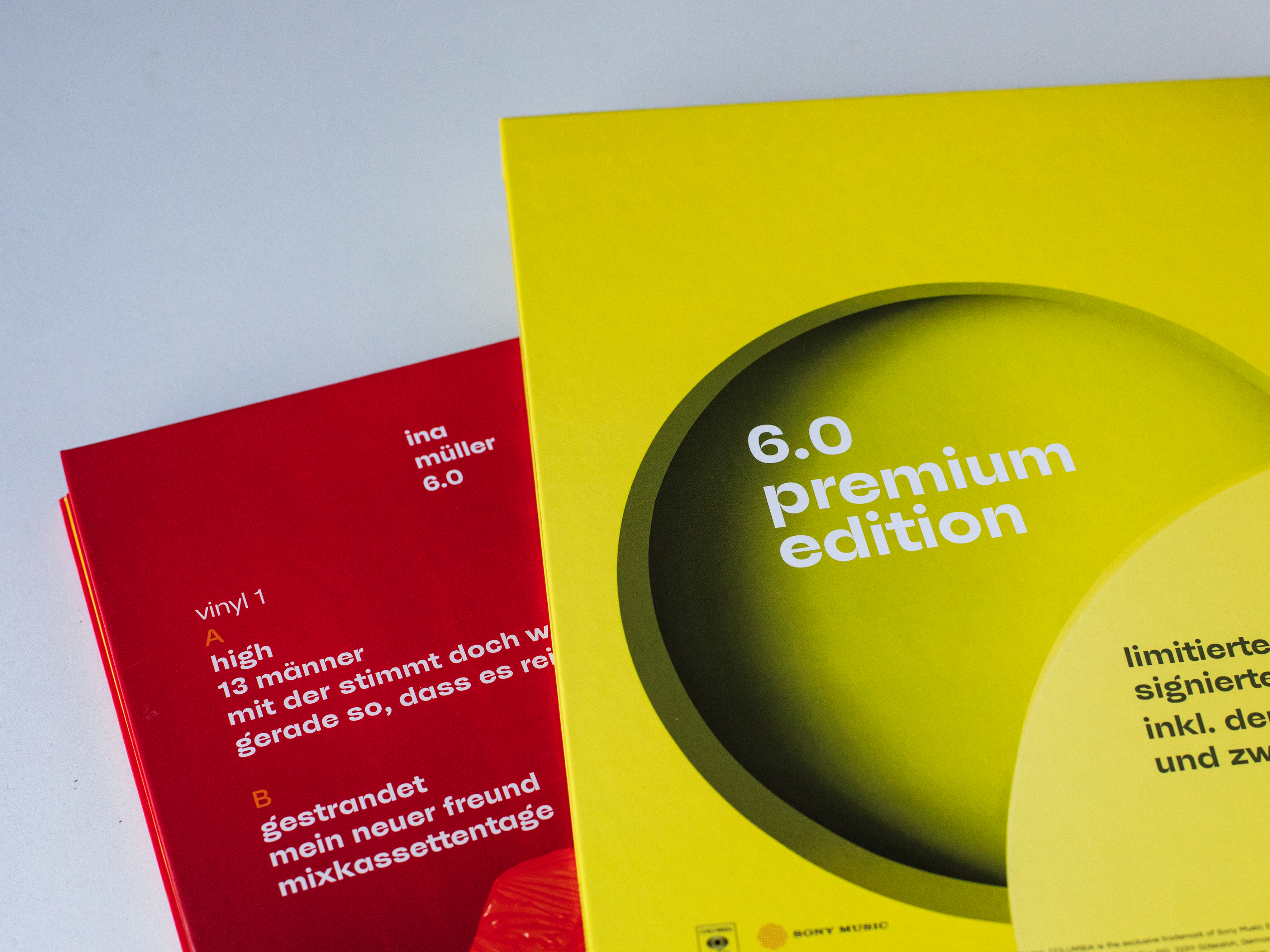
Fonts in use: Ina Müller’s latest album, 6.0, reached number one in the German charts for the first time. The central player in the artwork is the McQueen typeface.
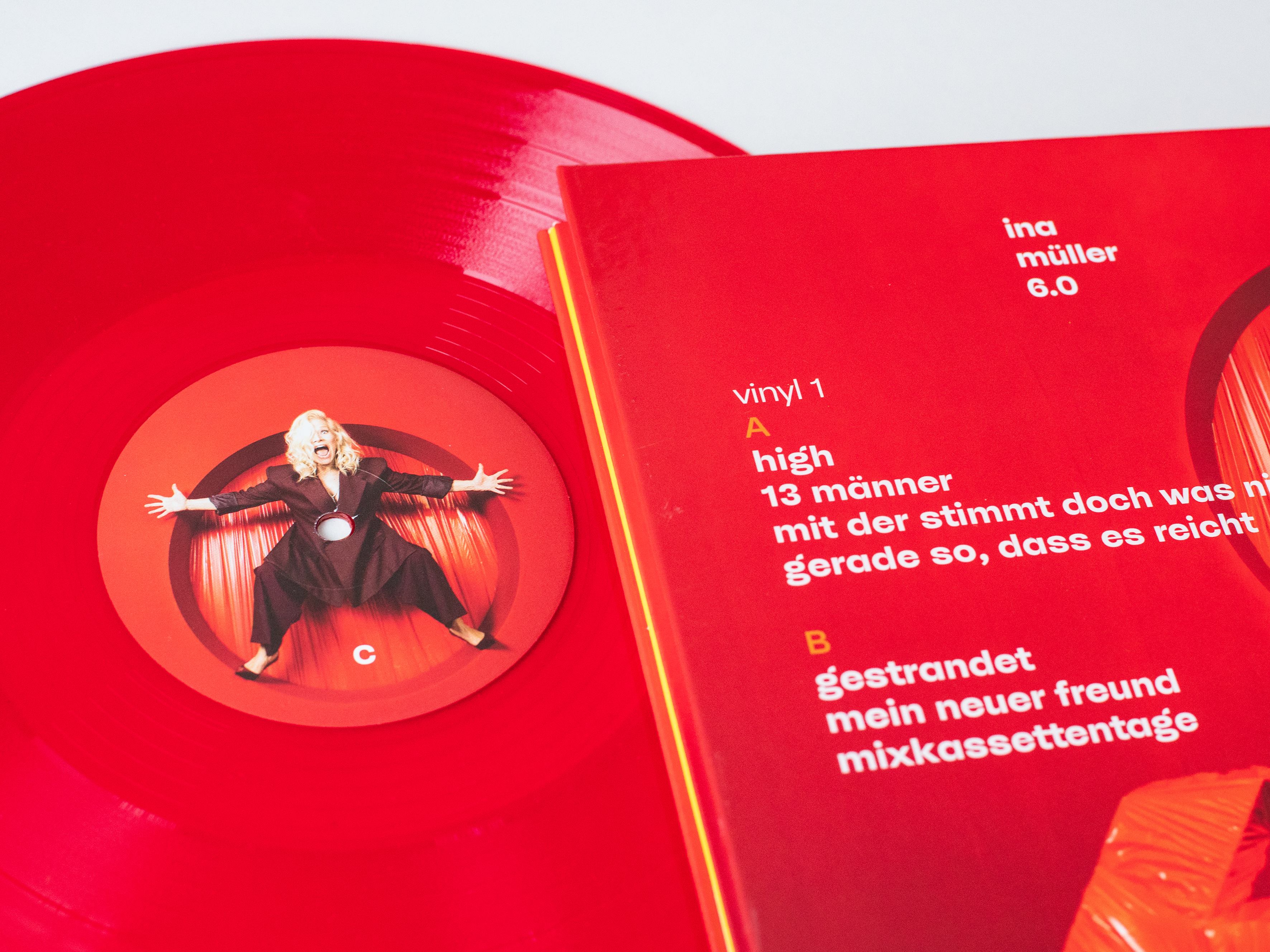
The limited collector’s edition of 6.0: including a 40-page photo book and CD and 2 × vinyl in a yellow slipcase – numbered and autographed
Fonts in use: Ina Müller’s latest album, 6.0, reached number one in the German charts for the first time. The central player in the artwork is the McQueen typeface.

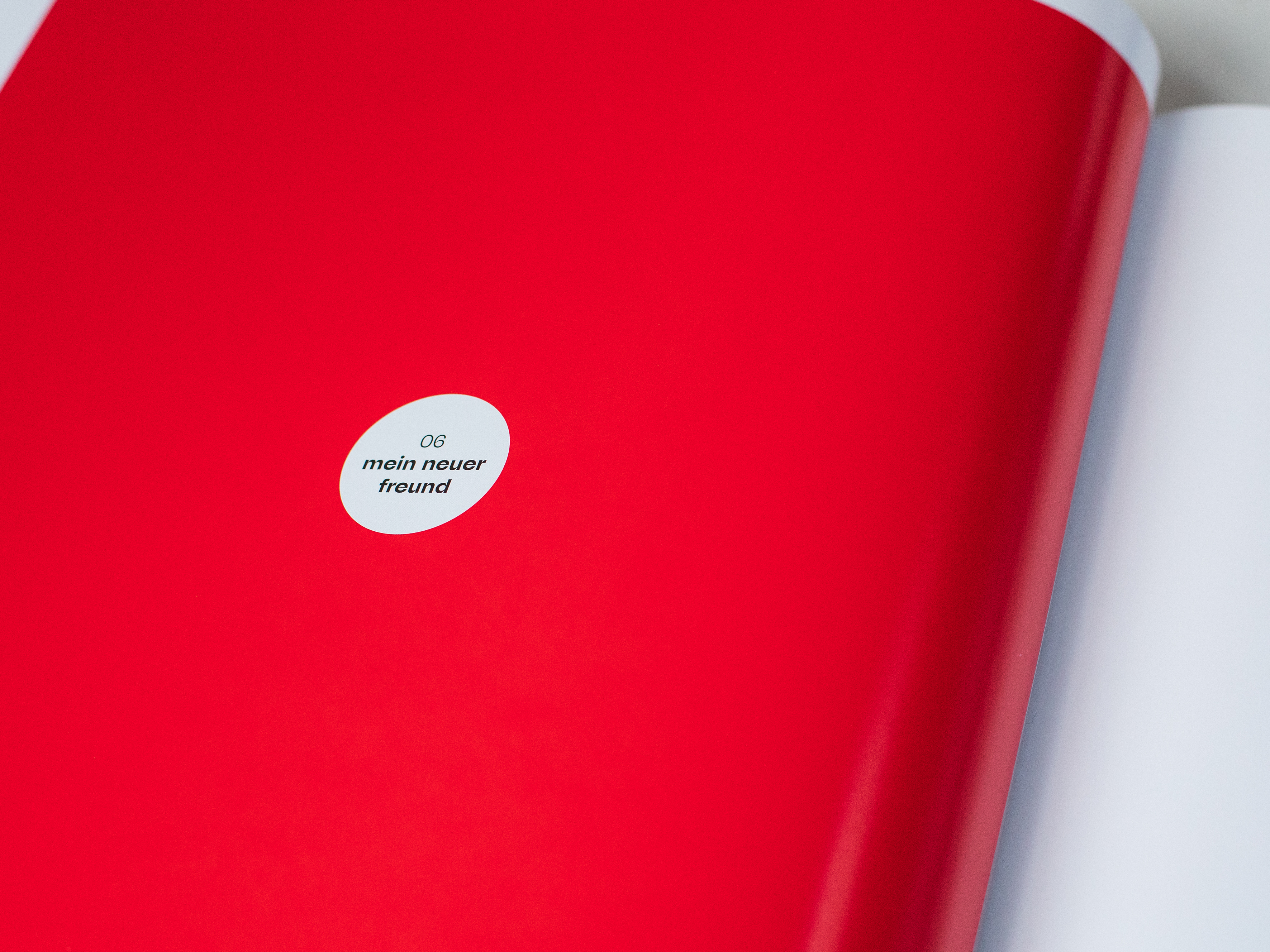
This attitude is also reflected in the artwork. Sven Grot from the Hamburg design agency B—99 was hired as Art Director by Sony Music and was responsible for the design and visual concept. The project encompasses a wide range of formats: from a simple CD digipack to various vinyl editions, including a gatefold double album and an elaborately produced limited edition with a large-format photo book in a slipcase.

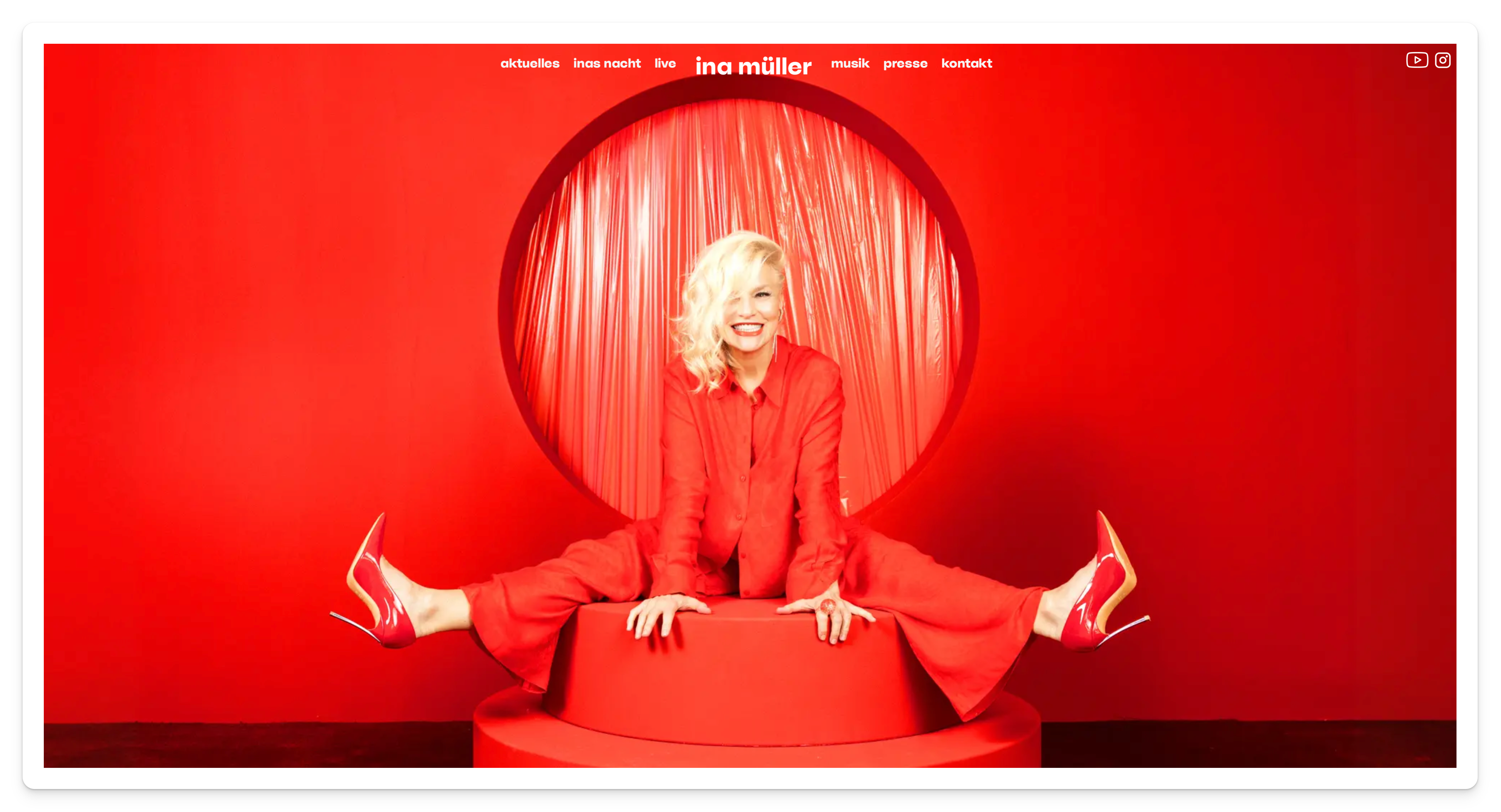
In several design meetings, Sven Grot, Ina Müller, and her music manager Adriana Schulz developed a visual identity that focuses on photography accompanied by strong typography. This design language was also to be reflected on the Ina Müller website.

Fonts in use: Ina Müller’s latest album, 6.0, reached number one in the German charts for the first time. The central player in the artwork is the McQueen typeface.
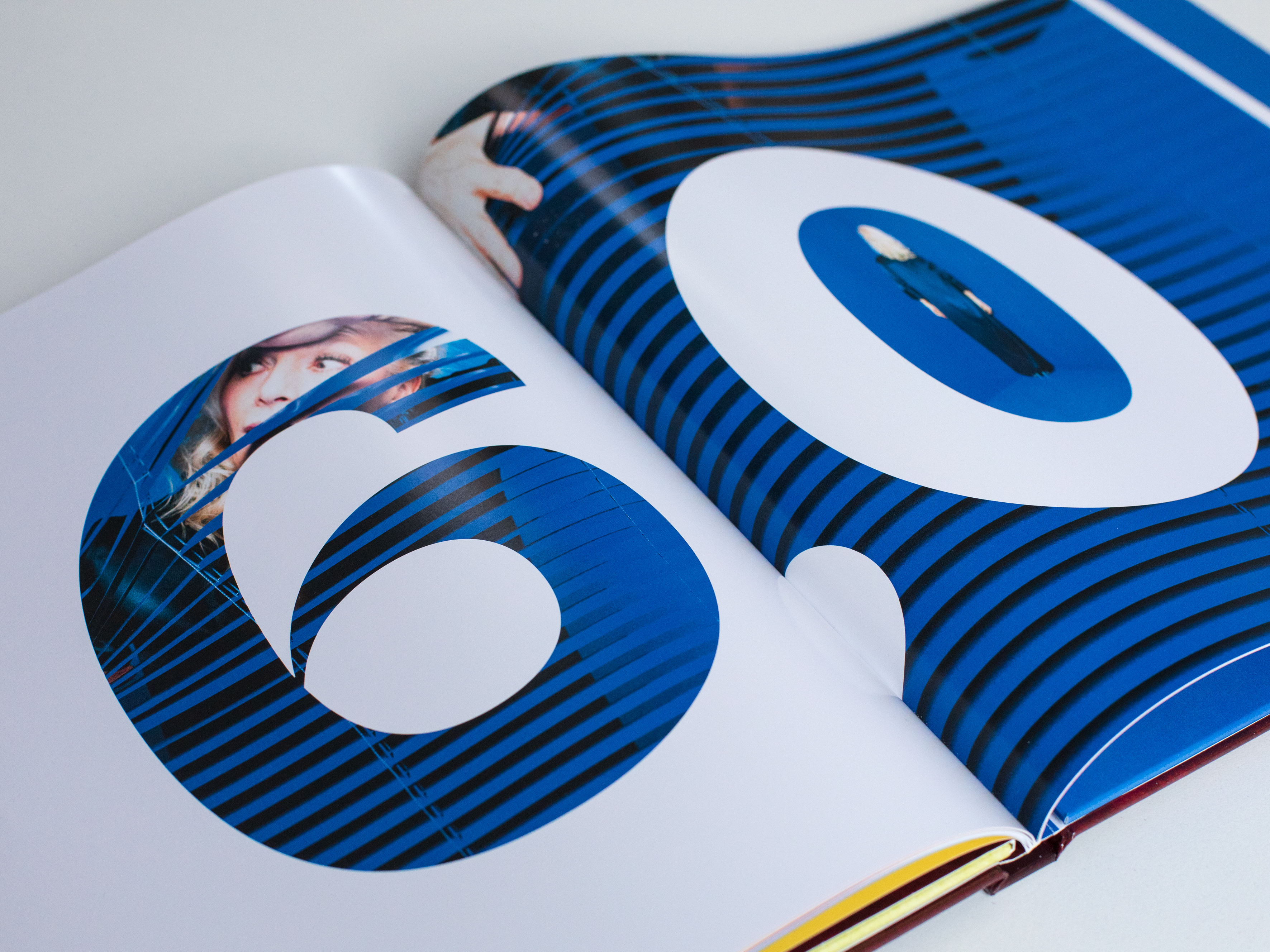
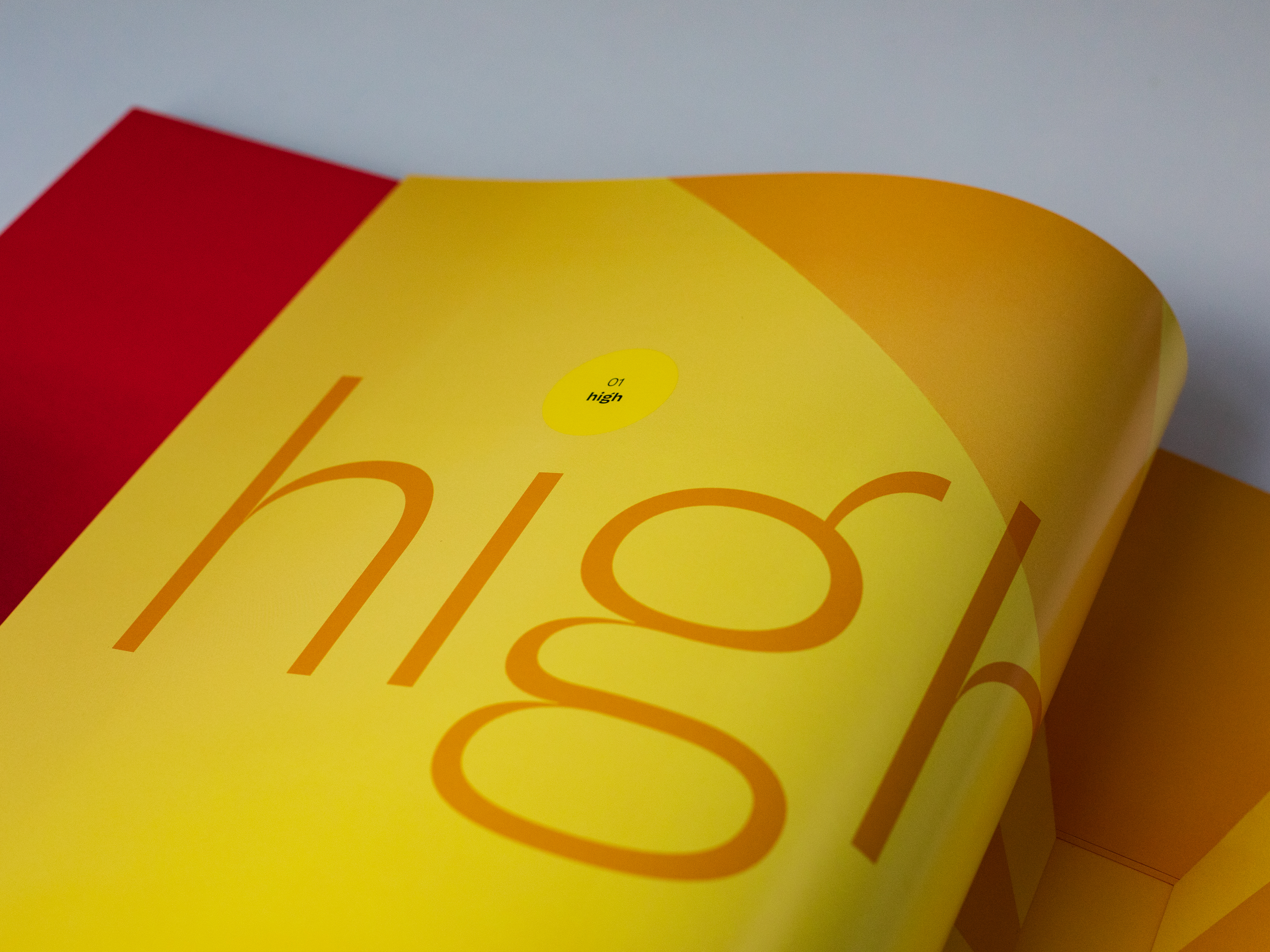
A bow to a strong font: the album title of Ina Müller’s most successful album in the borderland between text and image
Fonts in use: Ina Müller’s latest album, 6.0, reached number one in the German charts for the first time. The central player in the artwork is the McQueen typeface.

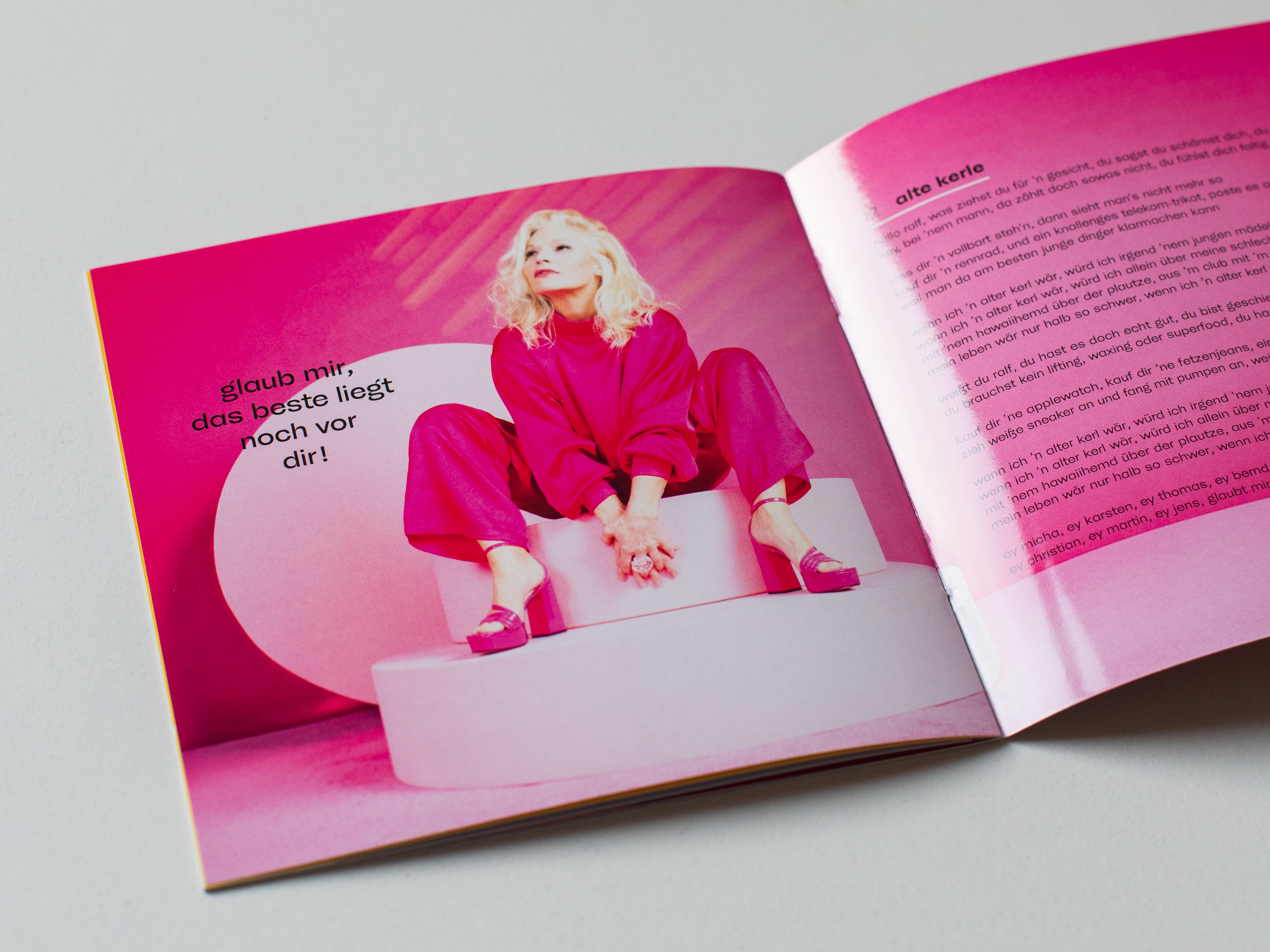
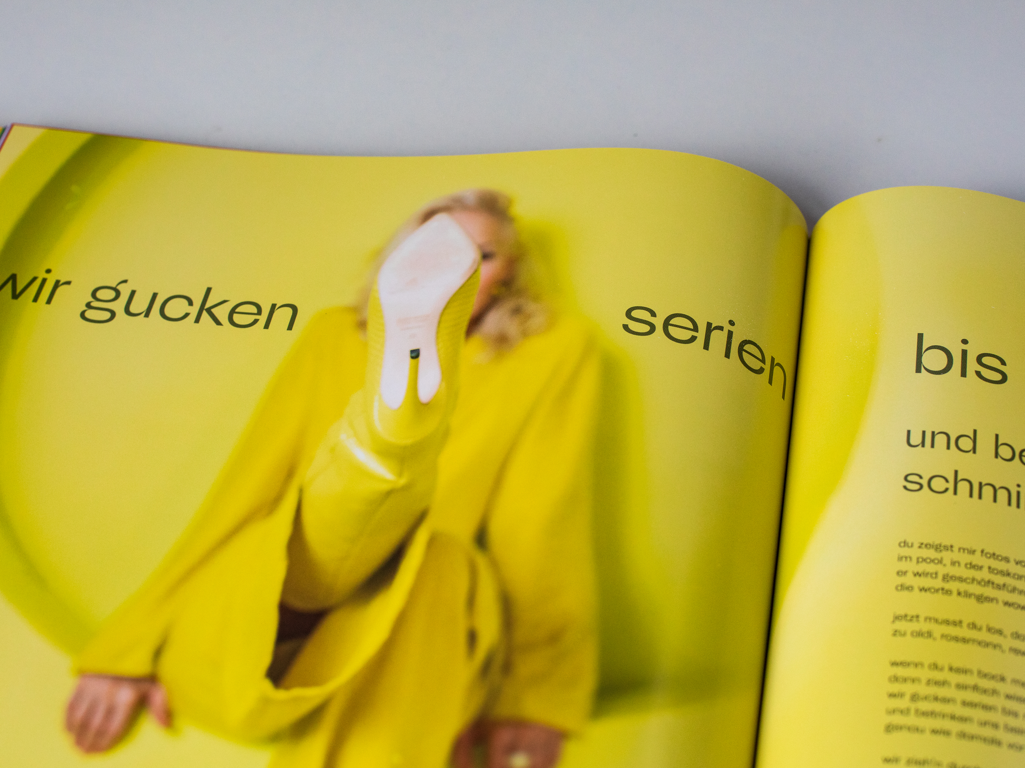
The central player in the artwork is our very own Sans, McQueen, whose namesake reinforces her DNA: the antihero with two faces. The core family combines contradictory principles: a strong contrast with ink-trap-like cuts and geometric architecture. This is precisely why McQueen is exceptionally legible, even in the small print. For 6.0, McQueen proved to be the ideal choice. It stands out powerfully against the reduced, visual power of the imagery and works well both in the title sentence and in the paragraph text. Together, photography and text give the album artwork a timeless presence.

“It was important to me to find a typeface that had something special and harmonized well with photography.” recalls art director Sven Grot.

Fonts in use: Ina Müller’s latest album, 6.0, reached number one in the German charts for the first time. The central player in the artwork is the McQueen typeface.
When we realized during the process that we wanted to work exclusively with photos and text, an expressive font became more and more important.

The final decision for the typeface landed on McQueen in Regular and Bold – not least because Ina Müller immediately fell in love with the design. “As always, she was right,” said Grot. So, it’s no surprise that McQueen now also features on Ina’s website.

Try McQueen

Fonts in use: Ina Müller’s latest album, 6.0, reached number one in the German charts for the first time. The central player in the artwork is the McQueen typeface.
It began with the artwork for her number one album ‘6.0’… and suddenly Ina Müller had her own signature font.
Fonts in use: Ina Müller’s latest album, 6.0, reached number one in the German charts for the first time. The central player in the artwork is the McQueen typeface.
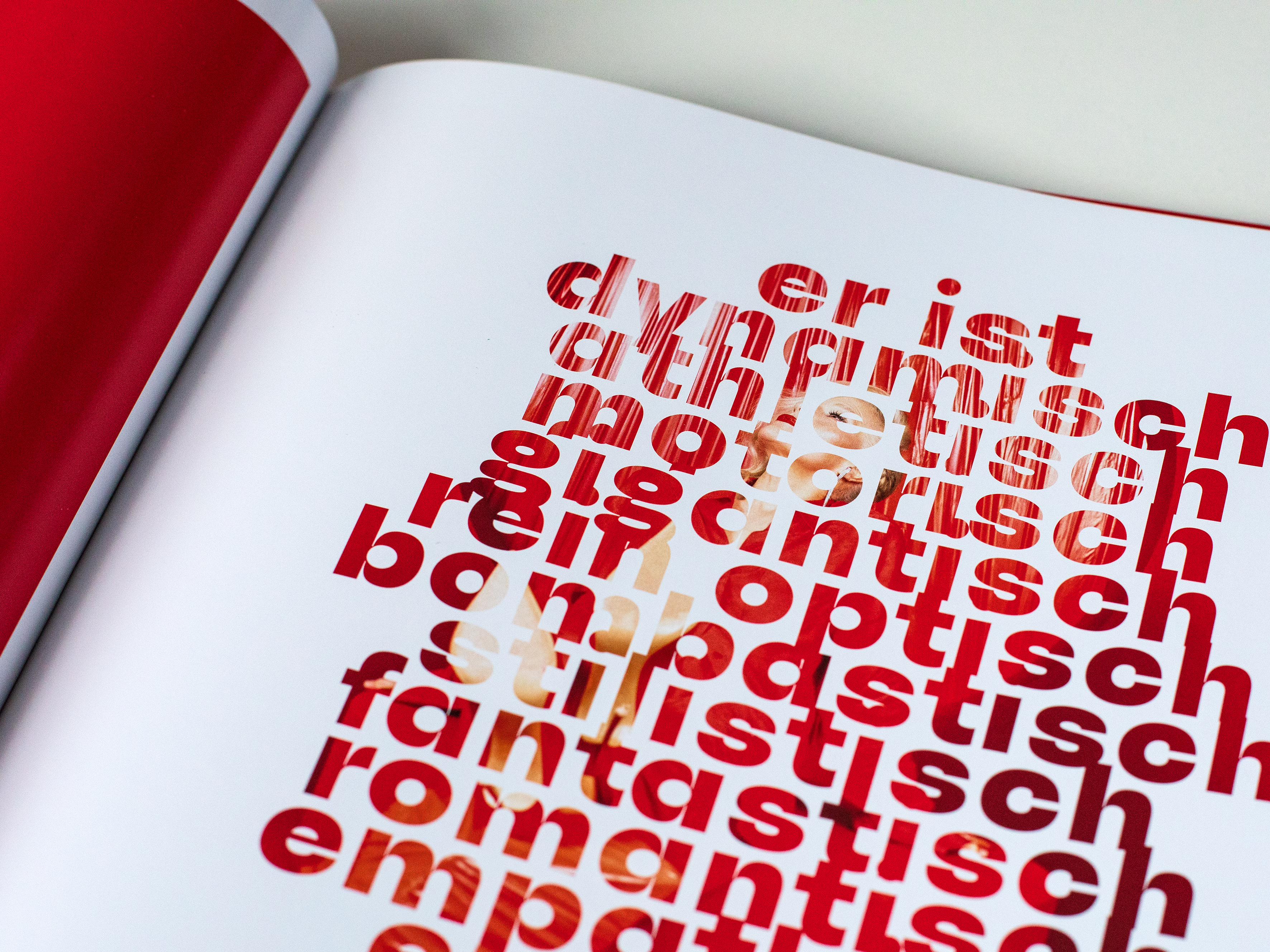
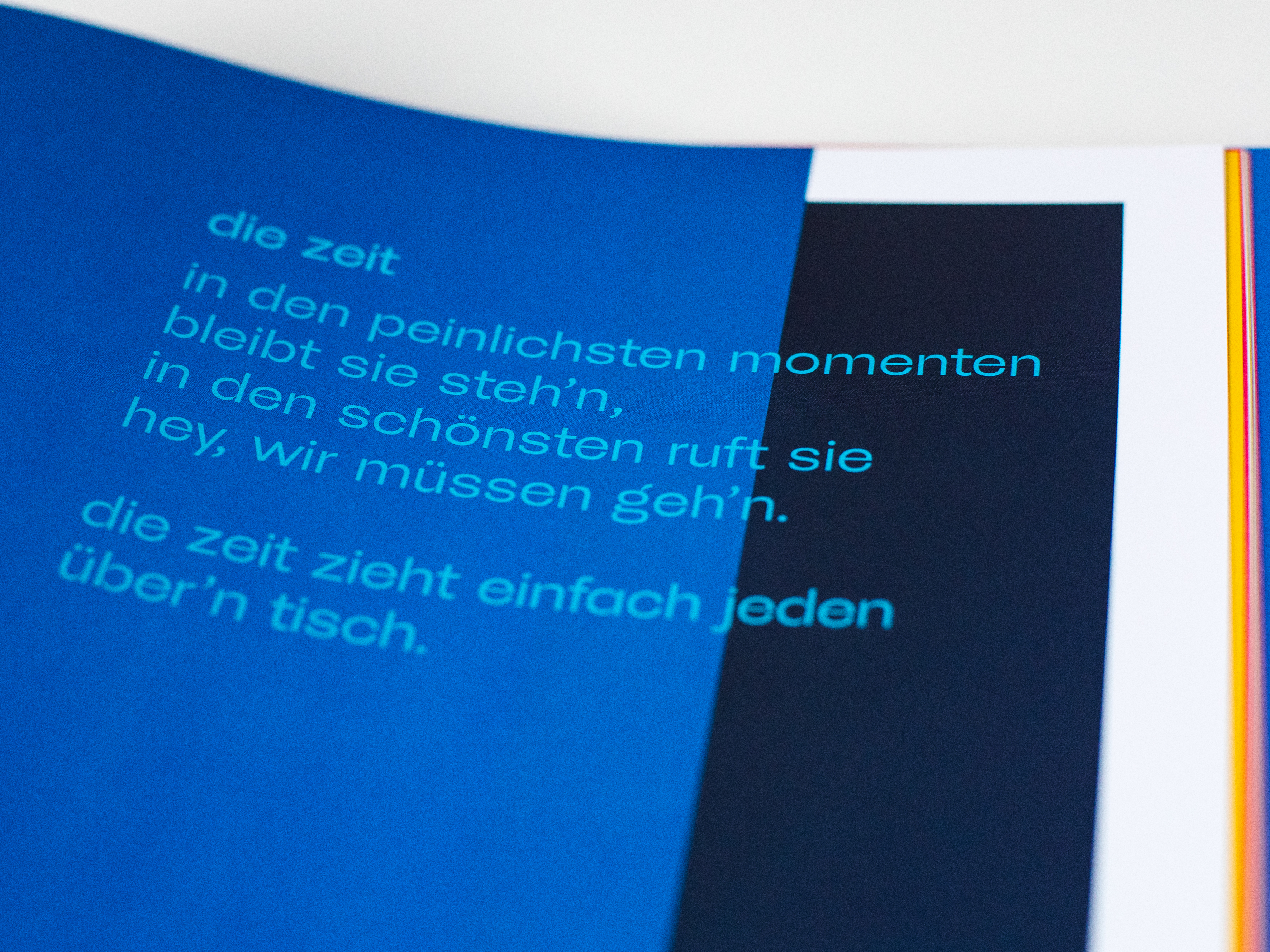
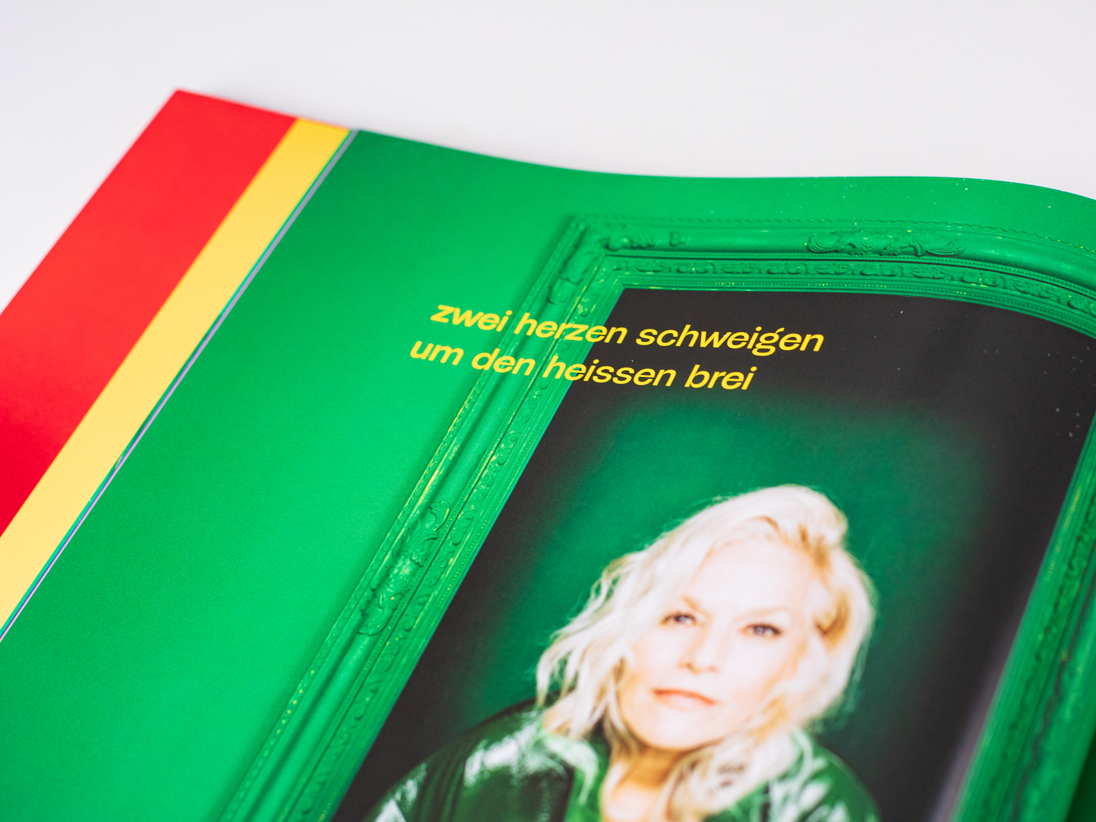
The sturdy McQueen remains perfectly legible even under extreme conditions: lowercase text, colored text, color changes in the background.
Fonts in use: Ina Müller’s latest album, 6.0, reached number one in the German charts for the first time. The central player in the artwork is the McQueen typeface.
Contrast: what creates character on a large scale also remains legible in the small print.
Fonts in use: Ina Müller’s latest album, 6.0, reached number one in the German charts for the first time. The central player in the artwork is the McQueen typeface.
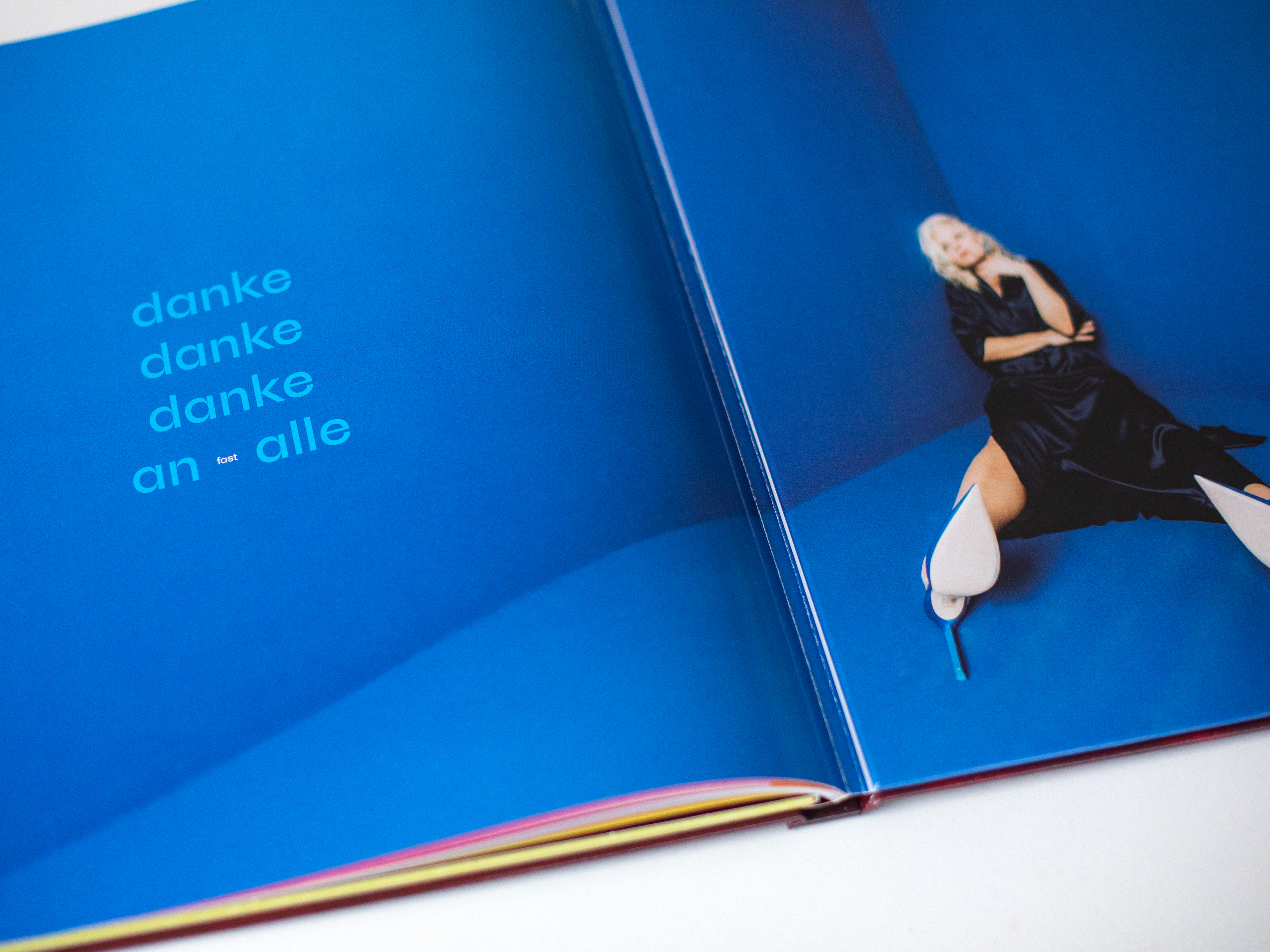
The photography takes center stage, accompanied by minimalist typography using McQueen Bold and Regular.
Fonts in use: Ina Müller’s latest album, 6.0, reached number one in the German charts for the first time. The central player in the artwork is the McQueen typeface.