GRŌA

Corporate design award for outstanding branding

Fonts in use: The typefaces Nikolai and New Reason for the editorial design of the foundation brochure of the fictitious GRŌA foundation

Issues such as mental health and the destigmatization of mental illness are particularly close to the heart of the Communication Designer Jana Heinz. As part of her Master’s thesis whilst studying typography under Professor Andreas Hogan at Trier University of Applied Sciences, she developed the branding for a fictitious foundation that aims to raise awareness of these issues amongst young people.

G

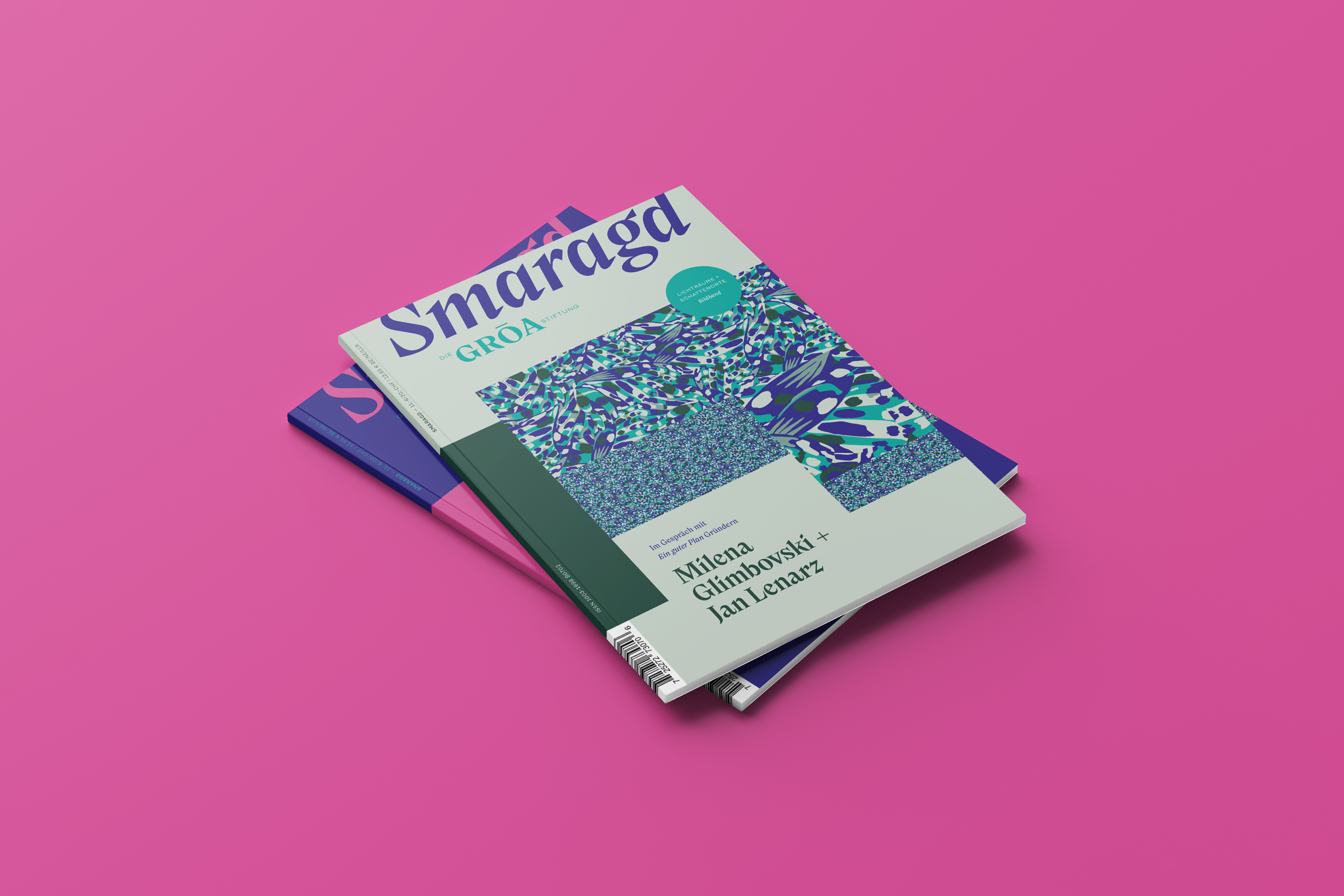
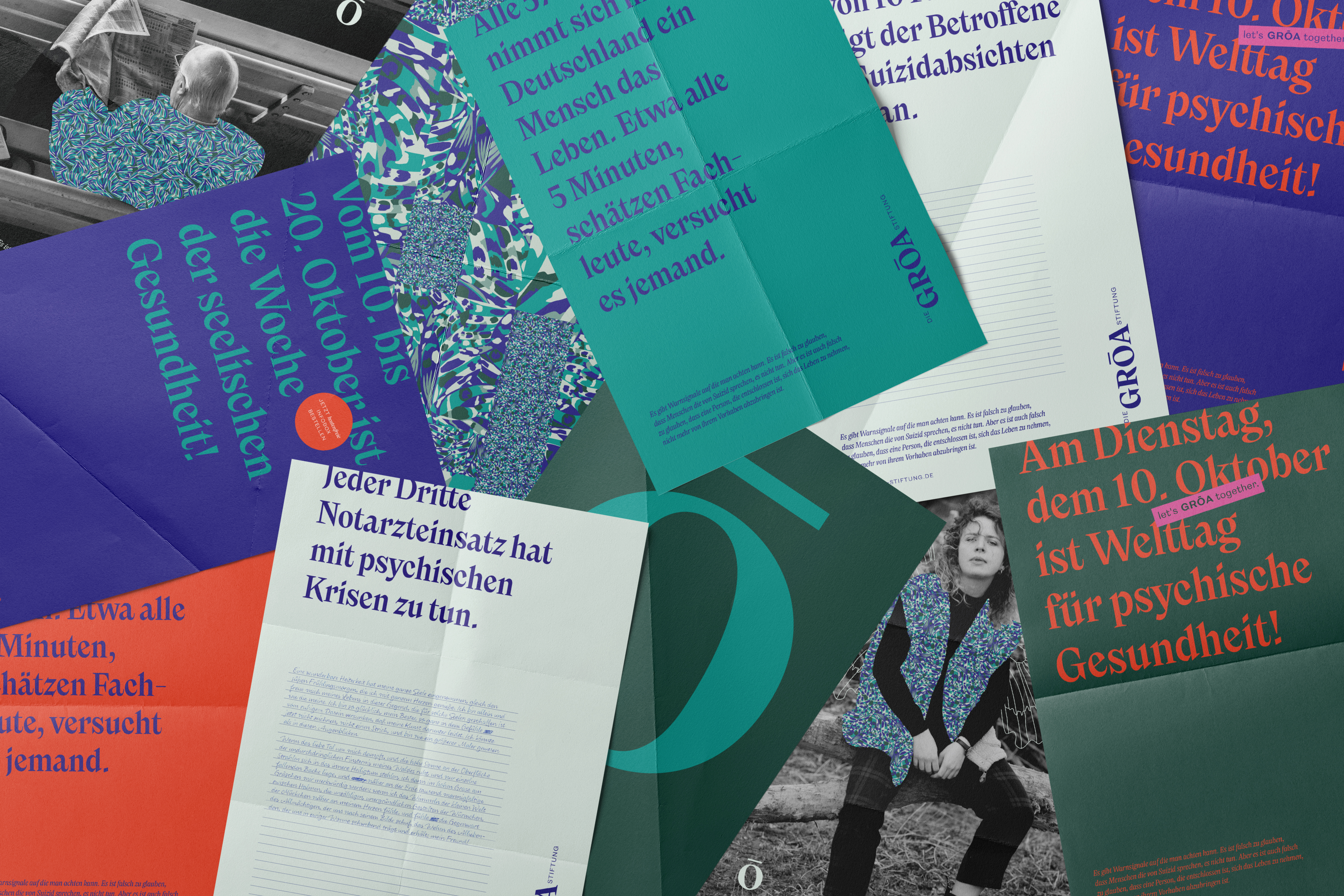
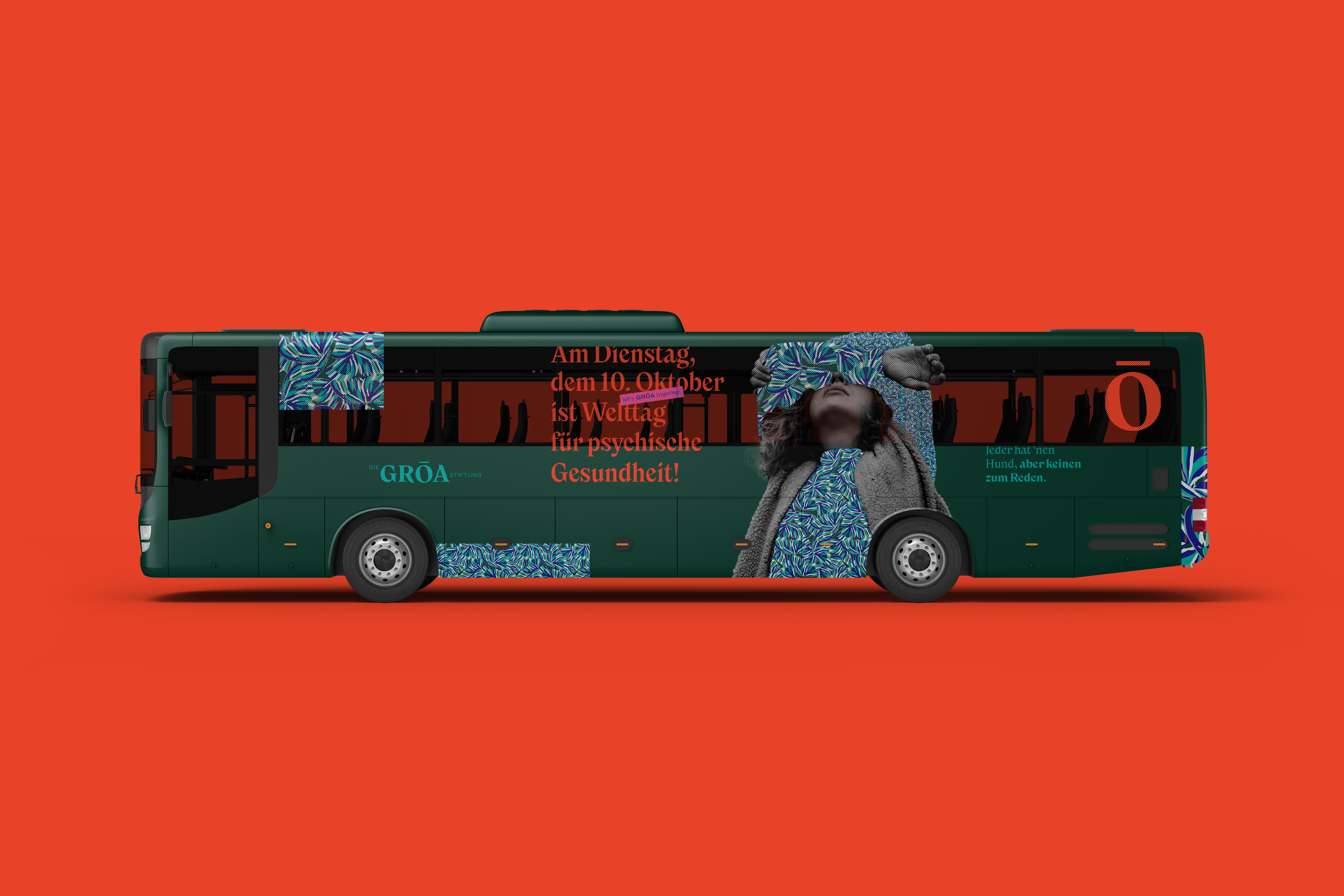
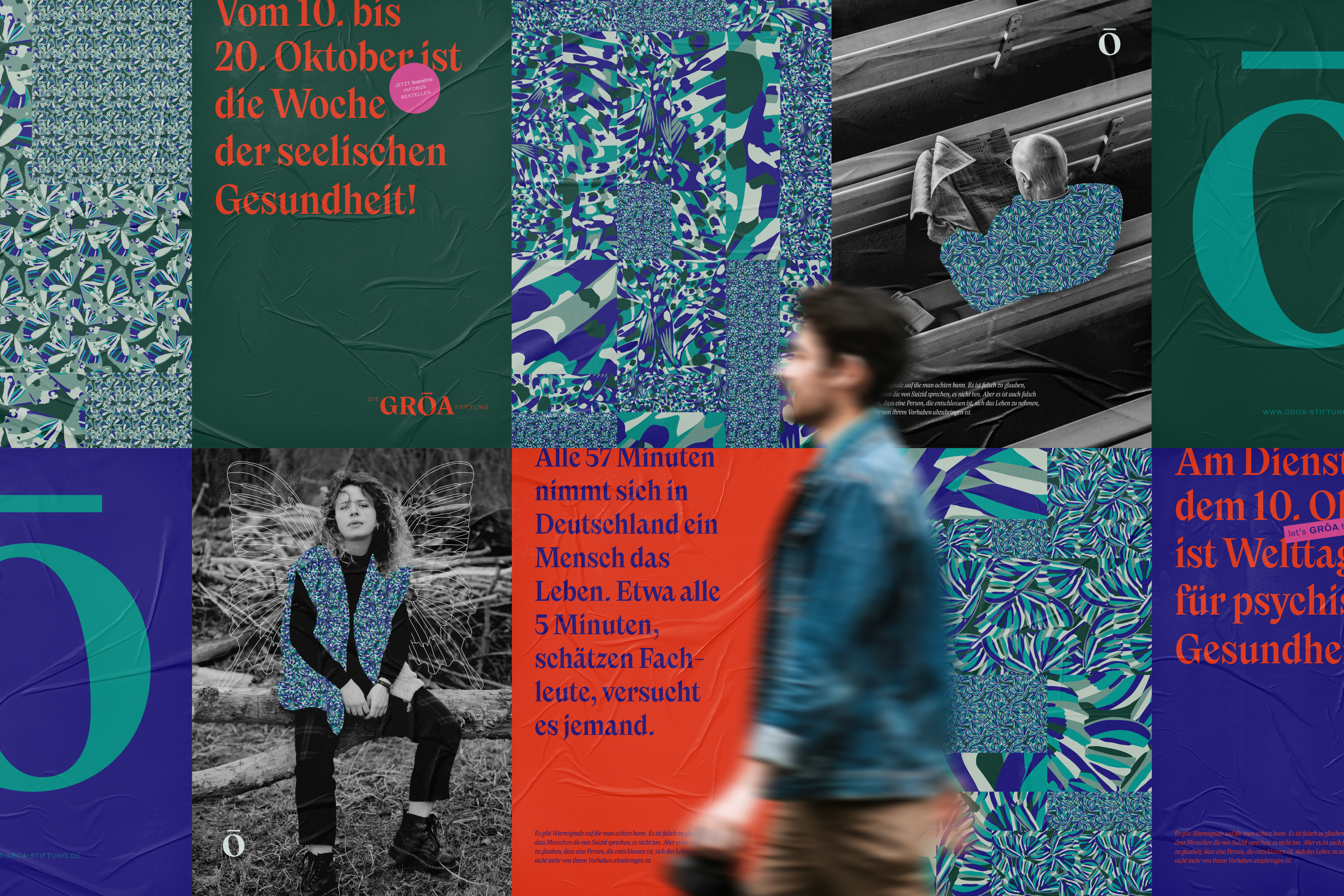
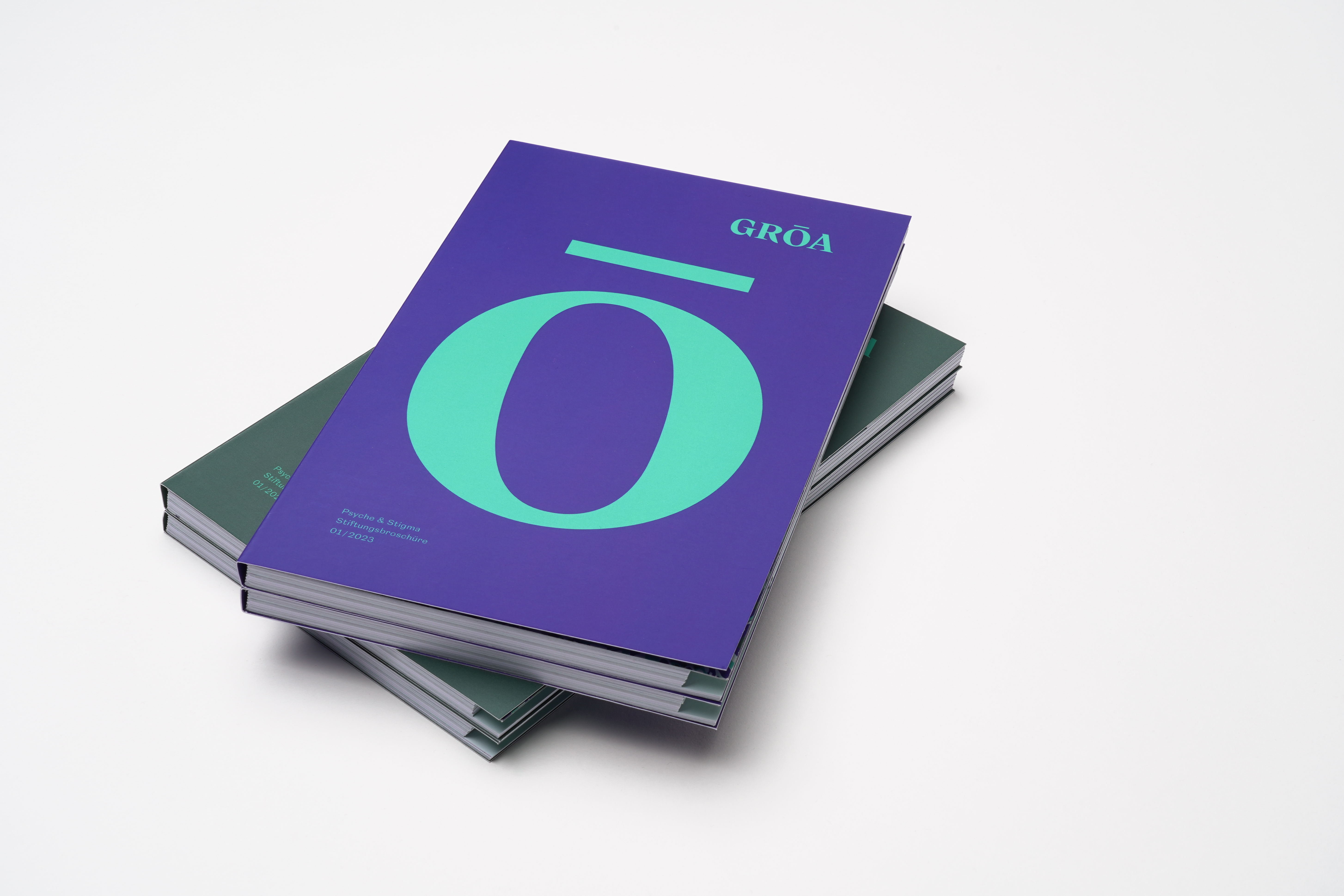
RŌA – the name of the foundation – was derived from the Germanic word ghro (which is the origin of the word green) and the Green Ribbon. Introduced in the early 1990s, the green ribbon is the international symbol for the acceptance of mental illness.

Jana Heinz’s aim was to create an image that conveys openness, diversity and closeness yet that was still convincing. At the heart of the design is a modular construction kit. Four basic patterns, four grid types, two font families and a variable scaling system enable an exceptionally high degree of design flexibility. Constants such as the characteristic typography and a fine-tuned color concept with a focus on shades of green ensure the brand’s recognition value. The large number of application examples – from ballpoint pens to buses – impressively demonstrates the variability and suitability of the system for everyday use.

Fonts in use: The typefaces Nikolai and New Reason for the editorial design of the foundation brochure of the fictitious GRŌA foundation
A strong alliance: the Nikolai brand font, in combination with the corporate colors, carries the editorial design of the foundation’s brochure
Fonts in use: The typefaces Nikolai and New Reason for the editorial design of the foundation brochure of the fictitious GRŌA foundation

Jana Heinz chose the strong character of Nikolai, designed by Franziska Weitgruber, as the corporate typeface for the foundation’s branding. It is complemented by the sans-serif New Reason by Newlyn, which mostly appears in capital texts. Nikolai not only carries the GRŌA logo, but also characterizes the entire advertising communication as well as the editorial design of the foundation brochure and the in-house magazine “Smaragd”. With its expressive italics, strong contrasts and carefully balanced proportions, Nikolai gives the visual appearance an unmistakable voice – elegant, yet at the same time lively and approachable.

Fonts in use: The typefaces Nikolai and New Reason for the editorial design of the foundation brochure of the fictitious GRŌA foundation

In addition to its visual quality, the corporate design was particularly convincing due to its suitability for everyday use. It also enables non-experts to create media content quickly and consistently - a deliberate focus, as communication tasks in foundations, associations and smaller organizations are often solved decentrally. So it’s no wonder that Jana Heinz’s work was awarded the Junior Corporate Design Prize shortly after publication. The jury was impressed. They praised the concept as “well-thought-out down to the last detail” and spoke of a “construction kit that invites experimentation”. The result is an identity-creating design system that not only communicates openness but actively enables it.

Try Nikolai

Fonts in use: The typefaces Nikolai and New Reason for the editorial design of the foundation brochure of the fictitious GRŌA foundation
Fonts in use: The typefaces Nikolai and New Reason for the visual identity and the editorial design of the foundation brochure of the fictitious GRŌA foundation
The striking foundation logo on the back of the business card also impressed the jury of the Corporate Design Award. (Mockup: Mr. Mockup)
Fonts in use: The typefaces Nikolai and New Reason for the visual identity and the editorial design of the foundation brochure of the fictitious GRŌA foundation
The scalable corporate design set no limits to GRŌA-Stiftung’s communication: from advertising material for jacket pockets to the lettering on a public bus (font: Nikolai, mockup: Mr. Mockup)
Fonts in use: The typefaces Nikolai and New Reason for the visual identity and the editorial design of the foundation brochure of the fictitious GRŌA foundation