 | EXCURSION INTO THE ARABIC SCRIPT |
|---|
|
Admittedly, we are being particularly nerdy this month, as we are launching our new essay series with an extensive but important guest article on the evolution of the Arabic script. Somewhat less demanding, though by no means less exciting, are the second exclusive collaboration with Roterfaden using Change, a fine use case of the McQueen typeface for a corporate psychologist, the special honor bestowed upon Nikolai and the exciting news about another RSS feed. Let’s go. |
|
 | | Persian-style Naskh and its characteristics | |
|
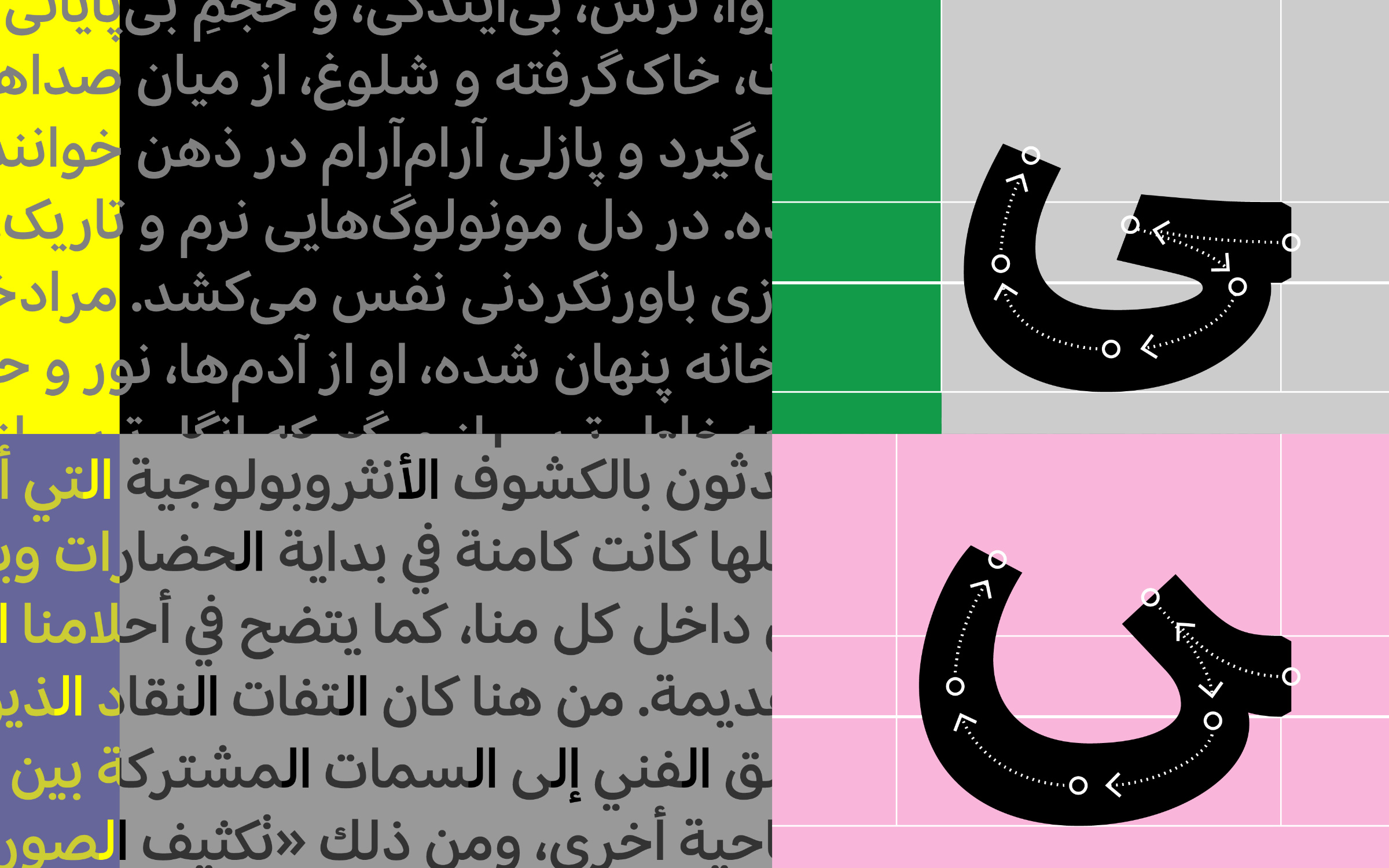
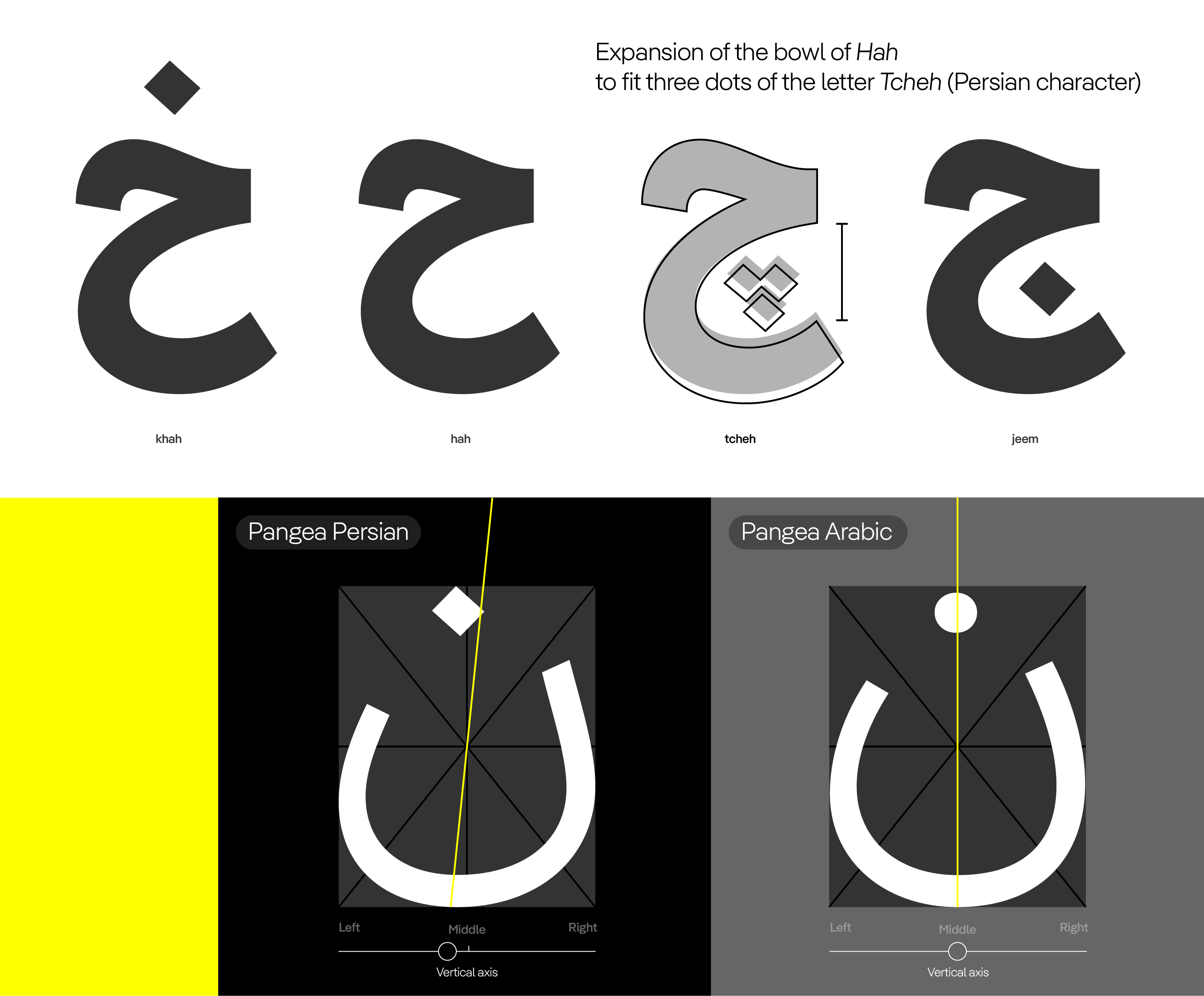
| | Cultural Diversities and Modern TypographyIt’s no secret that, despite today’s supposedly simple publishing options, it’s not that easy to make editorial content available to a wider audience, especially if it’s a bit longer or more complex. People are too quick to hit ‘like’, only few actually read the content, and it’s way less likely than you’d think that algorithms will even show your post. This is also an ongoing issue for us, so when we relaunched our website, we decided to integrate a blog section, which we simply call ‘Text.’ From the beginning, our goal was to publish more in-depth content here, because we believe there is a growing desire for less fleeting lines. Perhaps for a smaller readership, but hopefully for a more interested one. In addition to the already familiar categories Font Stories, Fonts in Use, Client Work, and News, the time has now come to publish Essays from time to time. To further increase the quality and thematic breadth, we will also collaborate with guest authors. In May of this year, we added an improved Persian version to Pangea Arabic. Persian is spoken as a native language by up to 70 million people and as a second language by another 50 million, particularly in Afghanistan, Iran, and Tajikistan. Although Persian language support was already available, the updated design is even more tailored to the reading habits of the respective audience. The design is the work of Azza Alameddine, with valuable consulting support from Amir Mahdi Moslehi. The latter now explains the differences and history of the various Arabic variants in general and particularly of Pangea Arabic and Pangea Persian in our first essay, ‘The Evolution and Adaptation of the Arabic Script: Cultural Diversities and Modern Typography.’ As mentioned at the beginning, this is indeed rather nerdy, but if our theory is correct, this depth may be just the right thing for some people in the hot month of August. | |
|
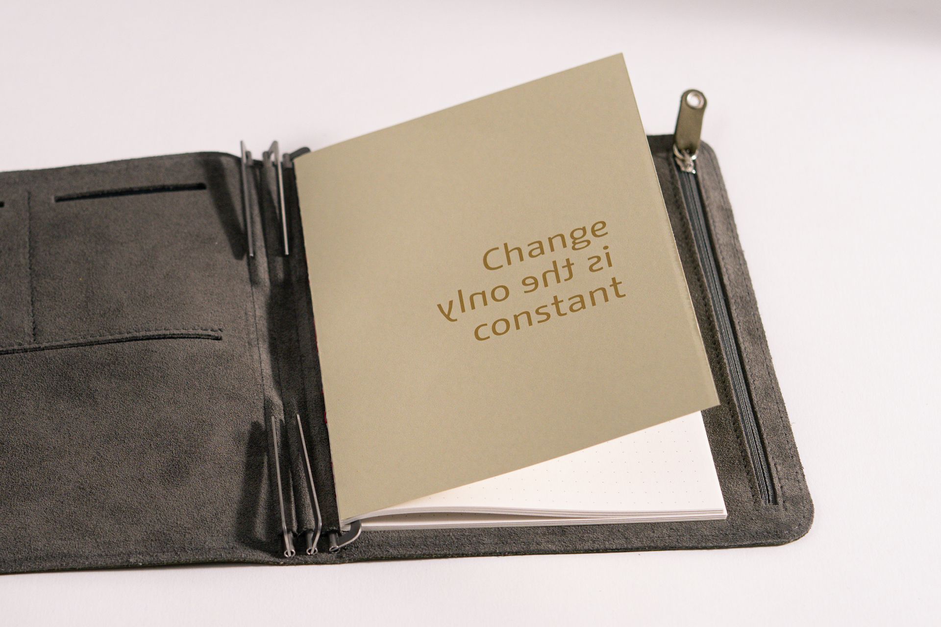 | | Alessio Leonardi’s Change typeface, printed in gold, reminds us that ‘change is the only constant’. | |
|
| | Limited notebooks availablePerhaps you remember our first collaboration with Roterfaden and Baumkuchen at the beginning of last year? Back then, we worked with the Saarbrücken-based manufacturer of customized organization systems and the Californian studio shop for fine things to produce exclusive, limited-edition notebooks. All of the notebooks have long since sold out (except for a few in our archive, but shhh…), which unanimously prompted us to repeat the fun with a similar project. While the embossed McQueen encouraged us to ‘trust the process’ back then, Alessio Leonardi’sChange typeface, printed in gold, now reminds us that ‘change is the only constant’. Once again, the notebook has a hard cover made of recycled cardboard and measures 14×20 cm (slightly smaller than DIN A5). It is strictly limited and can already be ordered from Roterfaden and will soon be available from Baumkuchen. A dot grid helps to keep things tidy when writing or drawing without being distracting. The 80g natural white, smooth paper is a delight to the touch and is also suitable for fountain pens. Bound with red thread, the notebook lies flat when opened. And because we are so enthusiastic about working with Beate, Wakako, and all the other similarly crazy design lovers, we are offering the following until the end of September: anyone who can prove that they have purchased at least one such notebook by then will receive a 50% discount on Change (singles or complete package). Simply contact us by email and we will clarify the procedure. But first … | |
|
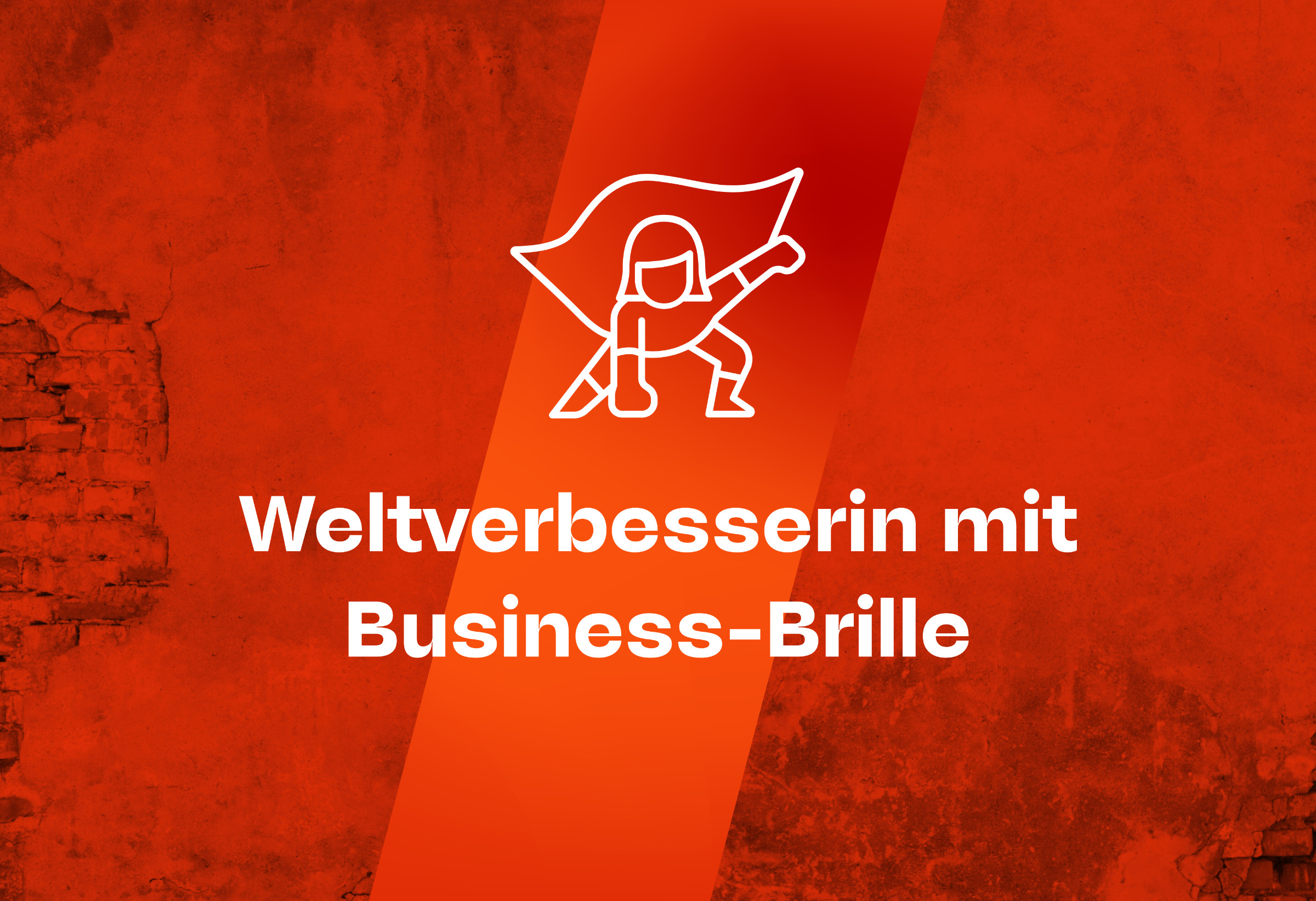 | | The eccentric typeface McQueen in use for Corporate Psychologist Katrin Terwiel’s brand design | |
|
| | Fueled by freedomFor her new visual identity, Katrin Terwiel, an expert in diversity strategy, mental health, and neurodiversity with the professional title of corporate psychologist, contacted art director Enrico Kunze from the Stuttgart-based agency Cigarsauerkraut. She was looking for branding that would flexibly reflect her working methods and philosophy. Based on this brief, a variable brand design was created that can grow with her development. ‘Uncompromising yet corporate… how can that work?’ Kunze asked himself as he searched for a suitable typeface. He came across McQueen, designed by Loris Olivier, Noheul Lee, Katja Schimmel and Olli Meier. This font sums up Terwiel’s brand positioning: ‘Loud, but not annoying. Strong, but not dominant.’ With McQueen, Kunze found the ideal solution for Katrin Terwiel’s business philosophy. The use case, especially the distinctive character of McQueen’s strokes, shows that business does not have to be boring. | |
|
 The Forum Typografie is an association dedicated to promoting better typography. Since 1984, it has served as a point of contact for professionals from all areas of communication design who understand that typographic culture needs competent advocates in order to play a decisive role. Every summer, the Forum conducts a type exchange on its website. Type designers and foundries lend a webfont for one year. The fonts can be selected and explored via a dedicated menu. This year, Franziska Weitgruber’sNikolai was among the typefaces selected, and we are very pleased about this small honor from our respected colleagues, who have repeatedly demonstrated a keen sense for special font families. Danke! ↗ |
|
 With the relaunch of our website, we have also implemented an RSS feed, which was eagerly requested by some users. This feed delivers our blog articles and newsletters (!) to subscribers’ RSS readers in real time. A post by Typographica’s Stephen Coles on Mastodon, which refers to a request by Matthew Smith – ‘What if there were a standardized approach to receiving font updates and learning about new releases? What if instead of /feed.xml, there was /fonts.xml? Just imagine being able to subscribe to a release feed without the noise and baggage of other social platforms. No algorithms. No ads. Just fonts.’ – has now inspired us to additionally provide such a feed. There is no faster way to stay informed about new Fontwerk releases (and there are quite a few planned for the coming months!). ↗ |
|
Did you know we can also provide additional languages and script systems? Our typefaces already support all Latin-based European languages such as English, French, Spanish, German, Czech, Polish and Turkish. Some families also support African Latin, Greek, Cyrillic, Arabic or Hebrew. But if you’re looking for something specific, we can make custom fonts for you. From Thai to Cyrillic, from Greek to Japanese, from Arabic to Chinese, from Korean to Devanagari, we’d love to help your brand speak more languages. |
|
|
|