In our first little round-up of the year, we share some lovely limited edition font merch to help you Push your best foot forward this year, news of some nice accolades, a special sponsorship for a girls handball team as well as a great new in-use case for Neue DIN.
In our first little round-up of the year, we share some lovely limited-edition font merch to help you Push your best foot forward this year, news of some nice accolades, a special sponsorship for a girls handball team as well as a great new in-use case for Neue DIN. |
|
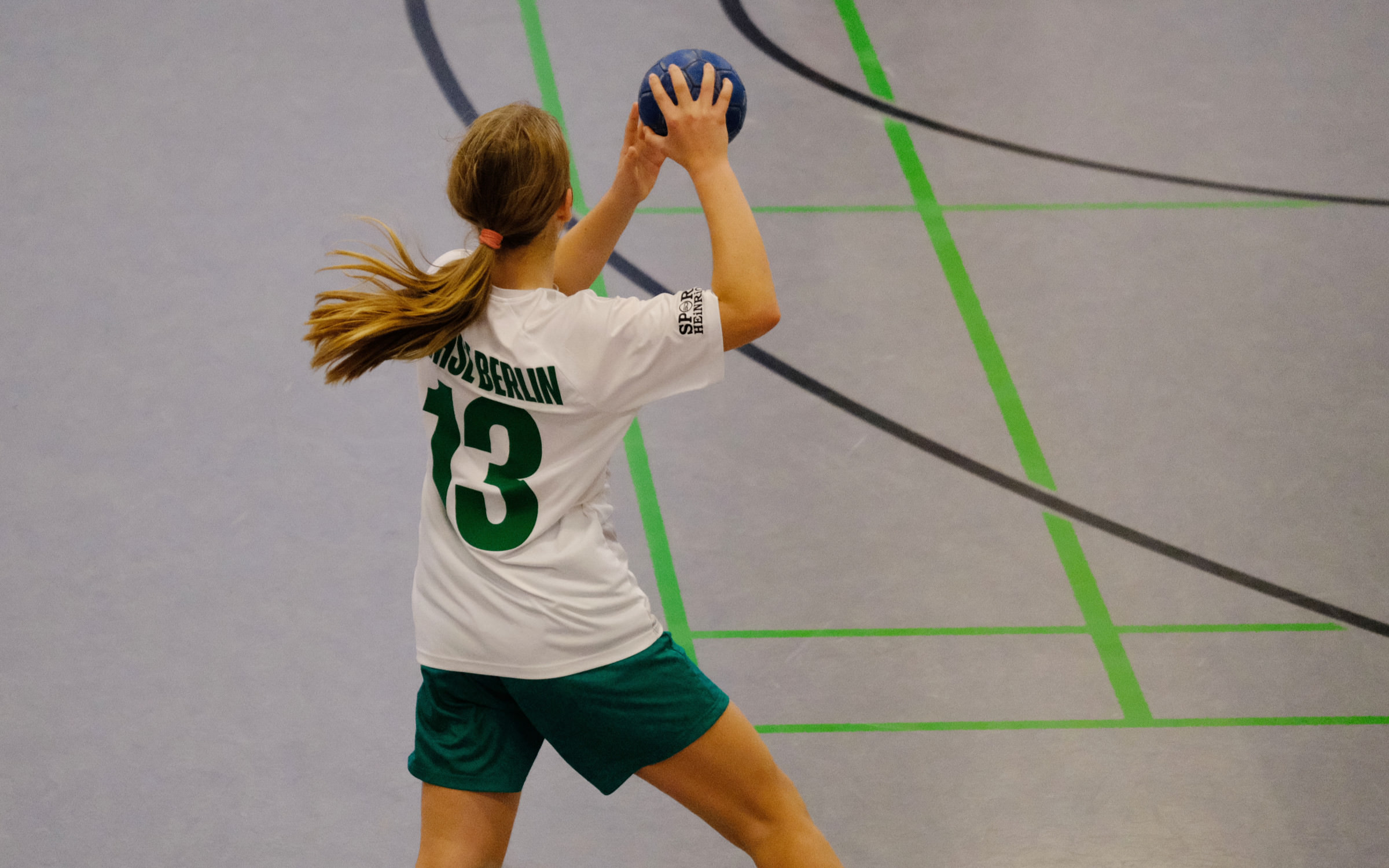
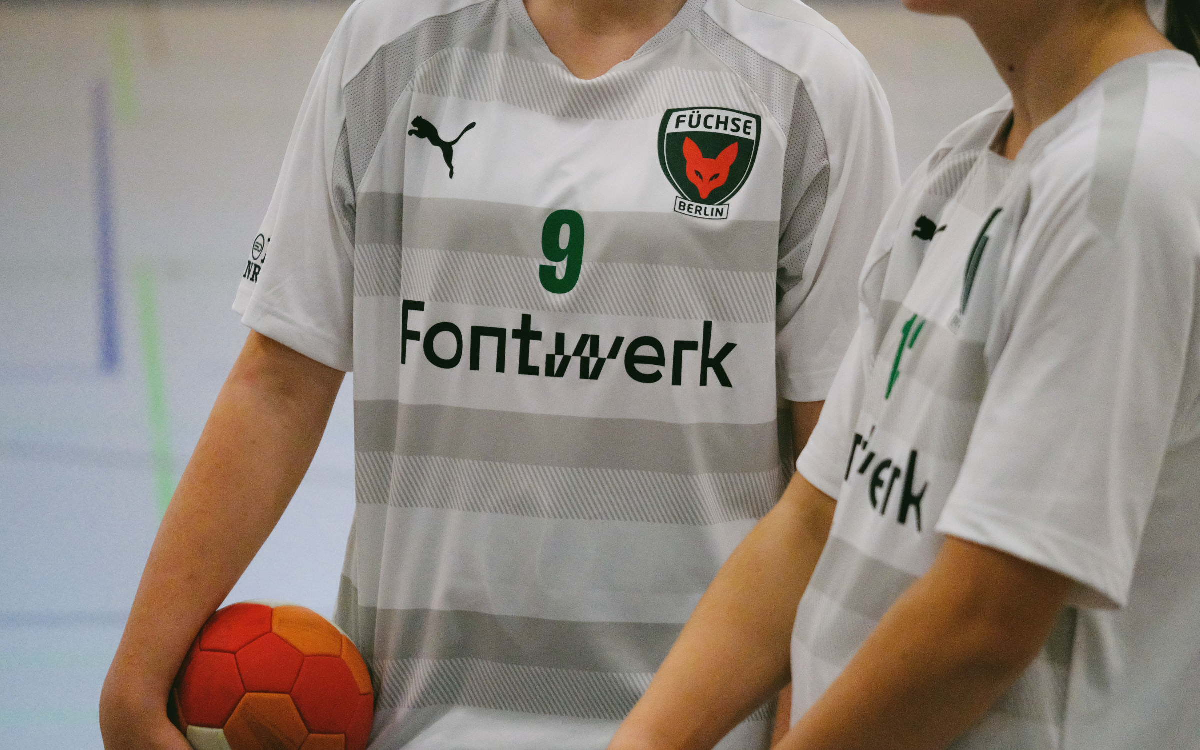 | | Fontwerk is the proud kit sponsor for the C-Youth Girls Team, Füchse Berlin II. | |
|
| | We support rising starsFor a few months, Fontwerk has been the kit sponsor for the Girls Youth Team of the local handball club Füchse Berlin Reinickendorf II (which translates to Foxes or rather Vixens in this case). Each of the team shirts is adorned with Push Condensed and XCondensed Black, our latest typeface release by Swiss Designer Christine Gertsch (read about how you can wear some Push below). As a small company, we are proud to support this grassroots team in a small way, the girls have just qualified for the second half of the season in the ‘Oberliga’, the highest league in Berlin, and will be competing for the Berlin championship. Go Girls Go! | |
|
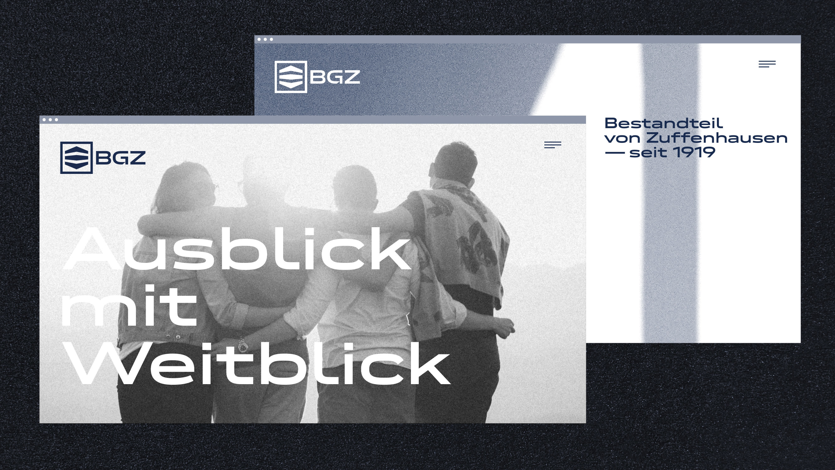 | | Neue DIN adds a modern touch to BGZ’s identity. | |
|
| | Stability and strength built-(D)inSeeing our fonts in use really does make us smile. In this latest in-use case, Neue DIN helps Baugenossenschaft Zuffenhausen e.G. (BGZ) forge a new identity. BZG was founded in 1919 to alleviate the housing shortage after the First World War. They recently looked to Scope, an interdisciplinary agency for architecture and interior design based in Stuttgart, to help them revamp and modernize their image. The brand new BGZ logo features the semibold variant of Neue DIN XWide and it is also used as the corporate font. Building on the previous logo (which was in use for 100 years!), the new version creates a link between the brand’s heritage and its ambition moving forward. Neue DIN reflects both the strength and stability of the brand and adds a modern touch to the identity. | |
|
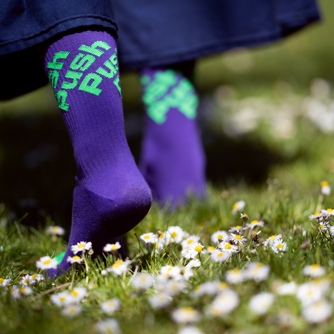 | | Christine Gertsch, the designer of Push, has designed and produced her own super comfy socks. | |
|
| | Push your best foot forwardWe love a bit of font merch, especially when it includes a Fontwerk font. Christine Gertsch, the designer of Push, has designed and produced her own striking and super comfy socks. So why not Push your best foot forward with some of these exclusive socks, those inside Germany and Switzerland currently benefit from free shipping. But be quick: there are only a few pairs left. | |
|
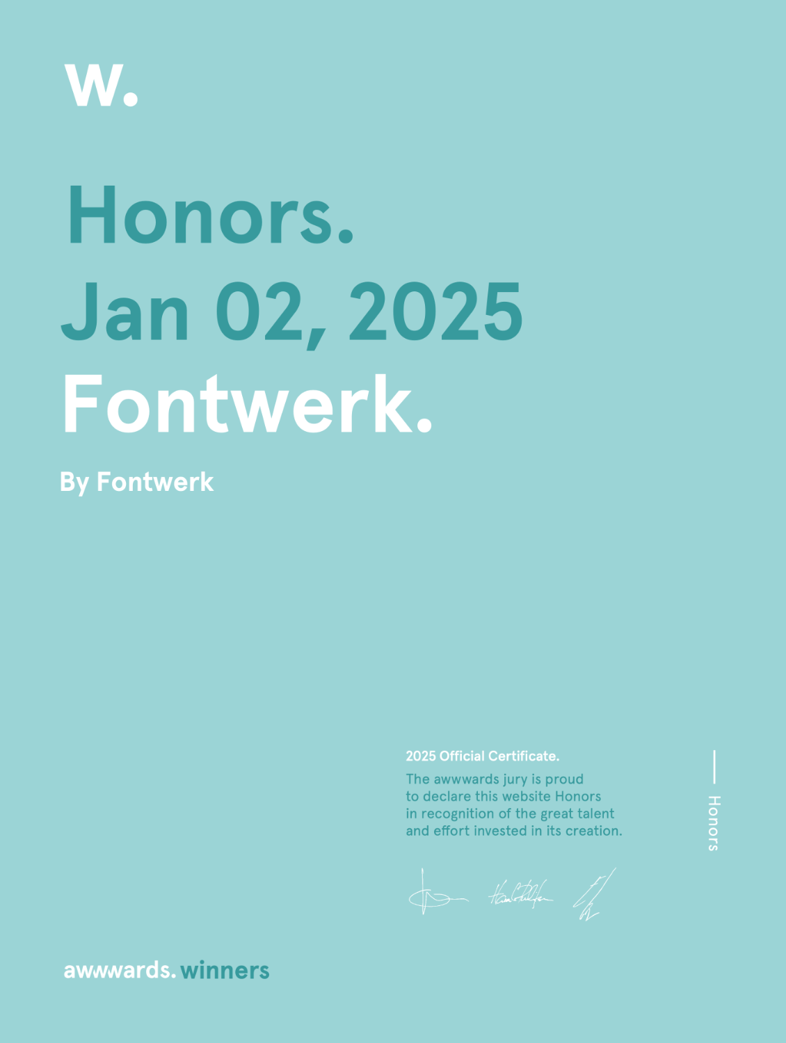 As you may have seen or read, we’ve been very busy working on our own website project. We were over the moon that we were finally able to make the new digital home for Fontwerk live as the year came to a close. Much to our delight, the feedback from customers was almost exclusively positive, visitor numbers exploded at the turn of the year and the new Trial Fonts have proved to be very popular. At the same time, we received news that Fontwerk had received an Honorable Mention in the prestigious Awwwards, which recognize the best website designs from across the world. We were very grateful to receive the news that the site has also been recognized in the Ecommerce Design Awards (Store of the Day), the Mindsparkle Mag (Site of the Day) and Muzli (Pick). These accolades make us very happy and motivate us to continue working on the site! A huge DANKE again to our team who helped bring our vision to life. ↗ |
|
Michael Coyne from the leading journal for visual communications, and – according to their website – the largest creative magazine in the world, asked our founder some questions about the relaunch of our website. Read Ivo’s thoughts over on Communication Arts’ Webpicks section, including his favorite details, his opinion on cookies and the most challenging part of the project. If you speak German and are interested in the topic, you can also read Sabine Danek’s detailed report on our relaunch published this morning on Page Online. ↗ |
|
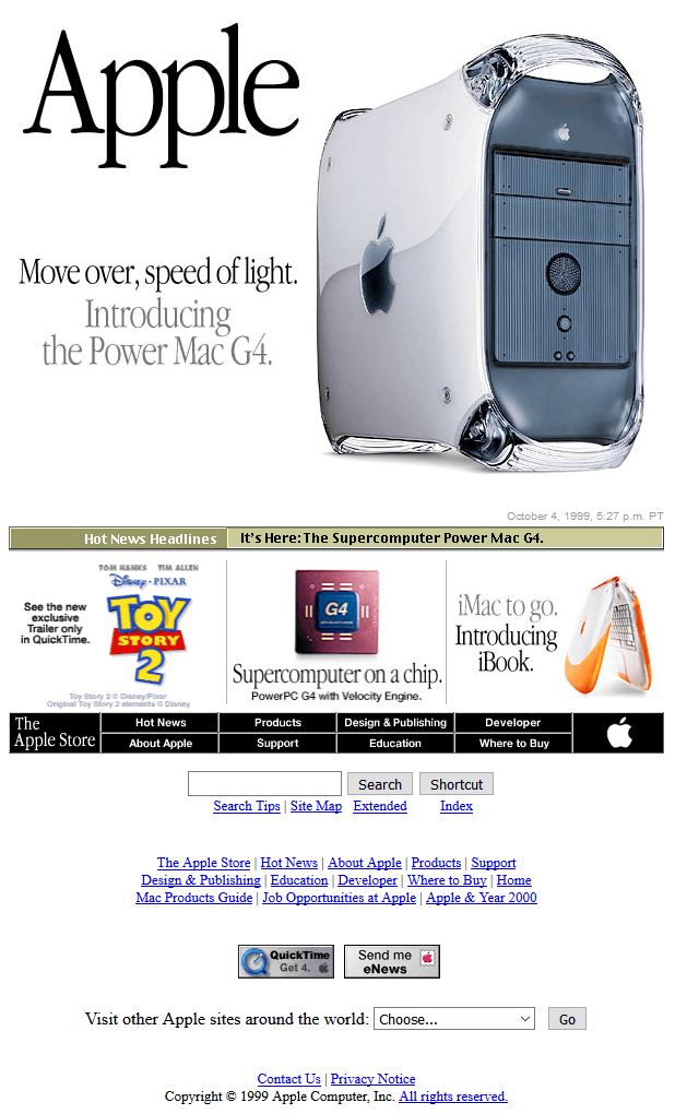 Not so keen on the latest new shiny thing? Or perhaps you’re curious as to what the original web design looked like at the beginning? We recently happened upon this fab website via the new Superlunar Newsletter (fka Aisle One Digest Newsletter). Rewind to the 90s and 00s to see what web design, web banners and software looked like back then. ↗ |
|
Seeing our typefaces in the wild makes us do an actual happy dance! Whether you’ve used our fonts for a project or maybe even for a university project, we would LOVE to hear from you. Our brand spanking, new and improved in-use gallery casts the spotlight on some of the most recent use cases shared by our customers. So, if you’ve got something that you are proud of and have some images to share, please get in touch. |
|
|
|