As Spring arrives and with it the promise of lighter, longer days we are super excited to welcome an exceptionally Nice addition to our library, we share a beautiful in-use Case and we have some good news for fans of Supermarker, who want to see her flex her typographic muscles.
As Spring arrives and with it the promise of lighter, longer days we are super excited to welcome an exceptionally Nice addition to our library, we share a beautiful in-use Case and we have some good news for fans of Supermarker, who want to see her flex her typographic muscles. |
|
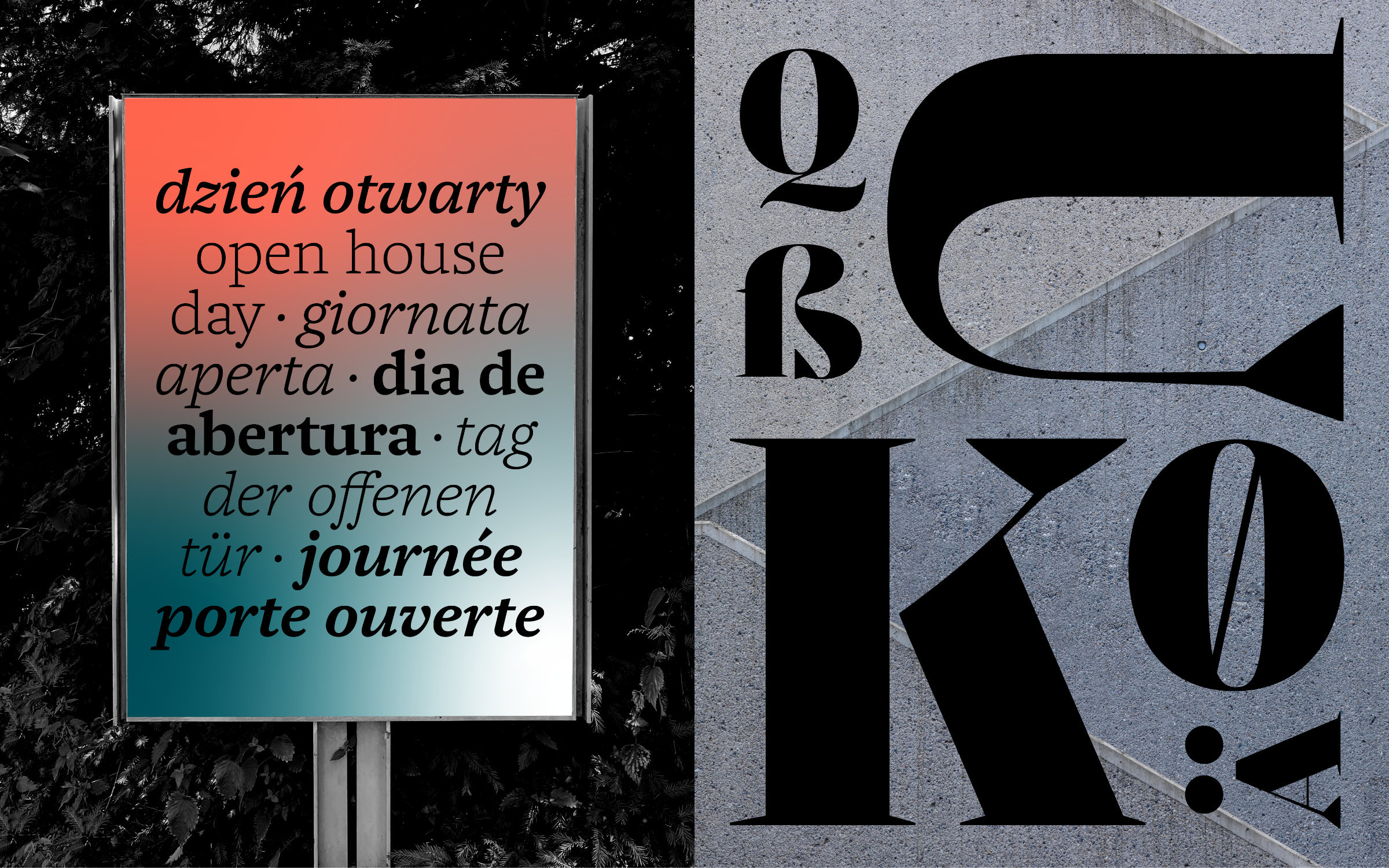 |
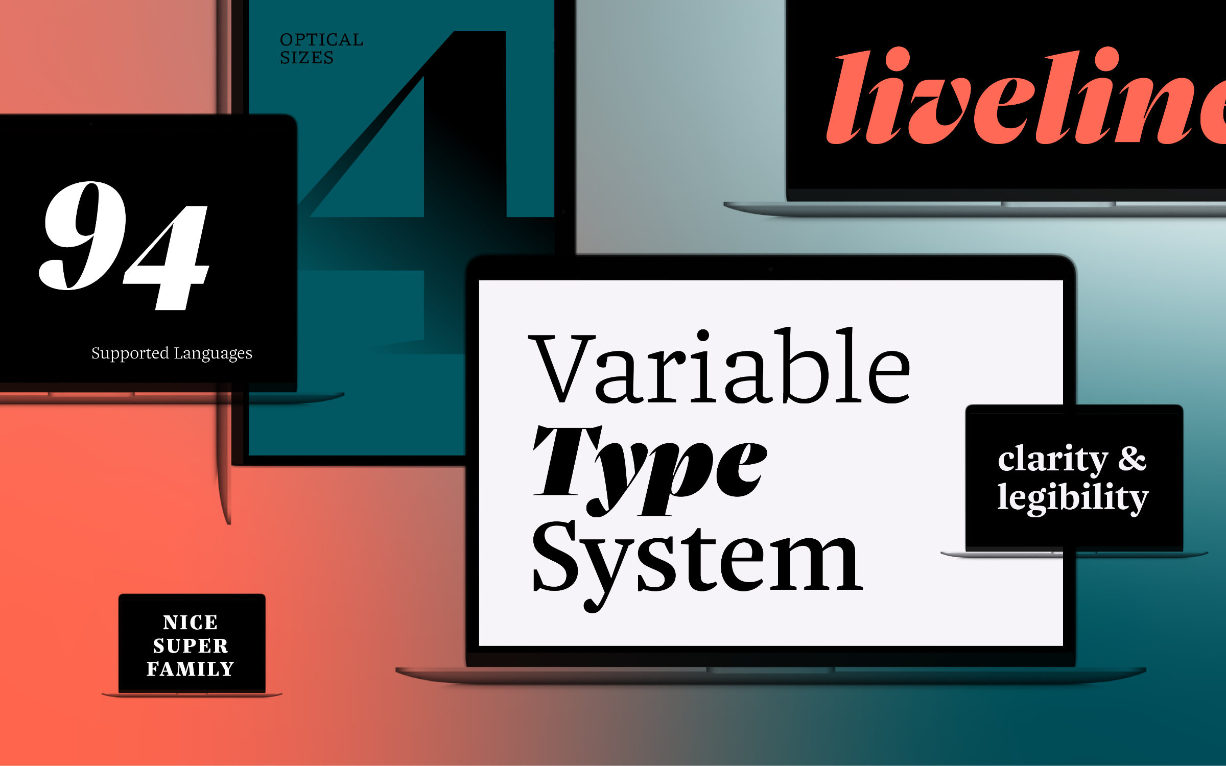
| | Meet NiceWe are over the moon to welcome Nice by Jan Fromm to the Fontwerk family. Nice is a complex type system with an enormous range of typographic possibilities. Thanks to its four optical sizes, it covers a wide range in terms of design and legibility: from texts in very small sizes to large, expressive billboard grabbing titles. In contrast to many historically oriented serif fonts, it has a fresh look with a slightly nostalgic flair. Drawing from its baroque ancestors, it takes only the most important essences: the expressiveness, the contrast between severity and warmth, the playfulness of the italics, the subtle quirkiness. By softening typical decorative elements such as sprawling curves, twisted drops or idiosyncratic serifs and carefully incorporating them into a modern framework, Jan Fromm places its historical formal language in a contemporary context. Nice is therefore not a revival. Instead, the attributes of classical baroque typefaces that still make sense today have been tailored to a refreshingly modern text font. Its availability as a variable font (which is included in the Superfamily package) makes its discreet historical borrowings almost completely unrecognizable. Equipped with a rich typographic repertoire of small caps, numerals, arrows and symbols, whether it is used in editorial design, fashion, branding or packaging – Nice always cuts a mighty fine figure. | |
|
 | | Supermarker Trial Fonts fully loaded | |
|
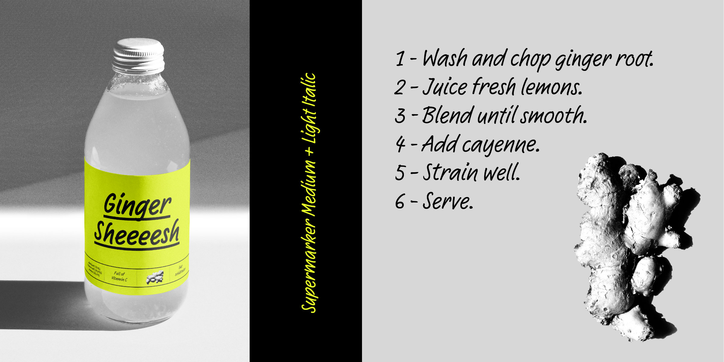
| | Supermarker Trial Fonts fully loadedOur super duper Supermarker Trial Fonts now contain the Contextual Alternates. Created by the truly wonderful Ulrike Rausch, Supermarker is one of our most playful yet authentic fonts. Perfect for retail and on a mission to sell, Supermarker also uses a very nifty technical trick. Each letter was drawn in three slightly different variants, and the vowels have four versions. These are then intelligently mixed using sophisticated OpenType programming. This creates the impression of handwriting and not a reproduced font design. Normally, our Trial Fonts don’t contain OpenType features but for Supermarker we’ve made an exception, so you can experience much more of her magic. | |
|
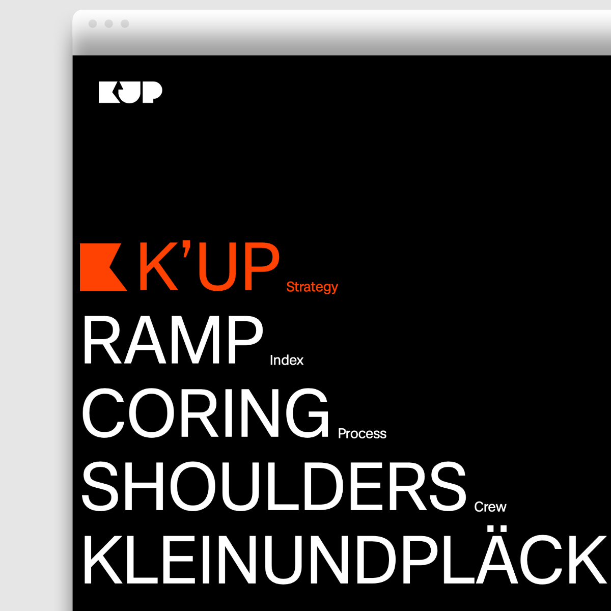 This month’s featured in-use case is of Case, which adorns the new visual identity of the Berlin-based agency kleinundpläcking. Back in 2005, Arne Klein joined forces with design legend Jochen Pläcking and they founded the agency kleinundpläcking. Fast forward to today and Arne Klein leads the agency, which has evolved from a Brand Consultancy to a Strategic Management Consultancy and is dedicated to the urgent issues of this time: Sustainability, Trust, Authenticity. The agency’s decision to strengthen their own profile with a contemporary, neo-grotesque typeface, namely Case – which was developed in 2020 by Erik Spiekermann, Anja Meiners and Ralph du Carrois, chimes with K’UP’s core values. On the website, Case is used in Regular and Bold. Across numerous typographic animations and zoom effects, it shows its strength in terms of legibility and clarity. The contact form, under the heading “Dnk” (Th(a)nks) is remarkably consistent: here Case does a great job as a web font, multicolored and discreetly animated. There is no friendlier way to reach out to potential customers. ↗ |
|
 | Want to see more Fontwerk fonts out in the wild? Or need some inspiration for your latest design project? Then head to our newest feature on our website, our In Use Gallery to see many examples of our typefaces in use. If you have used one of our fonts in a project then we’d love to hear from you. |
|
|
|