Welcome to our June Newsletter. This month, we welcome West to the Fontwerk family and share an in-use case of the font out in the wild, we explore the story behind Pangea – a typeface that connects cultures and saves the environment, we also share Mark Boulton’s thoughts on optical size tweaking for dark mode and Oliver Schöndorfer’s review of the super duper Supermarker. We also have one copy of the must-have book, ‘Italic‘ to give away to one of our newsletter readers. Read on to find out more! |
|
 |
 |
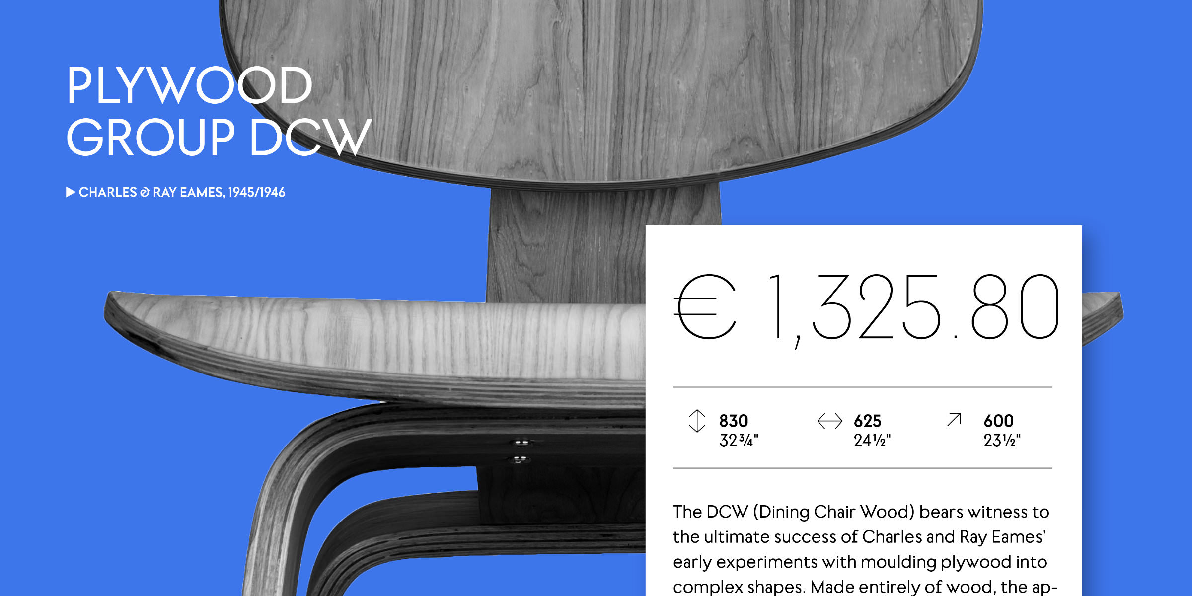 |
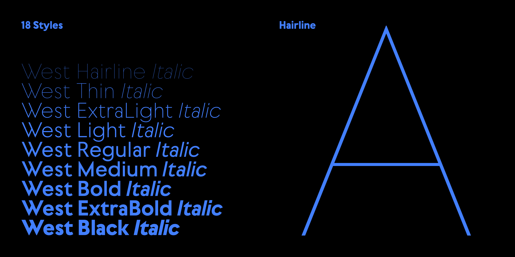
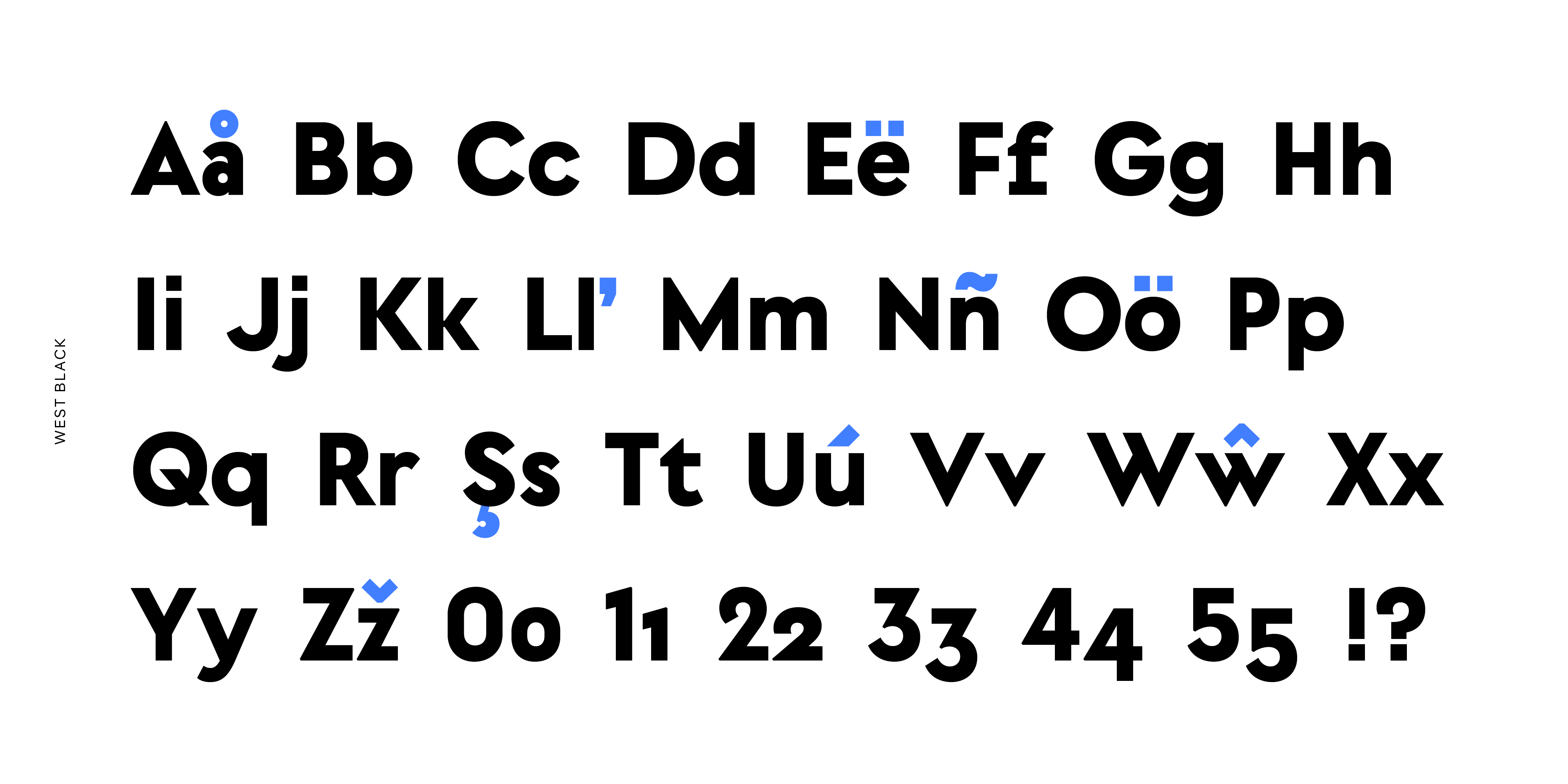
| | West by Daniel PerraudinBold, distinct and original, West by Daniel Perraudin is the newest addition to the Fontwerk family. It is a compelling mix of pragmatism and conciseness – perfect for branding, wayfinding and editorial projects. The classic geometric shapes of squares, circles and triangles have long fascinated creatives, not least those who design typefaces. So, it’s hardly surprising that many fonts that are rooted in these classical forms end up looking rather similar. West follows in the geometric sans serif tradition, yet it achieves independence and its own distinct character. It has a simple yet sophisticated formula: visually similar forms do not repeat. Behind its apparent lightness lie a multitude of different design decisions by its designer Daniel Perraudin. In order to maintain a harmonious canon of shapes and to do justice to its construction and symmetry, he varied individual letter widths (e.g. a narrow a and s in contrast to the wide b, n and J). He emphasized this unique character further with unusual glyphs such as W, t, f, 2, the alternative forms of the italic Q, the diagonal endings or angular dots. The characters beautifully oscillate between Art Deco influences (e.g. M, N, V, 3) and more technoid, monospaced influences of the nineties (e.g. f, alternative r) as well as the classical effect of fully reduced geometric grotesques (e.g. t, d, g, C, G, 9). All together, these design idiosyncrasies result in a compelling, contemporary mix. The range of West is also something rather special in the geometric genre: nine font weights ranging from Hairline to Black, matching italics as well as variable fonts that are all included in the Complete Package, giving the user full flexibility and control. Download free trial fonts of nine weights ranging from Hairline to Black, matching italics as well as Variable Fonts exclusively on fontwerk.com. | |
|
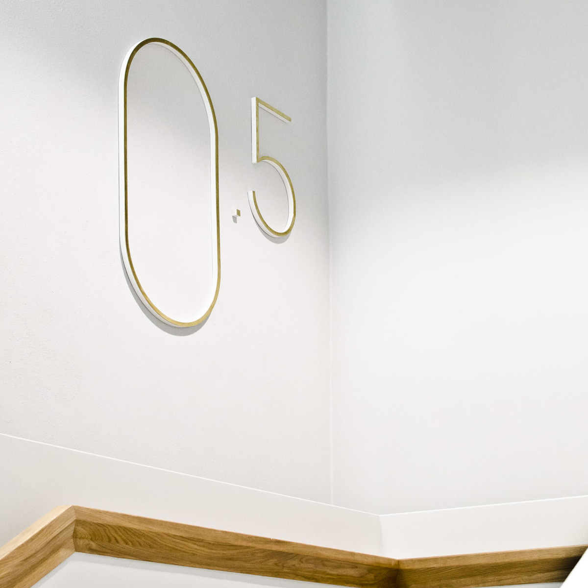 The latest addition to our Fontwerk family, West is already out in the wild and features in the wayfinding system for the Semper Building, Zwinger, in Dresden’s world famous Gemäldegalerie Alte Meister. Developed by Studio Gourdin in collaboration with the Berlin-based studio Capitale and Daniel Perraudin designed the typeface especially for this project back in 2013. This became the foundation for what was to become our newest release, West. In the museum, capital letters are used almost exclusively center justified and a real eye-catcher are the oversized floor figures in Hairline: unmissable yet restrained. The sculptural wall lettering fits into the architecture without dating it. Letters, floor plans, arrows and pictograms pick up the colour of the wall and the brushed brass that adorns the letters is a nod to the surroundings. Prior to publishing West, Daniel Perraudin expanded and developed the family, the three original styles became nine (from Hairline to Black), he added lowercase letters and special characters (in total 750 glyphs per font) and of course, italics. The entire West family consists of 18 luxuriously equipped styles, including arrows, ligatures, wonderful alternative forms (e.g. the uppercase Q) and pictograms. You can see West in action over on our website or download a trial version. ↗ |
|
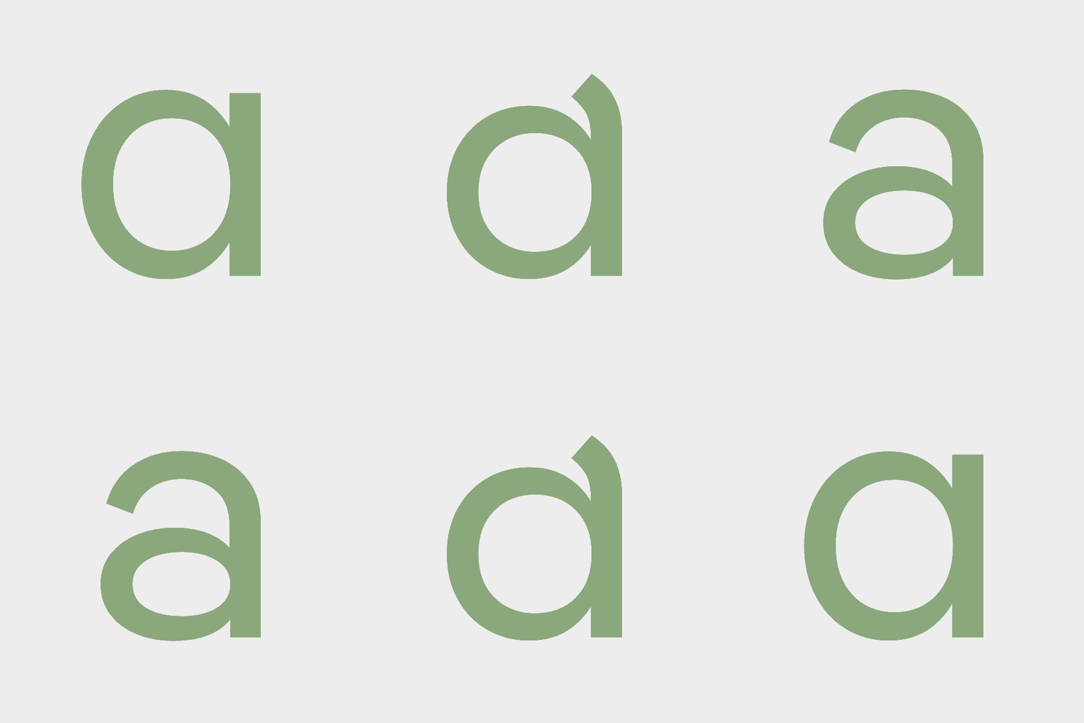 With Pangea, type designer and font engineer Christoph Koeberlin subverts the norms of the geometric genre – resulting in a technically flawless, multilingual and highly versatile font that also gives back. Christoph donates 25% of his royalties to organizations committed to preserving the rainforest. To quote Christoph, “There are actually a lot of typefaces based on the circular o and some really good ones. But most of them have one thing in common: they are latin, static, and one-dimensional and they differ only slightly. I didn’t want to design another one of these typefaces. Pangea is an extra special typeface for me. I thought about it from different perspectives... not only aesthetics and typography, but also technology, culture and sustainability.” Read more about this sustainable typographic game changer over on Christoph’s website. You can also download a trial version or buy it on fontwerk.com. ↗ |
|
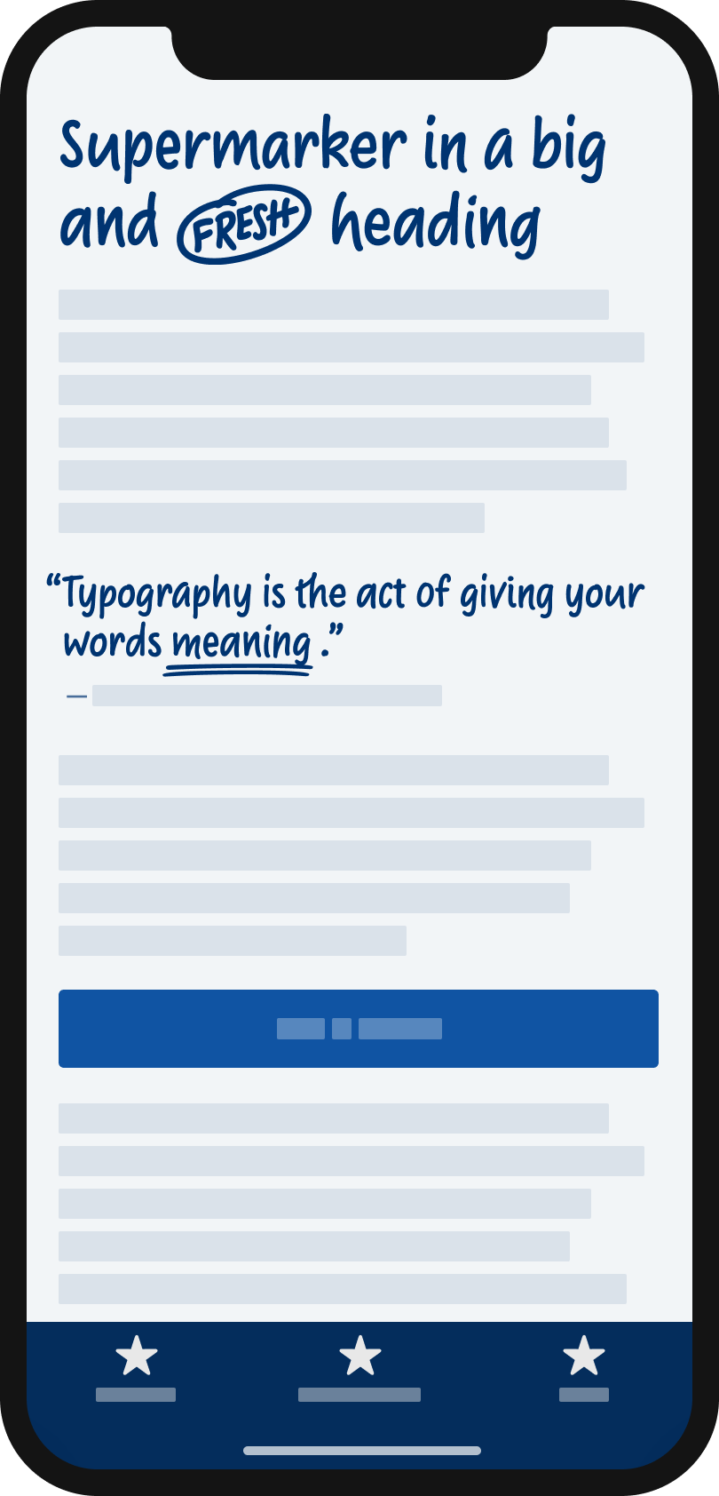 Supermarker by Ulrike Rausch is “super friendly, super approachable, super authentic” says Oliver Schöndorfer, the Austrian-based UI Designer and typographer on his Zeichenschatz blog. “It solves a problem almost all fonts in this category have. They want to appear intimate, personal, unique, imperfect… but that illusion is destroyed once you take a closer look at repeating characters and see they are exactly the same. Supermarker cleverly uses OpenType Features to prevent that.” Head to his blog to read the review in full and you can download a trial version exclusively on Fontwerk.com. ↗ |
|
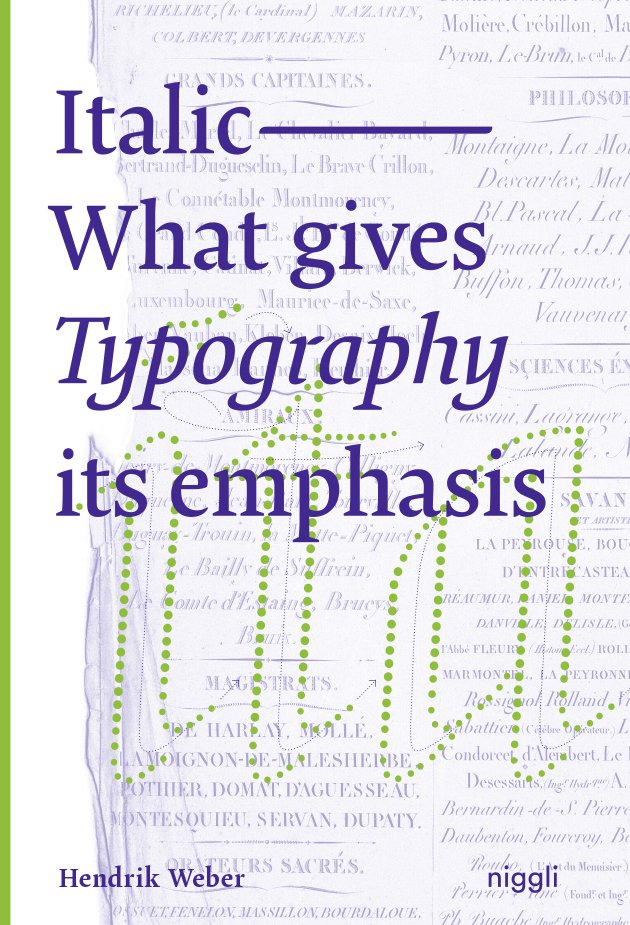 Thanks to our dear friend Hendrik Weber and his publisher, Niggli, we have one copy of his latest release, Italic – What gives Typography its emphasis to give away to one of our newsletter readers. The book offers an expert insight into the development of italics from handwriting to digital typesetting and a beautiful overview of the different style pattens that demonstrate how the form has evolved. It is a must-have for all type aficionados. All subscribers will be automatically entered and a winner will be picked at random and informed by email by June 30, 2021. ↗ |
|
In each newsletter, we want to share the work, words and thoughts from some of the leaders, thinkers, movers and shakers in the design world. Recently, our friend Mark Bolton – the renowned UK-based design and thought leader – questioned how he could best use variable fonts and explained why he considers optical size to be ‘the most useful of variable axes for type setting’. In his article he said, “in some type families, some glyphs look dramatically different depending on if they are intended to be used for captions or folios at one end of the spectrum, and display or ‘poster’ weights on the other. This is the optical size… So, big or small, right? No, it’s not as straightforward as that. Particularly when you consider digital products being presented in the plethora of devices and environments. Throw into the mix dark mode. Legacy devices with poor screen resolution (yes, they still exist!). And single type families for entire brands, suites of products, and all potential environments (print, physical, digital). All of a sudden, being able to tweak optical size becomes a very powerful tool.” Head to his website to read his thoughts in full and find out about what you should take into account if you want to iron out any contrast issues. Got some thoughts you’d like to share with us? Send them our way. ↗ |
|
We are specialists in Font Engineering and Typeface Design. We stand side by side with innovative agencies, designers and brands. Our Team is there to help you evaluate and analyze what you actually need to fulfill your brief, and we do it in the fastest and most cost-effective way possible. We strive to make a real difference and provide you with an outstanding result through our work. |
|
|
|