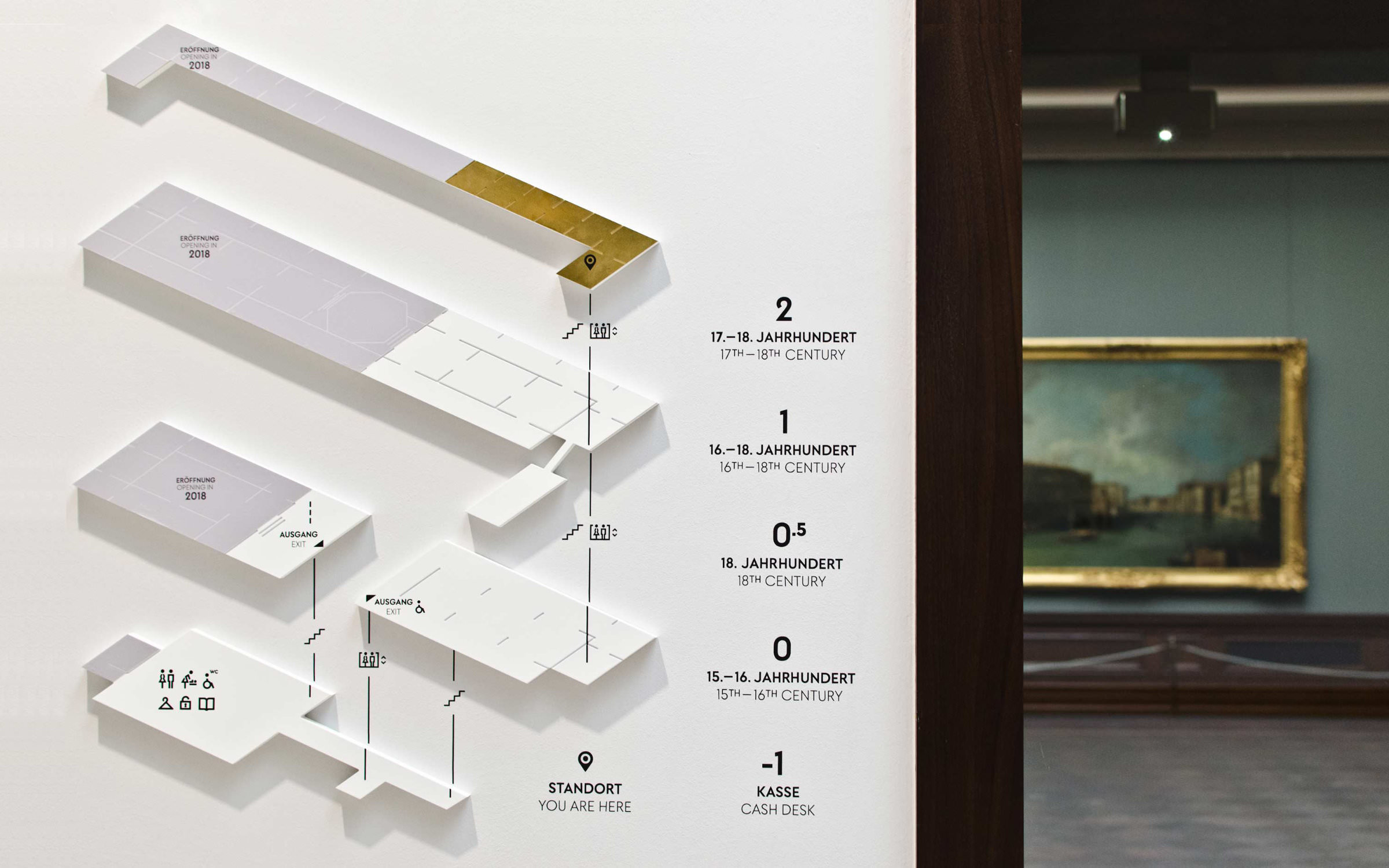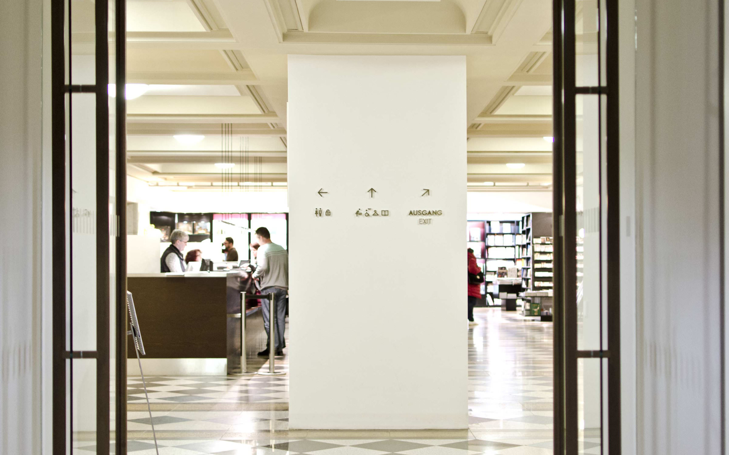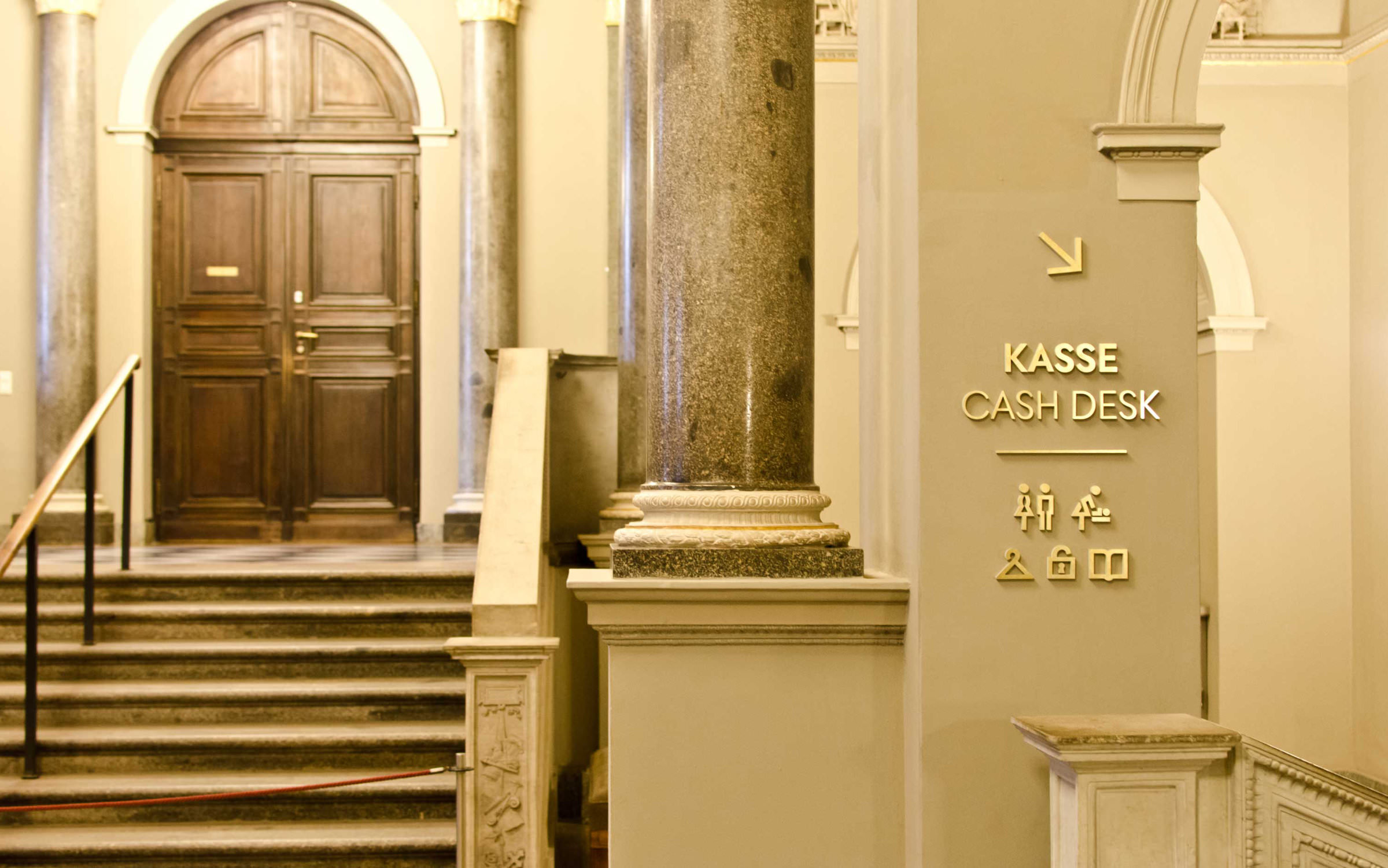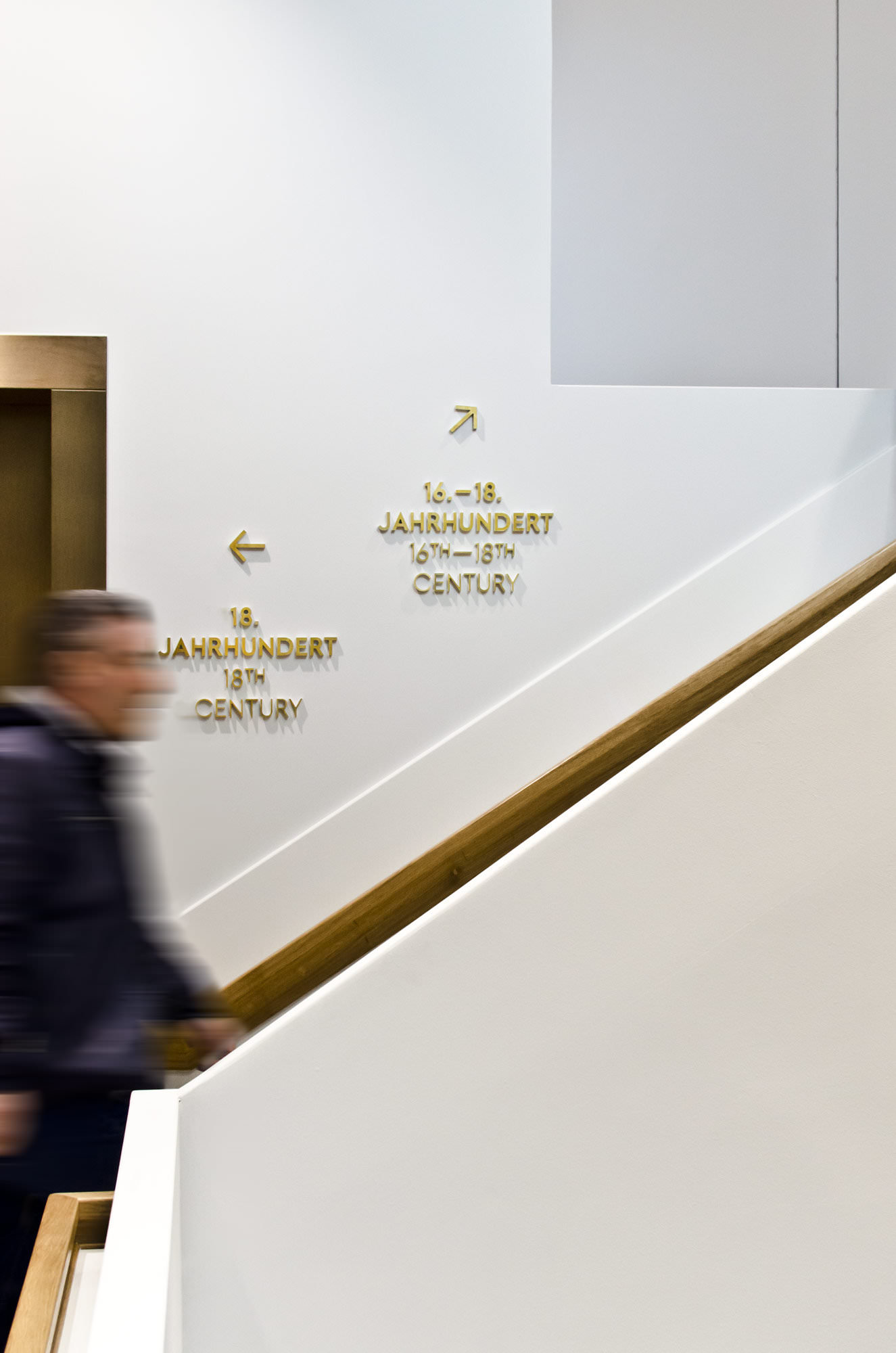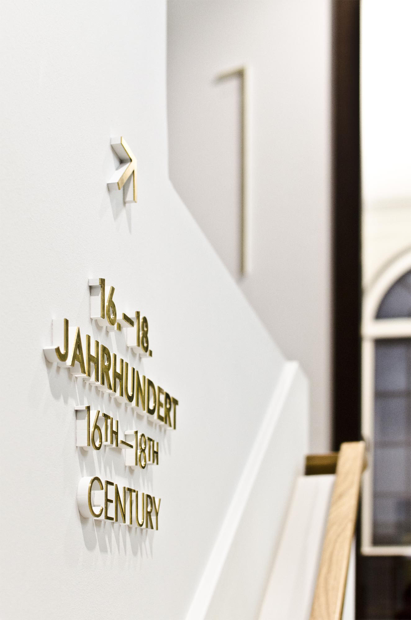
he permanent exhibition is arranged according to geographical schools and epochs, while considered accent lighting and coloured wall covering give the works a new radiance. Orientation is provided by the wayfinding and information system developed by Studio Gourdin in collaboration with the Berlin studio Capitale.
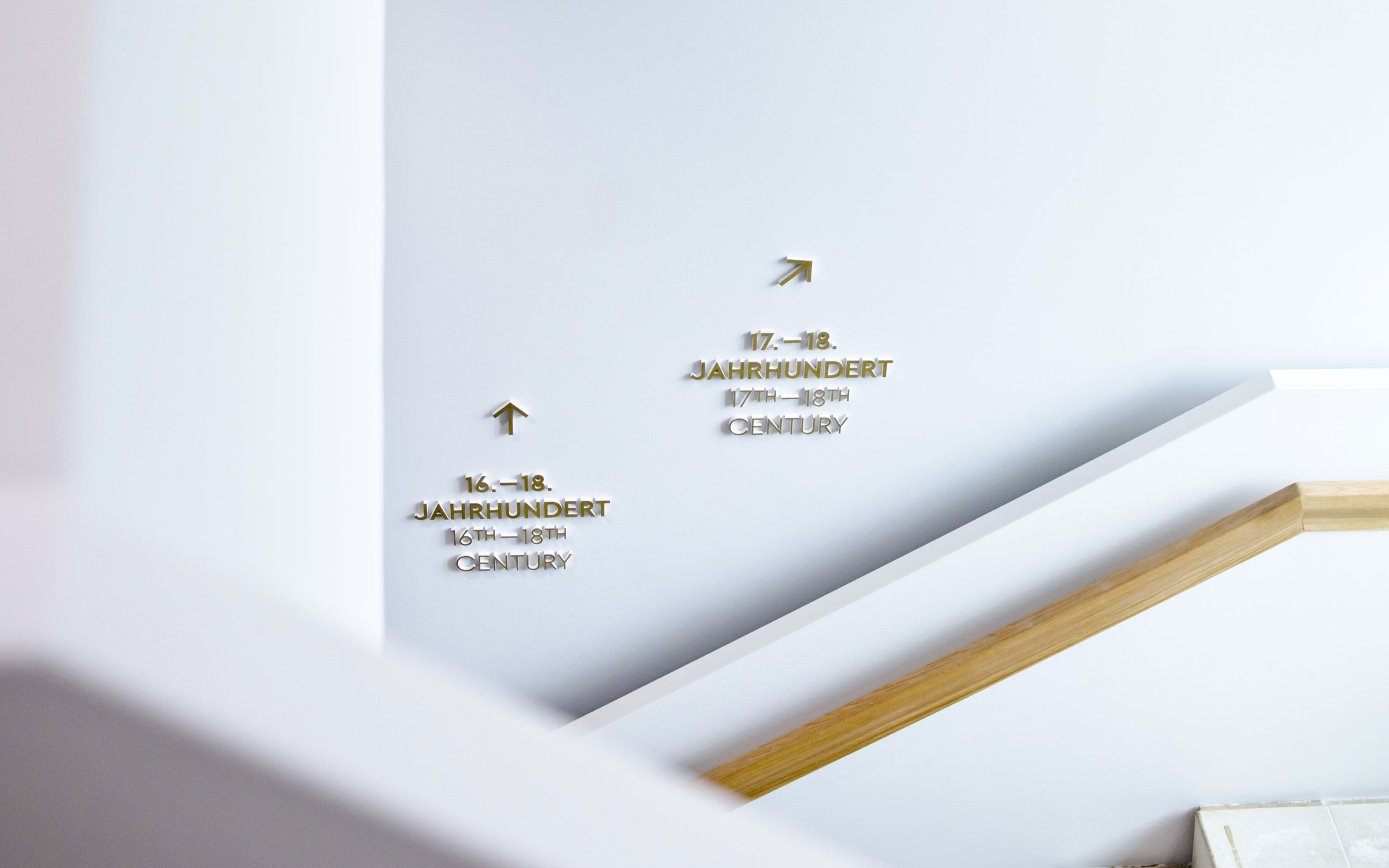
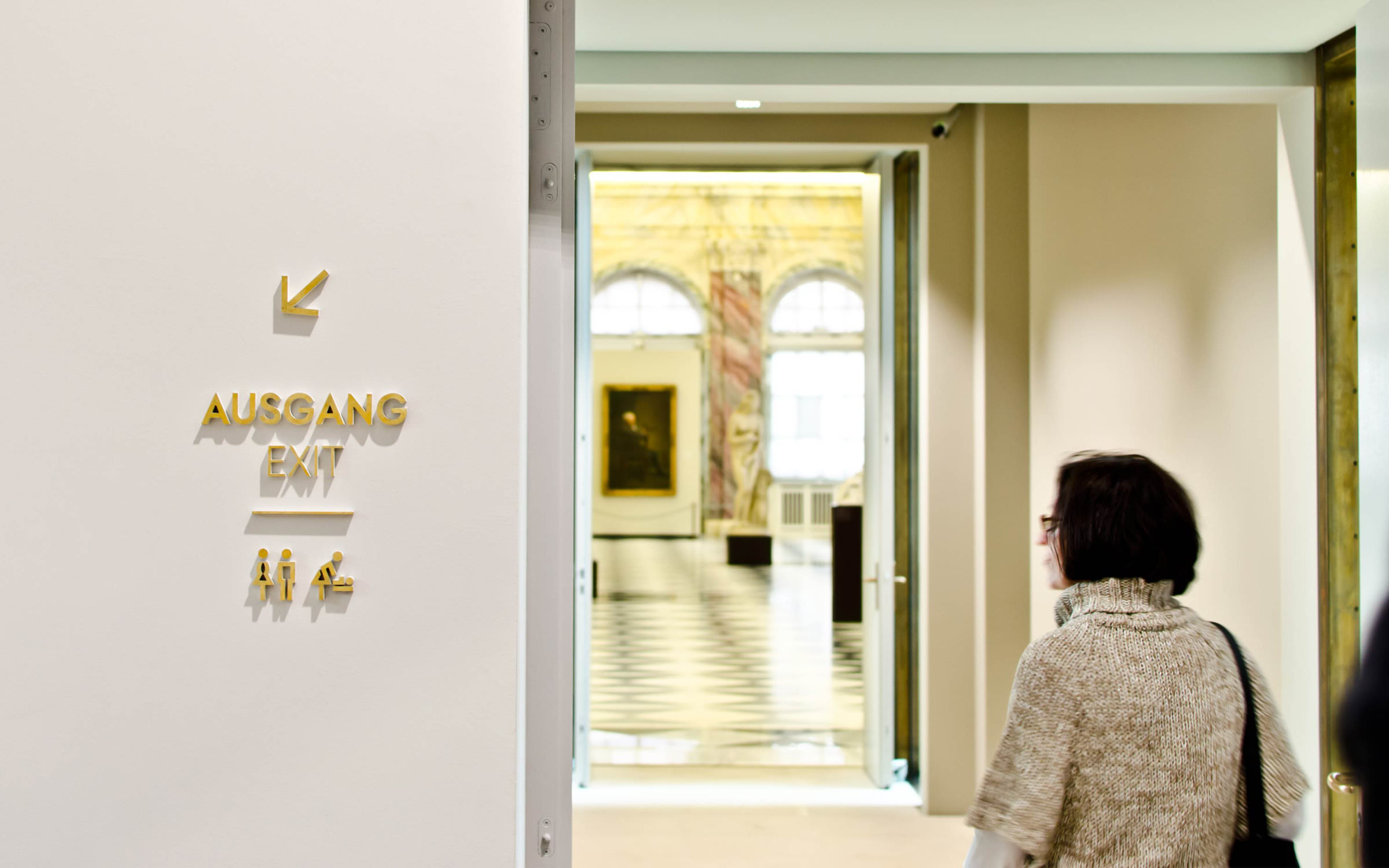
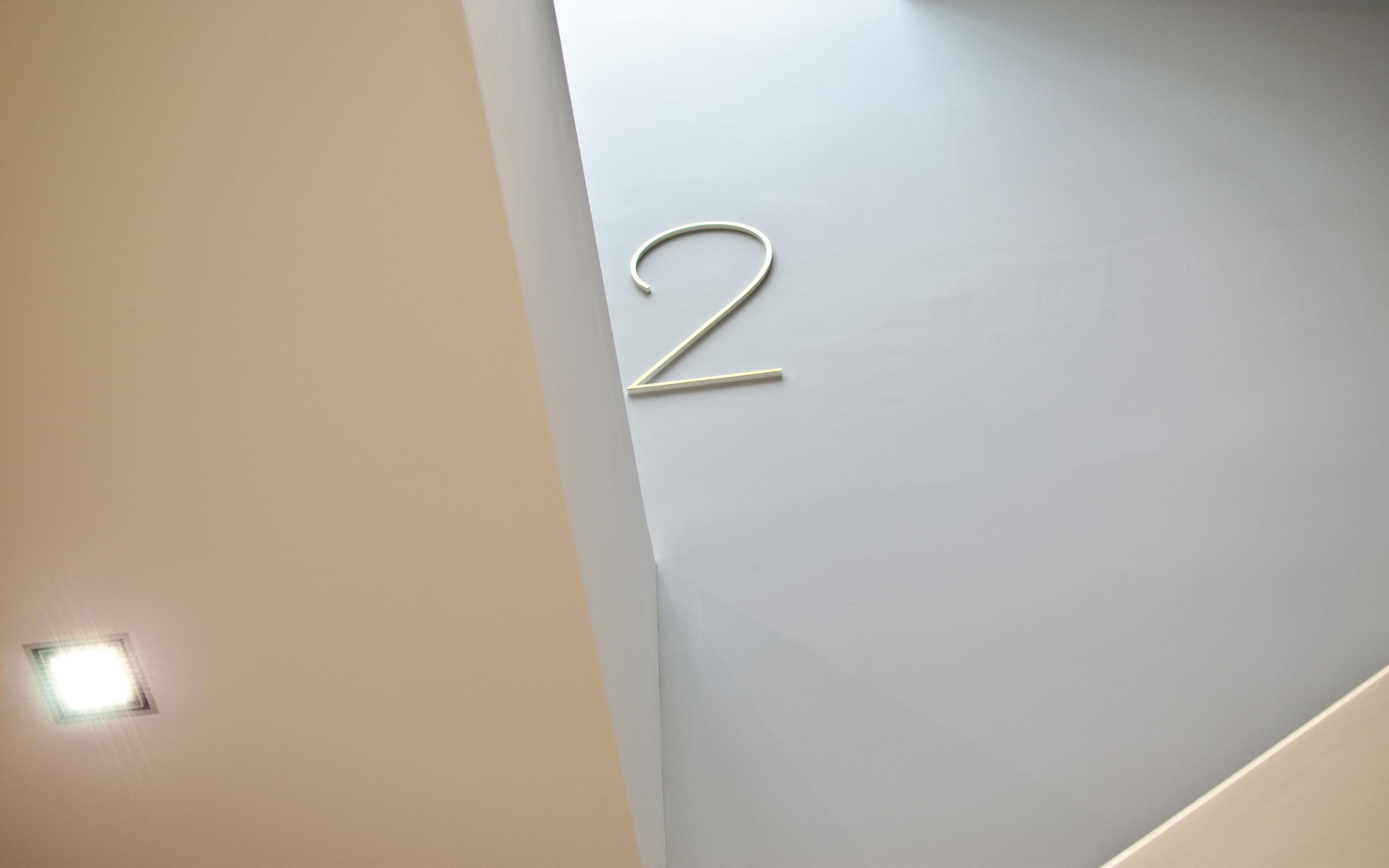
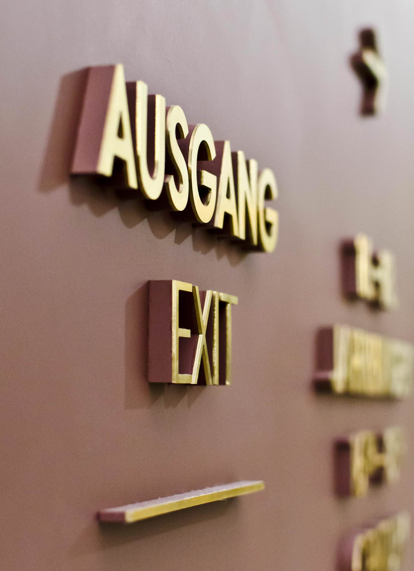
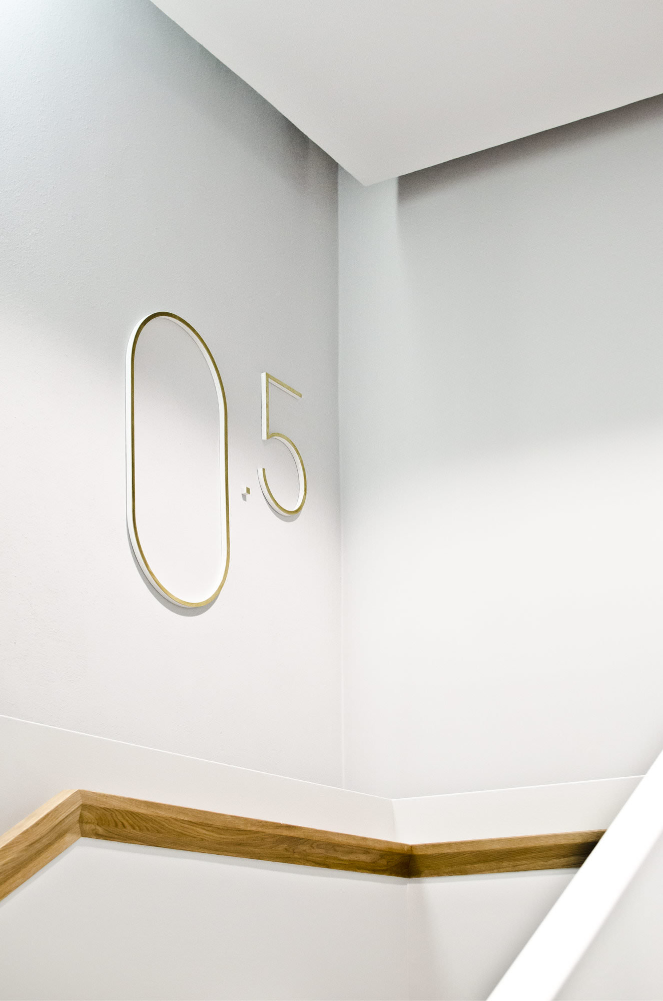
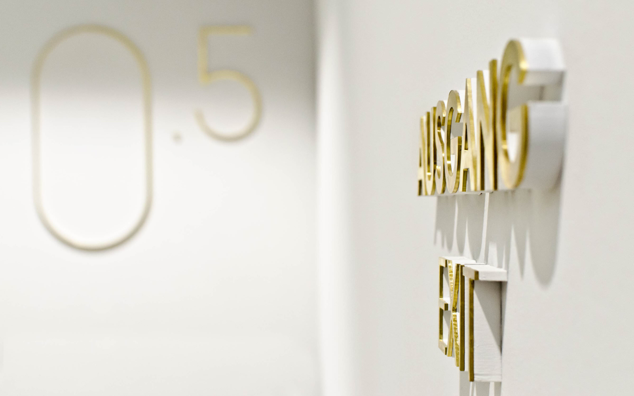
Their sculptural wall lettering fits into the architecture functionally and stylistically without historicizing it. Instead, it reflects the high reputation of the picture gallery. Letters, floor plans, arrows and pictograms are 10 mm deep and pick up the colour of the wall. The visible surface is made of 2 mm thin brushed brass, a nod to the color and materials of the surrounding architectural elements.
The typeface was designed by Daniel Perraudin especially for this project, which started back in 2013. Stylistically, he opted for a geometric sans with classic proportions, whose individuality is thanks to a clever magic formula: There is no repetition of visually similar shapes in the letters.
In the museum, capital letters are used almost exclusively, center justified, which corresponds to the typographical conventions of the Baroque period. A real eye-catcher are the oversized floor figures in Hairline: unmissable and yet restrained.
Before publishing under the name West, Perraudin expanded and developed the family enormously. The three original styles became nine (from Hairline to Black), in addition lowercase letters and special characters were added (in total 750 glyphs per font) as well as italics. And so, the West family consists of 18 luxuriously equipped styles, including arrows, ligatures, wonderful alternative forms (for example the uppercase Q); it also includes pictograms for wayfinding systems.
With its combination of conciseness and pragmatism West proves itself as a contemporary geometric sans, whose graphic roots lie in the classical modernism. A highly successful new interpretation.