The typeface Turbine in use for the visual identity and screen design of the b-good health brand.

35 years of health expertise

Founded in Istanbul in 1987, Çapa Medical developed into one of the largest wholesalers and suppliers of medical consumables in Turkey during its first 25 years. In 2015, Çapa accelerated its growth through its subsidiary Honnes which produces bandages, disinfectants and protective clothing. T
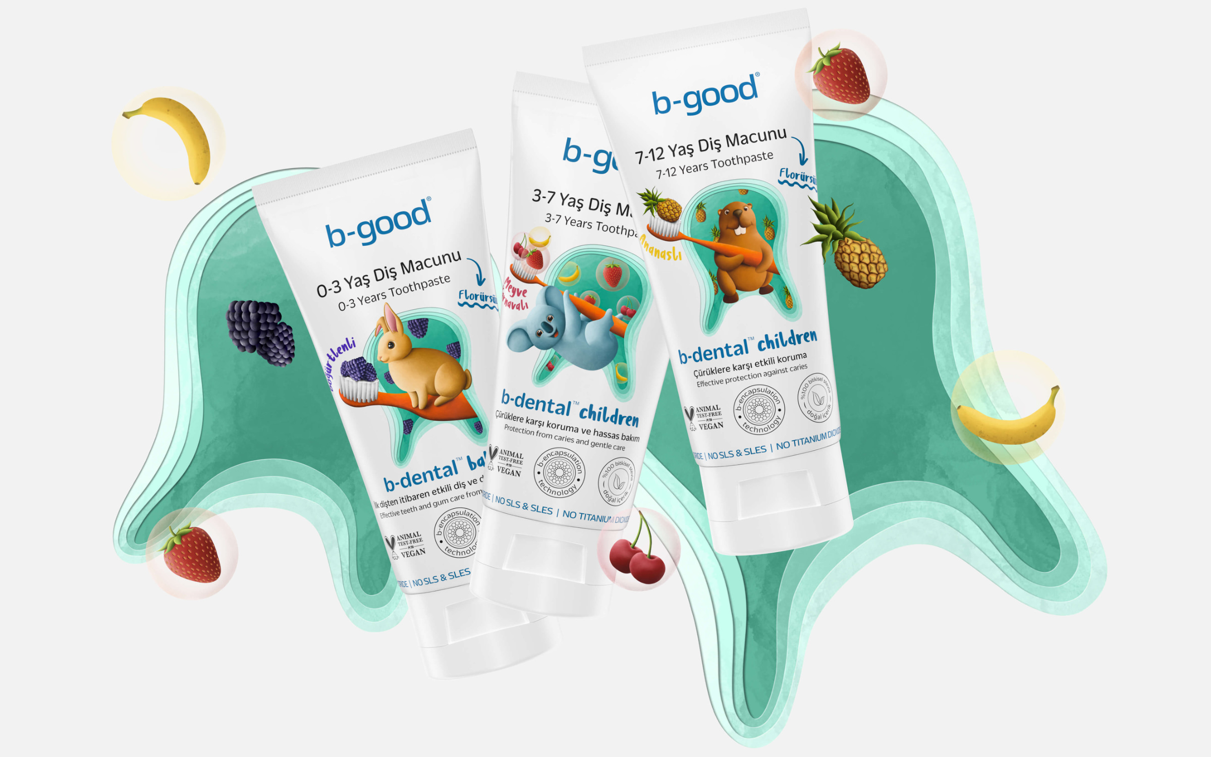
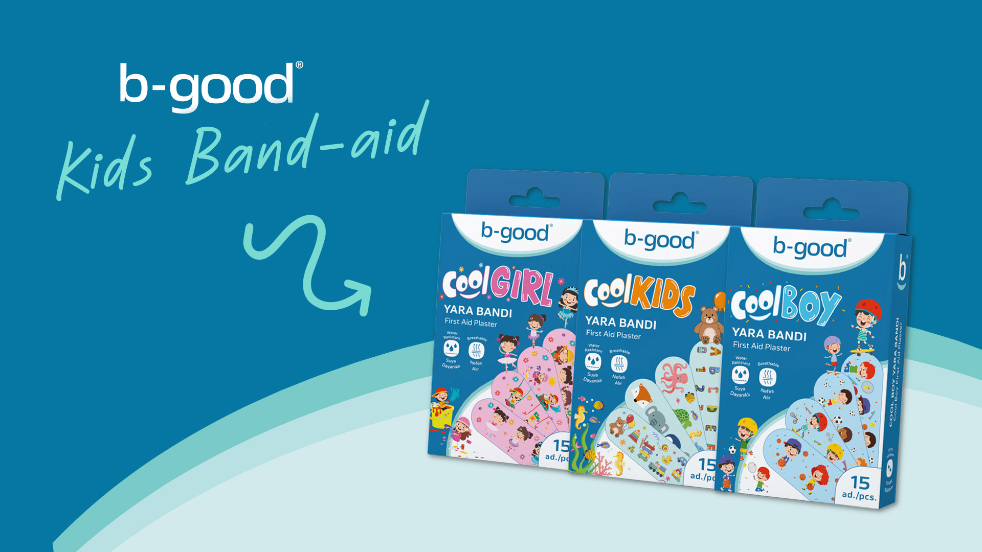
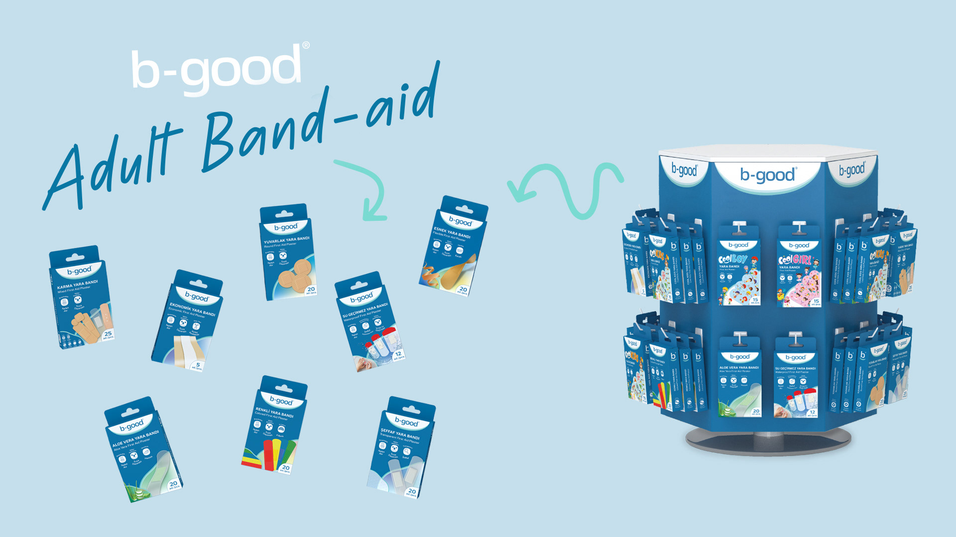
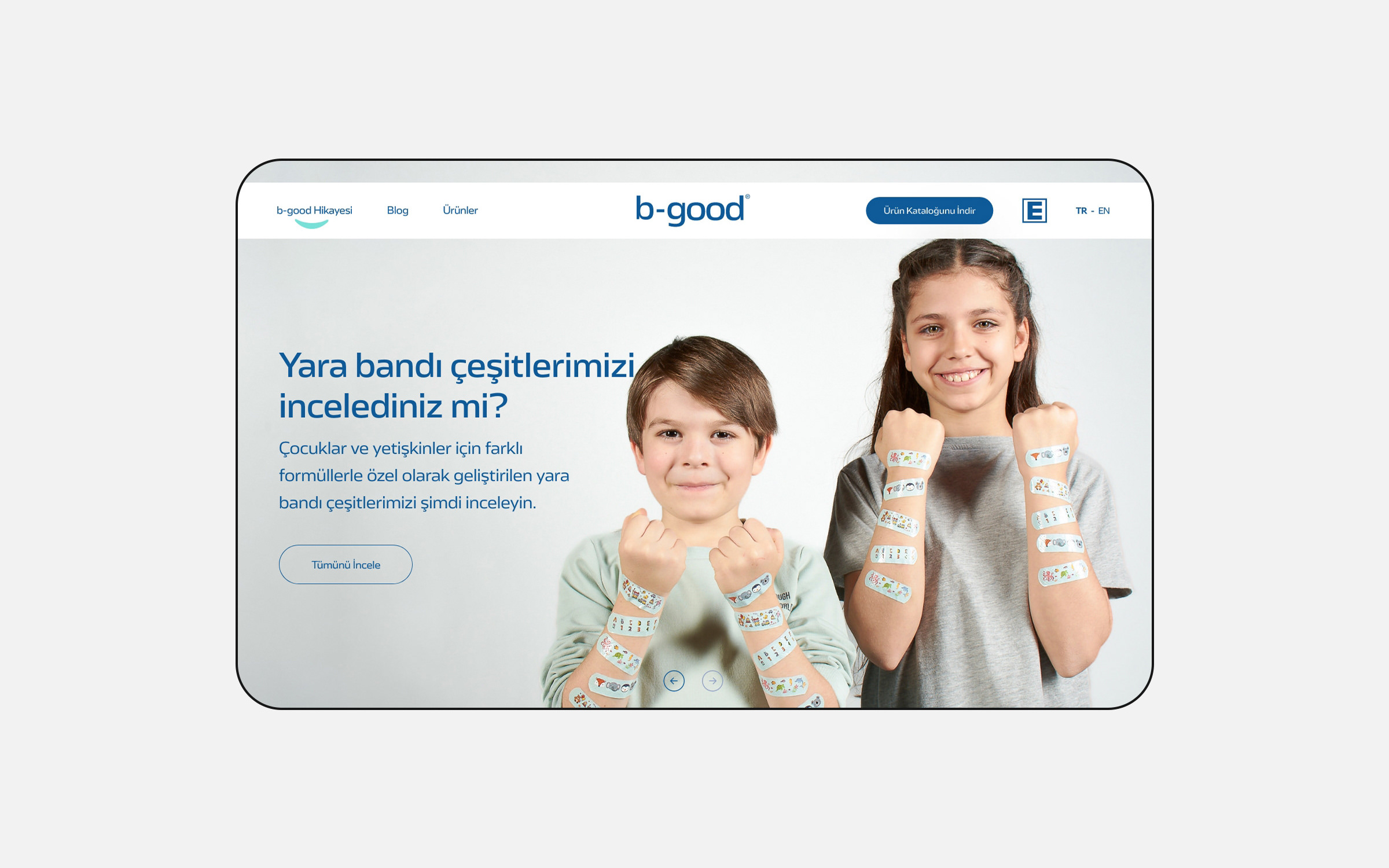
welve months later, Honnes launched the consumer brand b-good and entered the B2C business for the first time with a wide range of plasters and bandages.

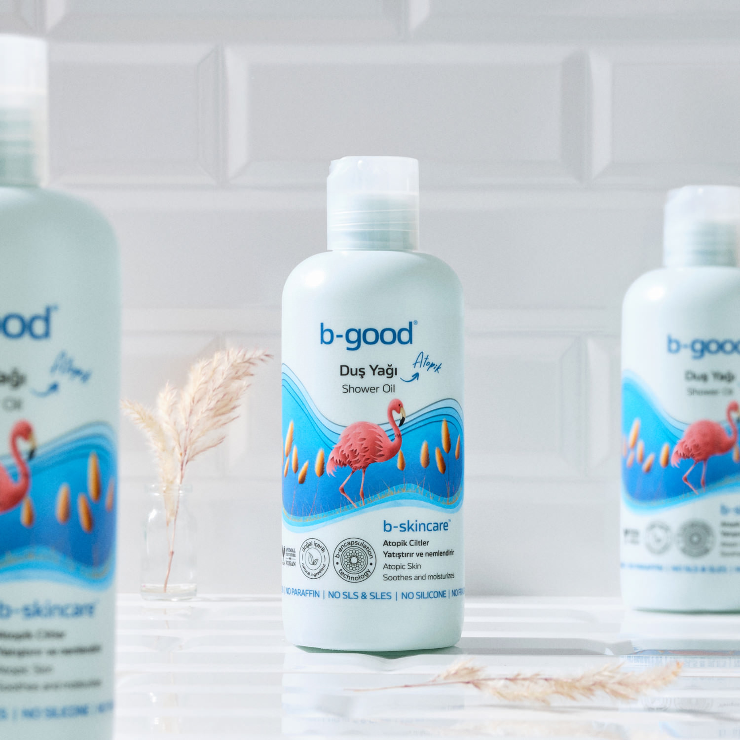
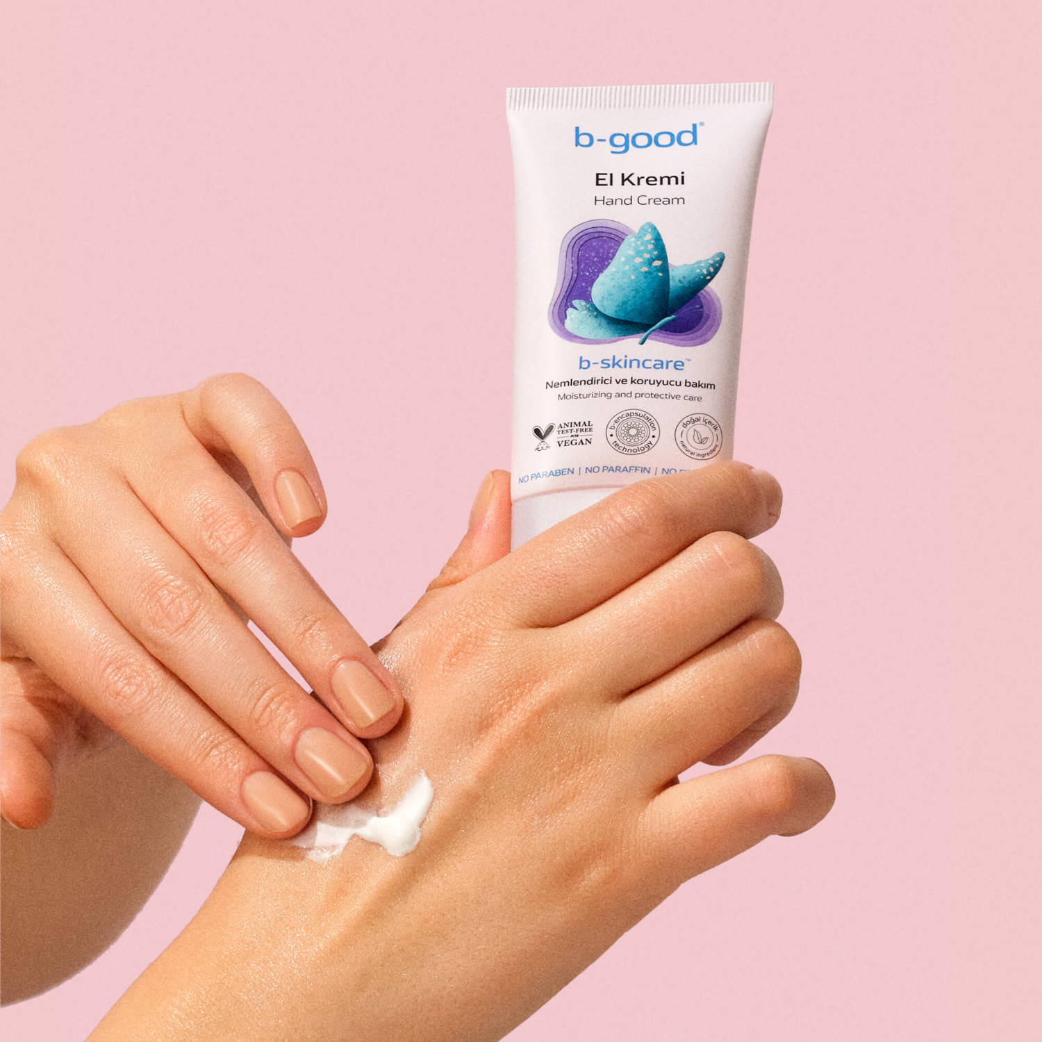
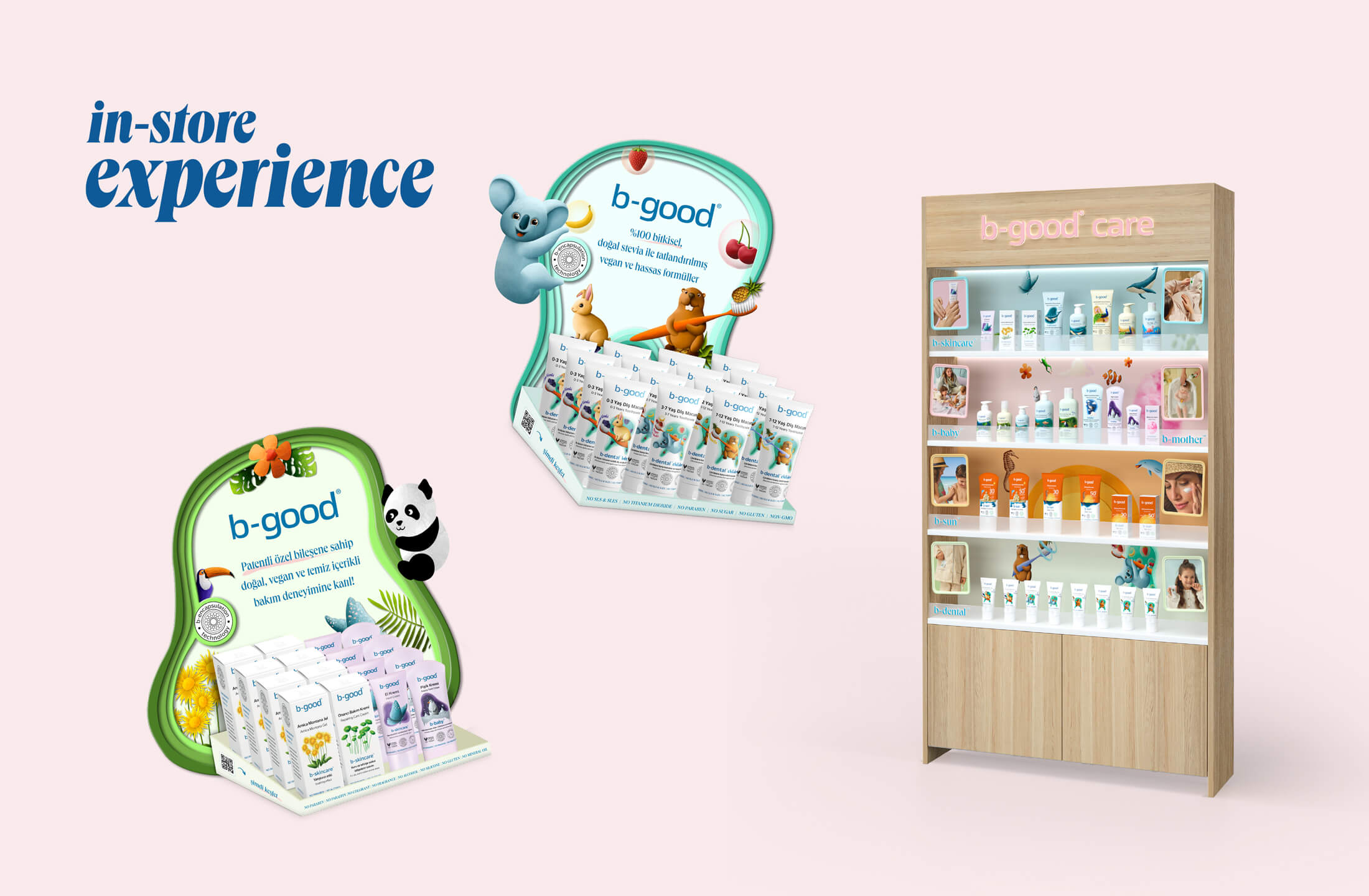
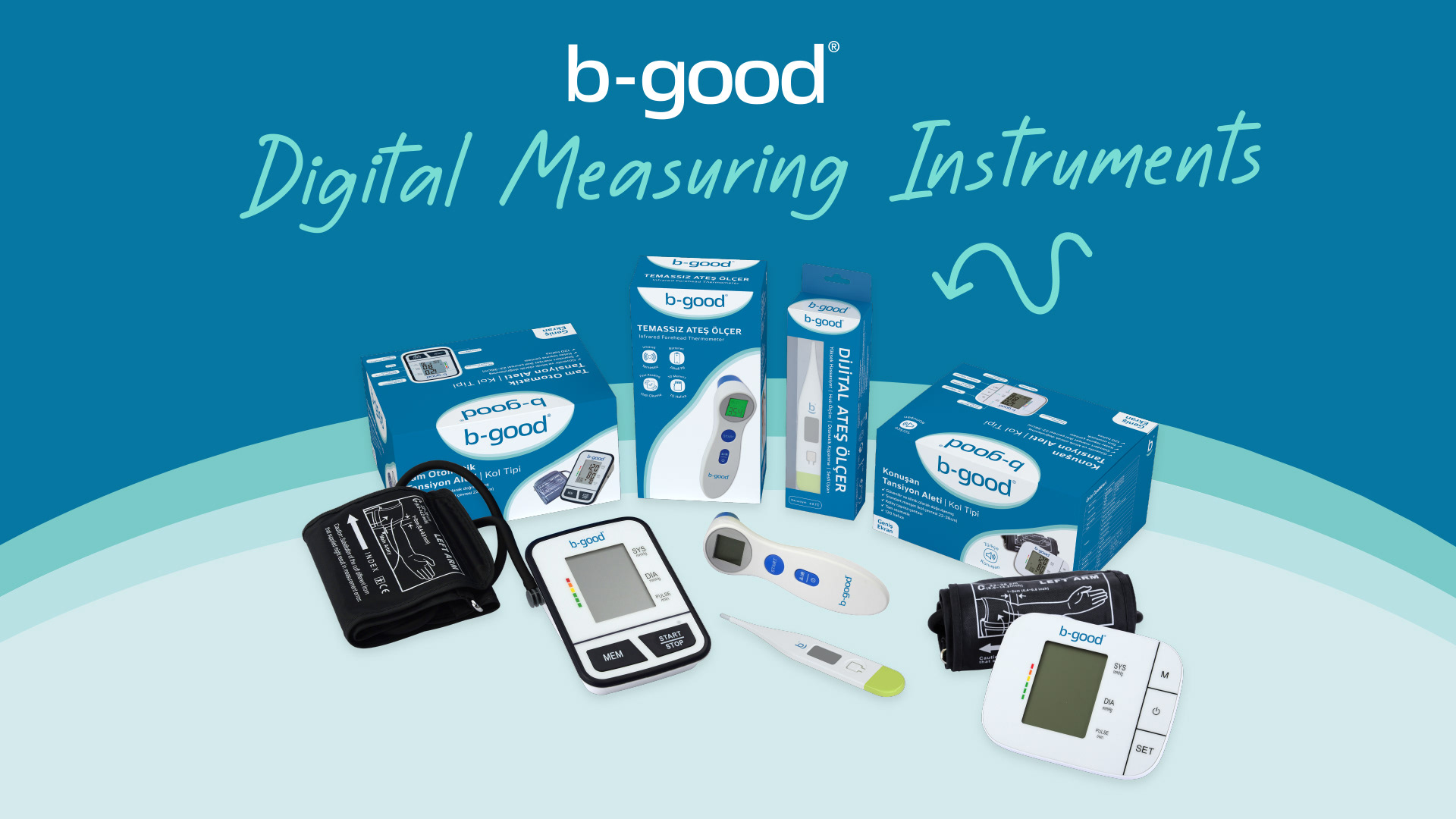
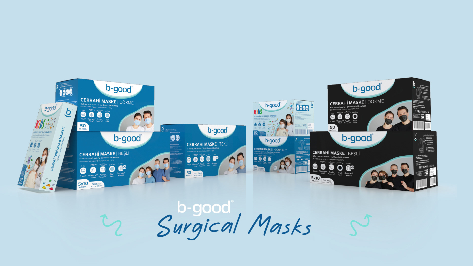
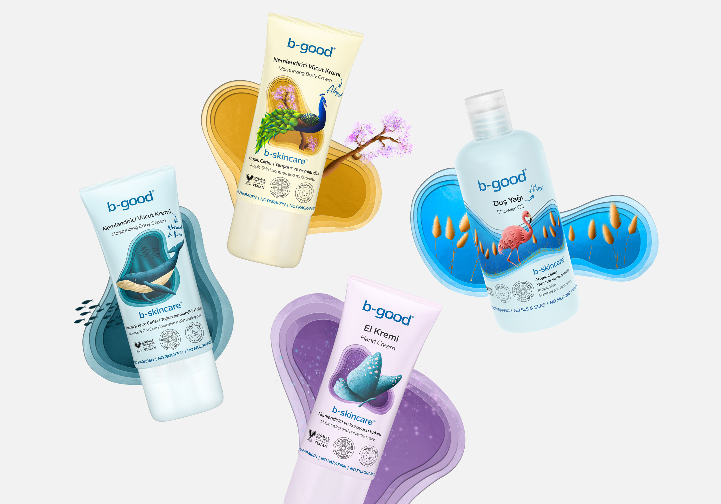
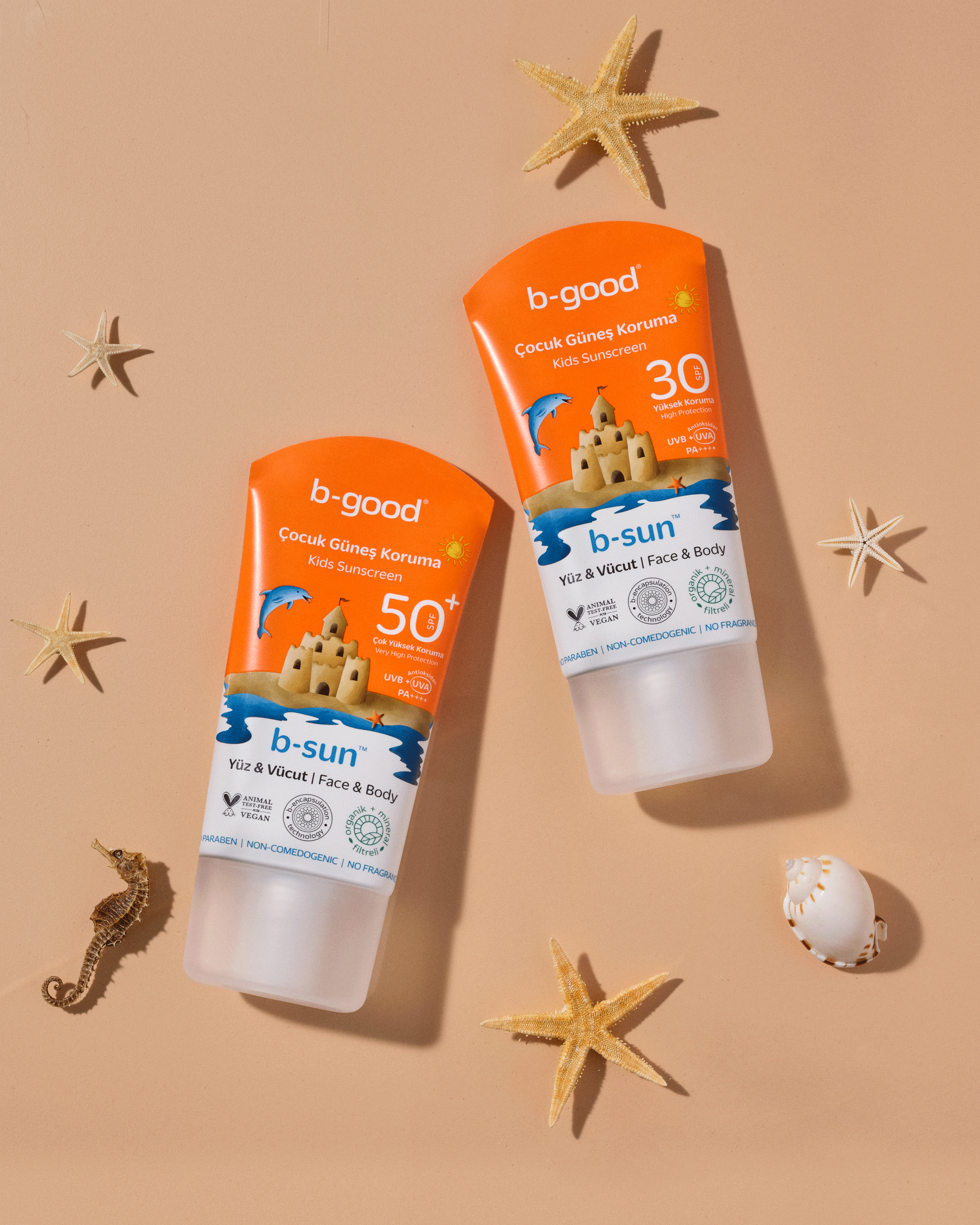
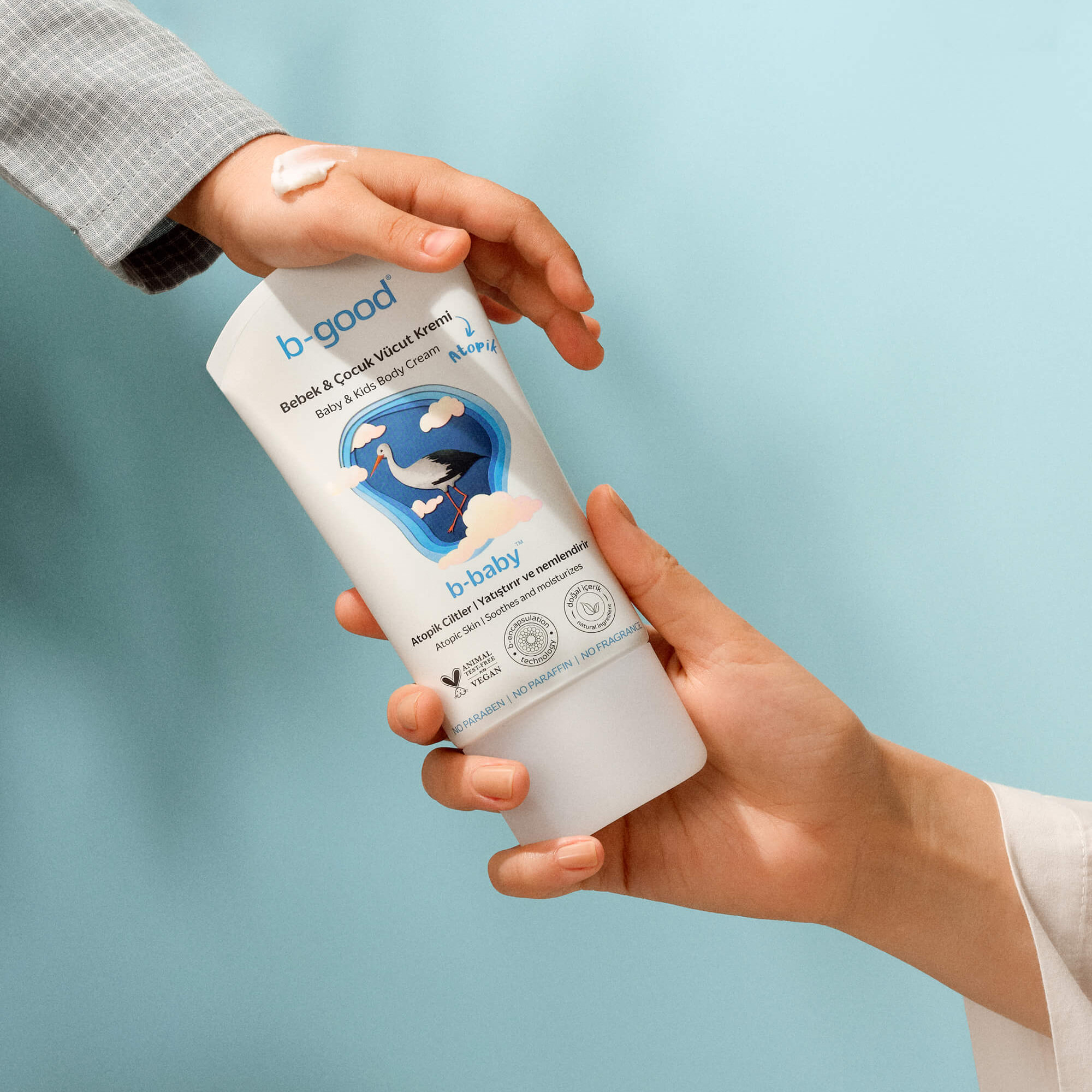
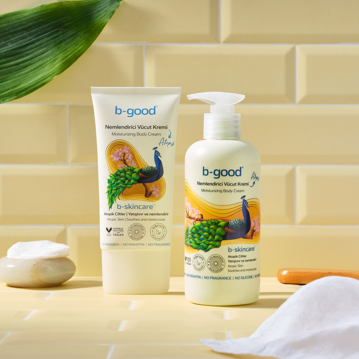
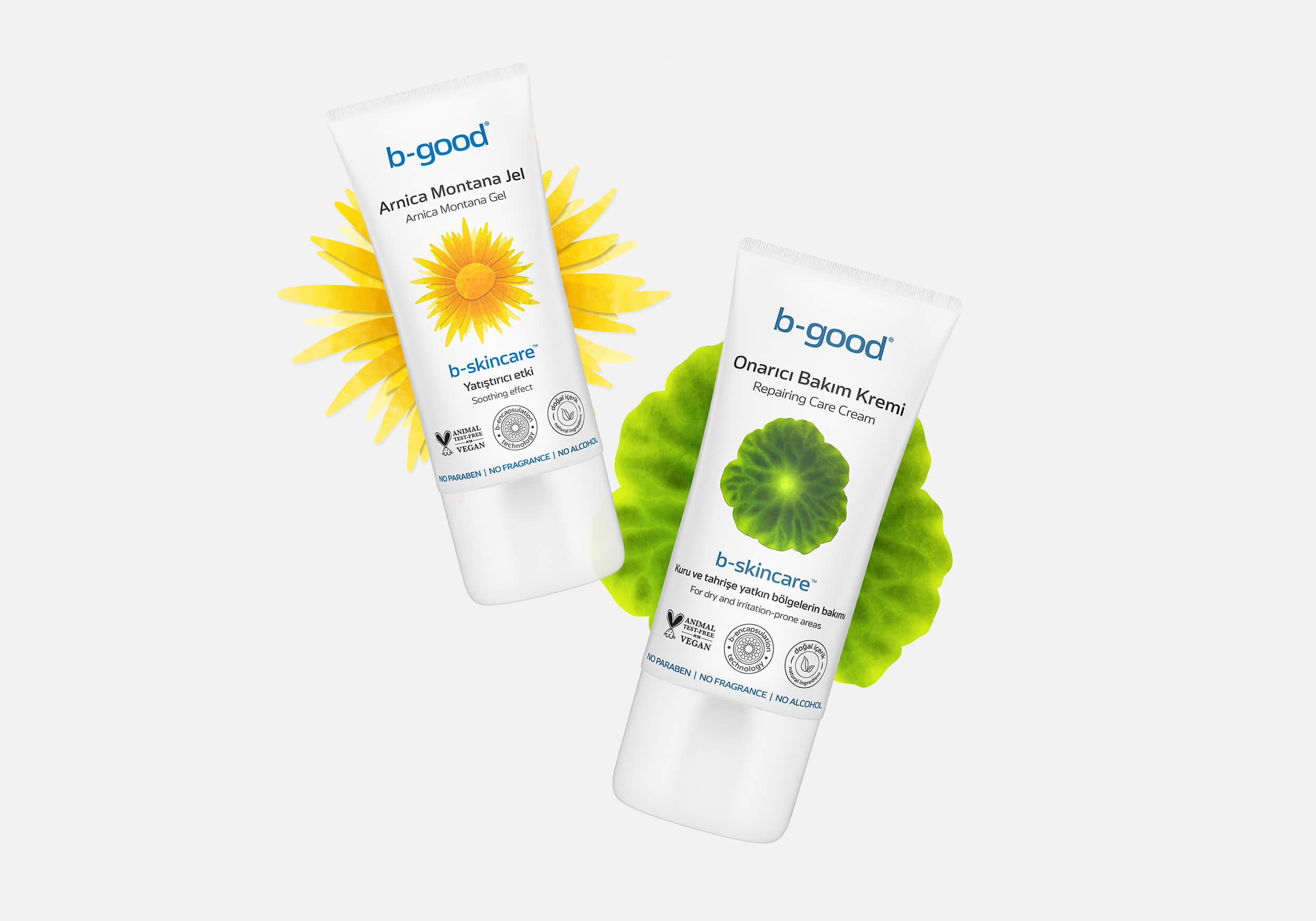
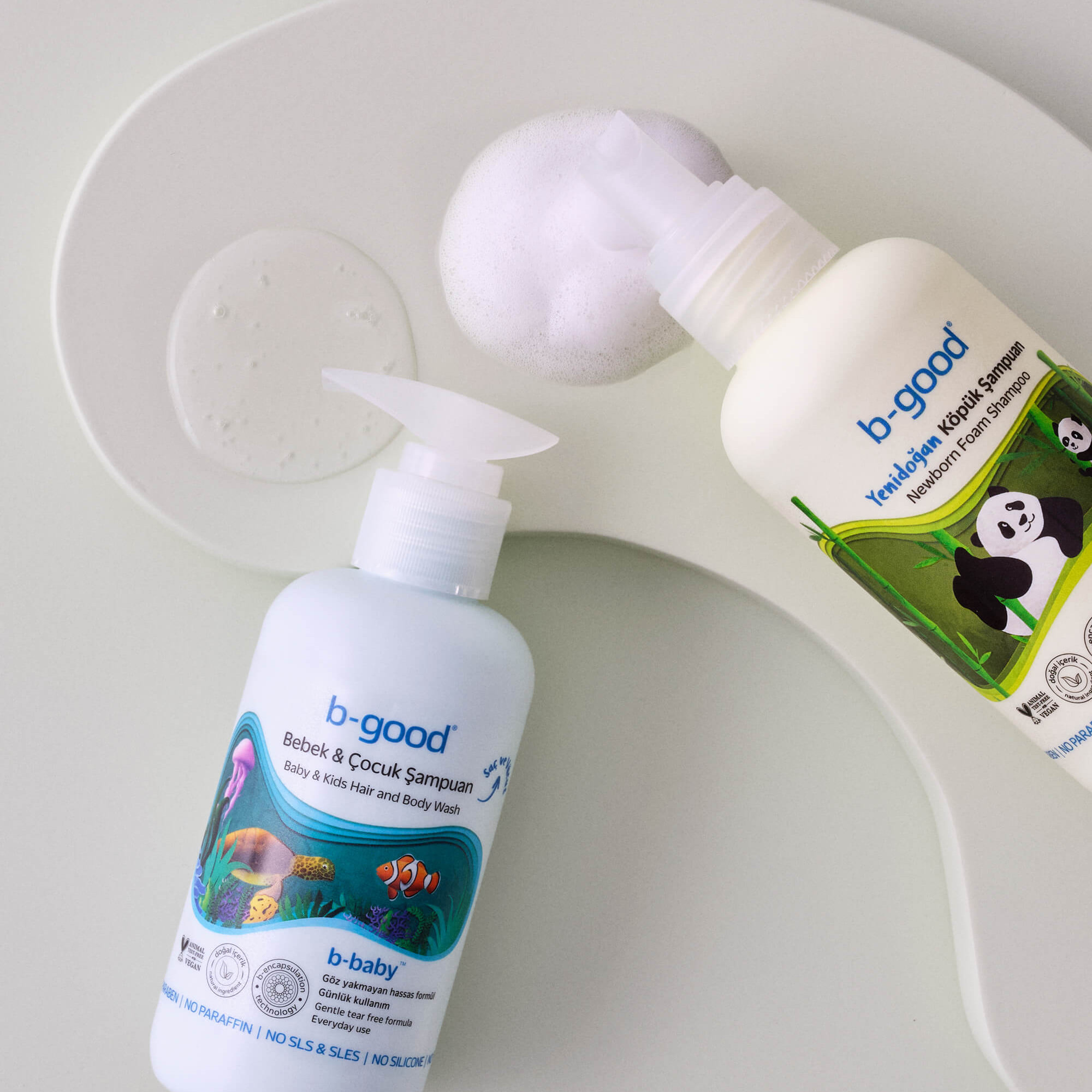
b-good sales multiplied during the Corona pandemic through the sale of disinfectants, gloves and face coverings and they expanded into 12,000 pharmacies in 50 countries. In 2022, this was followed by their entry into the manufacture and sale of cosmetic products with the launch of their sister brand b-good care. b-good sets itself apart from the competition by using high-quality, harmless ingredients and do not test their products on animals. The b-encapsulation process patented by Honnes is designed to enhance the effectiveness of the mostly plant-based ingredients.

The typeface Turbine in use for the visual identity and packaging design of the b-good health brand.
The typeface Turbine in use for the visual identity of the b-good health brand.

On the left: the b-good logo; On the right: the b-good word mark—both set in Turbine.

The typeface Turbine in use for the visual identity and packaging design of the b-good health brand.

With the evolution from B2B to B2C business, a revamp and revision of b-good’s visual identity became necessary. For this, the brand could find no better partner than the design studio Just Design FX, whose desks are located in a coworking area of the Meydan shopping mall, in the hip district of Ümraniye on the Asian side of Istanbul.

Agency Founder and Creative Director, Merve Gülay chose the Neo-Grotesque, Turbine by Felix Braden, as her house font. Its superelliptical curves (a mixture of ellipse and rectangle, also known as Lamé curve), broad proportions, minimal contrast and tight spacing guarantees a serious appearance with a high recognition value. Gülay explained her choice of typeface:

“The fact that Turbine can be used in both B2B and B2C, is easy to read and has a clean and modern aesthetic made me choose it.”

Merve Gülay, Agency Founder and Creative Director

Turbine’s fantastic language support, which includes Eastern European glyphs and many currency characters, makes it an excellent fit for international brands like b-good. Alongside Turbine, the other brand fonts include the Queens typeface by Sebastian Losch (Kilotype) which is used on the website and social media channels, the Pink Chicken script font by Gitayogi Irhandi (Scratch Design), which is used in the webshop and on the packaging and Duplicate Soft by Miguel Reyes (Commercial Type) on the packaging. All four font styles work together in harmony to create a strong and memorable brand identity.

Try Turbine

The typeface Turbine in use for the visual identity of the b-good health brand.

During the pandemic, the b-good medical brand developed into a broad-based cosmetics brand.

The typefaces Turbine and Queens in use for the visual identity and packaging design of the b-good health brand.

The products of b-good medical are sold exclusively through pharmacies; the cosmetic series of b-good care can be found in drugstores and supermarkets. (Additional serif typeface: Kilotype’s Queens)

The typefaces Turbine, Duplicate Soft and Pink Chicken in use for the visual identity and packaging design of the b-good health brand.

Alongside Turbine, the other packaging fonts include the Pink Chicken script font by Scratch Design and Duplicate Soft by Commercial Type.

The typeface Turbine in use for the visual identity and screen design of the b-good health brand.
The typefaces Turbine and Pink Chicken in use for the visual identity and packaging design of the b-good health brand.

Turbine and the Pink Chicken typeface

The typefaces Turbine and Pink Chicken in use for the visual identity and packaging design of the b-good health brand.
The typeface Turbine in use for the visual identity and packaging design of the b-good health brand.
The typefaces Turbine and Pink Chicken in use for the visual identity and packaging design of the b-good health brand.

Body cream, hand cream and shower oil from b-good, whose ingredients are activated with the patented b-encapsulation technology.

The typefaces Turbine and Duplicate Soft in use for the visual identity and packaging design of the b-good health brand.

Turbine and Duplicate Soft

The typefaces Turbine, Duplicate Soft and Pink Chicken in use for the visual identity and packaging design of the b-good health brand.

Turbine and Duplicate Soft

The typefaces Turbine and Pink Chicken in use for the visual identity and packaging design of the b-good health brand.

Often, solely Turbine is used on the packaging.

The typeface Turbine in use for the visual identity and packaging design of the b-good health brand.

The typefaces Turbine, Duplicate Soft and Pink Chicken in use for the visual identity and packaging design of the b-good health brand.

Alongside Turbine, the Pink Chicken script font by Gitayogi Irhandi (Scratch Design) and Duplicate Soft by Miguel Reyes (Commercial Type) are used on the packaging.