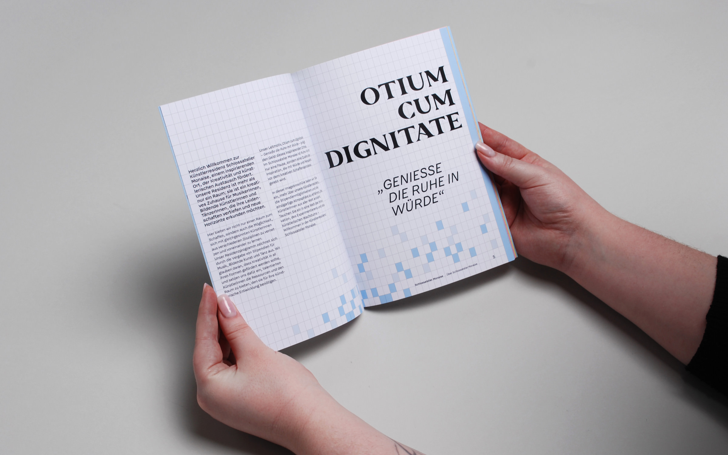
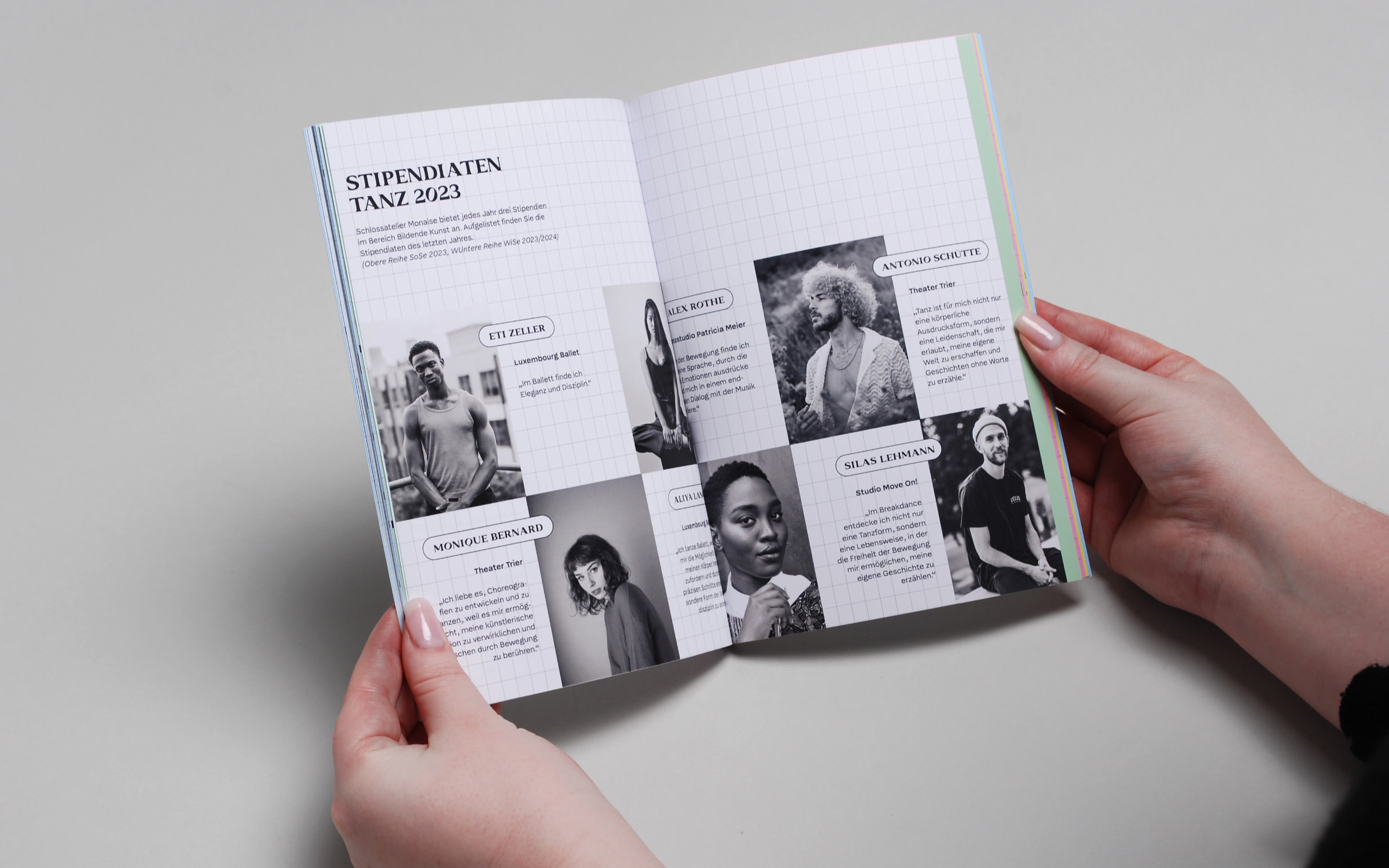
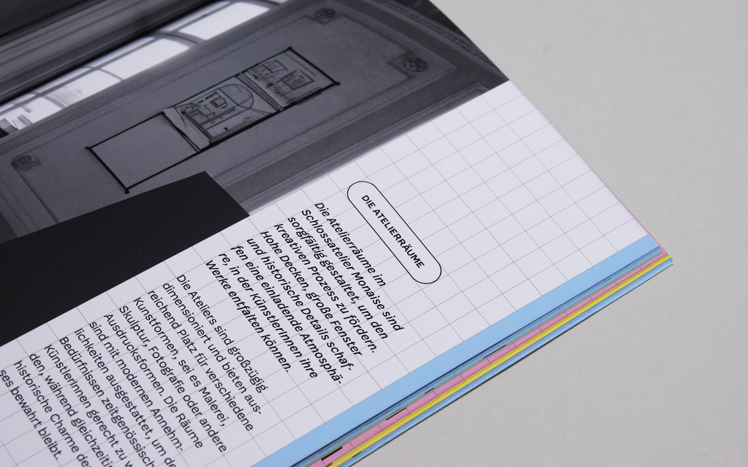
For designer Luca Marie Julien, the neutral, well-constructed typeface McQueen Grotesk was the perfect complement to her own font family Monaise.

Liberté + égalité + fraternité = Font idea

What could be better than developing a corporate design project without a client and with complete freedom to do what you want? The Designer and Type Designer Luca Marie Julien had this opportunity during her Bachelor’s semester at Trier University of Applied Sciences. The city is a cultural metropolis, but what it lacks is an artist residency. So, she invented one.

She chose Monaise Castle, a small chateau on the Moselle, as the hub of her fictional project. The basic idea: the imaginary “Schlossatelier Monaise” awards scholarships to young artists from the fields of music, dance and visual arts. “To match the architecture, I developed an exclusive typeface with three styles for the three disciplines. An inscription on the façade of the castle provided the inspiration for the Monaise font family which consists of three variants: Harmonia, Forma and Dynamica,” says Luca Marie Julien.

For designer Luca Marie Julien, the neutral, well-constructed typeface McQueen Grotesk was the perfect complement to her own font family Monaise.

While the classical Harmonia represents the music department, the lively styles of Dynamica represent dance and the straightforward Forma represents the fine arts. The student used these typefaces to develop 11 different use cases for the three departments as part of her Bachelor’s thesis.

For designer Luca Marie Julien, the neutral, well-constructed typeface McQueen Grotesk was the perfect complement to her own font family Monaise.

“I chose McQueen Grotesk from Fontwerk as the body text font because it looks friendly and inviting, is easy to read and offers an extensive character set.” The latter was particularly important to Luca Marie, as Trier has been a partner city of the multilingual city network QuattroPole since 2000, together with Luxembourg, Metz and Saarbrücken.

She also wanted to ensure that the text typeface radiated modernity and was a contrast to the neoclassical Monaise Pro.

“McQueen Grotesk is rather restrained, which was important to me as my display font is very showy.”

Luca Marie Julien

“McQueen Grotesk is rather restrained, which was important to me as my display font is very showy,” explains Luca Marie Julien. She was also impressed by the 18 font styles, which make it much easier to design the various marketing collateral and materials.

The Fontwerk licensing policy may also have contributed to her choice, as students can download each family for a flat rate of €50 (plus VAT).

Try McQueen Grotesk

For designer Luca Marie Julien, the neutral, well-constructed typeface McQueen Grotesk was the perfect complement to her own font family Monaise.

Three departments, three display fonts (from left to right): Monaise Harmonia, Forma and Dynamica, created by designer Luca Marie Julien

For designer Luca Marie Julien, the neutral, well-constructed typeface McQueen Grotesk was the perfect complement to her own font family Monaise.

For corporate designer Luca Marie Julien, the neutral, well-constructed McQueen Grotesk was the perfect complement to her own font family Monaise.

For designer Luca Marie Julien, the neutral, well-constructed typeface McQueen Grotesk was the perfect complement to her own font family Monaise.

The brochure for the fictitious artist’s residence Schlossatelier Monaise – one of 11 design use cases – is set using the exclusive headline font Monaise Pro and McQueen Grotesk for the body text.

For designer Luca Marie Julien, the neutral, well-constructed typeface McQueen Grotesk was the perfect complement to her own font family Monaise.