aving grown up with the Sikh philosophy, it is one of their core beliefs to “respect the environment and live in harmony with it”. So 5% of every purchase automatically goes to the following charities World Land Trust, Fauna & Flora International, The Wildlife Trusts, Earthjustice and the Soil Association.
MANA
A new benchmark for sustainable fashion
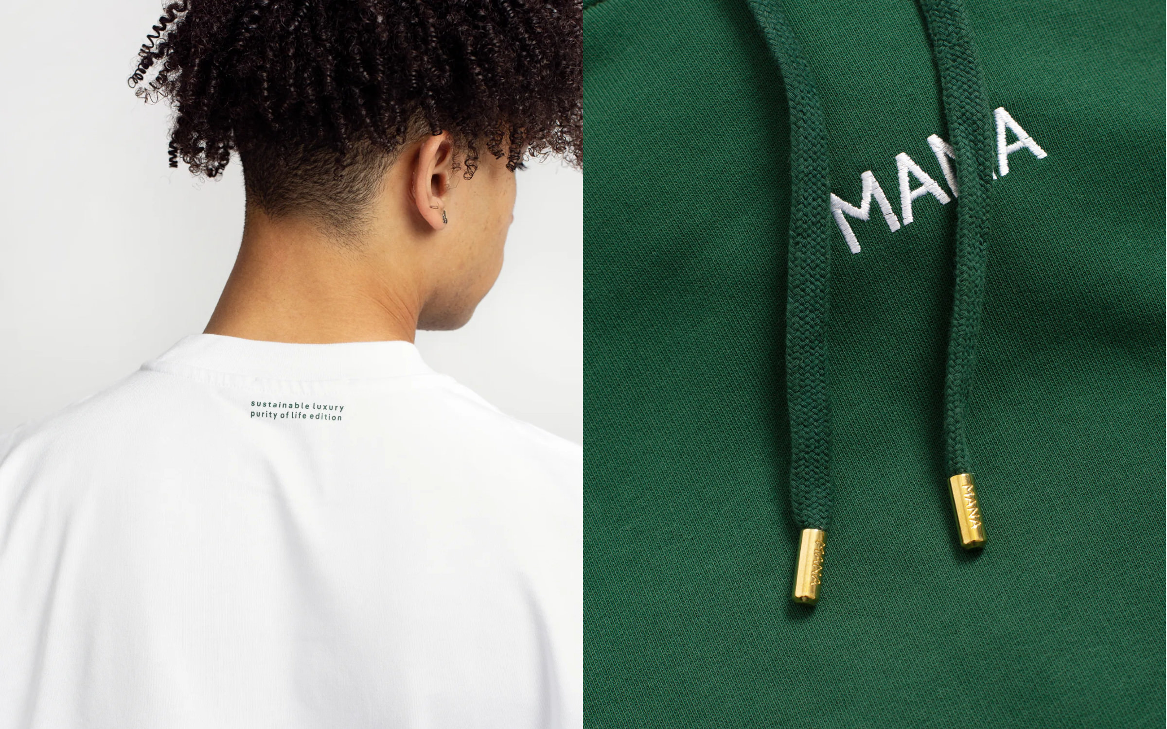
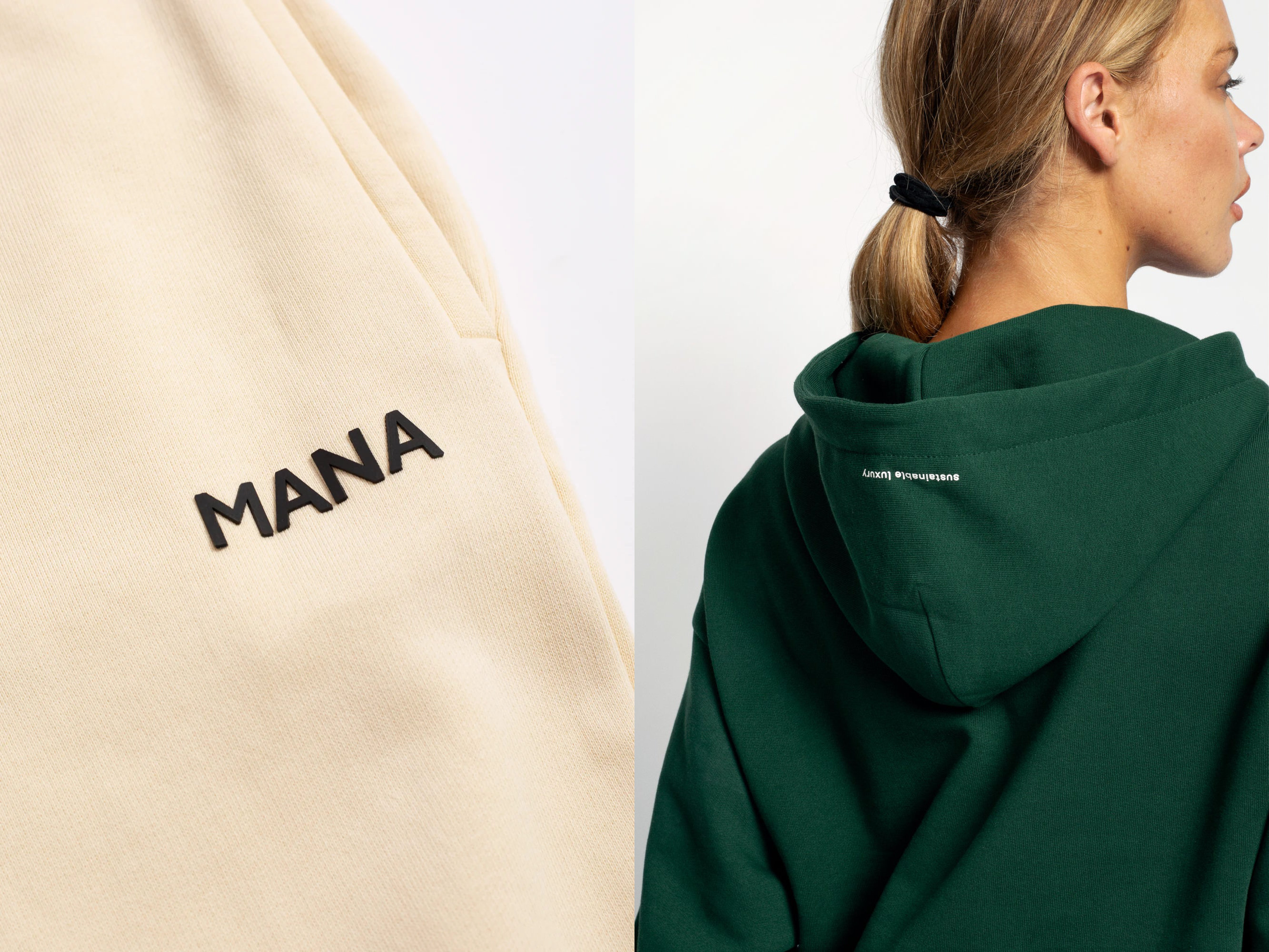
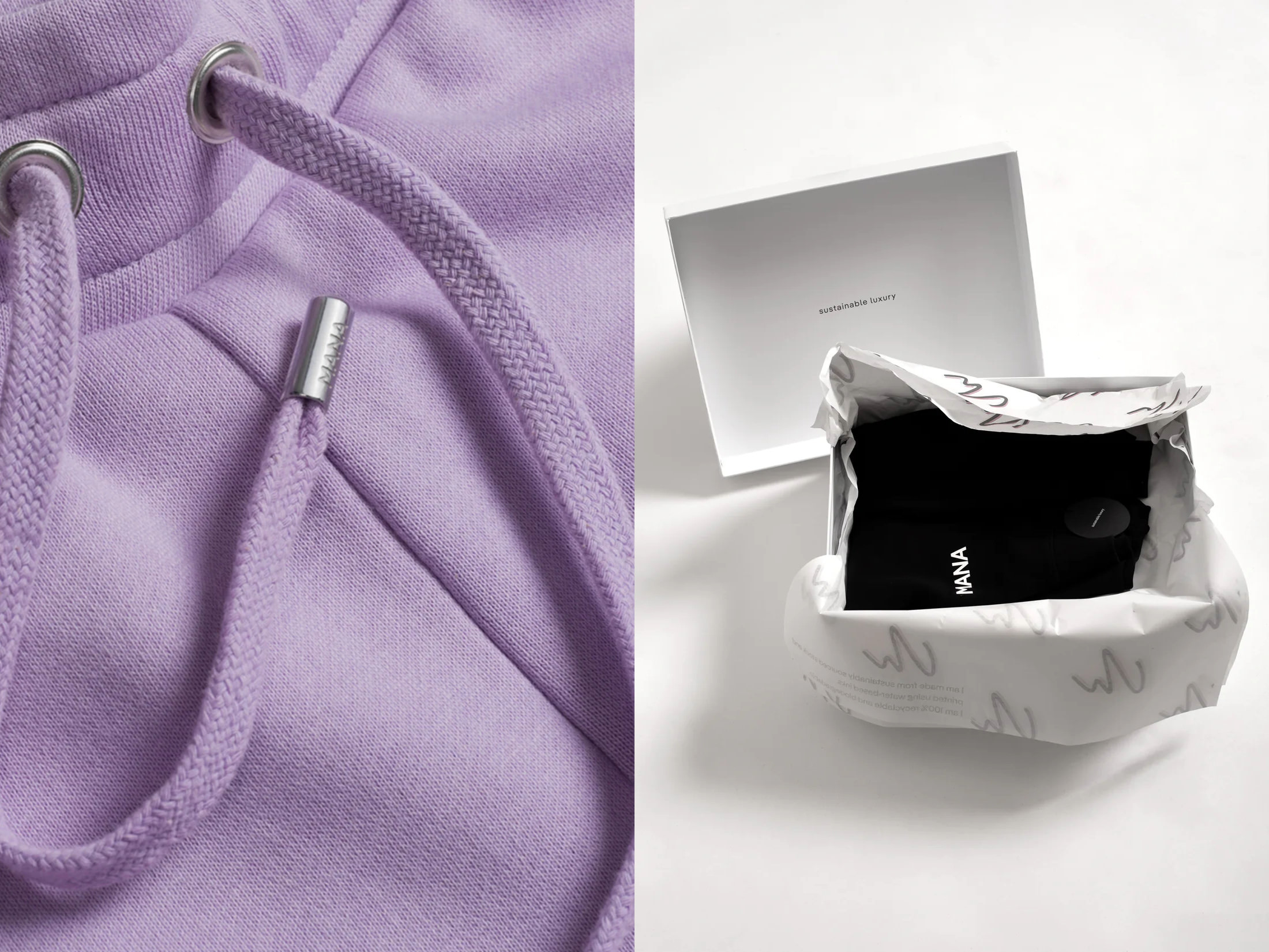
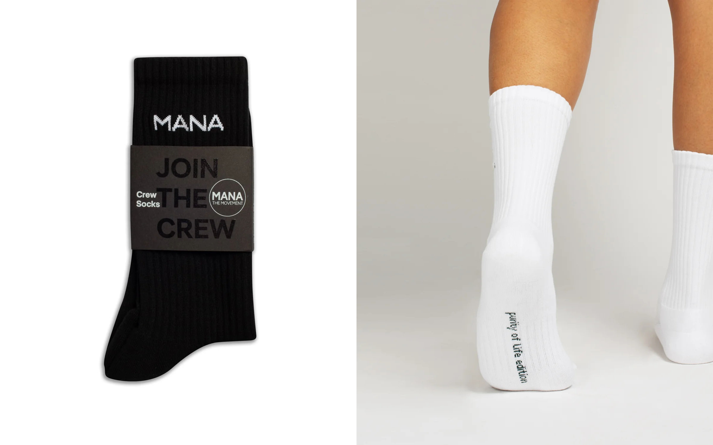
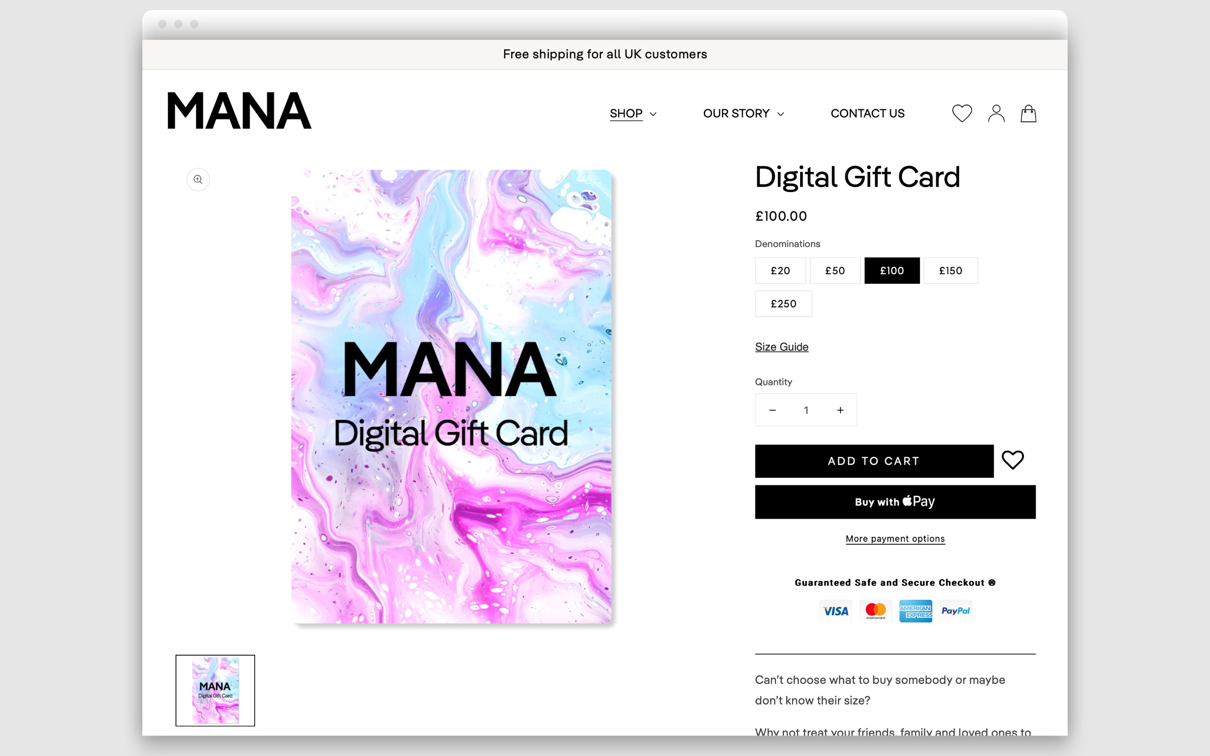
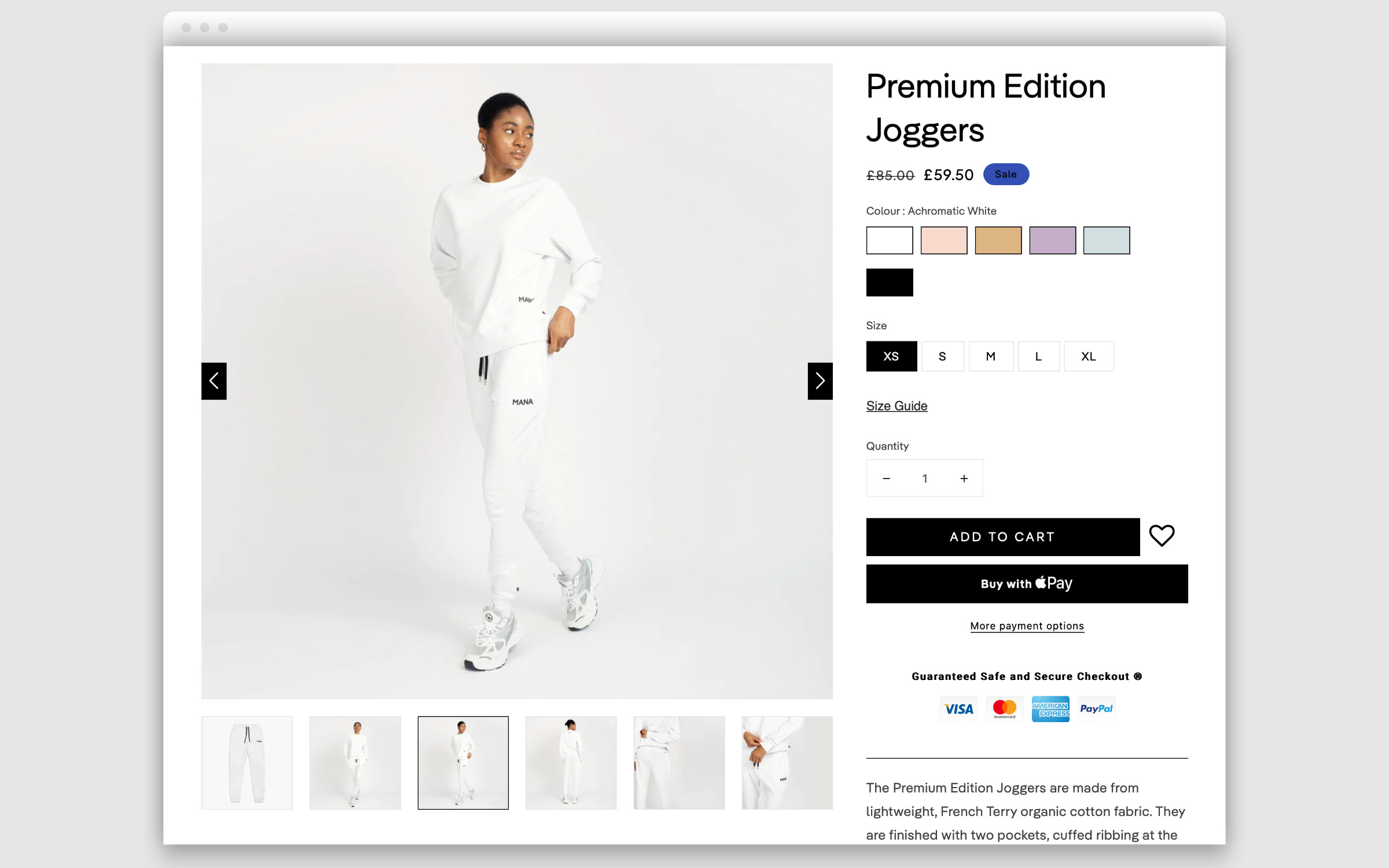
The MANA range is just as minimalist as its corporate design for which Portugal-based digital designer Keara Murphy was responsible: T-shirts, sweatshirts, hoodies and jogging pants – all the basics for eco-conscious consumers who still want to be fashionable. The decision to use the brand’s corporate fonts is just as on trend: Pangea (Regular and SemiBold) and Pangea Text (Light). The Pangea Collection corresponds to both the MANA design taste and its vision for sustainability.
Pangea is the first typeface that has made a contribution to climate protection. Its designer Christoph Koeberlin donates 25% of his income from this typeface towards the preservation of the rainforest and for large-scale reforestation projects involving the local population (including Trees for the Future, The Green Belt Movement, Fairventures Worldwide). To date, over 100,000 trees have been planted and at least 3,000 tons of CO₂ has been offset.

Pangea’s minimalist design also contributes to sustainability. It dispenses with redundant endings, has a space-saving design and with the easy-to-read Light style it is even possible to save on ink, toner or printing ink. These features and many more are the result of wise design decisions Christoph Koeberlin made during the five years he worked on Pangea. He’s expertly managed the balancing act between a narrow grotesque and a geometric sans, which is evident in the large, reader-friendly x-height, the Antiqua-g, the two-storey a and l with foot. If these characters are too extravagant for you, you can use a nifty OpenType function to switch to the simple alternatives of the three letters.
