The typeface Nikolai in use for KARAK, an Austrian manufacturer of traditional Raku ceramic tiles.

The back of each KARAK raku ornament tile is adorned with the company’s tradition and striking logo, a palindrome.

Glowing Love for Craft and Typography

In a former spinning mill surrounded by the Vorarlberg Alps, traditional Raku ceramic tiles are made by KARAK. Raku is a firing technique developed in Japan in the 16th century. The ceramics are pre-fired at 700°C and are made to glow in a highly heated kiln at 1000°C. T
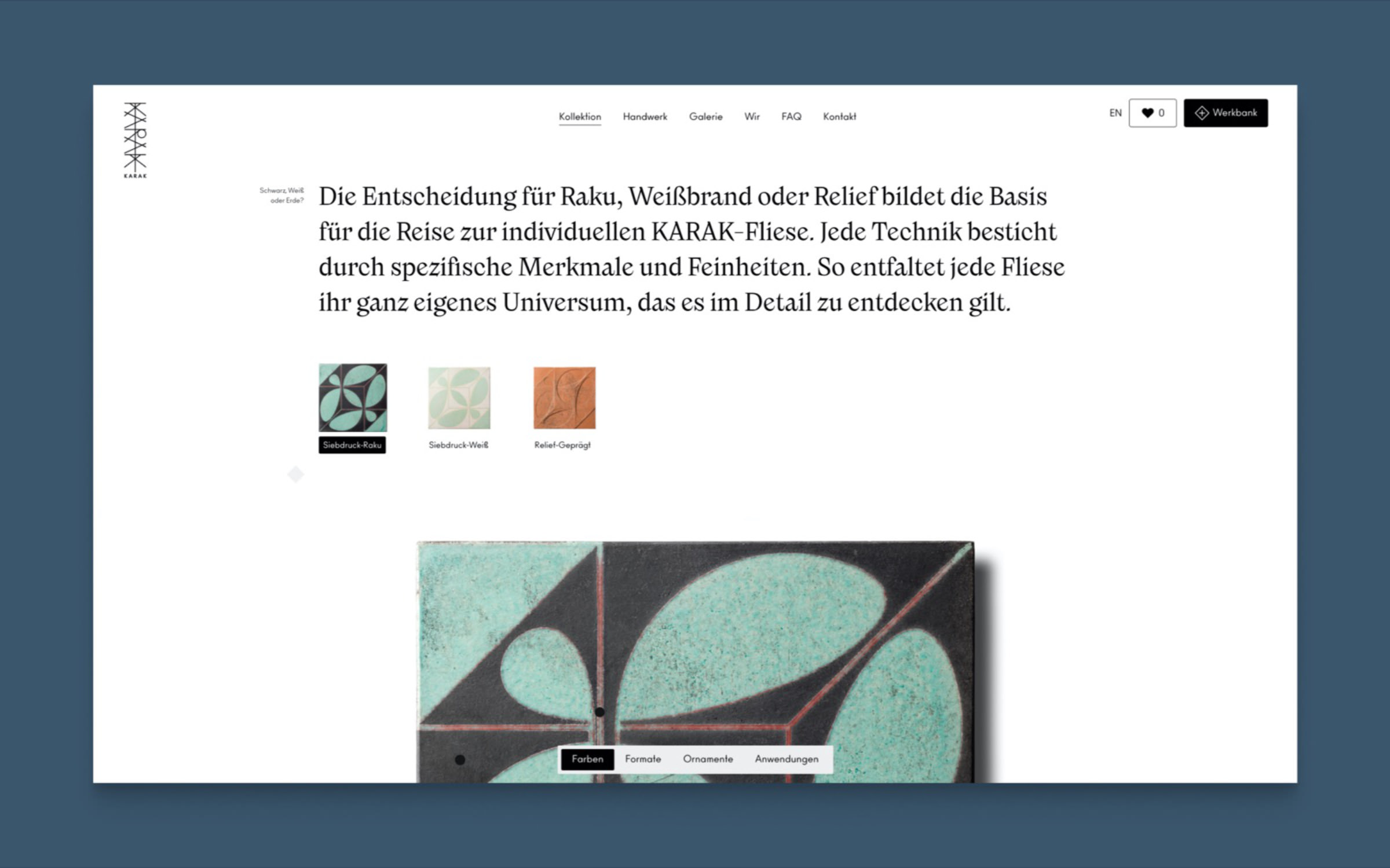
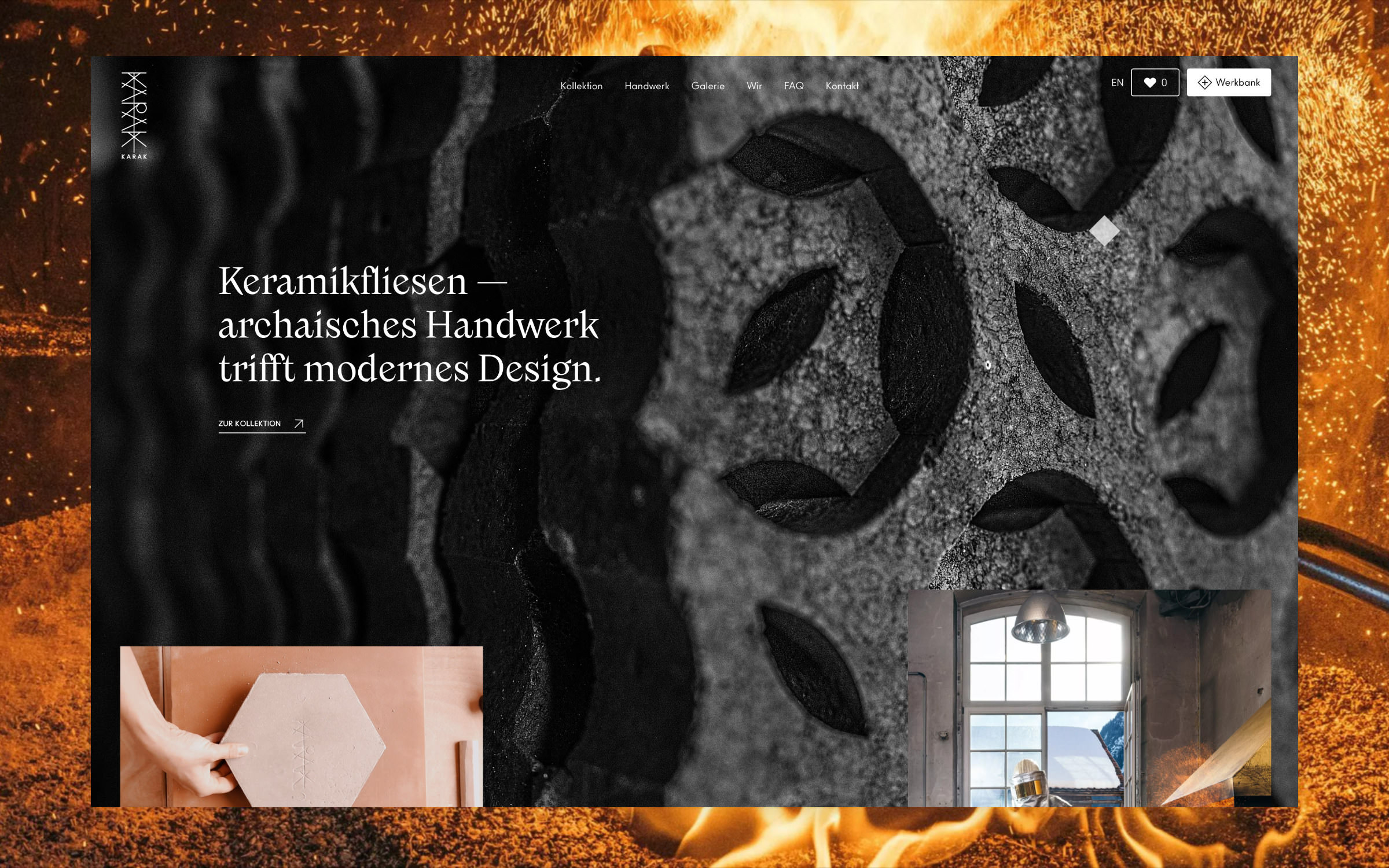
hey are then embedded in a container with leaves, straw or sawdust to form an airtight seal. The resulting smoke, as well as the minerals contained in the organic materials, create patterns on the clay and glaze, making each tile inimitably unique.

Each KARAK tile blank is individually shaped by hand and bears the unmistakable hand-stamped logo on the back. “As a sign of its originality and our conviction that this actually completely crazy manufacturing process is the only true one for us.” emphasizes the tile maker, whose concept was developed in 2007 by the ceramic artist Marta Rauch-Debevec and clay builder Martin Rauch. In 2015, Sebastian Rauch and his childhood friend Thomas Rösler took over the art project and turned it into a company.

The typeface Nikolai in use for KARAK, an Austrian manufacturer of traditional Raku ceramic tiles.

A perfect match for the Karak brand’s aspirations: the self-confident and contemporary Nikolai

Chaos and order, function and beauty: KARAK tiles draw together opposites into a grounded whole. In order to translate this dialectical company philosophy into a visual identity, a self-confident font was needed. KARAK decided on the display family Nikolai, designed by Franziska Weitgruber, who works as a designer in the South Tyrolean Alps.

As with the raku ornament tiles, the original idea with Nikolai was to reinterpret a historical type design tradition. As part of her TypeMedia master’s degree at the KABK in The Hague, Weitgruber explored a revival of the Monotype Veronese in 2016 and a short time later she worked on a reinterpretation of the Nebiolo Jenson. These explorations led to the development of the standalone Nikolai, an emancipated, distinctly contemporary serif display family. Perhaps the rebelliously constructed letters K and k were the calling card that opened the door to Nikolai as a brand font for KARAK.

The typeface Nikolai in use for KARAK, an Austrian manufacturer of traditional Raku ceramic tiles.

A brand for the soul: KARAK handmade ceramic tiles bring emotion into the home

The typeface Nikolai in use for KARAK, an Austrian manufacturer of traditional Raku ceramic tiles.

Interplay of type and form on the KARAK homepage

Nikolai’s baptism of fire was the relaunch of KARAK’s website in May 2022 (design and development: Huangart, Vienna), which Franziska Weitgruber also advised on. The ceramic firers wrote about it on Instagram: “Typography, an art form and a craft in graphic design, combines sensitivity and spirit. Combined with meaning, it visualizes a purpose. We chose to work with @franziskaweit, who beautifully set the scene for the text on our new website. She has succeeded spectacularly in using her own art to bring to life what we feel and do in our workshop, our craft and our design process.” For navigation and small print, Ano designed by Gareth Hague and published by Alias comes into play.

Since then, the Karak website has gone on to win two awards. At the Creativ Club Austria, Huangart who oversaw the project received a silver award. At awwwards, the website was chosen by a 19-member jury as Site Of The Day on 9 April 2022.

Try Nikolai