Fonts in Use: The typeface Case Micro for the Documentary Film ‘The Map of Beauty’ by Marco Kugel (Still)

Beautiful landscape, beautiful fonts, beautiful documentary

Can the beauty of landscapes be measured? The Scientist Prof. Michael Roth from the HfWU (Nürtingen-Geislingen University of Applied Sciences) received exactly this brief from the Federal Agency for Nature Conservation.

H
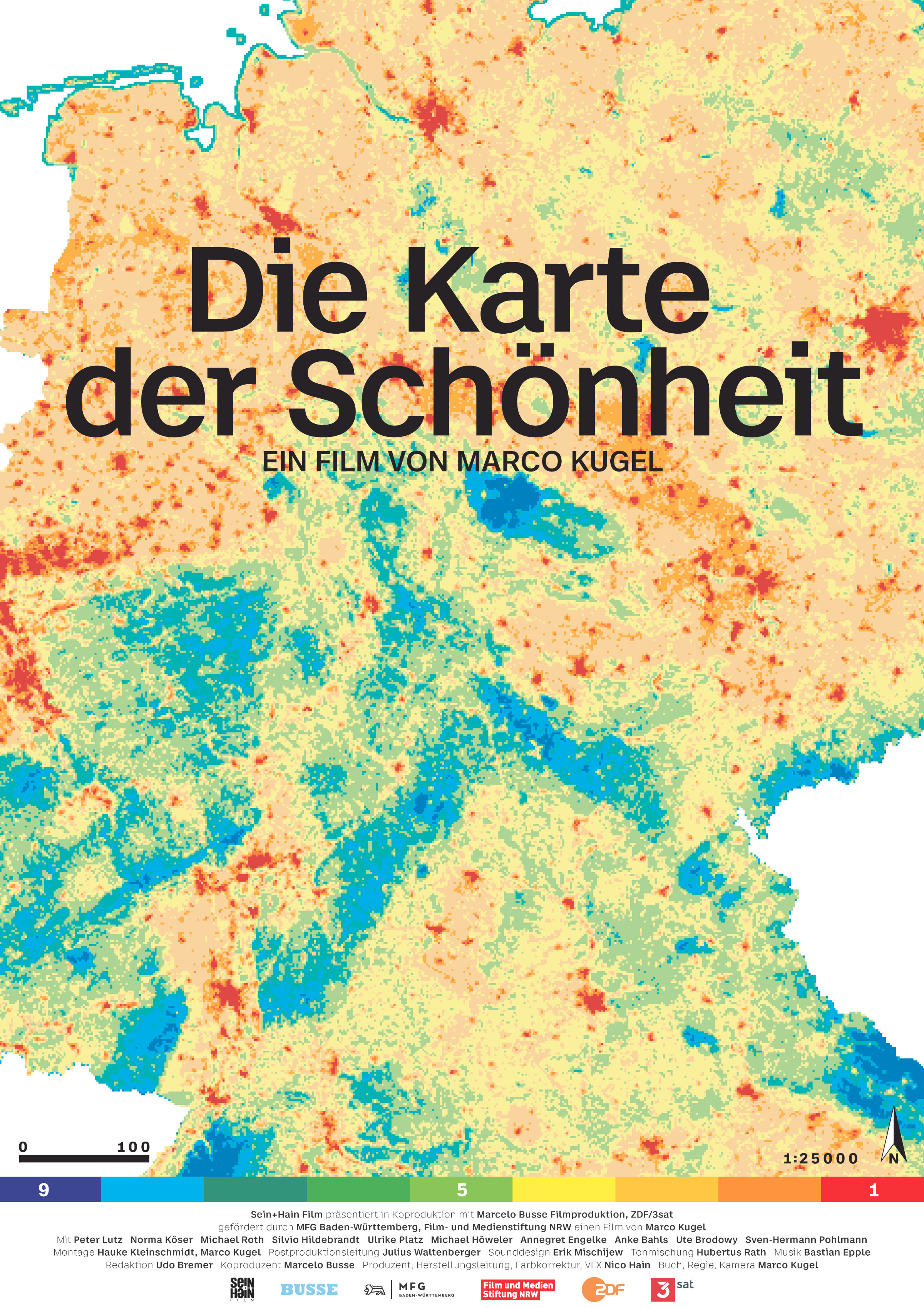
is task was to find out what area of Germany was most beautiful. The result is the “Map of Protected Areas in Germany”. In order to answer the brief, Roth and his team drove 15,000 kilometers across Germany, took over 10,000 landscape photographs, interviewed 3,500 people and evaluated 40,000 image ratings. For three years, they were accompanied by the Director and Cameraman Marco Kugel, who created the documentary “The Map of Beauty” in December 2020.

Fonts in Use: The typeface Case Micro for the Documentary Film ‘The Map of Beauty’ by Marco Kugel (Still) – Film poster

Film poster for the Documentary Film “The Map of Beauty” by Marco Kugel

The film shows landscapes as politically charged fields; with conflict arising from the constant struggle for resources, growth, the expansion of road networks and the need to protect them from change. With his precise and multi-layered camera work, Marco Kugel changes our view of the regions we call home or which we pass through on the way to work or when traveling. In doing so, he makes a contribution to the big question: What should the world we live in look like?

Fonts in Use: The typeface Case Micro for the Documentary Film ‘The Map of Beauty’ by Marco Kugel (Still)

Stills from the Documentary Film “The Map of Beauty”

Fonts in Use: The typeface Case Micro for the Documentary Film ‘The Map of Beauty’ by Marco Kugel (Still)

“The Map of Beauty” was produced by Sein+Hain Film GmbH who are based in Karlsruhe. The design twins 2xGoldstein were on hand to advise on the graphic design. For the typography, they recommended the font family Case Micro, which was designed by Erik Spiekermann, Anja Meiners and Ralph du Carrois. It is used both in moving images and on the poster for the film.

Fonts in Use: The typeface Case Micro for the Documentary Film ‘The Map of Beauty’ by Marco Kugel (Still)

The Graphic Designer, Andrew Goldstein explains the choice as follows: “Case Micro embodies the duality of the subjective and objective, which is a central theme of the film. In the film, cartography forms the objective level while the concept of beauty the subjective level. This duality is also found in the chosen typeface. Keywords here are: Machine ‘readability’ (i, j, r, …) and humanistic features (stroke tapers on 5, 8, e, …). Furthermore, the typeface has a narrative, warm level.”

“The typeface has a narrative, warm level.”

Andrew Goldstein, Graphic Designer

Since the documentary is mainly viewed on tv or streamed, the choice of the right typeface – both technically and aesthetically – plays a decisive role in the legibility of the text overlays. The explanatory texts are small because the landscape takes center stage. Each text overlay wanders from sequence to sequence to suitable open spaces, where they do their job discreetly. Due to Case Micro’s optimization for small print (wide spacing, visual distinction of similar letters, emphasis on letter details), the texts always remain optimally legible, meaning that the interplay of text and image is always excellent.

Try Case Micro

Fonts in Use: The typeface Case Micro for the Documentary Film ‘The Map of Beauty’ by Marco Kugel (Still)