Trixie – Modernization of the logo
Trixie was founded in Flensburg in 1974 by Bonnik Hansen from Denmark. The company supplies pet accessories to specialist retailers in over 100 countries. The range includes around 6,000 articles for dogs, cats, birds, small animals and reptiles. Trixie employs around 600 permanent staff and over 100 temporary workers.
As part of a strategic campaign to revamp the brand identity, the entire corporate design, including the packaging and logo, had to be redesigned. The company turned to Fontwerk with the brief to modernize it. Previously, a “blue roof” had dominated the entire range, but this was now to be replaced. This change meant a far-reaching change at the POS, so the logo had to be more restrained and revamped.
Old logo and the “blue roof”, that had dominated the entire range.
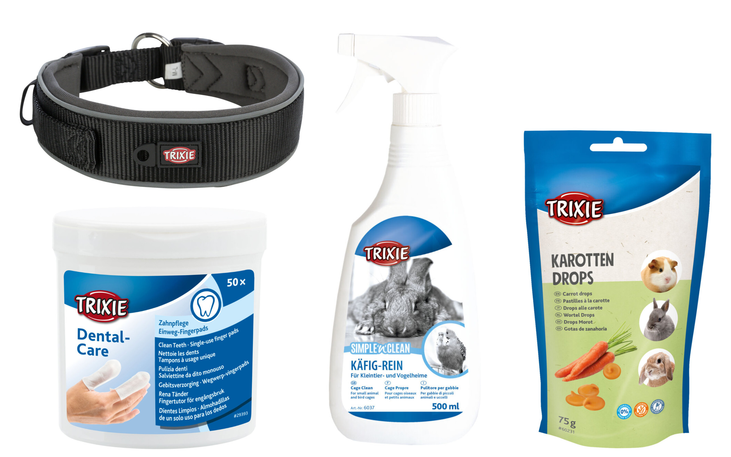
The new packaging concept meant that any future logo had to work on an array of different backgrounds. The logo is used across both printed and digital communication, but its primary use is in product labeling on a wide variety of materials and via different types of reproduction – as a rubber label, on fabrics, metals, wood, etc.; printed, embossed or die-cut; negative and positive. It is often not given much space and sizes of around one centimeter are often the norm.
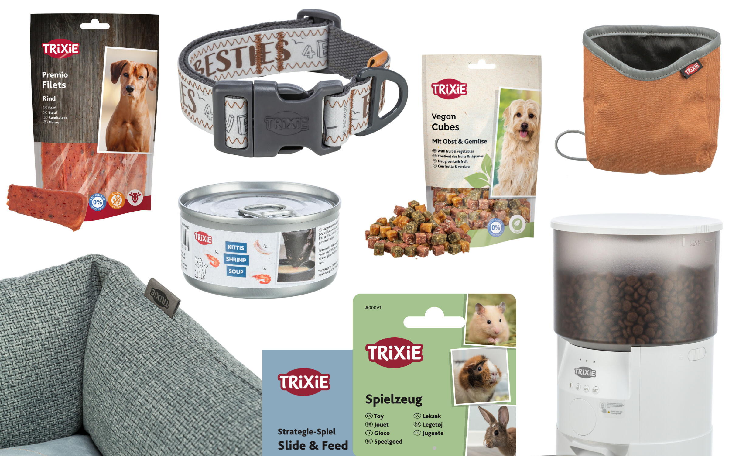
The new logo’s primary use is in product labeling on a wide variety of materials and via different types of reproduction – as a rubber label, on fabrics, metals, wood, etc.; printed, embossed or die-cut; negative and positive.
The formal and aesthetic requirements were clearly defined by Trixie. The new logo was to be more modern and simpler, remain concise and – like the overall appearance – convey warmth and trust. This would make it an ideal fit for the emotional industry, in which pets have played an increasingly important role for years.
As part of the brief, the colors red (for the background and text outlines) and white (as the type color as well as the rough shape of the ellipsis) remained untouched and ideally the spelling was to be in capitals. Internally, Trixie had already tested their own ideas and discovered that the elliptical shape was visually off when the last letter was larger than the first. With this exemplary briefing, we were ready to go.
Fontwerk’s agile structure ensures that we put together the ideal team for each project and if needed, we can draw upon experts from our international network. When approaching this project, we also focused on Trixie’s target group for this project in order to better meet their specific needs. The target group is three-quarters female and covers a broad age range, with buyers aged between 28 and 55. Bearing this in mind, we completed the team with type and graphic designer Franziska Weitgruber.
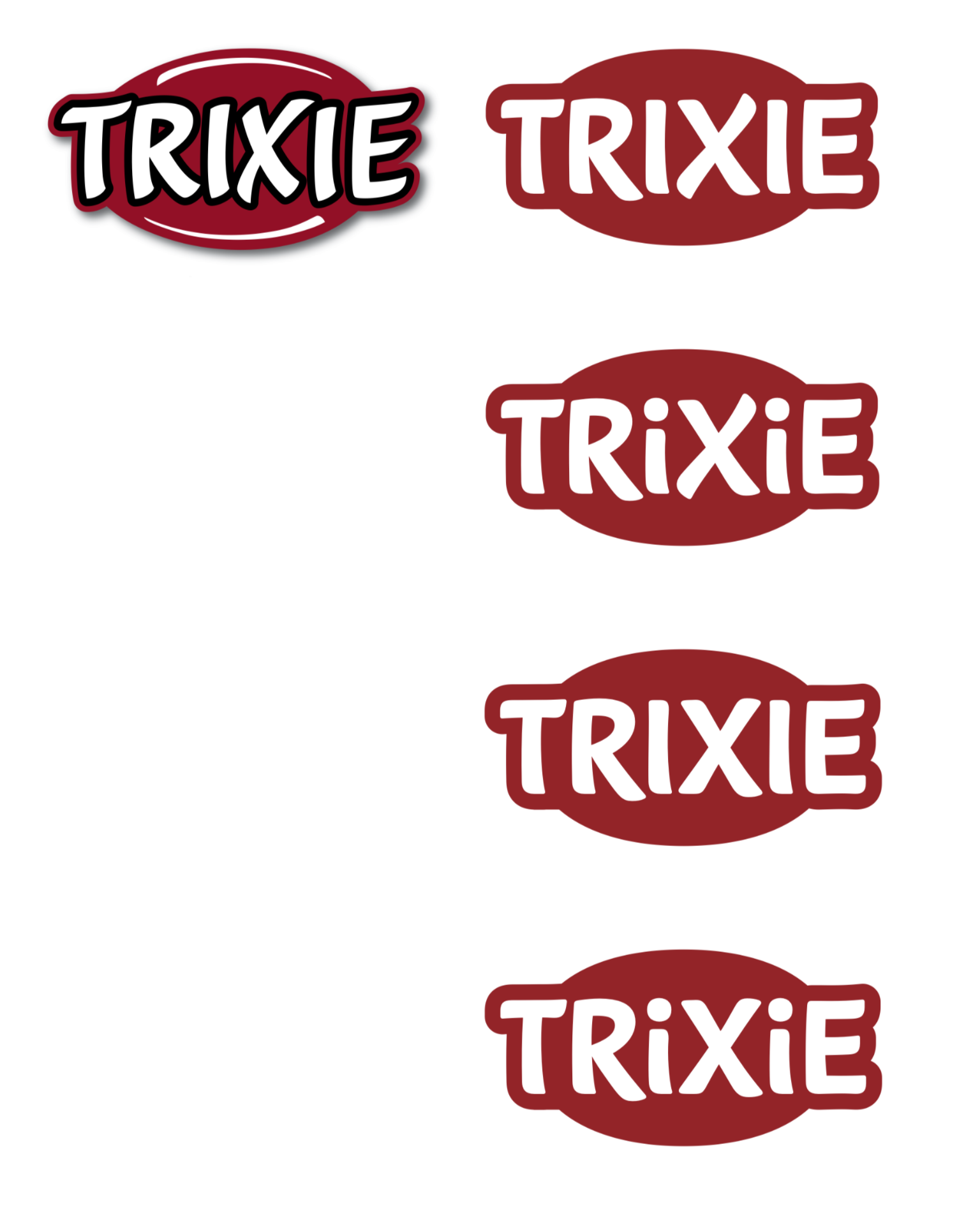
We developed four logo variants.
Together, we initially developed three logo variants, followed by a fourth in the next iteration. Two of these featured the two ‘i’s as minuscules. The implied eyes provide that “certain extra something and the emotion” that Head of Marketing Claudia Menzel wanted at the start of the project.
All the designs were characterized by a slightly curved basic structure (dynamism, liveliness), a subtly increasing line thickness (stability, confidence), a slightly upward line (warmth, emotionality), the absence of outlines and a simplified background (simplicity, conciseness and modernity).
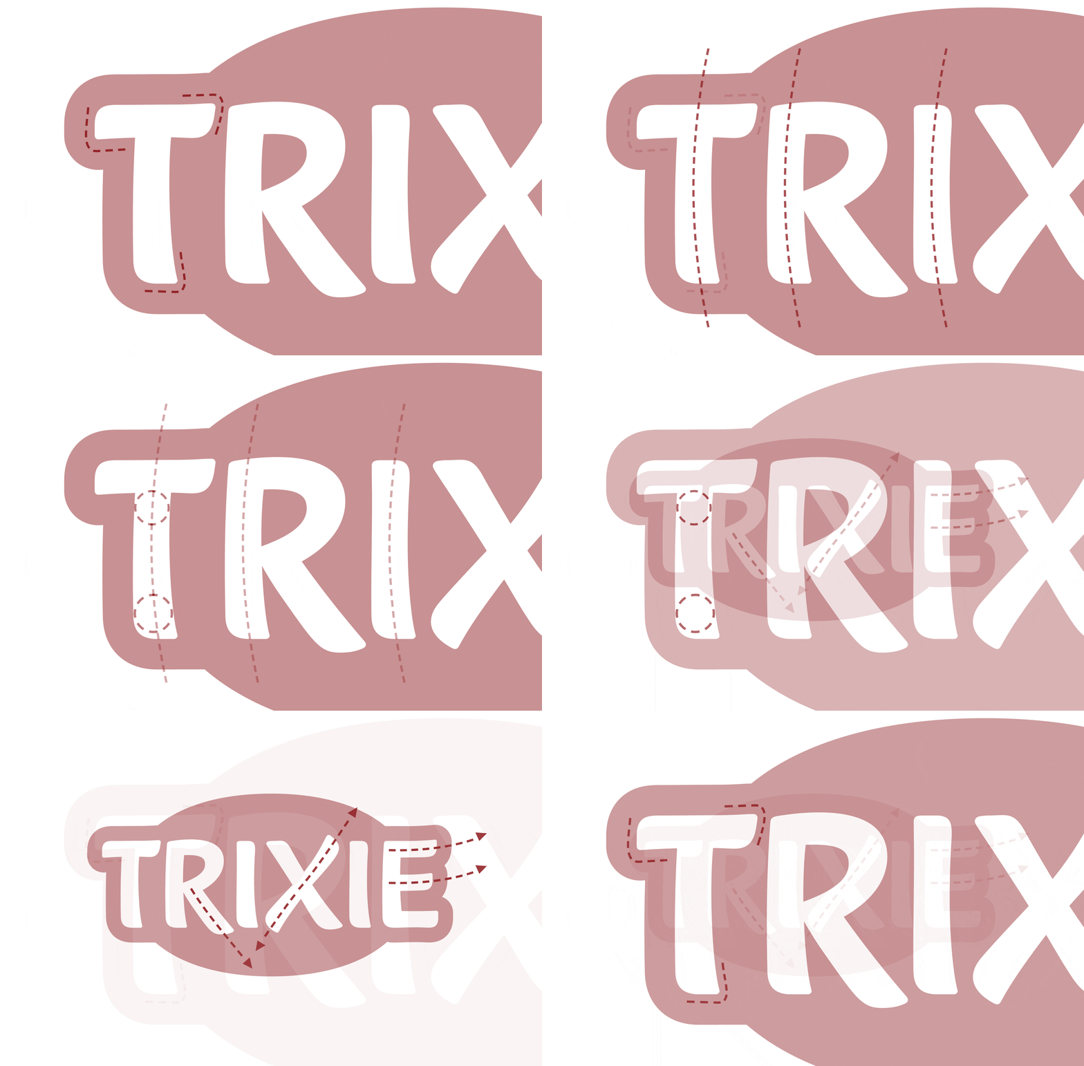
We put all the designs into real application examples and presented them to Trixie. A favorite quickly emerged and was refined and honed and then handed over to the client as a vector version within the agreed tight timeframe.
The logo has now been fully implemented across the brand and has been well received by customers. Claudia Menzel explains: “As the removal of the ‘blue roof’ has brought about a major change, particularly in the packaging sector, it was important to retain the basic features of the red ellipse. But in a reduced, more modern and emotional form. The Fontwerk team achieved this very well with their individually created letters. They took our project team on a journey and explained clearly in the presentations how the designs were created. That helped a lot in the decision-making process. The logo works extremely well on all media and we are very happy with it.”
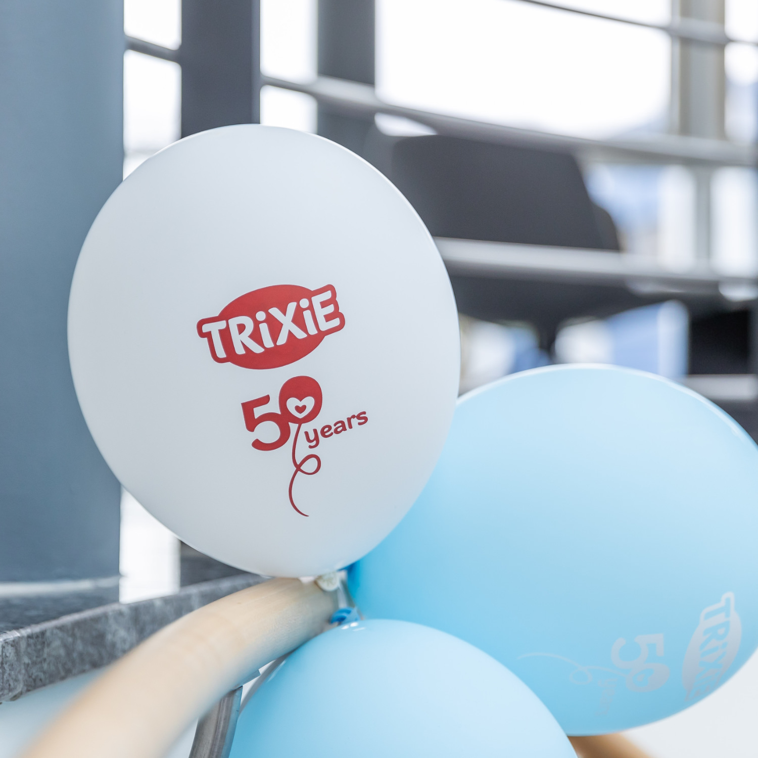
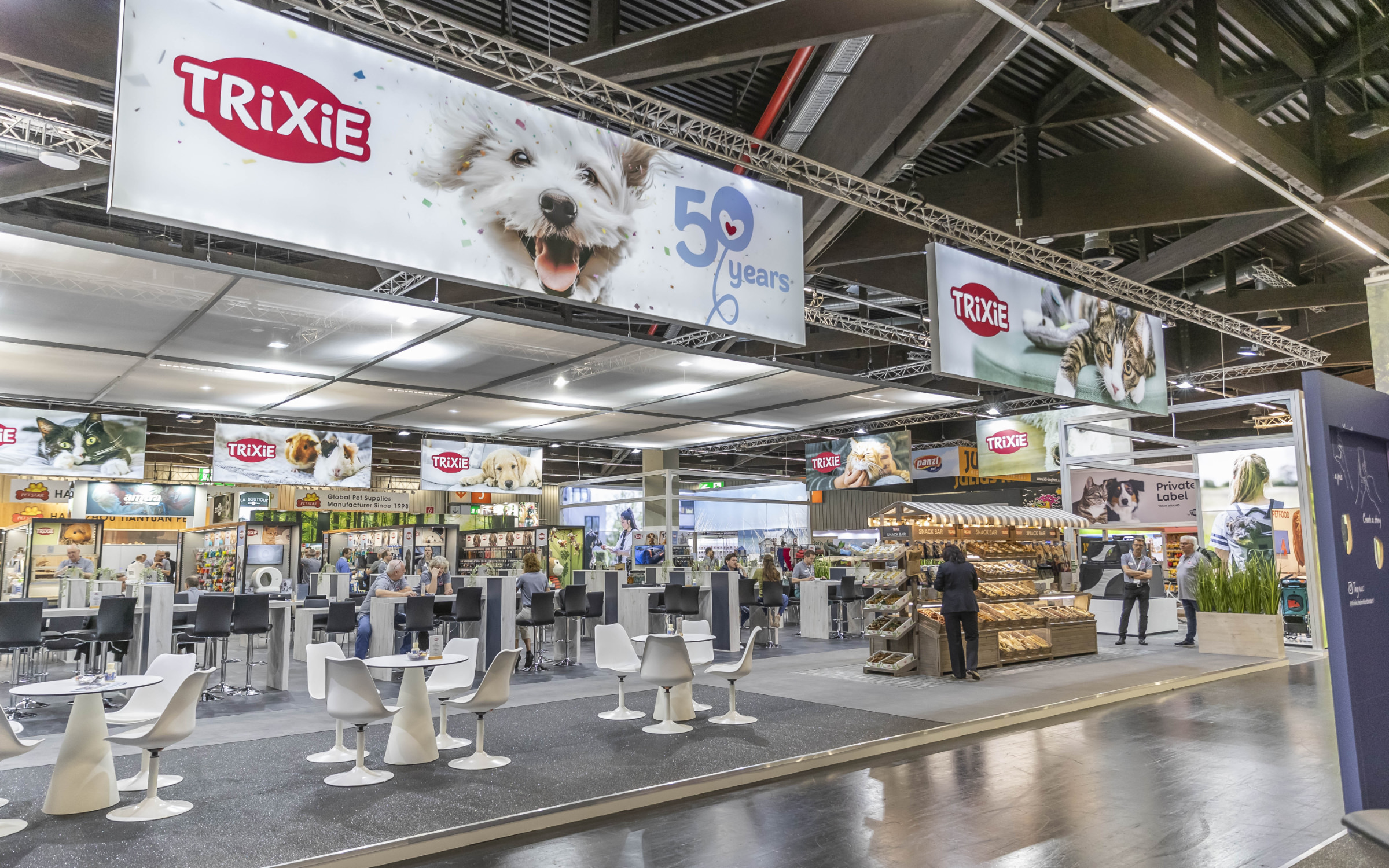
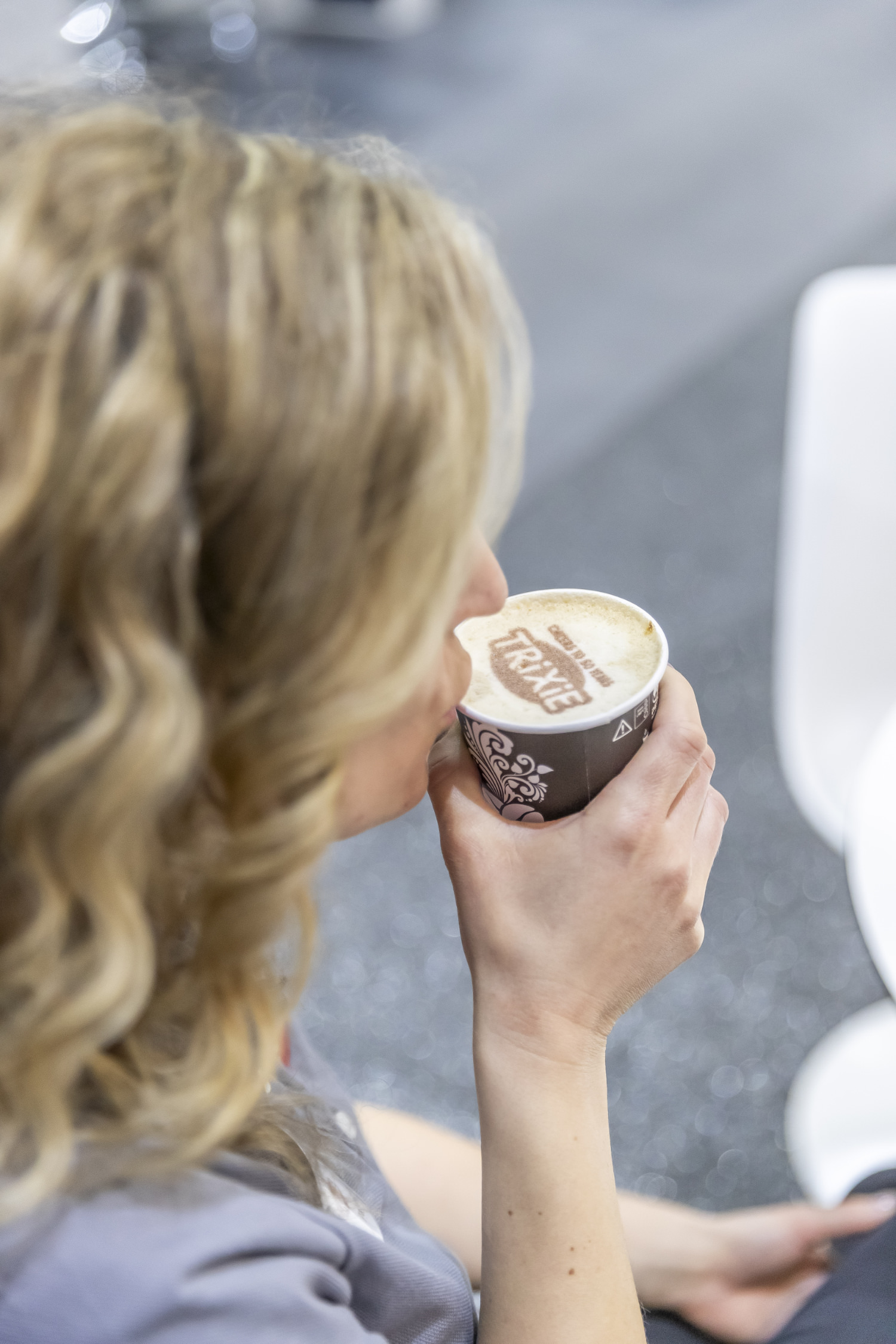
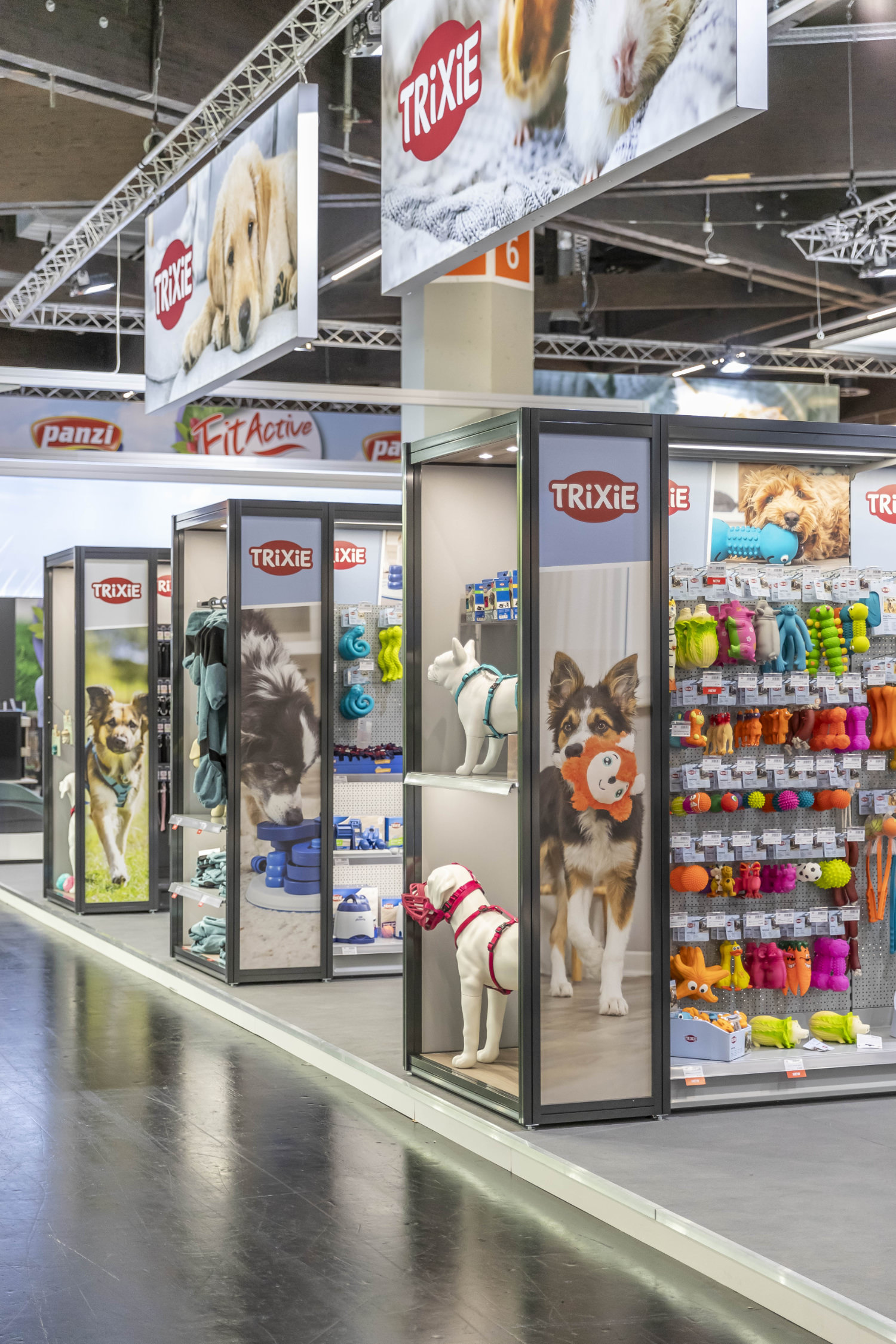
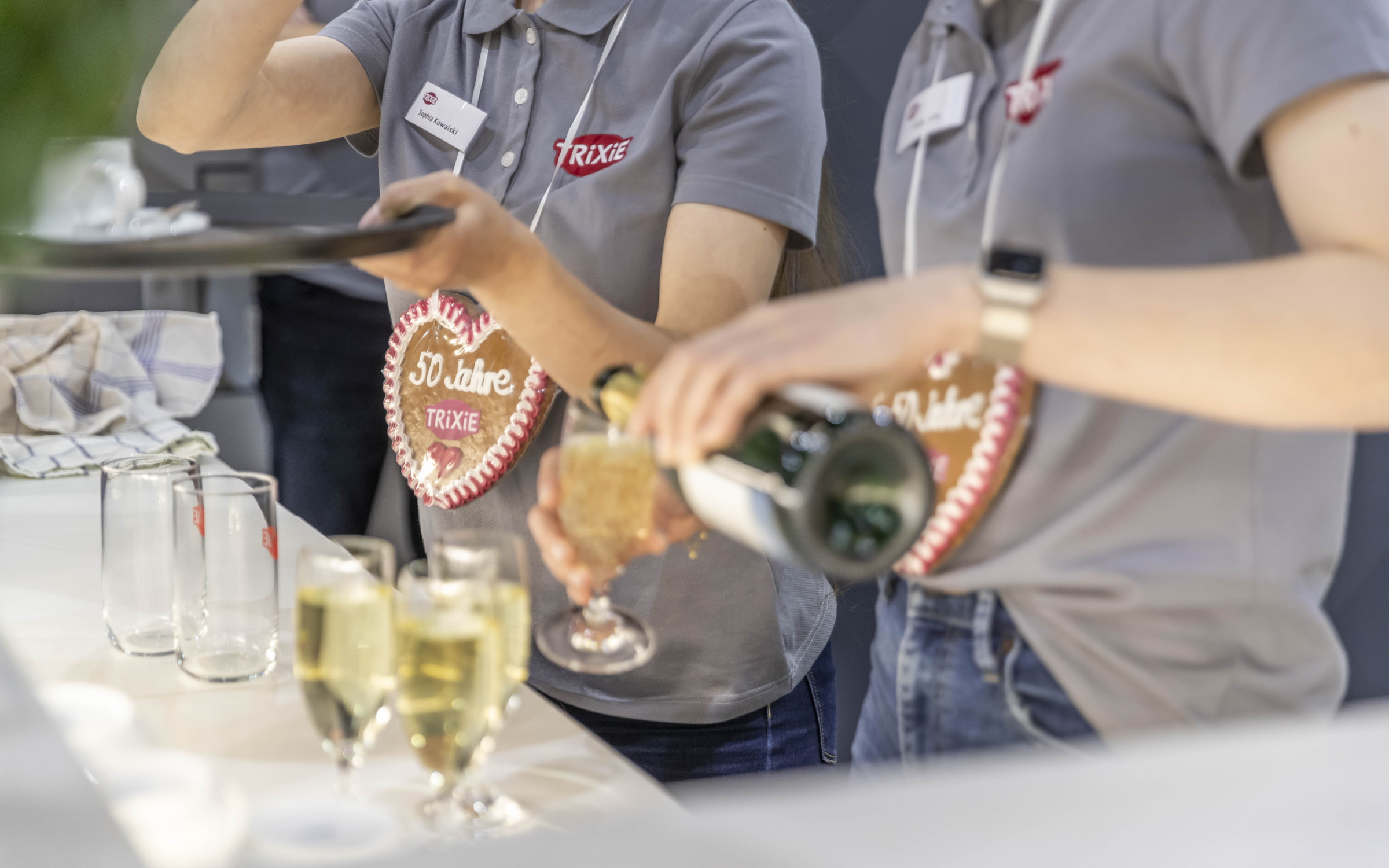
Trixie celebrated its 50th anniversary and introduced its new identity at Interzoo in Nuremberg, the world’s leading trade fair for the pet industry
