To mark the 38th festival (20–30 January, 2022), which went online for the second time due to the ongoing COVID-19 situation, Sundance treated itself to a new visual identity. This was created in close collaboration between the organizer Sundance Institute, the design agency The Gordon Co. and the Branding Course of the New York School of Visual Arts.
Sundance Festival
Lights, camera, action: New identity for Sundance Festival
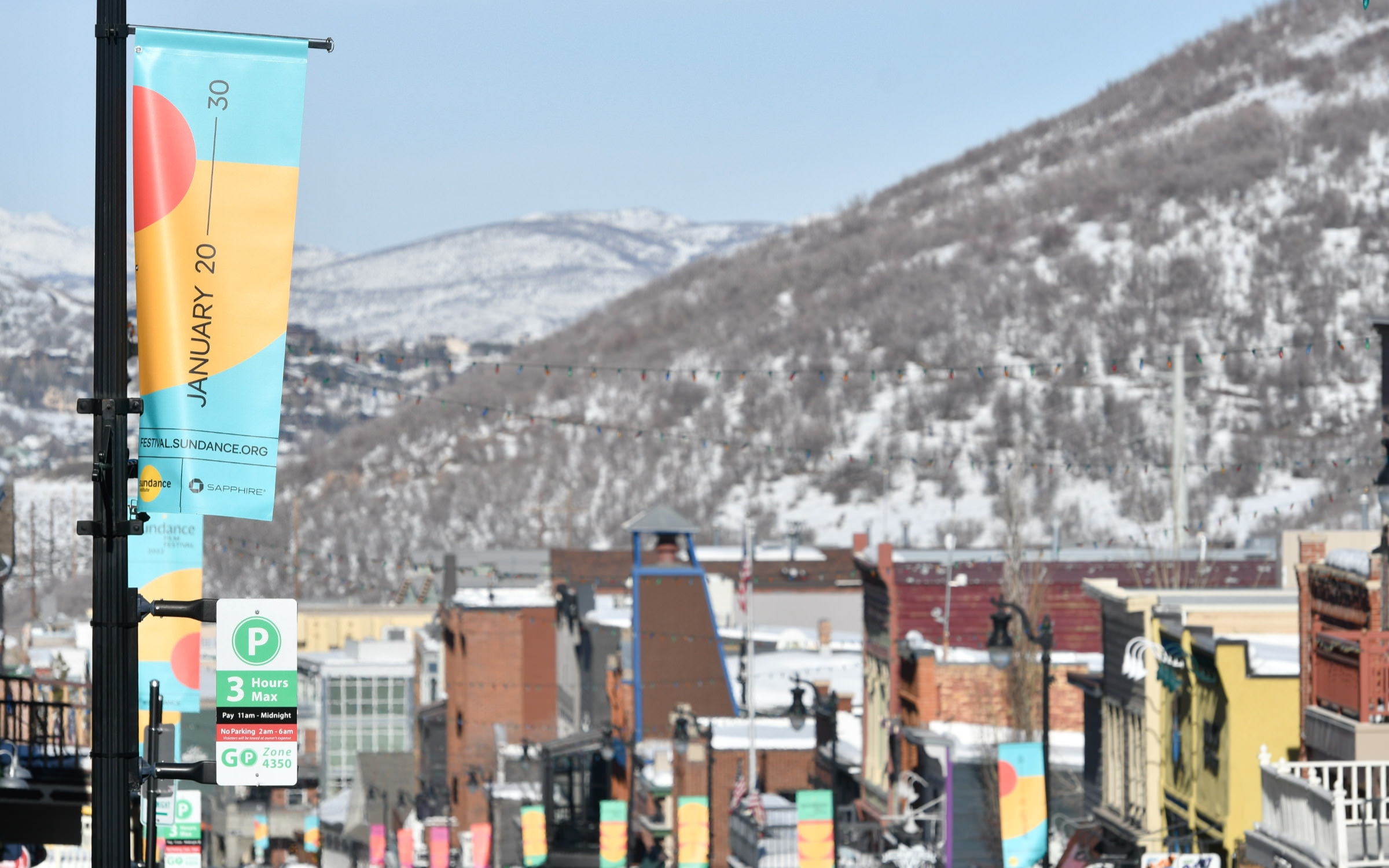

At the centre of the design is the festival’s namesake, the sun. Circles, semicircles and circular arcs dominate the visuals of the festival’s animations, products, social media, tickets and logo.
The Sundance Institute chose the universal Pangea family as its house font, which is used across all visual communication. Alongside the poster, the font is used on the website, the program, the festival catalog and of course, the multiple promotional items and merchandise. An exception is the logo, which is set in Typotheque’s Diurnal Display.
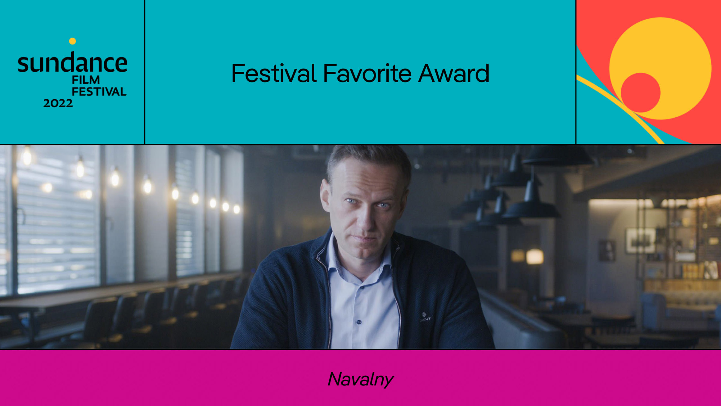
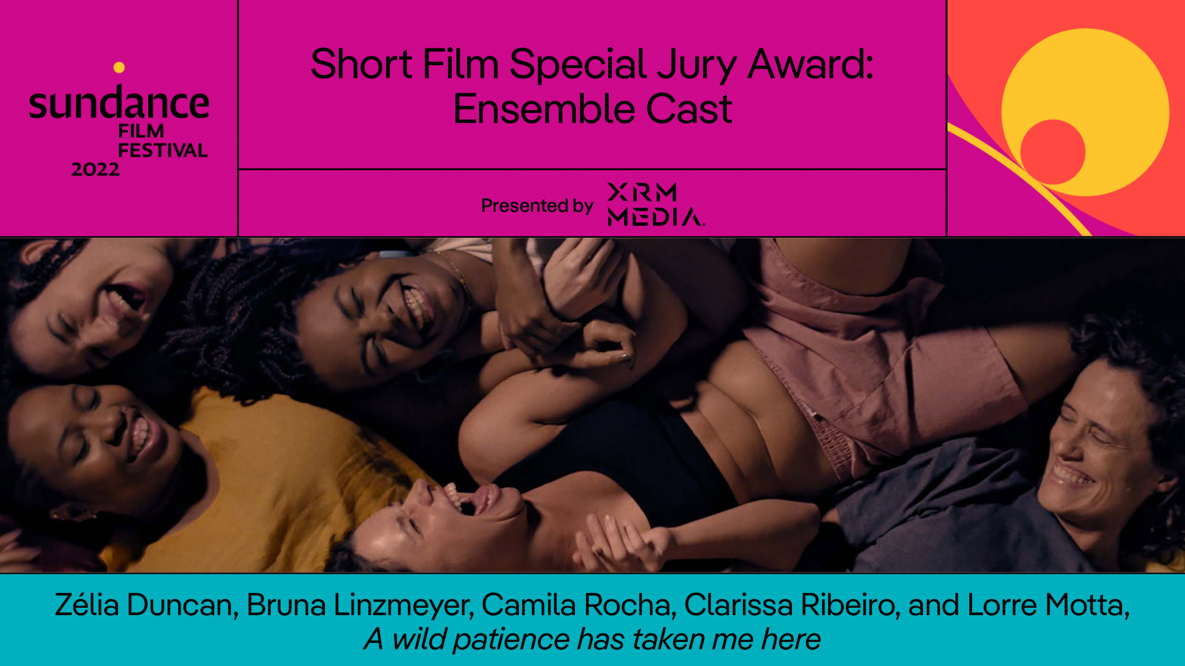
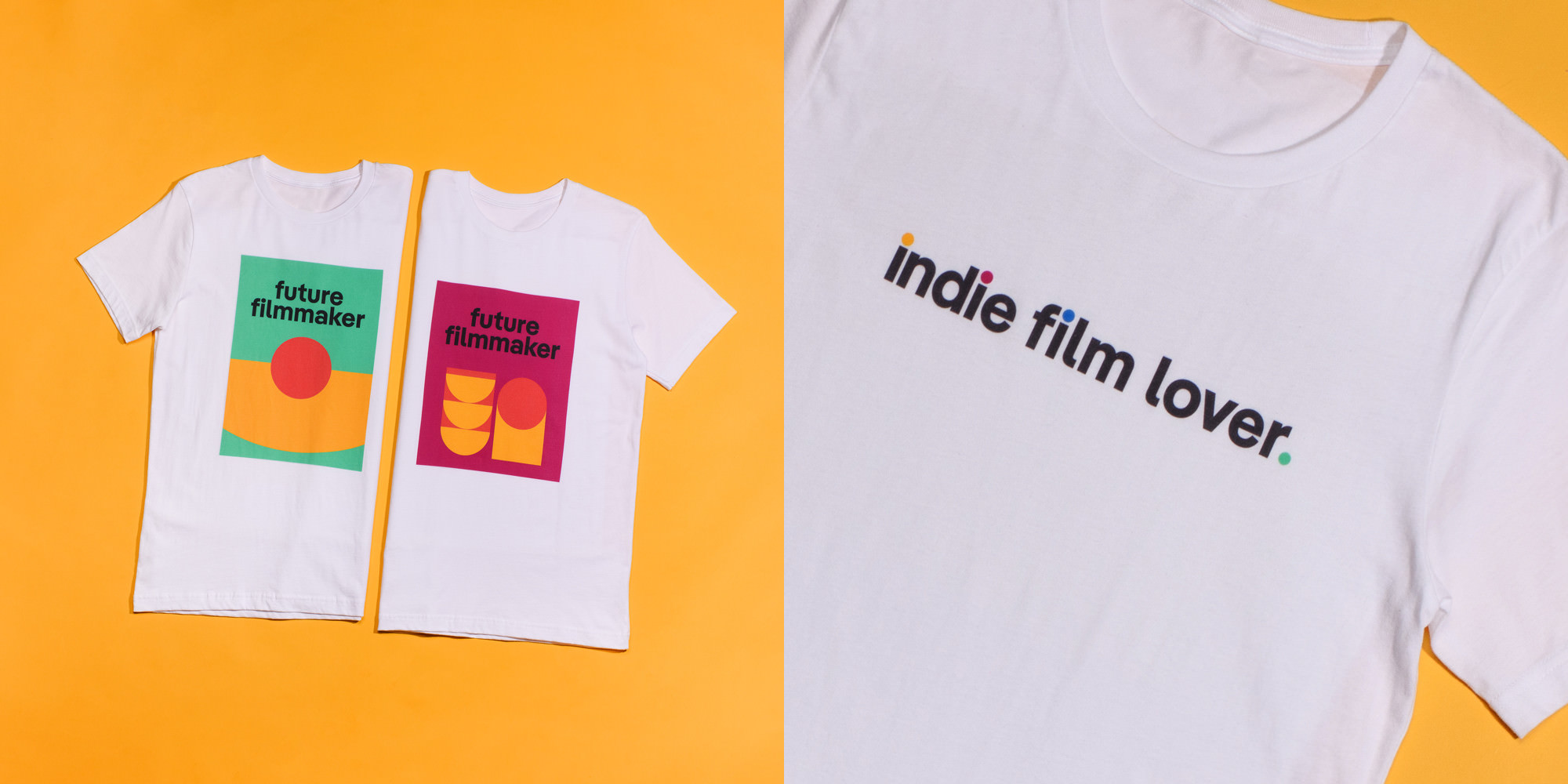
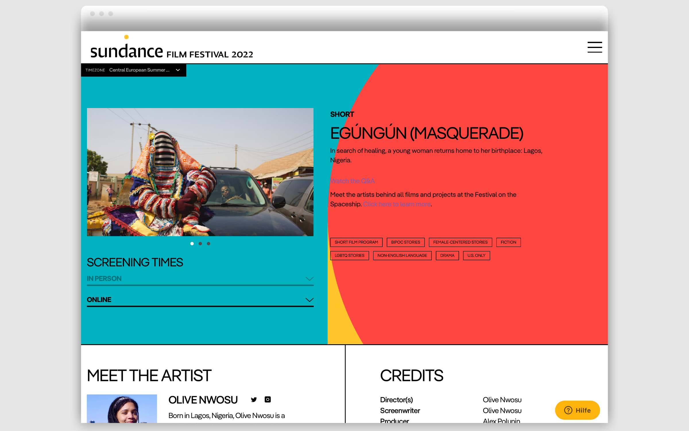
The demands on a typeface for an international festival are enormous. The meticulous design of text heavy documents, such as the catalog and program booklet, reveals a lot about the design team’s delight in Pangea’s versatility. The visual designers pull out all the typographic stops: using four different weights in tables and continuous texts, italics, caps and many other refinements.
The multilingualism of the typeface is also called for, not to ensure that the titles of international films are spelt correctly – for example “Every Day in Kaimukī” or “Egúngún” (Masquerade) – but also that the names of producers, such as Leila Lyytikäinen (Finland) and Jamie Gonçalves (Mexico) or those of directors László Csuja (Hungary), Francisca Alegría (Chile) or Carina Gabriela Dașoveanu (Romania) are also spelt using the correct accents.
(All images and animation kindly provided by the Sundance Institute.)