ts digitalization began in 2001 with the launch of the ZDFmediathek online, which offered a selection of livestream and on-demand programs. Since 2013, ZDF has broadcast all of its programs around the clock over livestream – insofar as this is possible under licensing law. Two years prior to this, they launched the ZDF app. In the following years, several dozen social media accounts supplemented the digital communication of “Das Zweite” (The Second), both under the name of the broadcaster and its digital channels, as well as under the direction of flagship programmes such as “heute” (Today), “WISO” (short for economy and social studies), “heuteshow” (Today Show), “sportstudio” or “ZDF-Fernsehgarten” (ZDF Television Garden).
ZDF
Making of: The ZDF Corporate Font
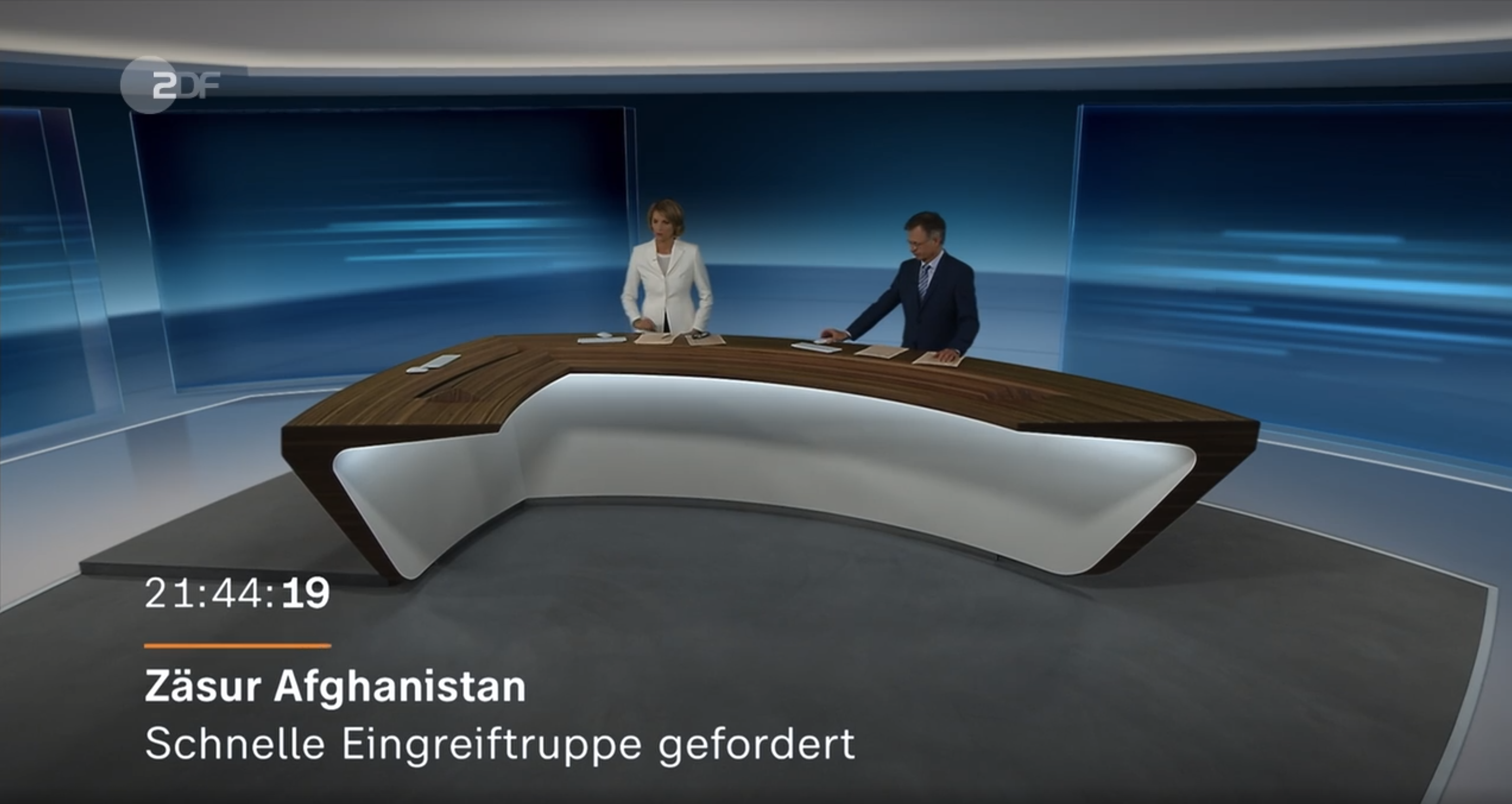
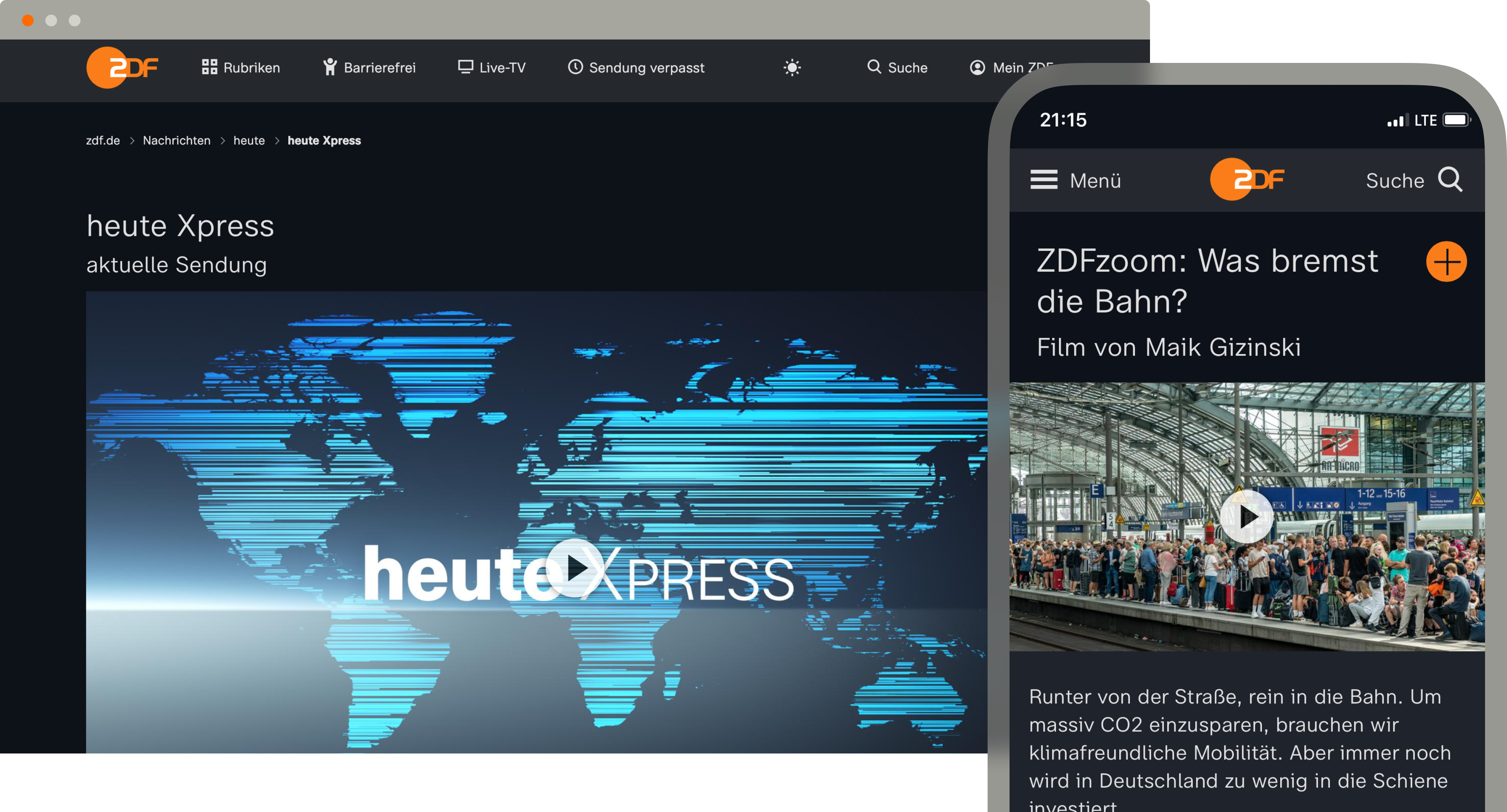
Since it began broadcasting almost 60 years ago, ZDF has been sending moving images and text to screens. Unlike newspapers and magazines, which only digitalized their content towards the end of the 1990s (in many cases this is still done without much regard to typography), the screen is the native output medium for television. The technical advances of the past twelve years in this area, in terms of resolution, colour, bandwidth and mobility are particularly gratifying. We all have an HD television in our hands or pockets and can easily access them around the clock and the images and texts that are reproduced on those screens are razor-sharp. Thanks to this increase in quality, typographic freedom in television graphics is also growing across all digital channels at the same time.
More freedom, means more fonts. In 2020 and 2021, the Berlin-based Design Studio bBox Type founded by Anja Meiners and Ralph du Carrois, completely revamped and redesigned the corporate ZDF typeface, with Fontwerk responsible for the font production and mastering. Taking a lead from Helvetica was the guiding goal and brief from the ZDF Marketing/Corporate design team. They wanted the new font to have better legibility, more flexibility and a stronger identity without leaving the type genre and thus the viewing habits of the audience. The result is an extremely comprehensive corporate type system: 116 fonts with three widths and three styles as well as corresponding italics.
The three different optical sizes of the typeface ensure the best legibility. ZDF Micro is perfect for very small texts as it runs wider, has a larger x-height and uses serifs and curved strokes to make it easier to distinguish between similar letters. ZDF Type is optimized for long body texts, the letters are constructed in a similar vein to Micro, but their spacing is narrower and have a smaller x-height. Both styles are uniwidth designs, that means each letter occupies the same space in all weights … the stroke width grows from within the letters, yet the spacing remains constant and linebreaks are preserved.

A contemporary and flexible development process, with a competent team and a direct working relationship. The result: tailor-made.
ZDF Design is the neutral headline typeface of the system, with graphic rigour and consistent design. Here the weights follow the classic typographic waterfall, i.e. headlines become wider with increasing heaviness of the strokes. The weights of ZDF Type form the basis of the ZDF corporate typeface. ZDF Micro and ZDF Design are used exclusively for the applications described above.
The entire superfamily was delivered to Fontwerk in eight Glyphs files and mastered in close coordination with the type designers. After a comprehensive test by Fontwerk engineers, Meiners and du Carrois made corrections and adjustments and eliminated any final inconsistencies. Font name entries, font metrics and other font info parameters were then adjusted to guarantee maximum functionality across a wide variety of operating system program combinations.

To ensure that ZDF’s digital content looks good on all computers, the entire family was treated to some rather elaborate manual TrueType hinting, in which the screen display was optimized not only for modern operating systems, but also so that it would be compatible with Windows XP’s ClearType rasterizer. Compared to the usual automatic hinting, this not only made it possible to adjust the smallest details, but also to optimally coordinate the fonts.
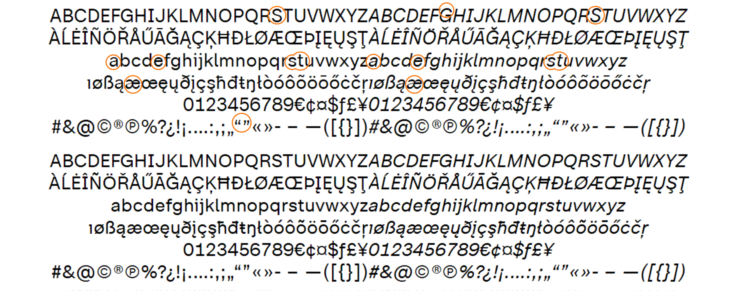

The ZDF font family was produced and tested in TrueType (.ttf, optimized for Office applications including style-linking), OpenType (.otf) formats and for the internet in .woff2, .woff and .eot formats.
Special attention was paid to the behaviour of the fonts within the Vizrt environment used by ZDF, a widely used tool for the production, management and distribution of graphic content in the digital media industry with some special features. On this platform, ZDF can now use its own fonts to create graphic templates, search and edit archived content, create playlists for on-air use, as well as distribute online content and maintain it on social media sites.

Because we were able to work on design and technology in partnership with Fontwerk, it was possible to create a very comprehensive product in a very short timeframe and deliver it on time despite many necessary adjustments and additional requirements that arose during the design process.
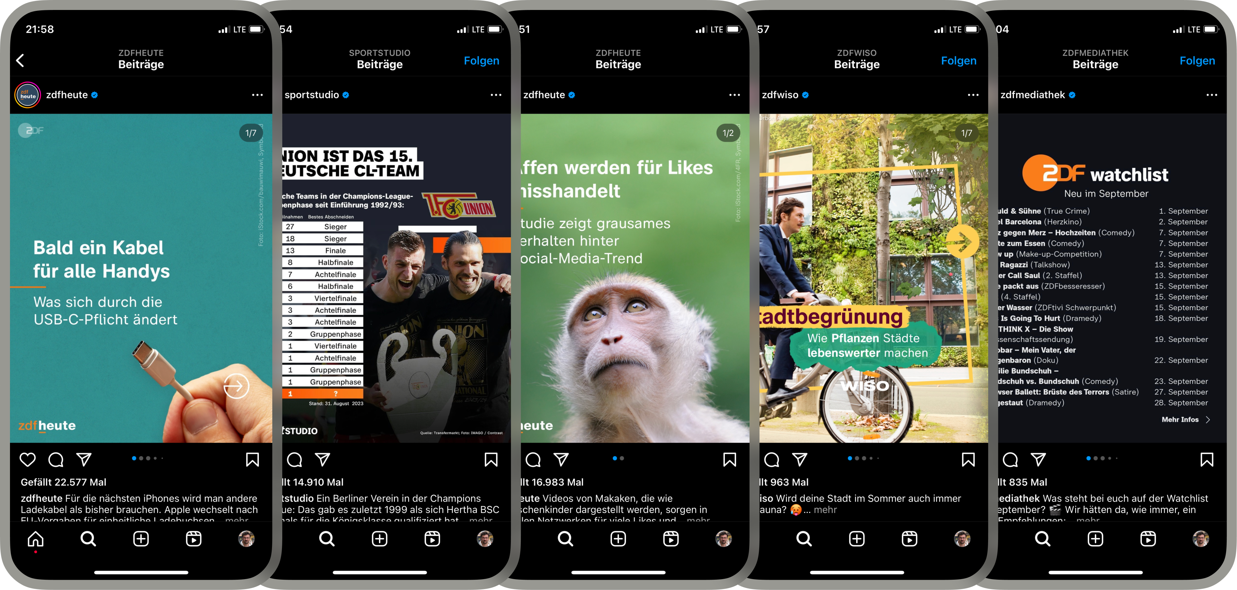
By summer 2021, many ZDF channels had already been converted to the new corporate font. It is already in use on-air, on the websites and on the ZDFmediathek. It is also used for Instagram posts and graphics by @zdfheute, @zdfmediathek, @sportstudio, @zdfwiso and @fernsehgarten. Of particular importance, however, are the possibilities of the new ZDF typeface in areas that most viewers are not even aware of. It’s about accessibility ... through audio description, sign language and subtitles.
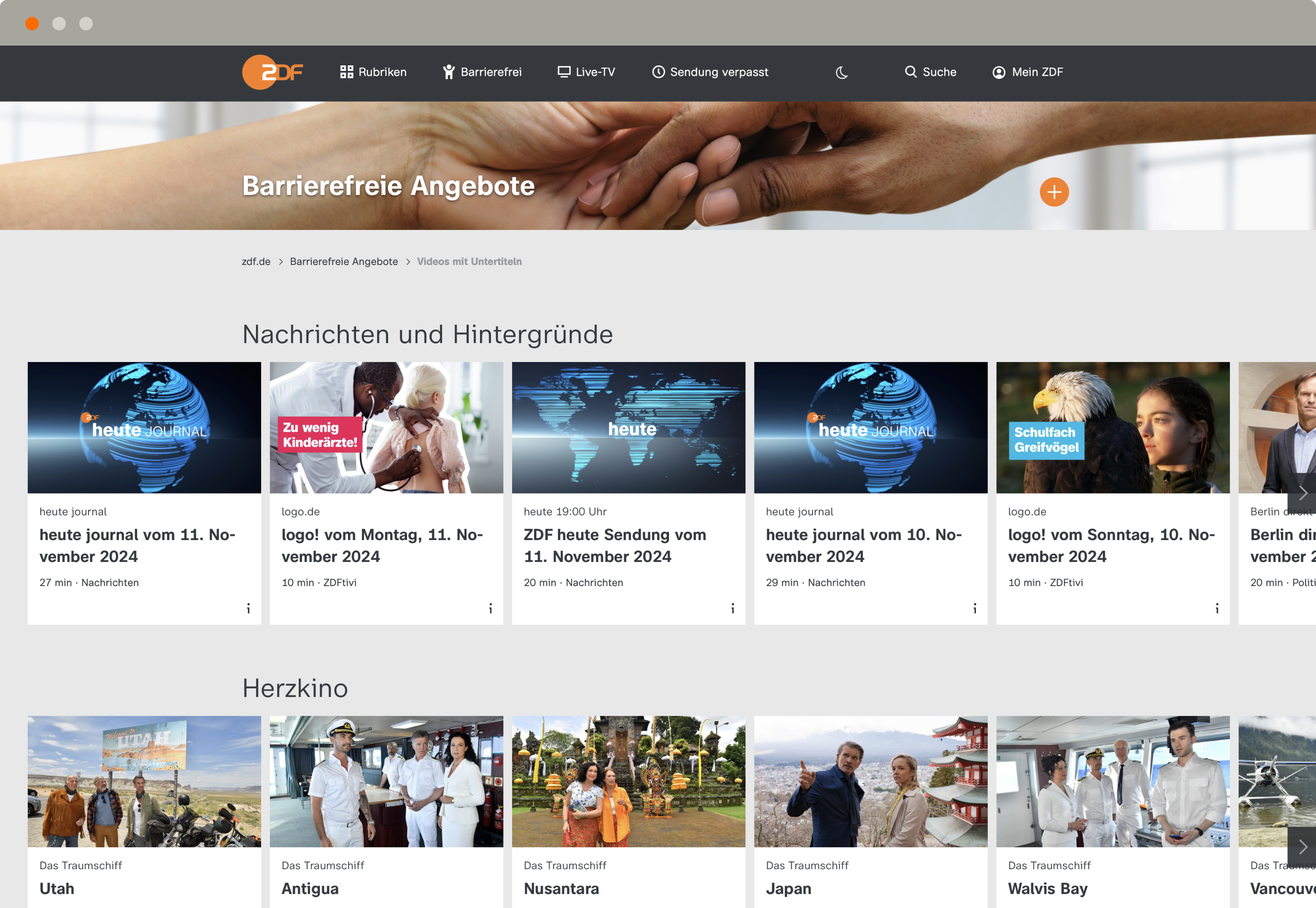
“I wholeheartedly welcome the channel’s desire to make programs more accessible to more people with the help of especially legible writing,” says Ivo Gabrowitsch, the founder and managing director of Fontwerk. ZDF understands the right of unrestricted participation in modern media as a basic prerequisite for inclusion and takes this obligation very seriously. “We also always had this goal in mind during the technical part of the project,” Gabrowitsch adds.