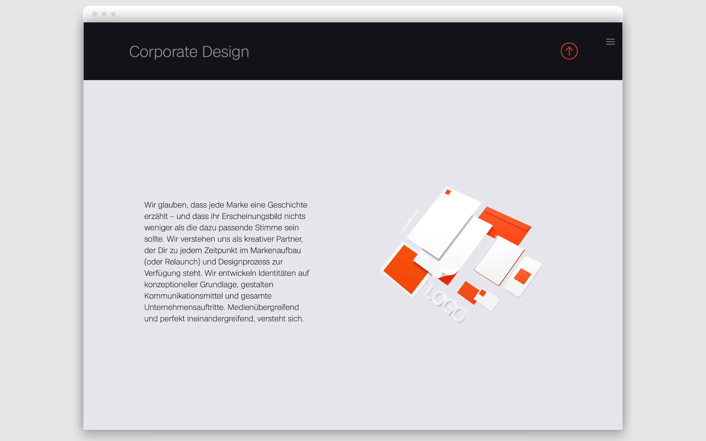
ounded in Berlin in 2012 and now with an office in London, KRAVT pursues a holistic branding strategy that is appreciated not only by local brands but also international giants, such as L’Oréal, Dior, Armani or Lacoste: “We break your brand down into its individual parts – a clear view and years of experience help us see the untapped potential. Together, we reassemble the building blocks and are not afraid of cleaning up processes.”
Kravt
Future-proofed by Kravt

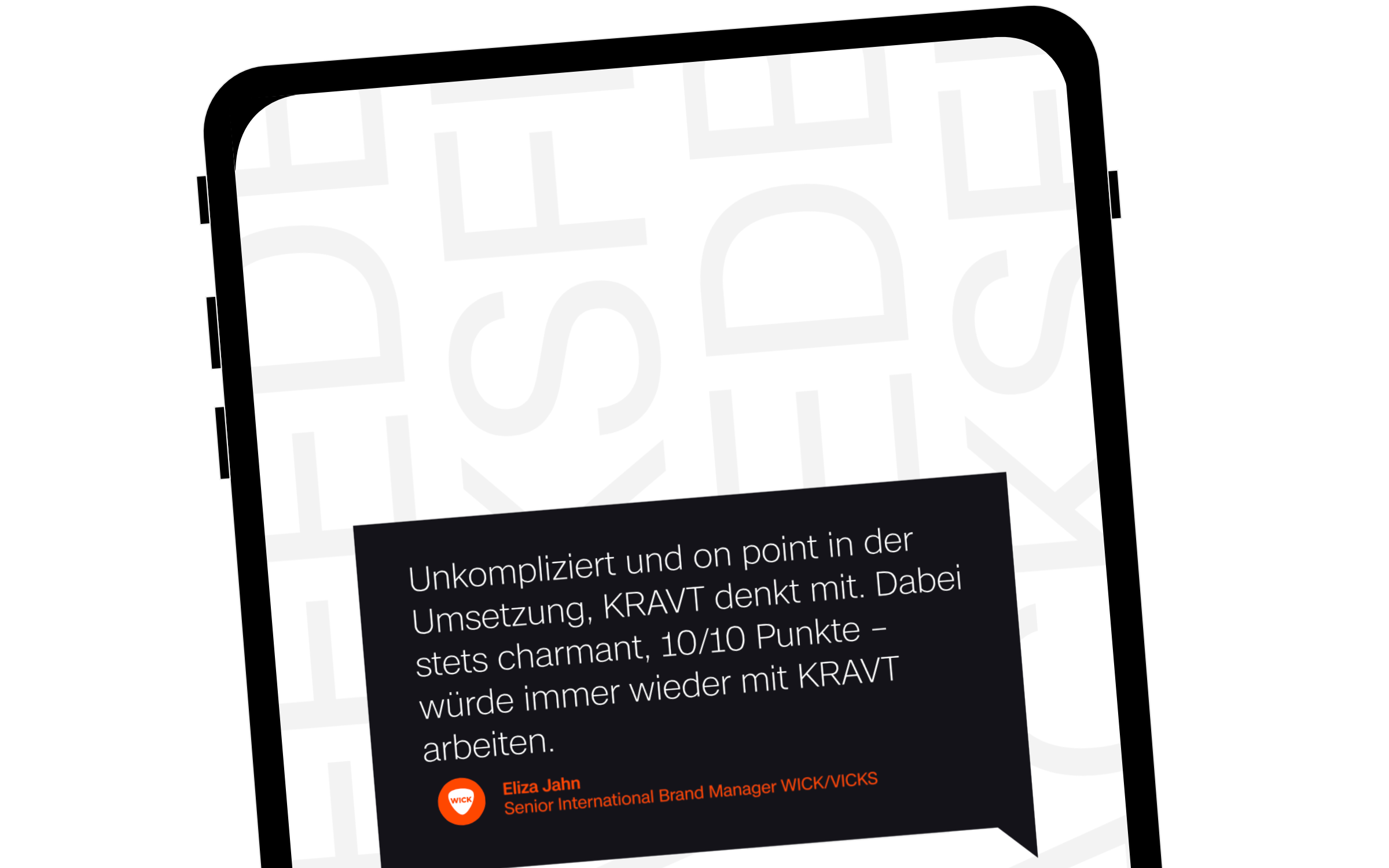
KRAVT knows that brand design and development can only stand the test of time on a strong and solid foundation.
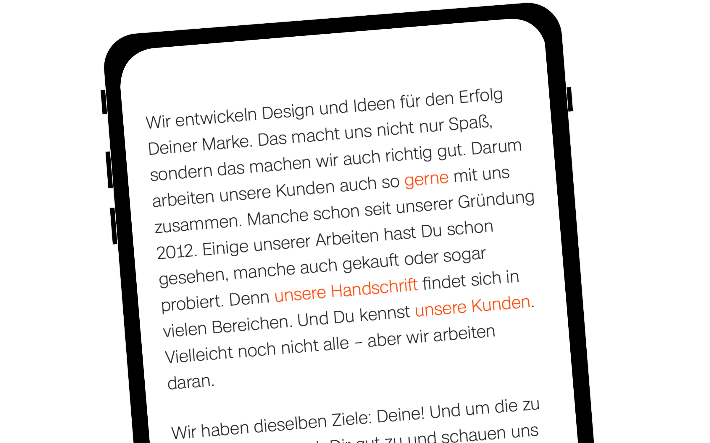
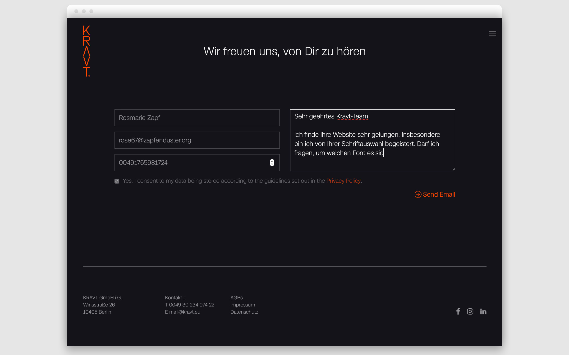
Recently, the KRAVT website has undergone a full revamp and now shines in new splendor. It goes without saying that the Berliners practice what they preach. The look and feel of kravt.eu reflects the agency’s design DNA: clear, authentic, personal and holistic.
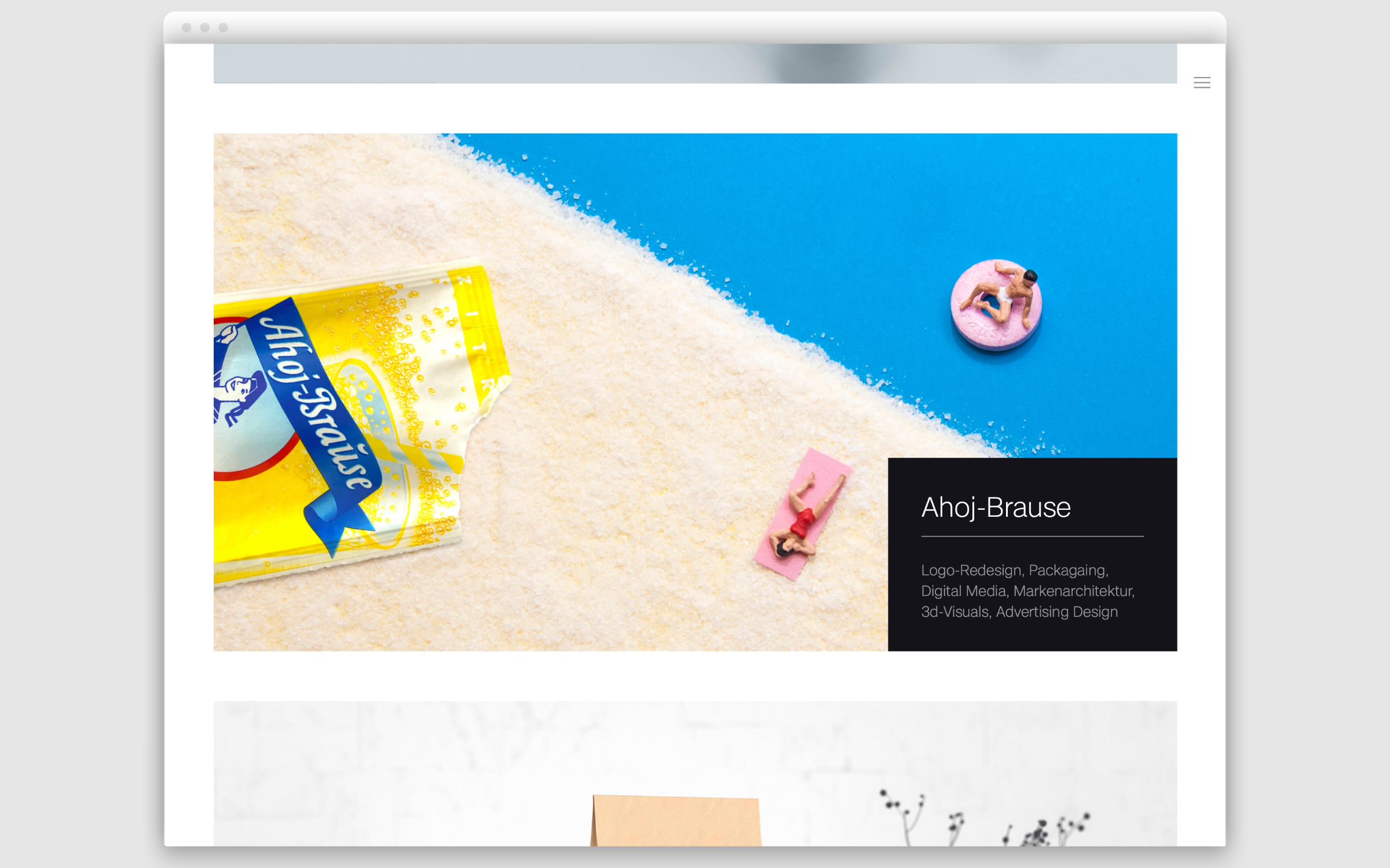
KRAVT uses Case, designed by Erik Spiekermann, Anja Meiners and Ralph du Carrois. Case is a neo-grotesque, a typeface category that has dominated international branding for decades. But Case is different. Its appearance looks familiar and inspires confidence, but at the same time it exudes individuality and modernity, because the family was created for the brand climate of the 2020s. Case carries the experience of complex branding projects over the last 5 years, and it shows.
Case is available in three optical sizes, the basic form, Case Text for body text and Case Micro which is perfect for small print. Another unique selling point of Case are the concise Italics, which are hard to find in this genre.
