 | RUV TYPE, A CUSTOM-MADE SUPERFAMILY |
|---|
|
In this month’s Werknews, we’re delighted to share our latest service case for R+V, one of Germany’s largest insurance companies. Not only is it the biggest custom job we’ve done to date, it’s also our most detailed case study, giving you an insider insight to initial sketches, iterations and an exclusive behind-the-scenes peek as to how this type of collaboration works. Also in this round-up, we have an award-winning use case for Nikolai, exciting award news for Tausend (once again), a little reminder about Sukoon as well as an inspiring book tip! |
|
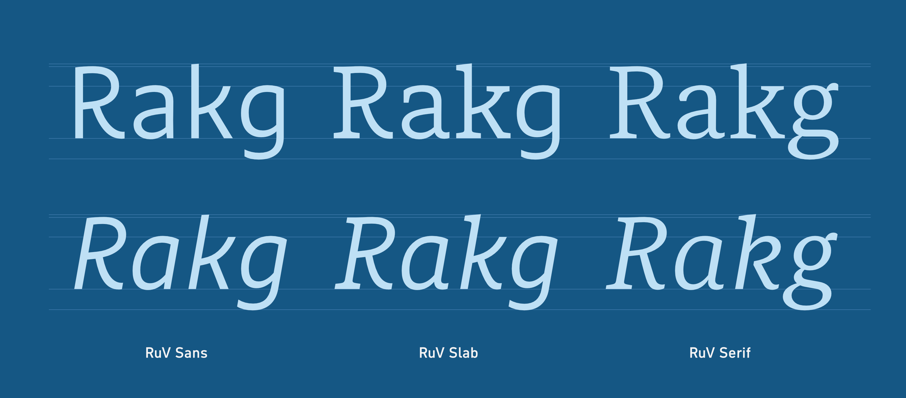
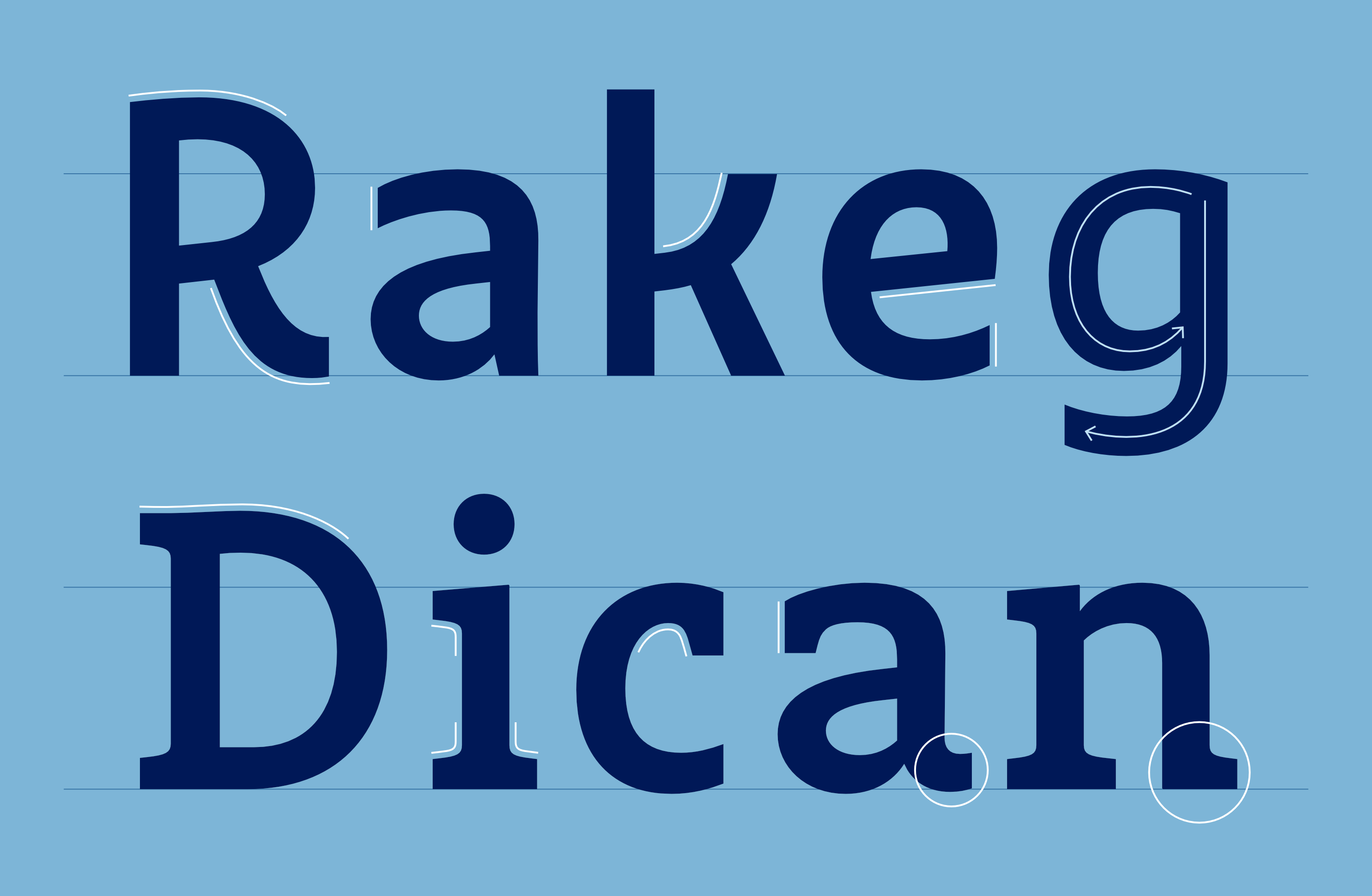 | | The distinctive features of RuV Sans and RuV Slab: modern character, lively, open, unadorned | |
|
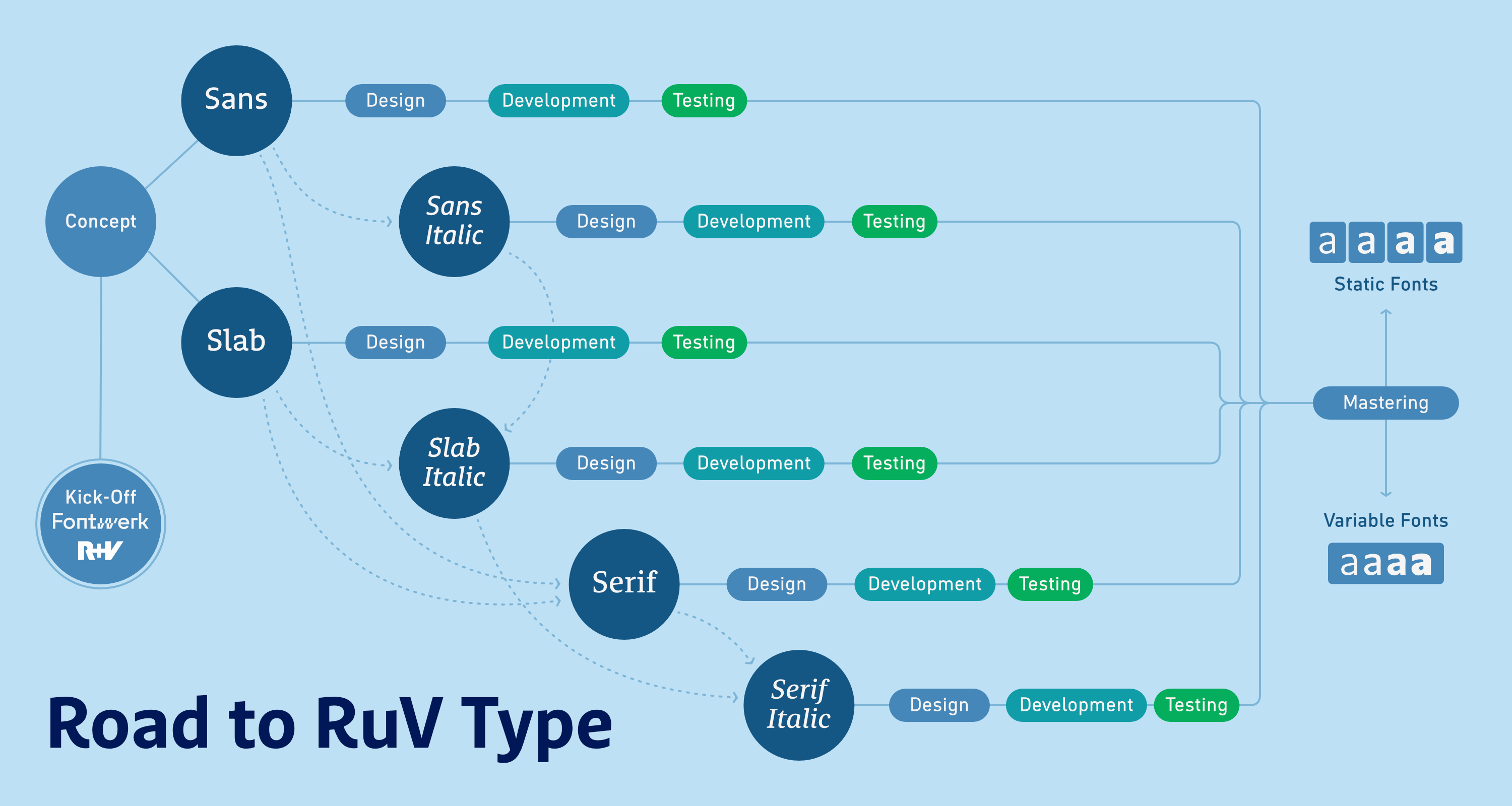 | | The overview of milestones illustrates the increasing complexity as the project progresses and the interdependence of the three styles. | |
|
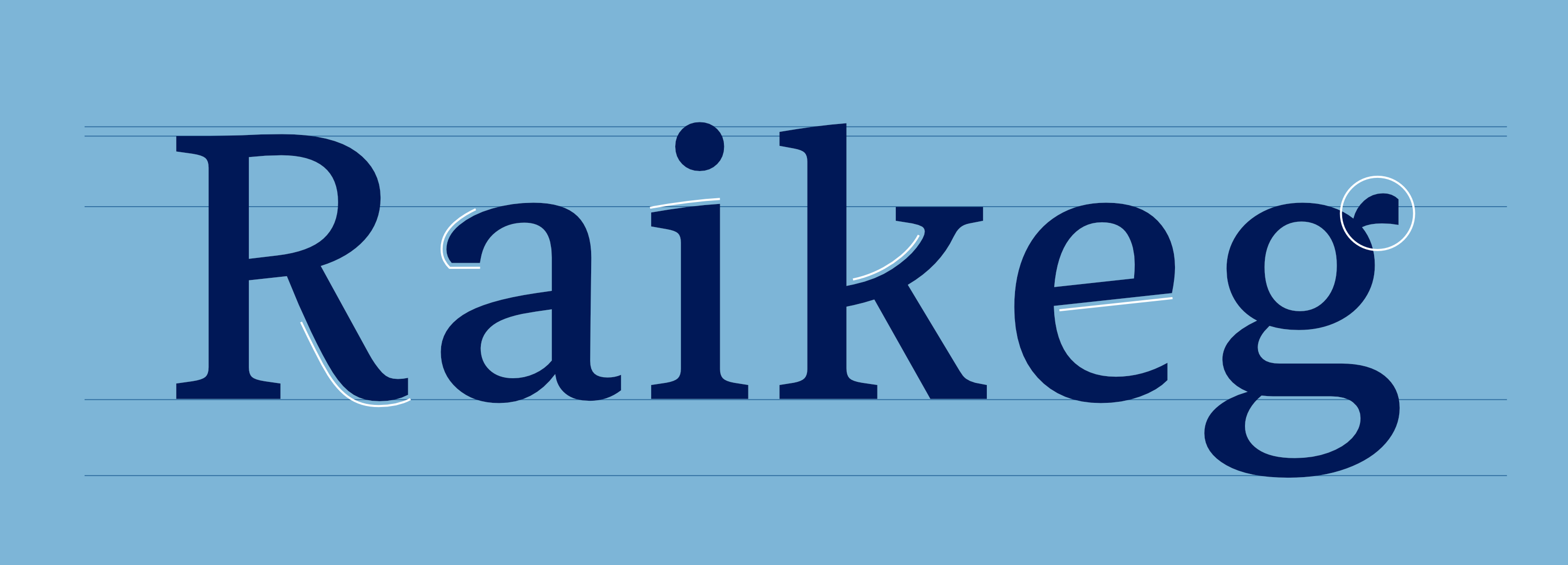 | | The serif counterpart could be designed more efficiently based on the existing sans and slab families. | |
|
| | Three exclusive typeface families for one of Germany’s largest insurance companiesWhen switching corporate typefaces, retail and semi-custom fonts remain the top choice due to their quick availability and lower costs. However, in some cases, the requirements for a new corporate typeface are so specific that only an exclusive solution will do. Recently, we had the privilege of designing such a custom font for R+V Insurance, one of Germany’s largest insurance companies. R+V were on the hunt for a future-proof alternative to replace their existing typeface, FF Marselis. They were keen to carefully evolve their brand and find a superfamily that consisted of a sans serif, slab serif and serif. While sans-serif/serif and sans-serif/slab pairs are not uncommon, the three-part configuration of serif/sans-serif/slab-serif is rare. After extensive research, no retail typeface was found that could meet the requirements, so we set about coming up with a solution for them and embarked on our most ambitious custom type project to date. To ensure the success of the project, teamwork and close collaboration with R+V was vital. Our agile structure and international network allow us to assemble the ideal team for every project. For ‘RuV Type,’ we were joined by Jan Fromm, who is known for his wide stylistic range and with whom we had previously collaborated on the extensive serif typeface family ‘Nice’ (which is currently being expanded to include a similarly extensive sans serif counterpart). We also worked closely with the Marketing, UI and Design teams from R+V as well as the agency, MetaDesign. Our focus, first and foremost, was on creating a typeface that embodies the client’s brand values and which could stand the test of time and the demands of today’s digital and ever-evolving environments. From the first initial sketches right through to the final intensive test phase, we worked hard to push and test the typeface to ensure it would meet R+V’s needs. By the end of the project, we delivered a three-part exclusive typeface family, which included 24 static and six variable fonts, each with 568 characters and support for approximately 100 Latin-based languages. We are so proud of this project and deeply inspired by the exceptionally great collaboration. When a client embodies its brand values as R+V does, translating them into design criteria comes easily. | |
|
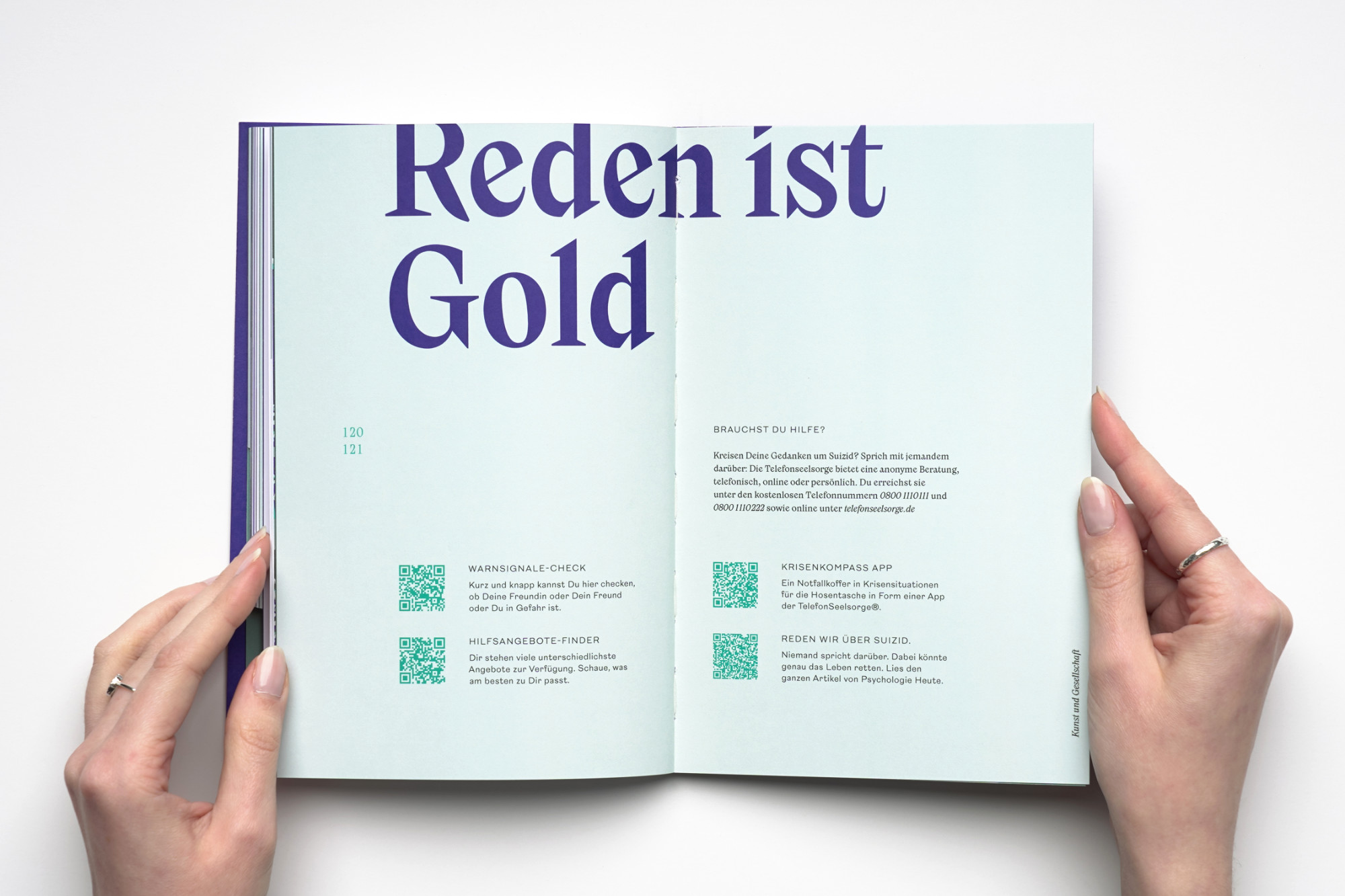 | | As part of Jana Heinz’ Master’s thesis, she developed the branding for a fictitious foundation that aims to raise awareness of mental health issues amongst young people. As the corporate typeface, she chose the strong character of Nikolai. | |
|
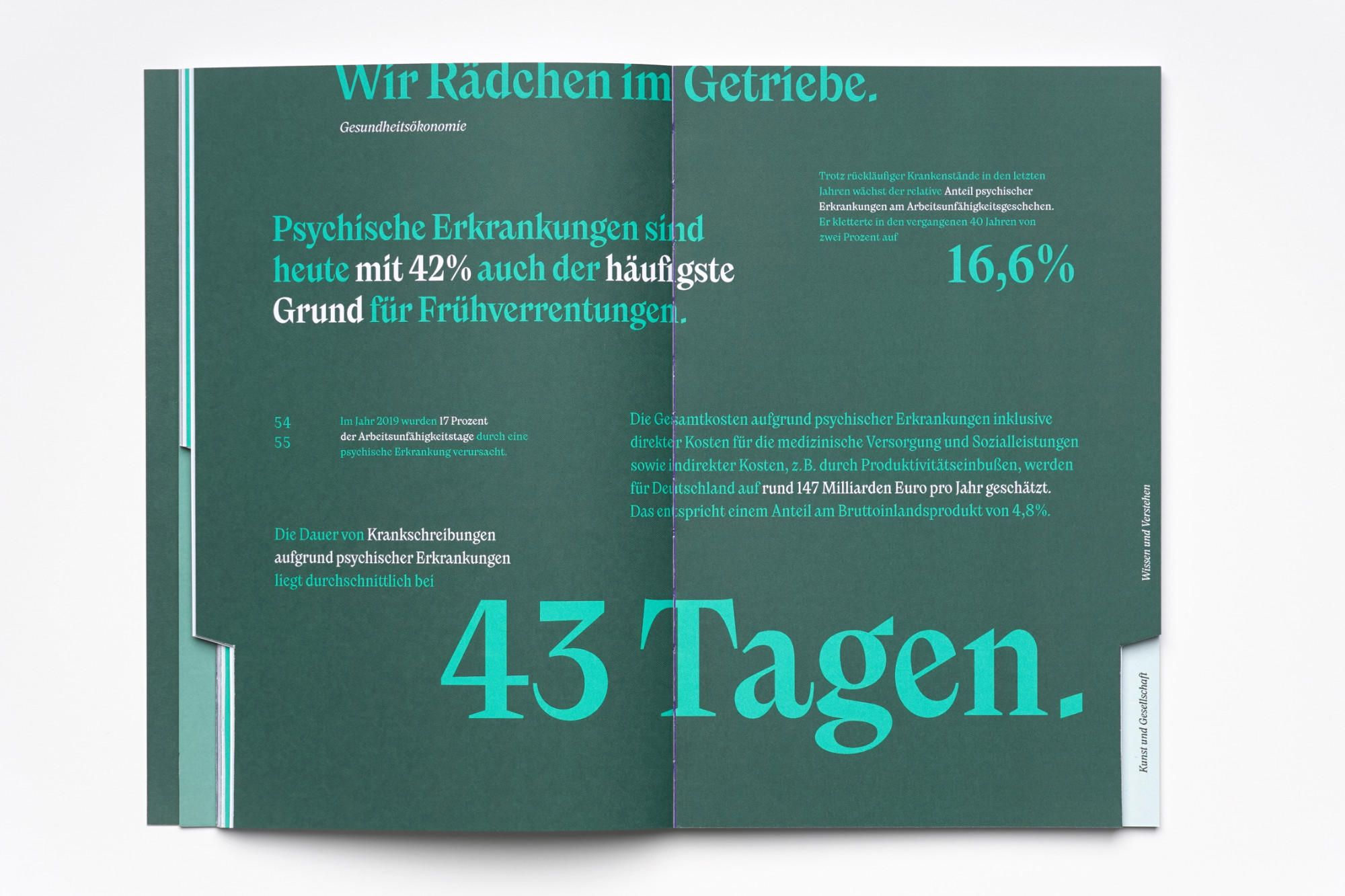 |
| | Nikolai top pick for fictional foundationWhilst studying typography under Professor Andreas Hogan at Trier University of Applied Sciences, Jana Heinz developed the branding for a fictional mental health foundation for young people, GRŌA. As the corporate typeface for the branding, Jana chose Nikolai, designed by Franziska Weitgruber. It is complemented by the sans-serif New Reason by Newlyn, which mostly appears in capital texts. Nikolai not only carries the GRŌA logo, but also characterizes the entire advertising communication as well as the editorial design of the foundation brochure and the in-house magazine ‘Smaragd’. With its expressive italics, strong contrasts and carefully balanced proportions, Nikolai gives the visual appearance an unmistakable voice: elegant, yet lively and approachable. The branding was such a hit that it won a Junior Corporate Design Prize after it was published. | |
|
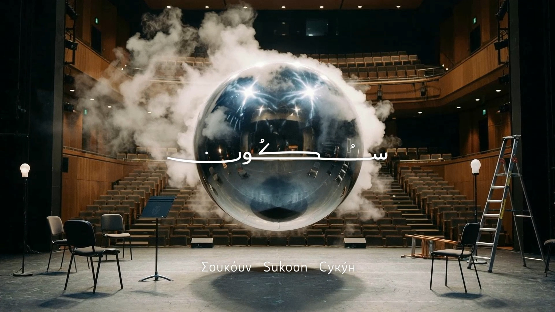 Last month, we launched Sukoon by Yanone and we have been so delighted to see the positive reactions to it over the past few weeks. What started out as a single letter drawn during a moment of inner peace evolved, over the course of ten years, into a fully fledged typeface that can travel across cultures and support hundreds of languages. Its unique character communicates across languages through its form, rhythm and restraint. Sukoon is also one of the reasons why we introduced Regional Pricing, as the font is primarily intended for countries where Arabic is spoken and the font itself speaks over 400 Arabic, Latin, Cyrillic, and Greek languages. If you haven’t taken a closer look at Sukoon yet, why not do it now? We promise you anything but a boring neo-grotesque ;) ↗ |
|
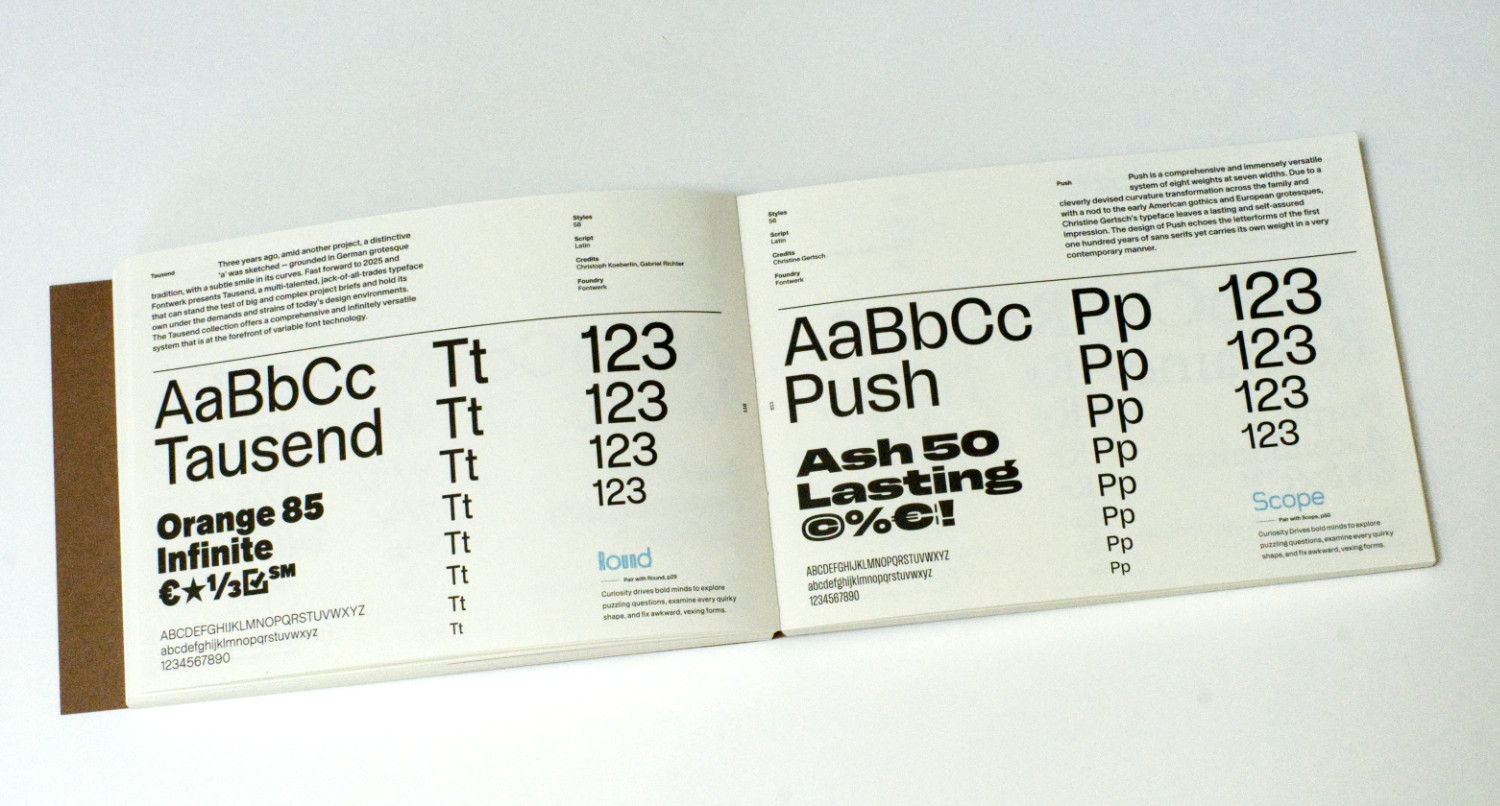 We love a nifty type tool, especially if it’s of the analog or print variety, so we couldn’t have been happier to see Offcut’s special design guide ‘Curious Typefaces, Volume 2’ to ‘interesting, experimental, curious typefaces and what to pair with them’. Not only is it beautifully bound and presented, it also features our very own McQueen, West, Tausend, Push, and Romaine! ↗ |
|
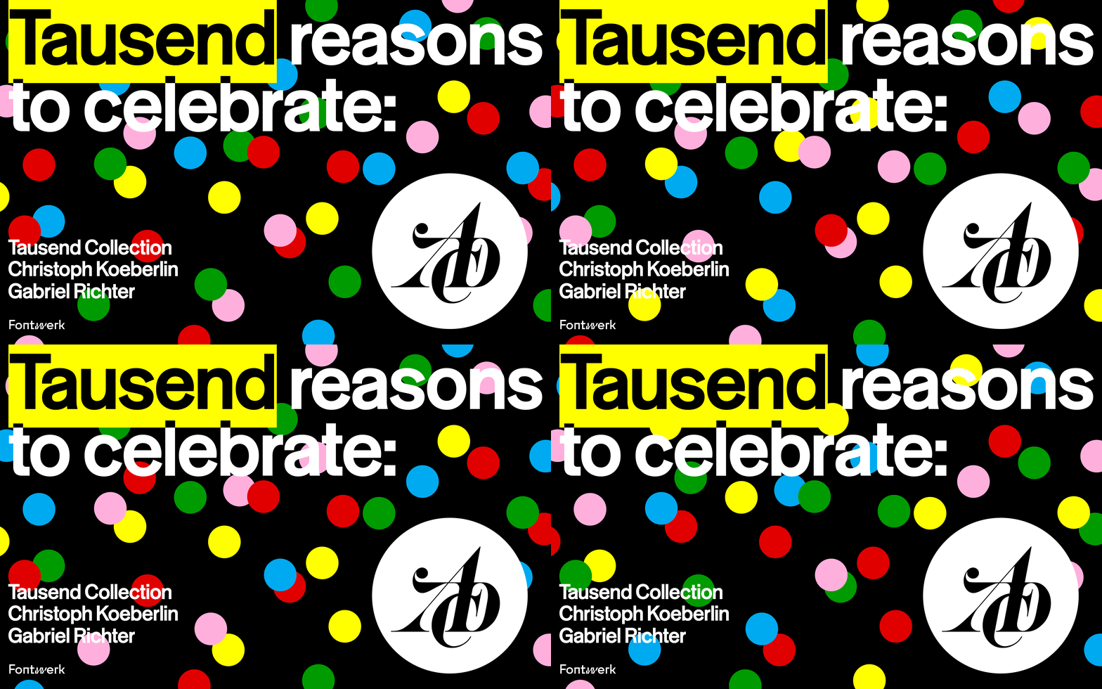 Hot on the heals of the recent wins for Tausend, we are overjoyed to see Tausend Collection shortlisted (‘Auszeichnung’) in the ADC Competition 2026 in the Typography and Type Design category. This means the typeface is among the 575 winners of this year’s competition, selected from 8,000 entries. If our calculations are correct, that means Tausend is among the top 7%. Huge congratulations again, Christoph and Gabriel. ↗ |
|
With our free Trial Fonts you get access to all characters and features of our fonts (except for currency symbols). So you can take all our typefaces for a spin before you buy. And for the eager beavers amongst you, you will also get exclusive access to our brand new (yet to be released) fonts from time to time (currently NG by Ralph du Carrois, the Dialogue Collection by Manuel von Gebhardi, and in the coming days Pangea Mono by Christoph Koeberlin). |
|
|
|