Since last month’s release of Tausend, we’ve been delighted to see the reaction to the new addition to the family, so we thought we would share a few of the nice words from others. Also this month, we share a special use case for Romaine, there’s award news for a Neue DIN logo, we take a moment to mark a milestone for Fontwerk and we have some suggested summer reading. |
|
 |
 |
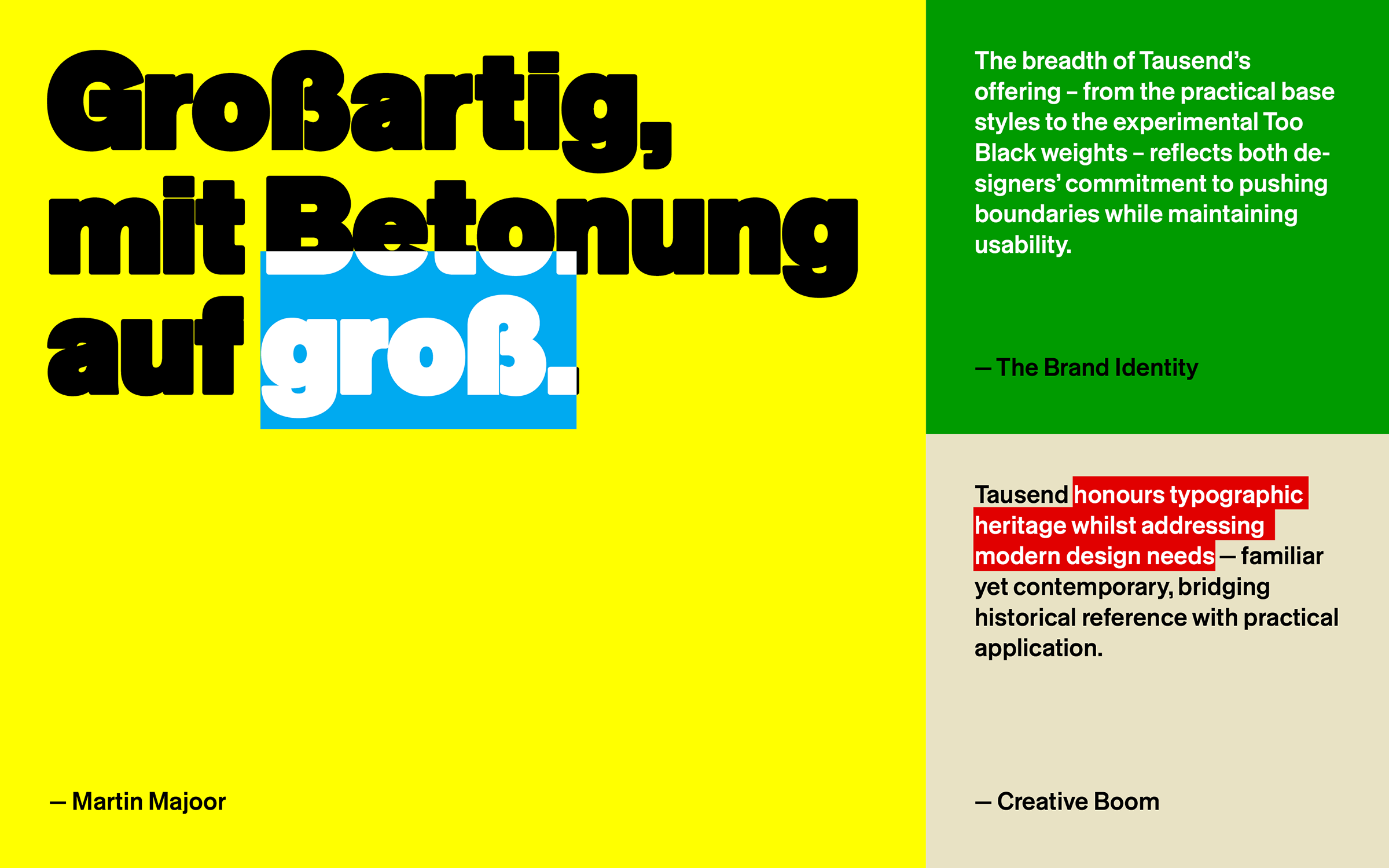 |
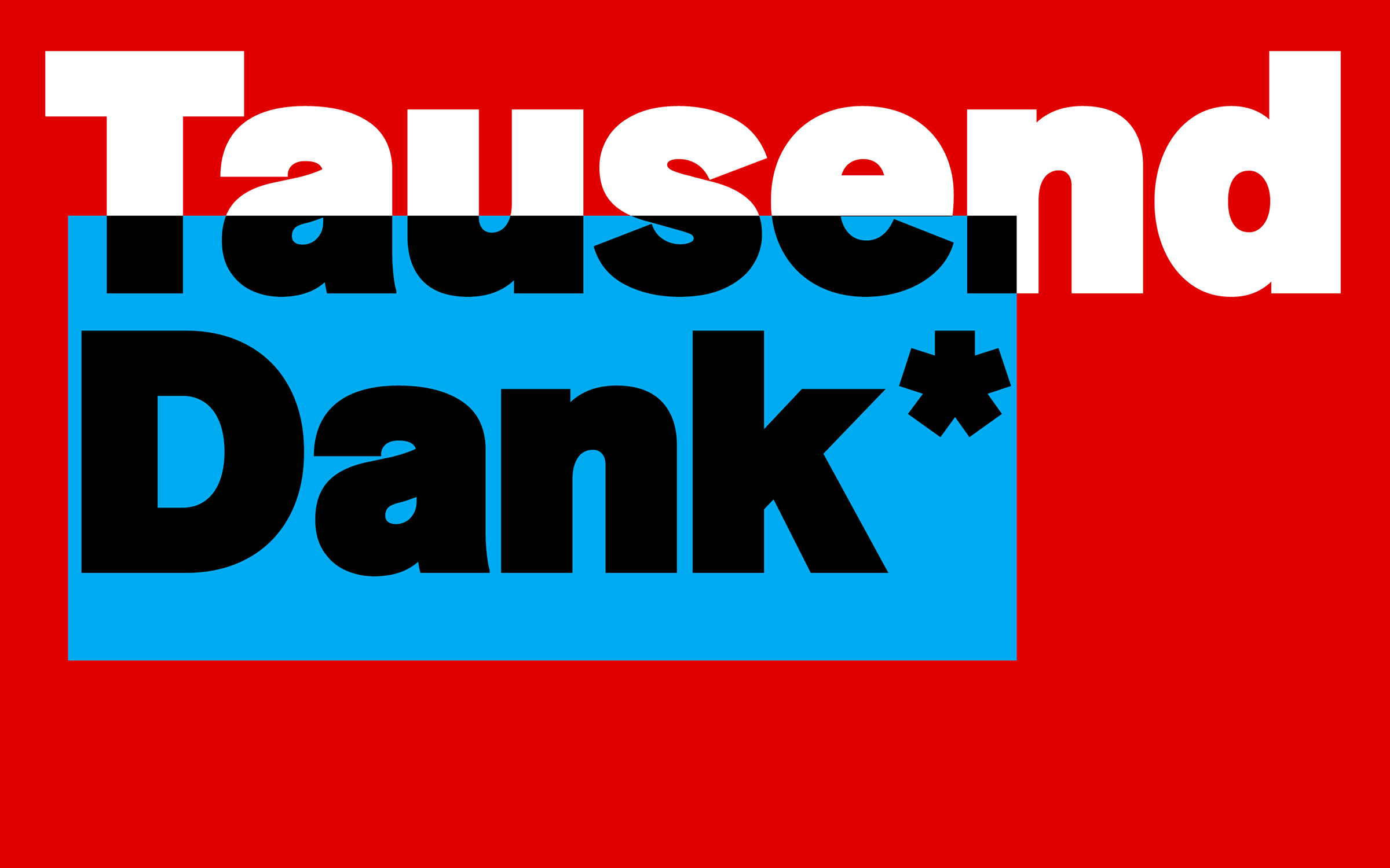
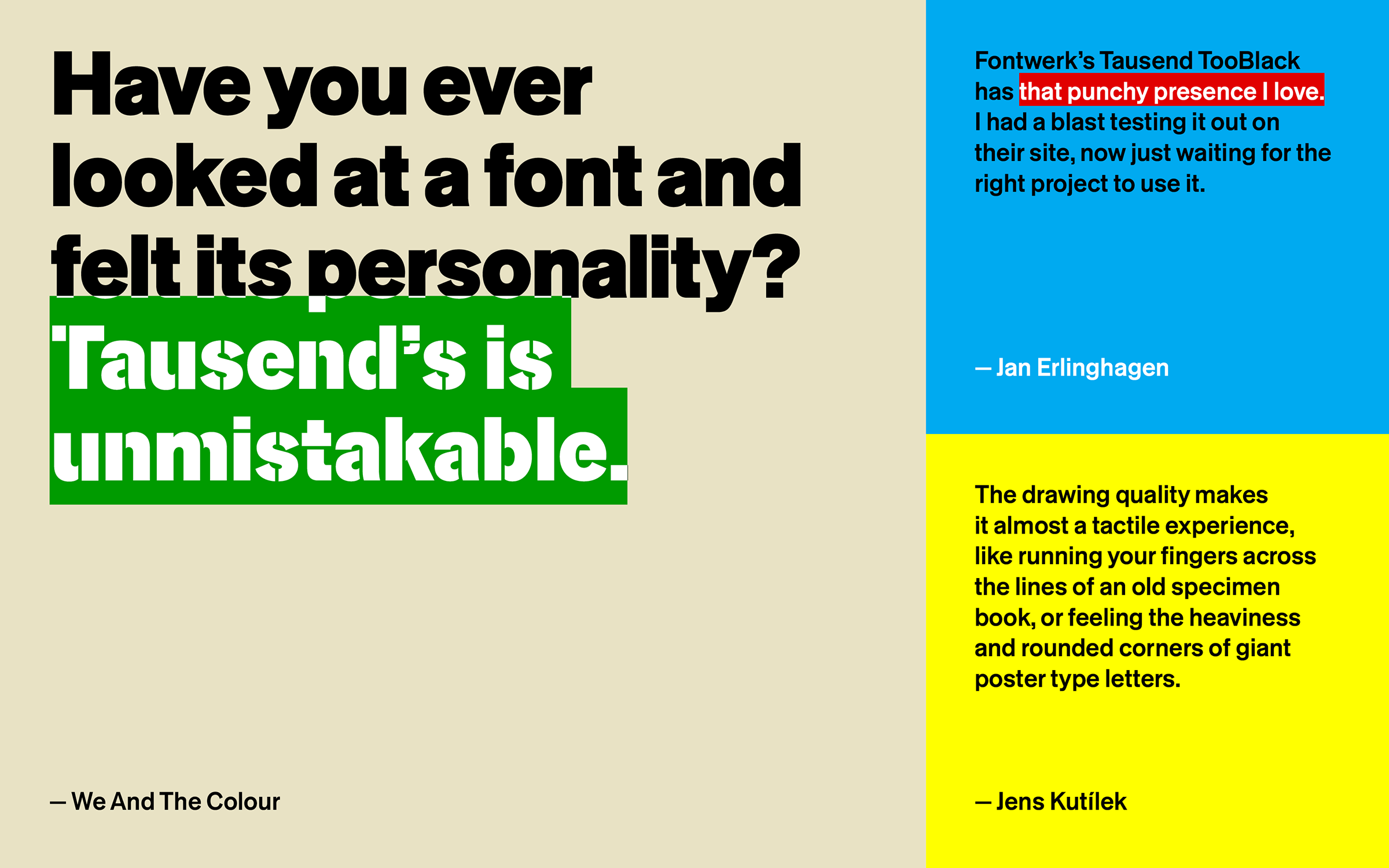
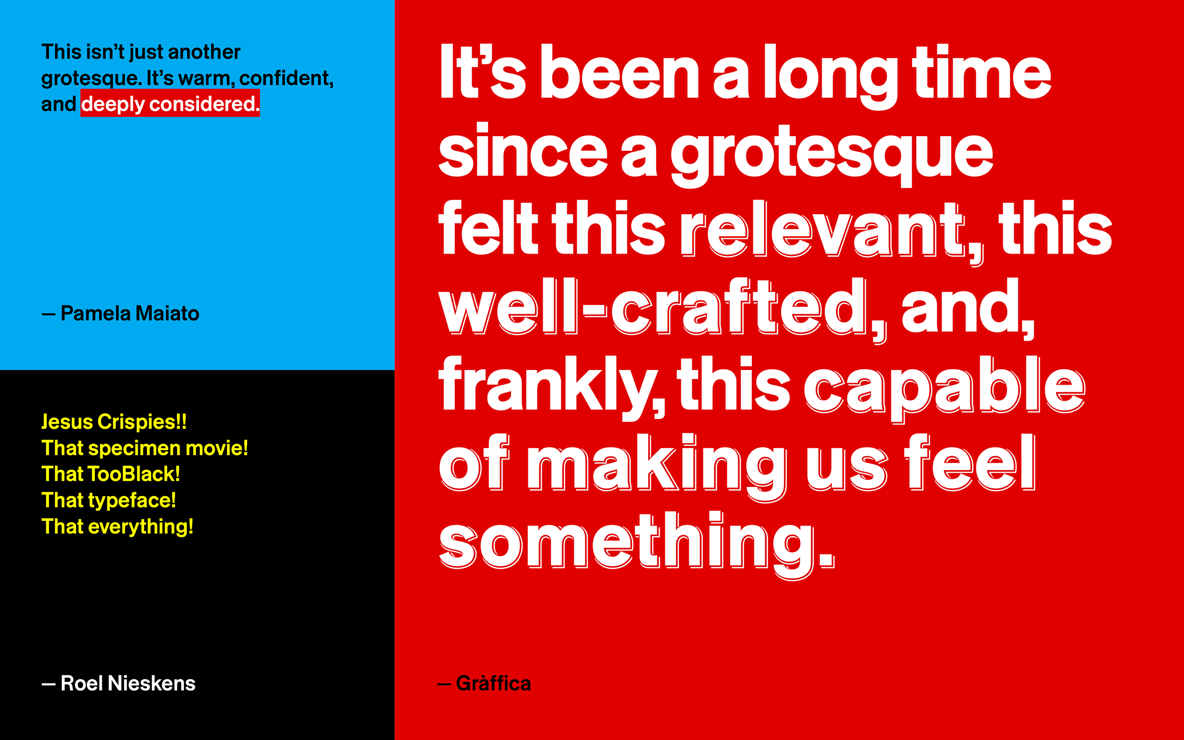
| | ‘Almost a tactile experience’Last month, we launched Tausend – a multi-talented, Jack-of-all-trades typeface that can match and adapt to the demands and restraints of today’s complex and ever-evolving design environments. Designed by the formidable design duo Christoph Koeberlin and Gabriel Richter, Tausend offers an infinitely versatile system at the forefront of variable font technology and includes six subfamilies and over 1000 variable weights and glyphs. Not a revival but a homage, the gentle top-heaviness, curved feet, small apertures, and ‘angular’ curves make Tausend proud, loud and confident. We are so delighted by the response and reaction to our new release that we thought we would share a few snippets from the mentions that have appeared over the past few weeks: “Tausend perfectly captures the spirit of this moment: a time when design needs to be rock solid, flexible, and expressive – all at once. A delicate balance between tradition and rebellion, between utility and personality … From the Gràffica editorial team, we can say this confidently: it’s been a long time since a grotesque felt this relevant, this well crafted, and, frankly, this capable of making us feel something.” — Gràffica (Spanish) “Koeberlin and Richter have crafted a typeface that feels both classic and perfectly suited for today’s design challenges. Have you ever looked at a font and felt its personality? Tausend’s is unmistakable. It doesn’t whisper; it speaks with conviction. This isn’t just a tool for setting text. It’s a partner in communication that brings its own distinct character to the table.” — We And The Colour Also check out the nice words, It’s Nice That, Creative Boom, The Brand Identity, Communication Arts, Identifont, PAGE Online (German) and Designer In Action (German) have to say about Tausend. | |
|
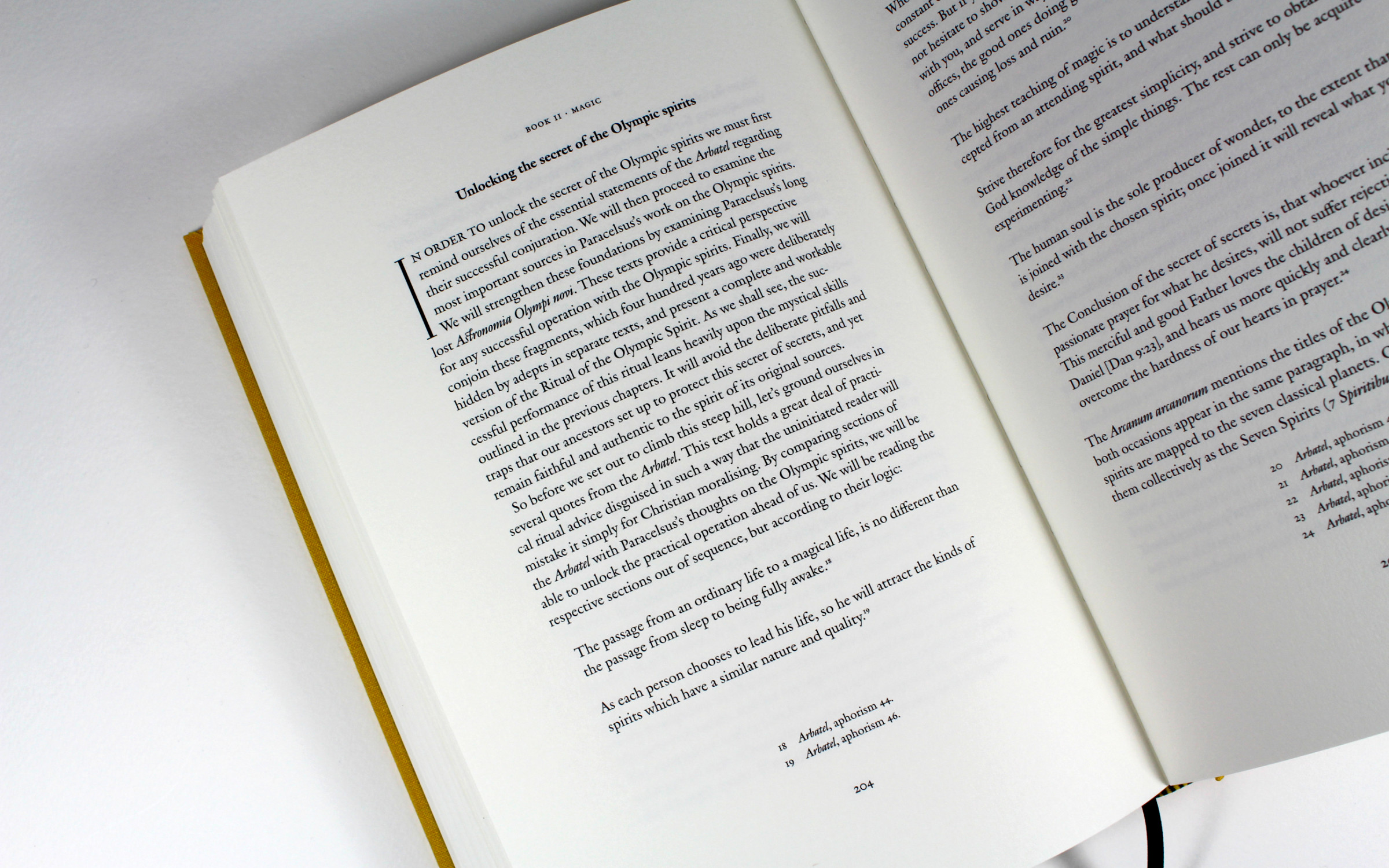 | | Outstanding typesetting with Fontwerk’s Romaine, an interpretation of Robert Granjon’s Ascendonica from 1570. The initial is set in Remnants (Apfel Type Foundry). | |
|
| | Romaine takes center pageThe Cornwall-based publisher, Scarlet Imprint, specializes in contemporary occult texts and practices. Since its inception in 2007, it has become a leading platform for magical and esoteric texts. Every book they publish is a work of art in itself, from the binding to the typesetting, every detail is carefully considered. So we were delighted to see our very own Romaine by Aad van Dommelen grace the pages of Frater Acher’s ‘Holy Daimon’ and ‘Holy Heretics’ books. Romaine complements his ‘magical’ writing perfectly, blending traditional forms with contemporary expression. | |
|
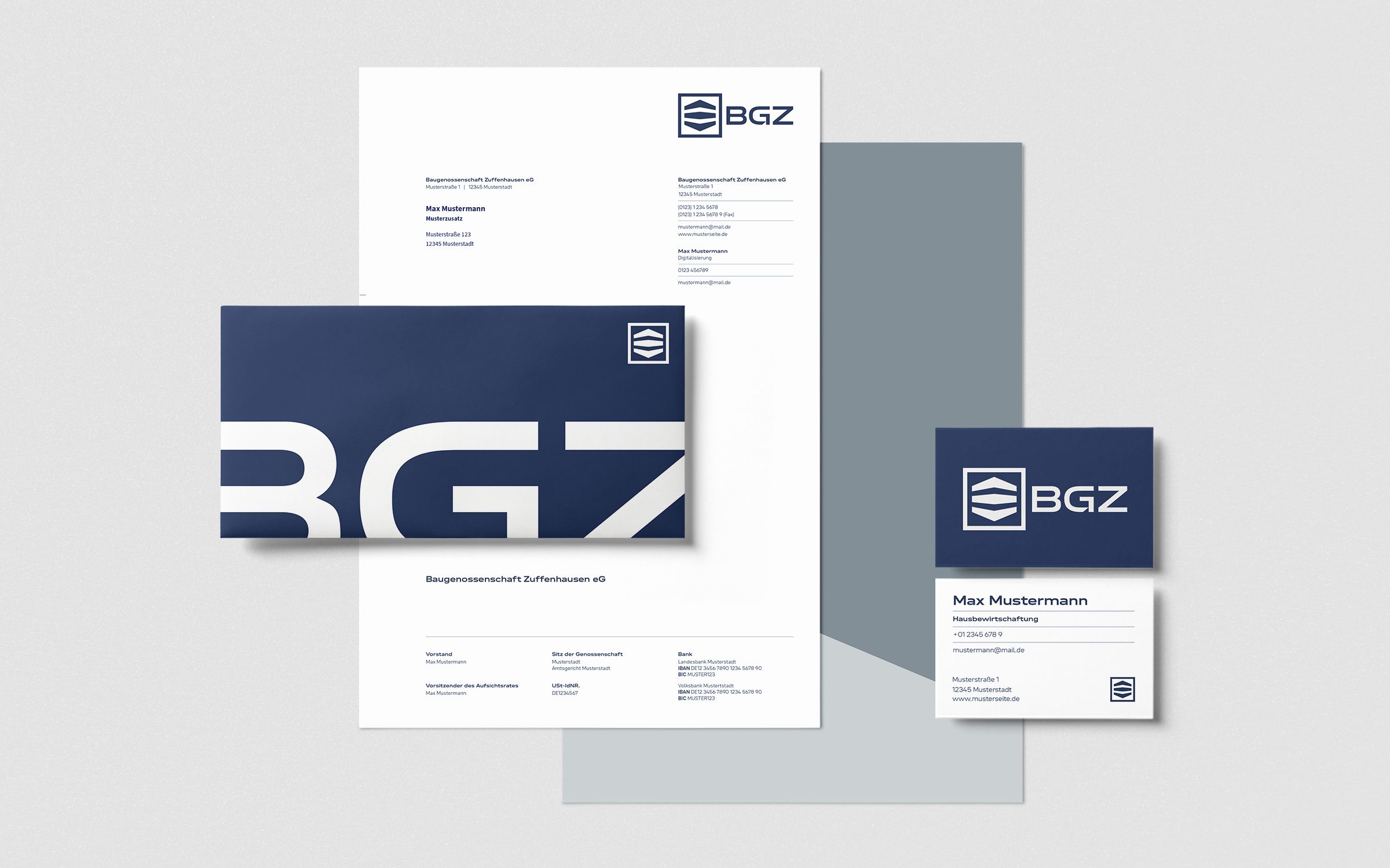 | | After more than 100 years: new logo, new corporate typeface and new colors for Baugenossenschaft Zuffenhausen. | |
|
| | Neue DIN logo for BGZ wins goldIt really does make us smile when we see our fonts taking brands to the next level and it makes us smile even more when it leads to award wins. Last year, the building cooperative BGZ employed Scope, an interdisciplinary office for architecture, interior architecture and design based in Stuttgart, to help them revamp and redesign their image and it included a full logo redesign. The new BGZ logo is based on the semibold variant of Neue DIN XWide and it is also used as the corporate font. The square pictogram in the logo has been simplified and the capital G has been modified in such a way that it builds a bridge to its serif predecessor, which served the brand for over 100 years. At the recent German Brand Awards, Scope scooped Gold in the category of Excellence in Brand Strategy and Creation Brand Design – Logo for their work for BGZ. As the jury remarked: “The revised logo preserves historical values while conveying a clear, contemporary aesthetic through the modernized typeface ‘Neue DIN XWide’ and subtle adjustments to the logo. The harmonious integration of typography, color scheme, and visual consistency elevates the brand to a new level. […] This logo is a powerful symbol of change and lasting value.” | |
|
Time flies when you’re making fonts and we can’t quite believe that it’s now five years since we launched Fontwerk back in the summer of 2020 with the first of our font families: Ika, McQueen, Nikolai, Pangea, Romaine, Supermarker und Turbine. A little background: we actually started working on the idea for Fontwerk one and a half years before the launch, as we always say, good typefaces take good time. Fast forward to 2025 and we are taking a moment to celebrate this milestone in our font-making journey. Today, we already have more than twice as many typeface families in our program and have worked with amazing partners, customers and clients. What a crazy journey it has been so far … We wish we had time to share some more thoughts on what these past few years have taught us, but looking forward is always much more exciting than the other way round. This being said, we urge you to check out all our families to see how much we’ve grown since those first days. Don’t forget you can test drive ALL our typefaces when you download our trial fonts. ↗ |
|
We love to keep up to date with industry news, especially trends and new innovations, so we thought we would share this latest Logo Trends report by logo expert and founder of Logo Lounge, Bill Gardner (via GDUSA). Having studied over 30,000 logos from 120 countries, Bill has compiled a treasure trove of insight into all things logo-related. ↗ |
|
We love to read long form, especially when it is about legendary design makers and shapers. So we can highly recommend these in-depth articles from our friends at Type Journal about the inspirational Experimental Jetset. Experimental Jetset is an Amsterdam-based graphic design collective that was founded in 1997 by Marieke Stolk, Erwin Brinkers and Danny van den Dungen. Their work focuses mainly on printed matter and site-specific installations. ↗ |
|
Want to see more Fontwerk fonts out in the wild? Or need some inspiration for your latest design project? Then head to our growing In Use Gallery to see many examples of our typefaces in use. If you have used one of our fonts in a project then we’d love to hear from you. |
|
|
|