Happy Equinox! With under 100 days until the end of the year, we are working hard to bring you some exciting new things before 2024 comes to a close.
Happy Equinox! With under 100 days until the end of the year, we are working hard to bring you some exciting new things before 2024 comes to a close. While we have to keep you waiting just a little longer before the grand reveal, we’re delighted to bring you one special use case featuring the fabulous Pangea and a brand new service case we worked on recently, which includes a totally new and revamped logo for a well-loved brand that pet lovers might recognize. Read on to find out more. |
|
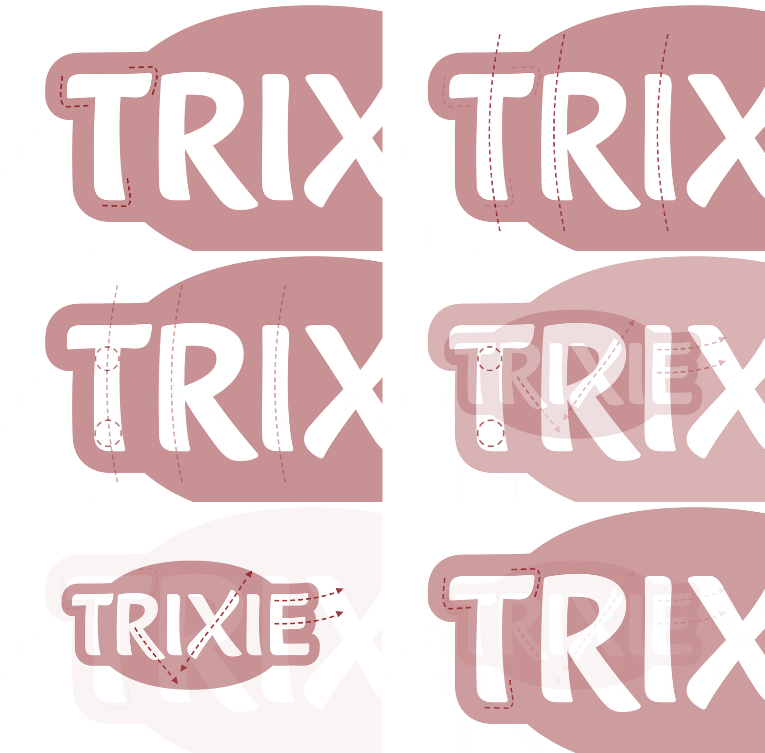
 | | Trixie’s new logo is characterized by a slightly curved basic structure, a subtly increasing line thickness, a slightly upward line, the absence of outlines and a simplified background. | |
|
| | Brand new logo for TrixieThe European market leader of pet accessories, Trixie, has turned to Fontwerk to help modernize and revamp their logo as part of a complete packaging overhaul. The brief required us to think creatively as the new packaging concept meant that any future logo had to work on an array of different backgrounds. From rubber labels to metal, from fabric to wood, from printed to embossed, the new logo needed to be able to work across a broad variety of materials and across a range of scales and sizes. Drawing on the expertise of Franziska Weitgruber (designer of Nikolai), we came up with four different variations and a favorite quickly emerged. It was a privilege to work on this project and the Trixie team were rather pleased with the result too. As their Head of Marketing, Claudia Menzel explains, ‘[Fontwerk] took our project team on a journey and explained clearly in the presentations how the designs were created. That helped a lot in the decision-making process. The logo works extremely well on all media and we are very happy with it.’ | |
|
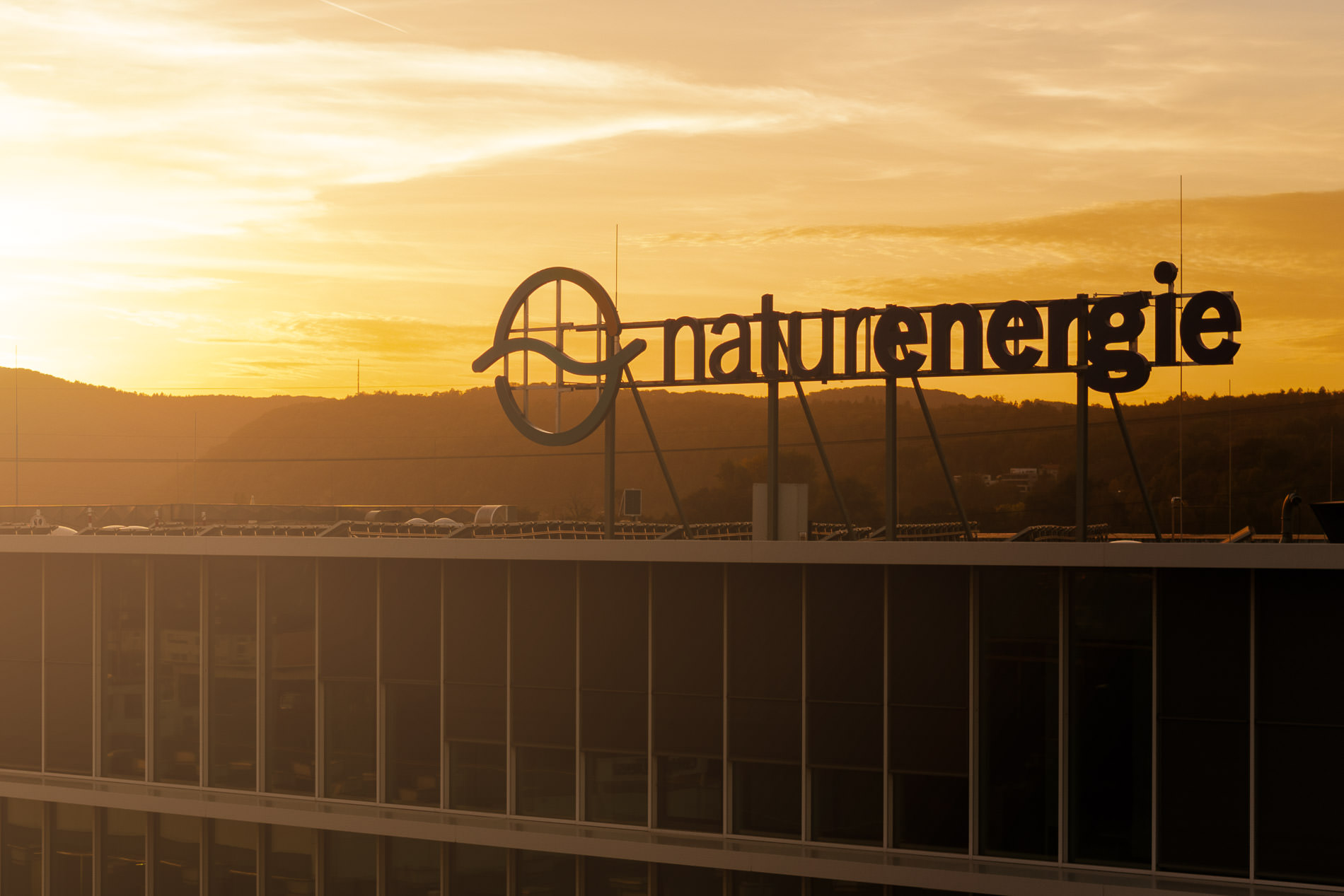
 | | Pangea was used in the logo in a slightly modified style for the “energie” part. The heavily modified original of the thinner “natur” part is likely set in KLIM’s Söhne. | |
|
| | Green energy, green fontThe Swiss energy supplier Energiedienst was founded back in 1998 and since then has grown and expanded to offer electricity and energy-related services to southern Baden, north western Switzerland and Valais. At the end of 2023, the design agency tonic was tasked with coming up with a broad brand restructure and new visual identity. The company now has a brand new name, naturenergie, a new color palette, new look and our very own Pangea by Christoph Koeberlin is now their corporate font. Pangea’s own green credentials chime with naturenergie’s vision of transforming into a sustainable energy provider and their brand motto of ‘Welcome to the We & Now’. Pangea’s large character set and modern, cohesive and compact appearance ensures that naturenergie’s new look is transparent, clear and powerful. If, like naturenergie, you’re in the market for a font that tries to make the world a better place, Pangea is a perfect match as 25% of all designer royalties are donated to preserving the rainforest and to implementing large-scale reforestation projects. | |
|
 The ‘world’s leading art and design site’ asked our founder Ivo Gabrowitsch and other experts to name the best typefaces of the last three decades and explain why they chose them. Of course, such a list can only be subjective, but it certainly makes for fascinating reading. You can find out which fonts Ivo has picked from the thousands and thousands of possibilities over in the Creative Bloq. ↗ |
|
If you’re keen to customize your font, we are happy to help! Whether you need an expanded character set or some extra special font engineering, whether you need a brand new logo or just want some type direction, we’ve got your back. If you want to stand out from the crowd with a custom font, tailor-made for you and your brand, please get in touch. |
|
|
|