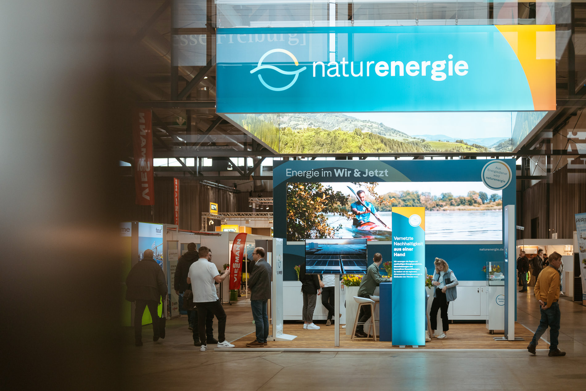
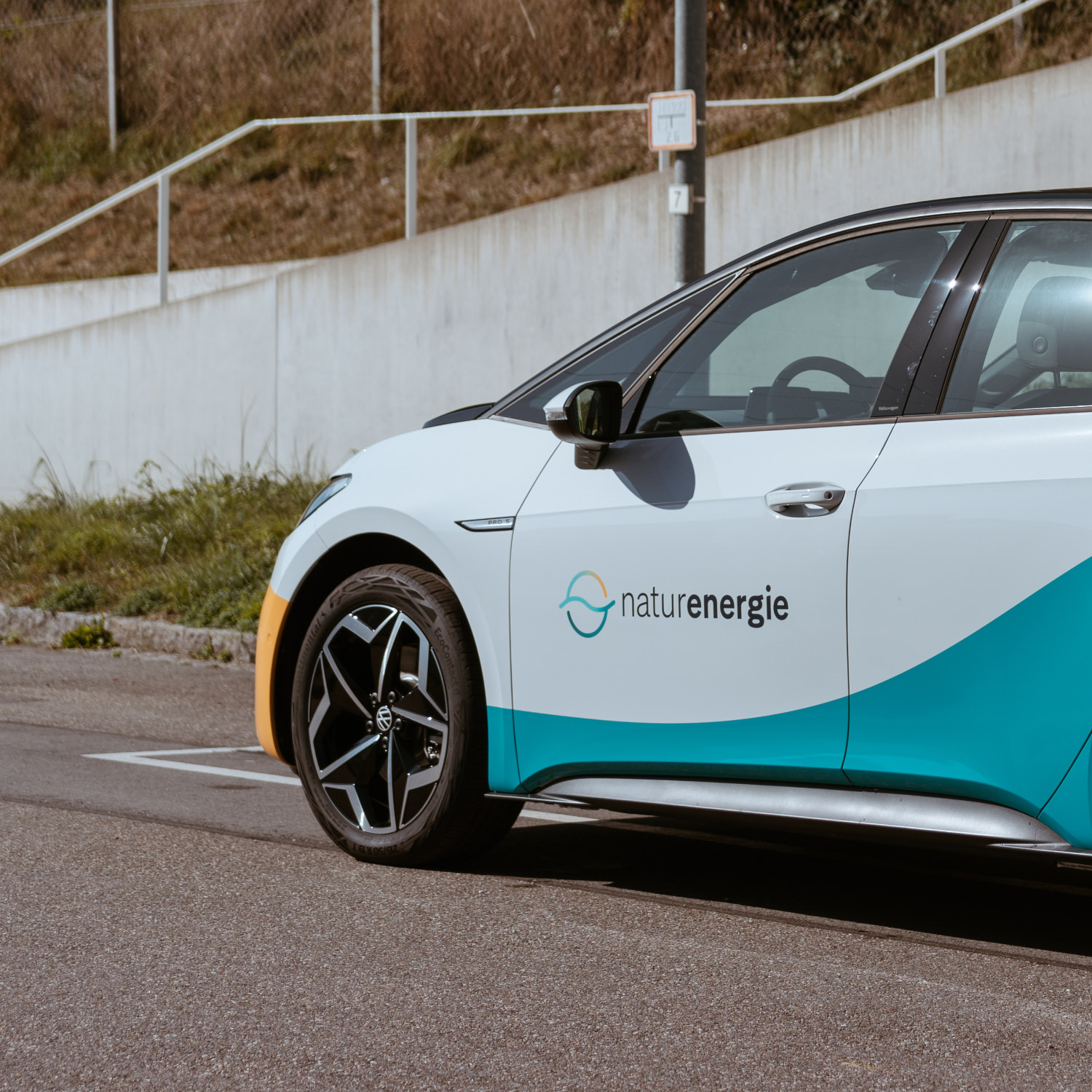
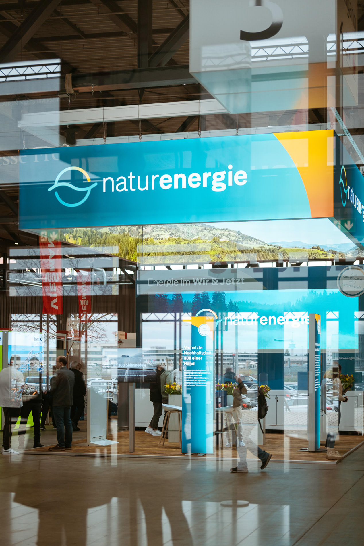
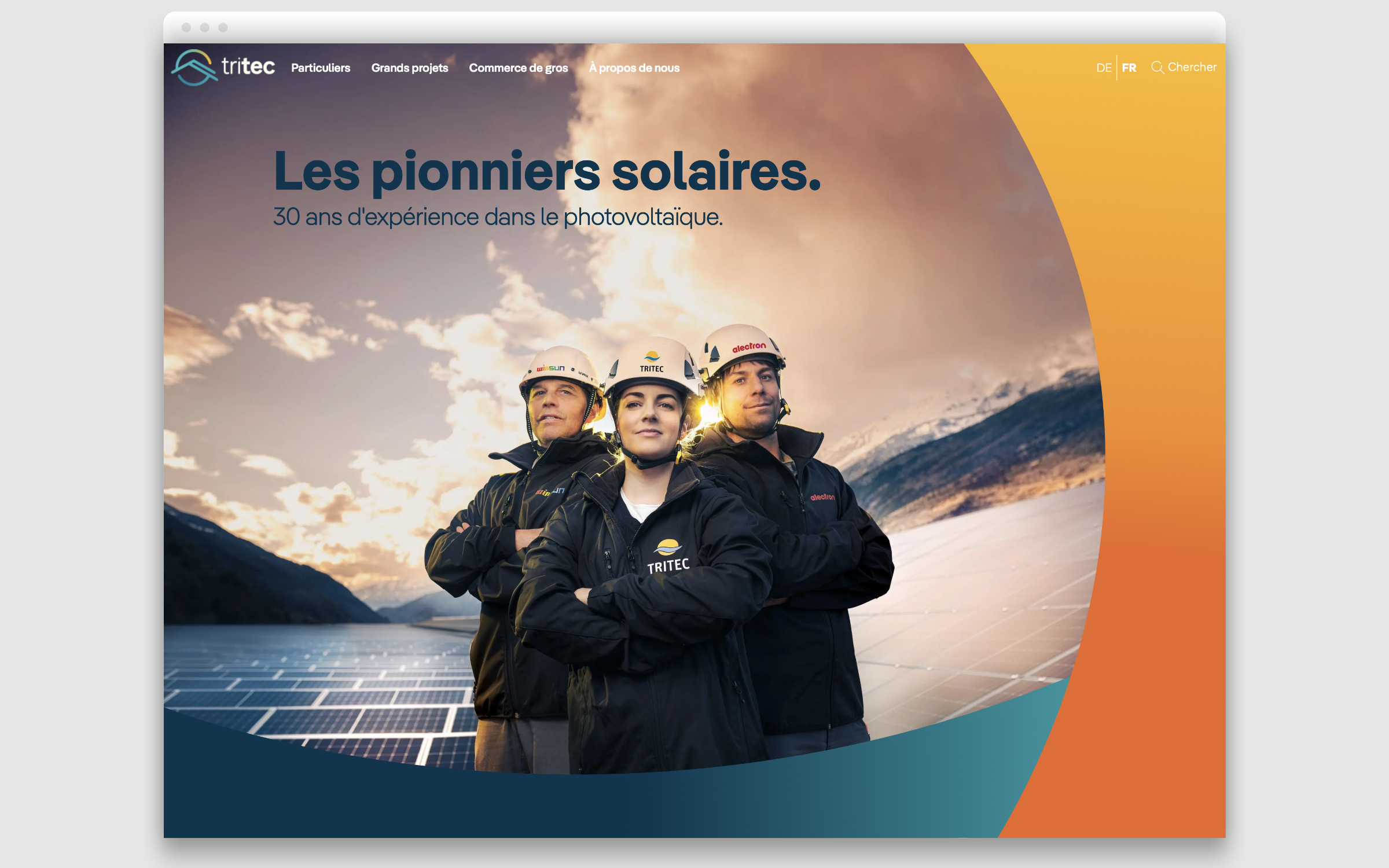
Founded in 1998 in Laufenburg (Swiss Canton Aargau), Energiedienst is an energy supplier that offers electricity and energy-related services in southern Baden, north western Switzerland and Valais. At the end of 2023, the group restructured its brand strategy, which led to its renaming in 2024 to naturenergie, with the sub-brands enalpin (active in the Upper Valais market area), tritec (Swiss photovoltaic market) and naturenergie netze (the grid operator for South Baden).
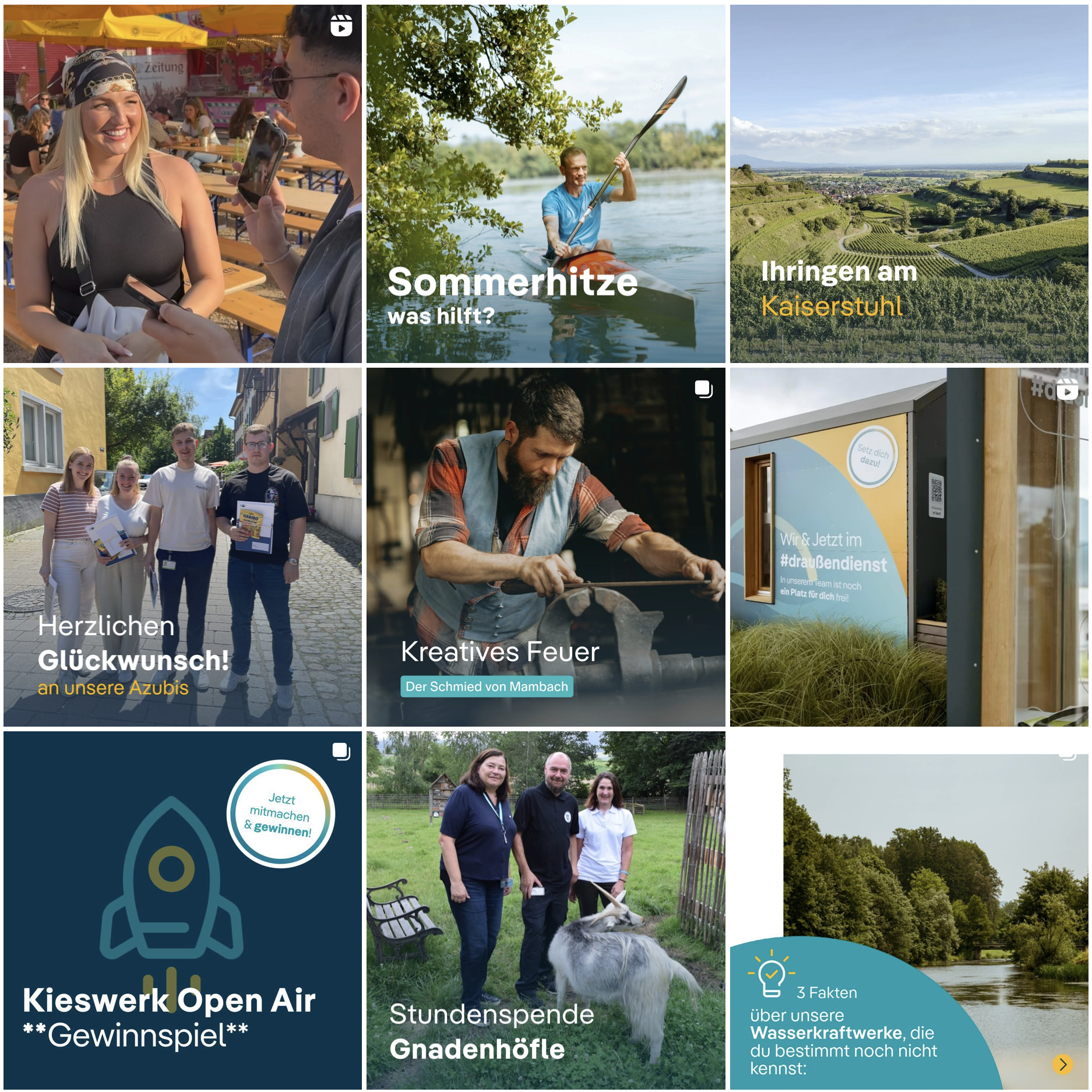
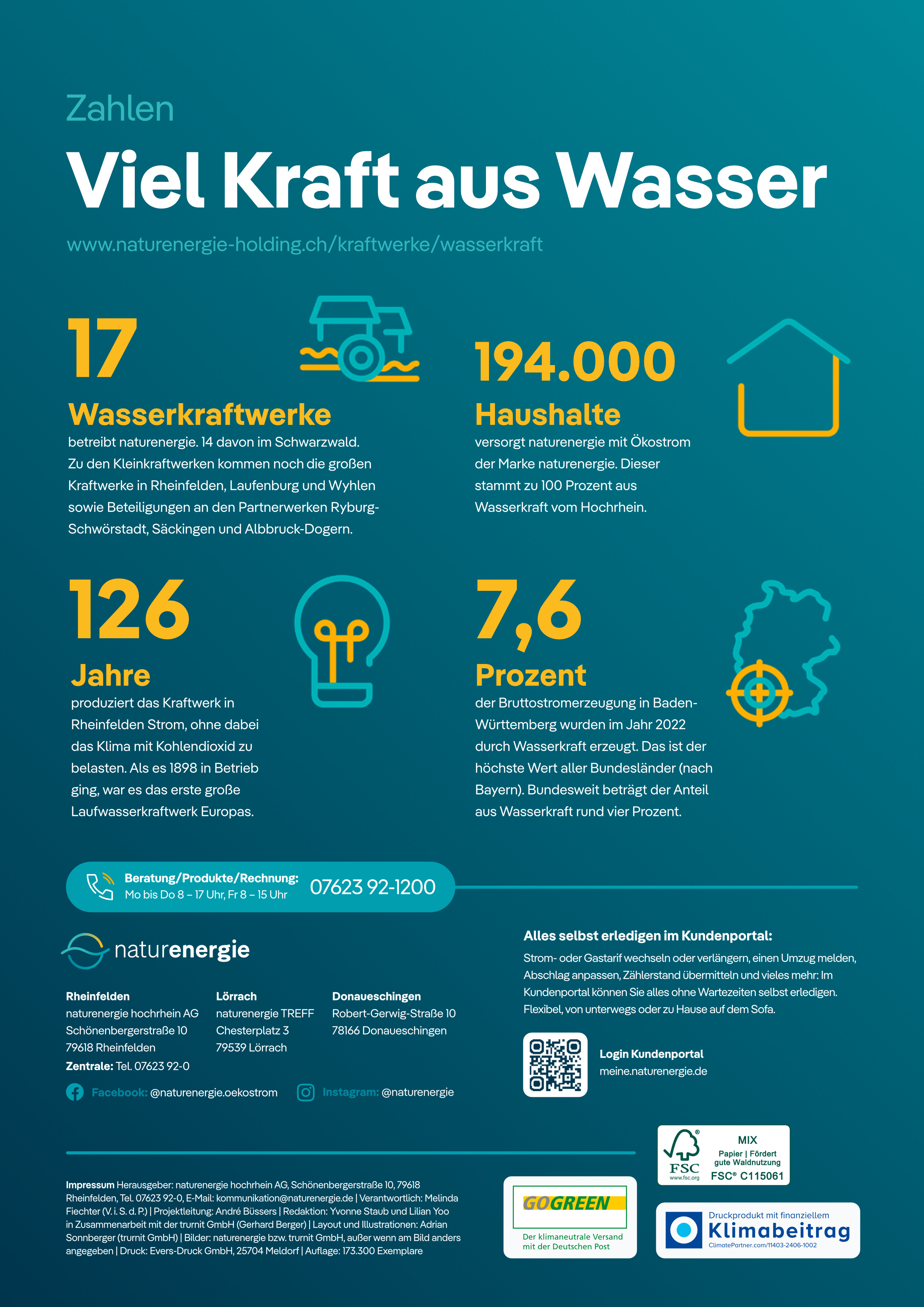
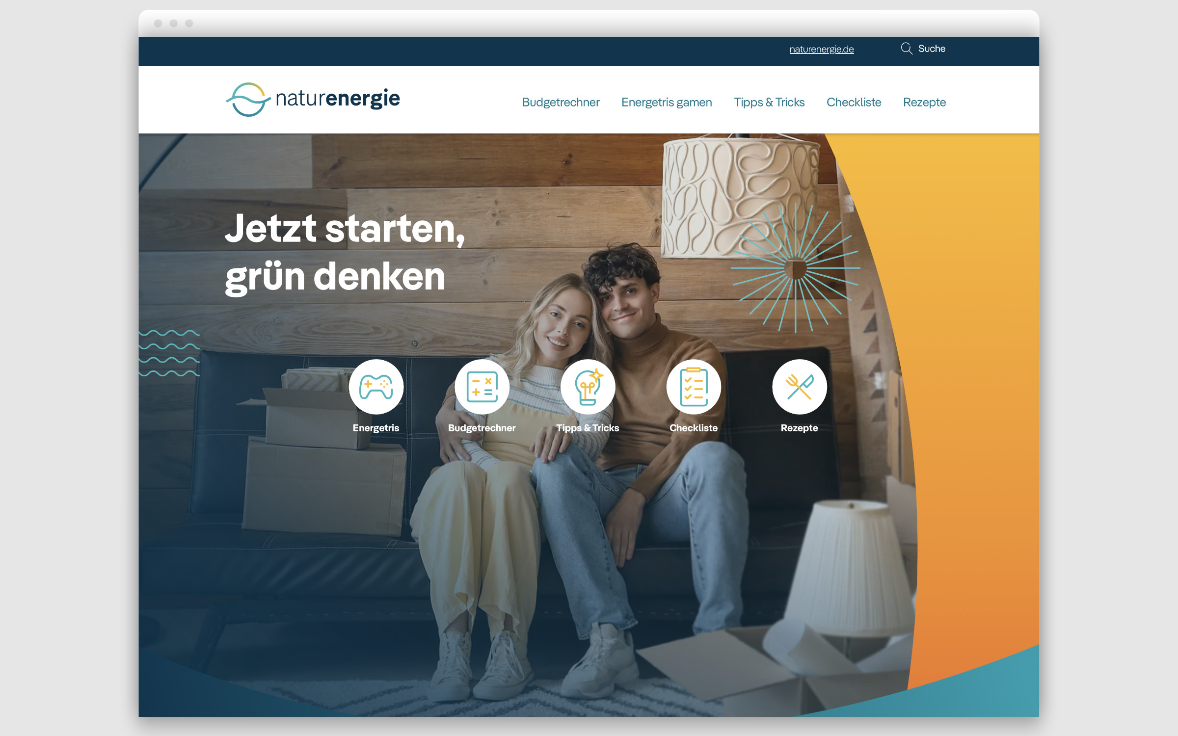
The new visual identity was developed by the tonic agency from Upper Valais. “Many people call us marketing specialists or creative agencies. We call ourselves design activists”. With this in mind, Sebastian Bonani and his team created the brand kit for naturenergie with colorful, partly animated pictograms (“glyphicons”), a turquoise-yellow color scheme and using Pangea as the new corporate font.
“Energy transition is a major goal. Anything is possible if we join forces. If everyone pulls together, the future can become greener and more colorful at the same time,” says Bonani as he sums up his team’s motivation on the project page. With this in mind, Pangea is the perfect team player. 25 percent of designer royalties from Pangea go towards rainforest conservation and large-scale reforestation projects.
In terms of design, the font also supports the sustainable transformation of the naturenergie brand, under the motto “Welcome to the We & Now”. Pangea is modern, compact and cohesive. The striking “pince-nez glasses” g, the two-stage a and the l with a curved end give the otherwise neutral typeface a humanistic touch. Diagonal terminals and round dots ensure a friendly appearance. Together with the large character set, Pangea’s range of services corresponds 100 percent to naturenergie’s brand essence: transparent, clear and powerful.
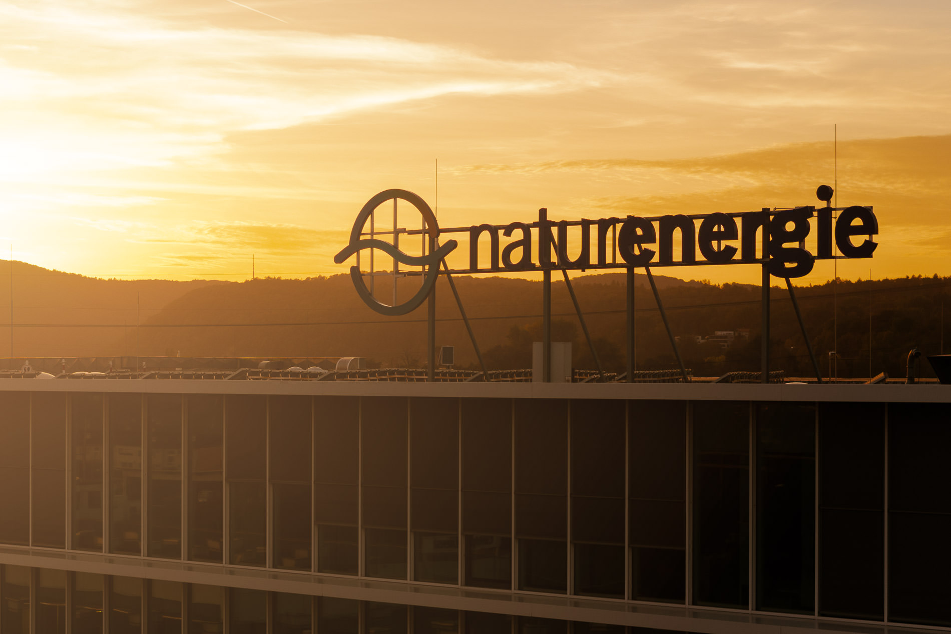
Pangea was used in the logo in a slightly modified style for the “energie” part. The heavily modified original of the thinner “natur” part is no longer known.