Over the past few weeks, we have been busy beavering away in the Fontwerk Studio, working on some super exciting, new things that are coming very soon… In the meantime, we wanted to say hello and share two fantastic in-use cases featuring the striking McQueen and the multilingual talent that is Pangea.
 | BRAND BUILDING FONTS UNDER THE SPOTLIGHT |
|---|
|
Welcome to the latest edition of Werknews. Over the past few weeks, we have been busy beavering away in the Fontwerk Studio, working on some exciting, new things that are coming very soon… In the meantime, we wanted to say hello and share two fantastic in-use cases featuring the striking McQueen and the multilingual talent that is Pangea. Read on to find out more. |
|
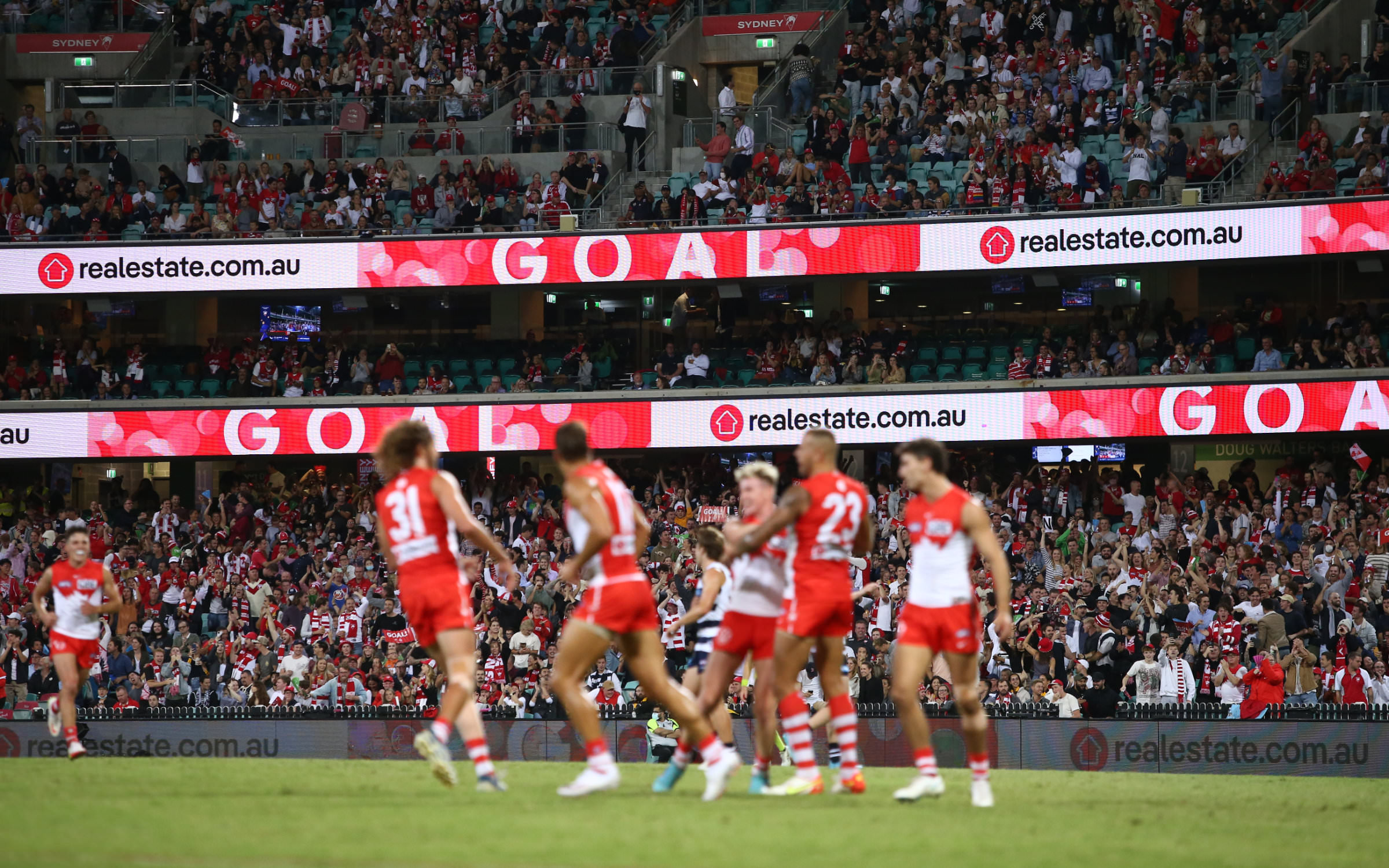
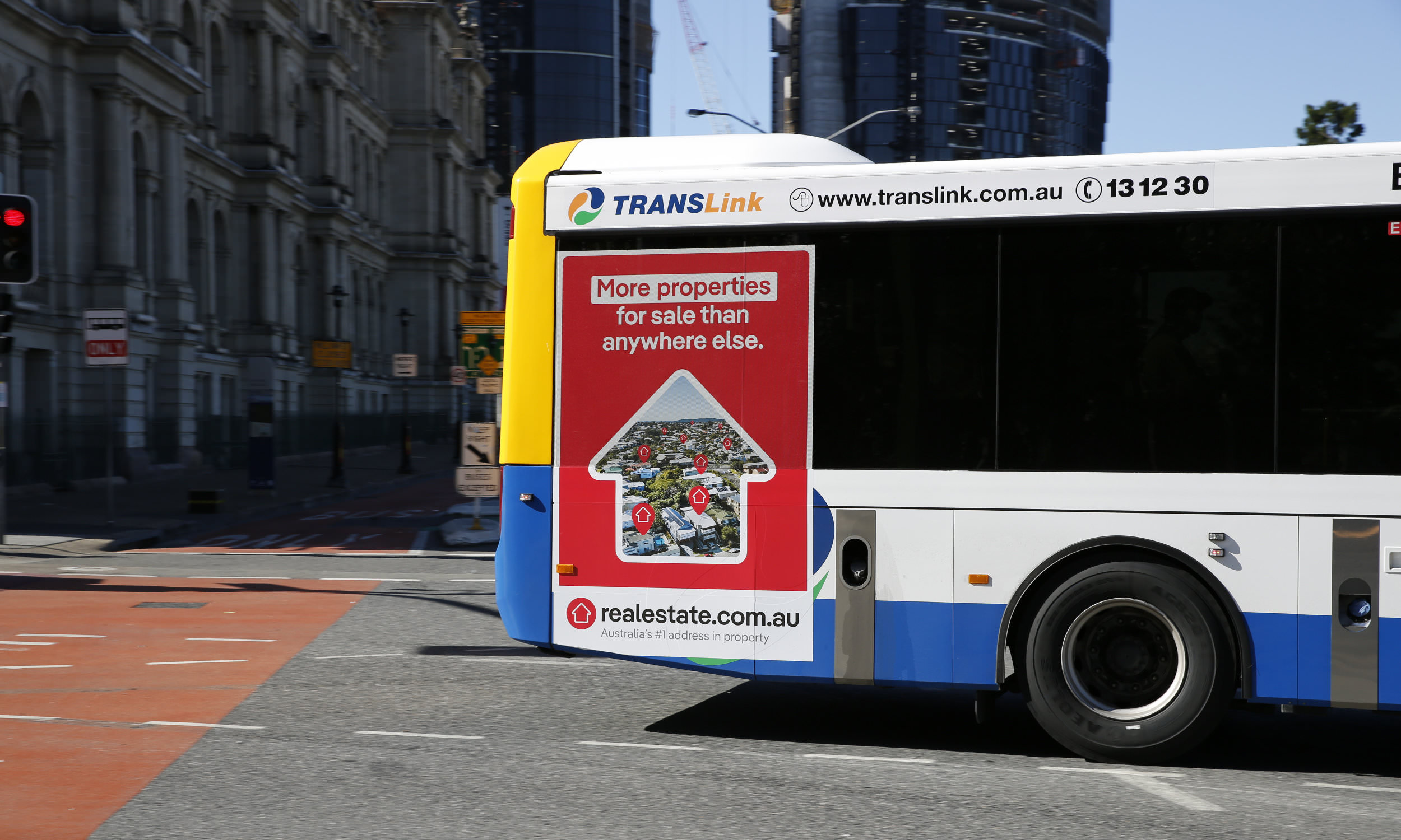 | | Pangea in use for Australia’s largest real estate platform, realestate.com.au | |
|
| | Glocalization: REA Group The REA Group is a global digital business that specializes in property. Spanning three continents, their mission is to change the way people experience property. Their portfolio spans a broad spectrum of brands from residential and commercial websites to flatmate finding websites, through to mortgage application and e-lodgement solutions. REA has risen to become Australia’s seventh largest digital brand and operates the country’s largest real estate platform, realestate.com.au. An international presence calls for a multilingual, hardworking and eye-catching visual identity. Our very own Pangea Collection therefore seems the perfect fit for a brand that has its eye on a world audience. Both Pangea and Pangea Text are the new corporate fonts and are used globally across REA’s branding. The Pangea family currently supports over 500 languages with its European-Latin, African-Latin, Greek, Cyrillic, Hebrew and Arabic character sets. Christoph Koeberlin has worked closely with designers from across the globe to realize the extensive language support that this omnicultural typeface offers. Not content with being a multilingual talent, Pangea’s breadth and depth of styles is expanding too. Pangea Condensed is currently in the works and will include SemiCondensed, Condensed and XCondensed. If you fancy testing out some Beta Fonts, do get in touch with us. | |
|
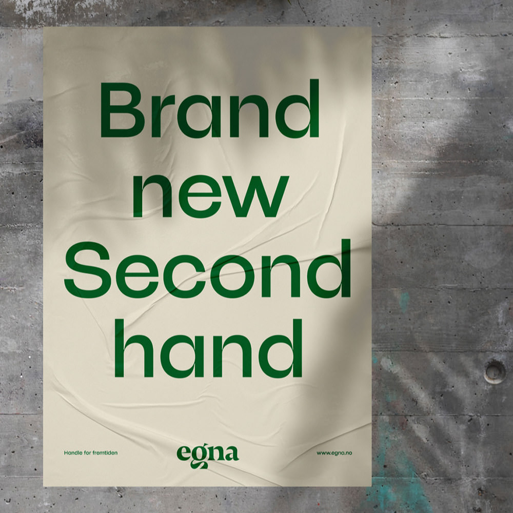 Egna is a mall with a difference, with sustainability at its core, the shopping center opened its doors in the Norwegian city of Bodø in 2021. Offering goods and services that are ‘in harmony with our planet’, the company is committed to providing an alternative model to shopping and investing in the local community by creating environmentally friendly jobs. Egna’s brand identity was created by the local design company by north, an ambitious and forward-looking studio that works under the motto ‘Big Impact with a Small Footprint’. For their house font, by north, chose the upright styles of the eccentric and eye-catching McQueen Display. In their brand manual, by north highlights the strong contrasts and whimsical ink traps of McQueen, which underline the craftsmanship behind the design. Each character is an original, with small traces of use, so to speak. This formal yet unique look of the typeface fits seamlessly with the Egna concept. ↗ |
|
We always do a little happy dance when we see our typefaces in the wild! And we would love to see how you’ve used them too. Our ever-growing in-use gallery showcases some of our clients’ work and we always like to shout about them on our socials. So, if you’ve been working on something that you are proud of and have some images to share, we would love to hear from you. |
|
|
|