Find out how our simple licensing model just got even simpler, read all about a beautiful Ukrainian publication that features Jan Fromm’s Nice with an extra special custom logotype too. We also share one of our favorite most recent in-use cases of Case and highlight a couple of recent articles about Fontwerk fonts. Grab a cuppa and read on.
 | SIMPLE LICENSING JUST GOT EVEN SIMPLER |
|---|
|
Welcome to our August Newsletter! This month, find out how our simple licensing model just got even simpler, read all about a beautiful Ukrainian publication that features Nice with custom logotype too. We also share one of our favorite most recent in-use cases of Case and highlight a couple of recent articles. Grab a cuppa and read on. |
|
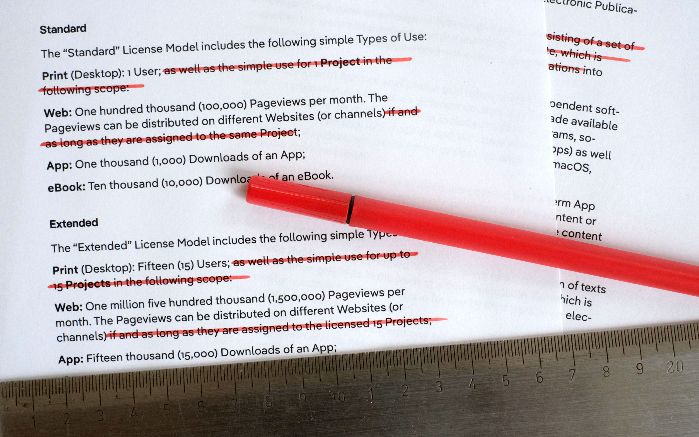
| | Simpler font licenseSince our launch two years ago, one of our main goals has been to offer the simplest possible licensing model. In addition to the free Trial License, there are only two other options available: Standard – all-inclusive print, web, app and eBook, – and Extended – for more users, pageviews, downloads and it also includes broadcasting rights. Only in a few cases does an individual license need to be agreed separately. You only pay once and never have to deal with us again for that license amount, unless you are so enthusiastic about our fonts that you want more ;) But it was always clear that even such a simple model could be further optimized. Thanks to your feedback, as a first step, we have simplified (one could also say shortened) our license by another 4%. In concrete terms, it means that the restriction on projects has been dropped. So, for example, the sum of pageviews now applies to all websites of the respective licensee or the app license for several titles. Have you got any more ideas for simplifying our font license? Keep them coming! If not, why not try out our first license level, Trial? You really can’t go wrong with it and trying out new fonts is the best excuse for procrastinating, isn’t it? | |
|
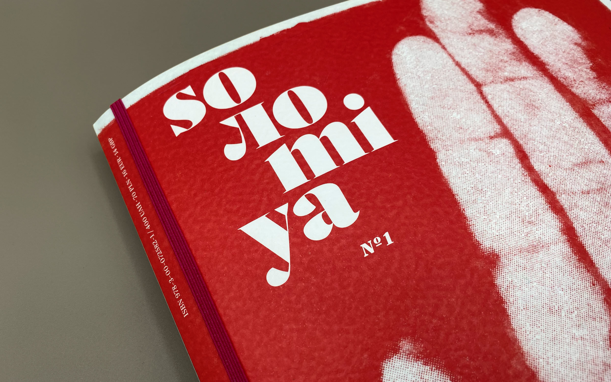 | | Soлomiya’s cover using Nice Poster | |
|
| | Make art not warFollowing the Russian invasion of Ukraine, the German photographer, Sebastian Wells left Berlin and travelled to Kyiv. Unsure of exactly what he was going to do there but keen to do something, he met fashion photographer Vsevolod Kazarin. They spontaneously decided to start a project with and about young people in Ukraine and so the foundation was laid for an extraordinary art magazine called Soлomiya (Ukrainian for ‘peace’). With the premiere edition, Kazarin and Wells wanted to show what there is to defend in Ukraine: Young people with hope and courage, who grew up in an independent country and who are not ready to give up their freedom. The logo and editorial are set in Jan Fromm’s typeface Nice. The logotype with a custom-л was created by Fromm using Nice Poster and inside the magazine both Nice Headline and Nice Text are used. | |
|
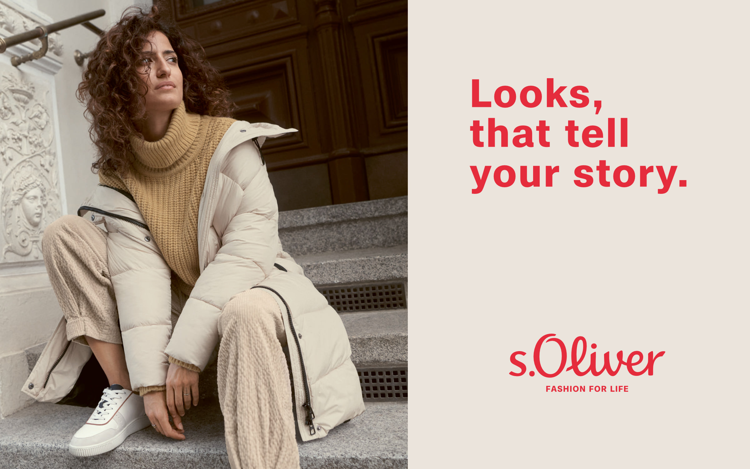 | | s.Oliver employed a new corporate typeface across the whole visual identity: Case | |
|
| | Case on the runways.Oliver is one of the retail stalwarts in Germany and beyond. With 7,850 shops in over 40 countries, as a family of companies, the group caters for a variety of lifestyles with the brands: s.Oliver, Q/S by s.Oliver, comma, comma casual identity and Liebeskind Berlin. To keep ahead of the times and in order to grow their “presence, relevance and profile while tapping into new, urban target groups”, the company underwent a major brand overhaul. The Munich agency Serviceplan developed a brand new logo, new tagline and employed a new corporate typeface across the whole visual identity. We were delighted to license Case to s.Oliver for this. | |
|
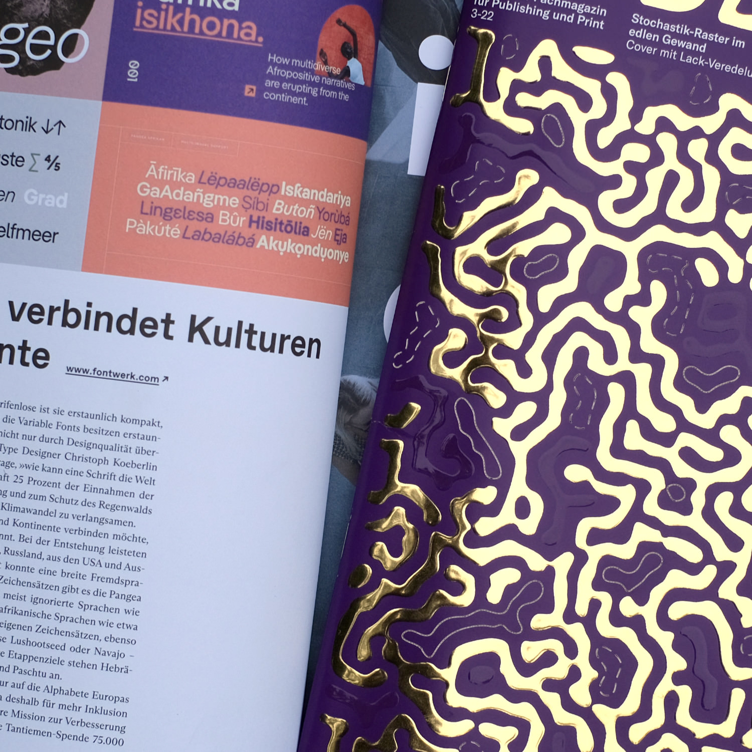 We are always super happy when established and well-renowned magazines and blogs take notice of us and our typefaces. Some of the highlights from the past couple of weeks include a feature in the Swiss trade magazine for publishing and print “Publisher”, which named Jan Fromm’s Nice as the “nice” Jack of all trades and also mentioned Pangea as a download tip for sustainability. In Grafikmagazin 3.22, the extraordinary concept of Christoph Koeberlin’s free Pangea Afrikan was also showcased. Many thanks to all editors who support our work. Maybe this is also a good reason to consider subscribing to one of the many analog and digital platforms that painstakingly gather the truffles of creative work for their readership? ↗ |
|
From the design of custom typefaces to modifications of existing fonts, from font engineering services such as mastering to creating Variable or Color Fonts, we can help bring some typographic magic to your project or brand. As specialists in Font Engineering and Typeface Design, whatever your brief, our team is there to help you evaluate and analyze what you actually need. And, we do it in the fastest and most cost-effective way possible. We strive to make a real difference and provide you with outstanding and beautiful results. |
|
|
|