Tirana-born baker and entrepreneur Fatjon Kolici came to Vienna for love. “One day my wife and I discovered a notice on the restaurant to say that it was closing soon,” Kolici recalls. As a lover of and master in the art of French baking, he founded his own bakery in Vienna’s Mariahilf district in 2016.
After a successful start-up phase, it relaunched in September 2020 as a boulangerie-patisserie L’Amour du Pain, with professional branding produced by the Viennese creative agency CIN CIN.
At the heart of the brand design is the typeface Nikolai, designed by Franziska Weitgruber. “Most French cafés outside of France have the same visual look: creamy and cute,” observed Jasmin Roth and Stephan Götschl of CIN CIN. “Designing a new brand is about avoiding clichés.” The agency’s goal was a contemporary, fresh appearance without losing sight of tradition.
“Nikolai meets these criteria exactly: It looks timeless yet at the same time surprises with novel details.”
Jasmin Roth and Stephan Götschl of CIN CIN
These attributes are essential when the typeface on packaging is the only brand element.
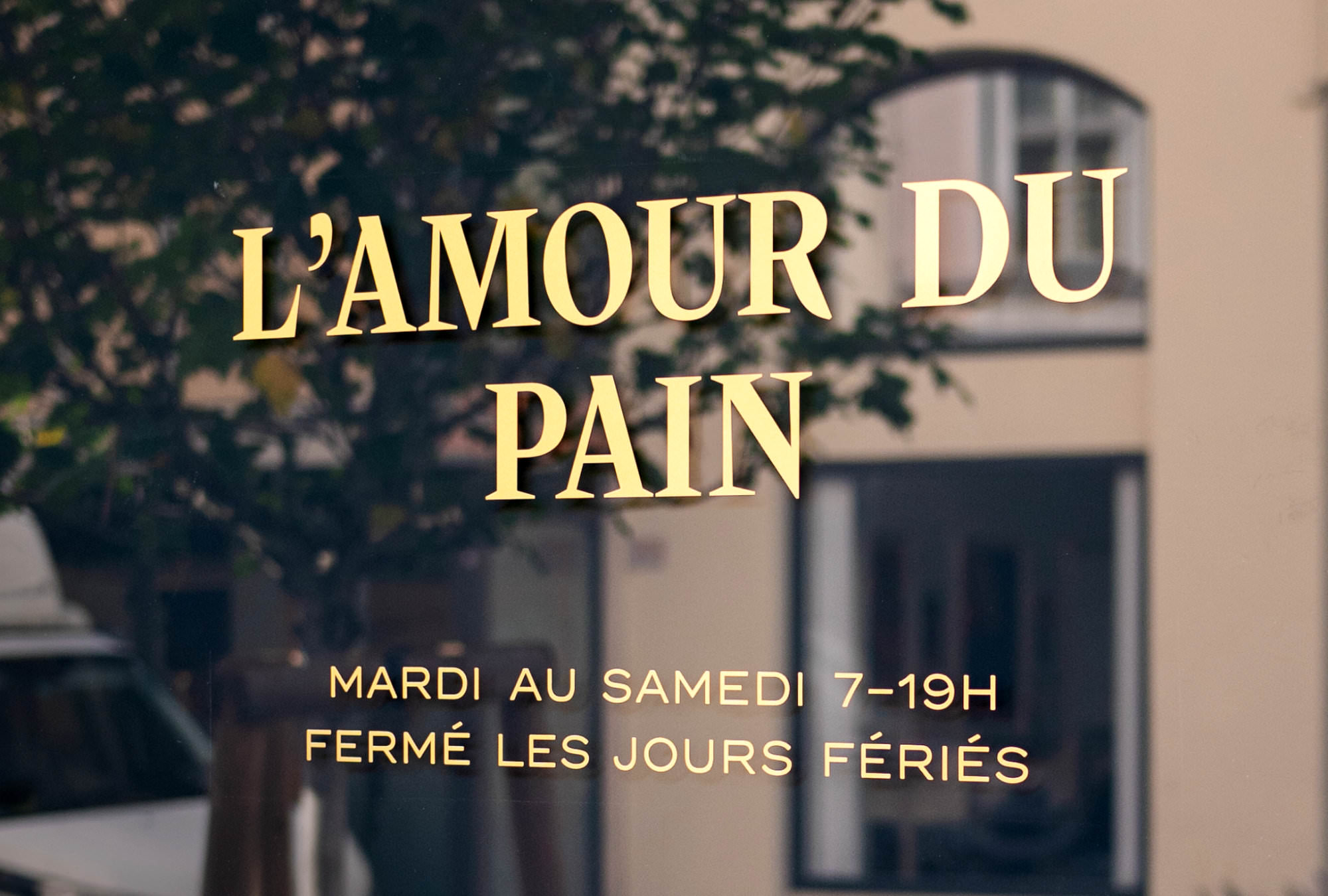
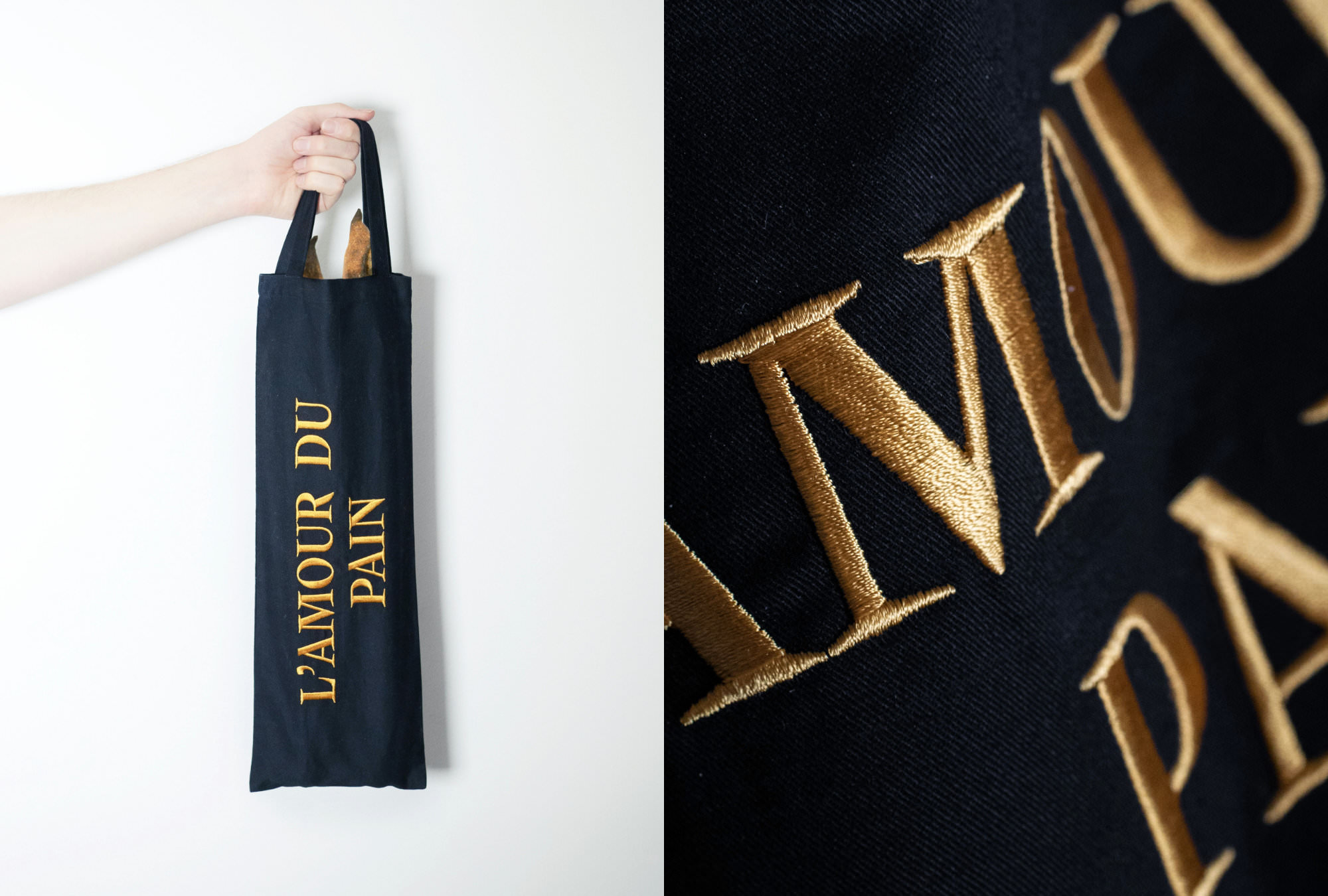
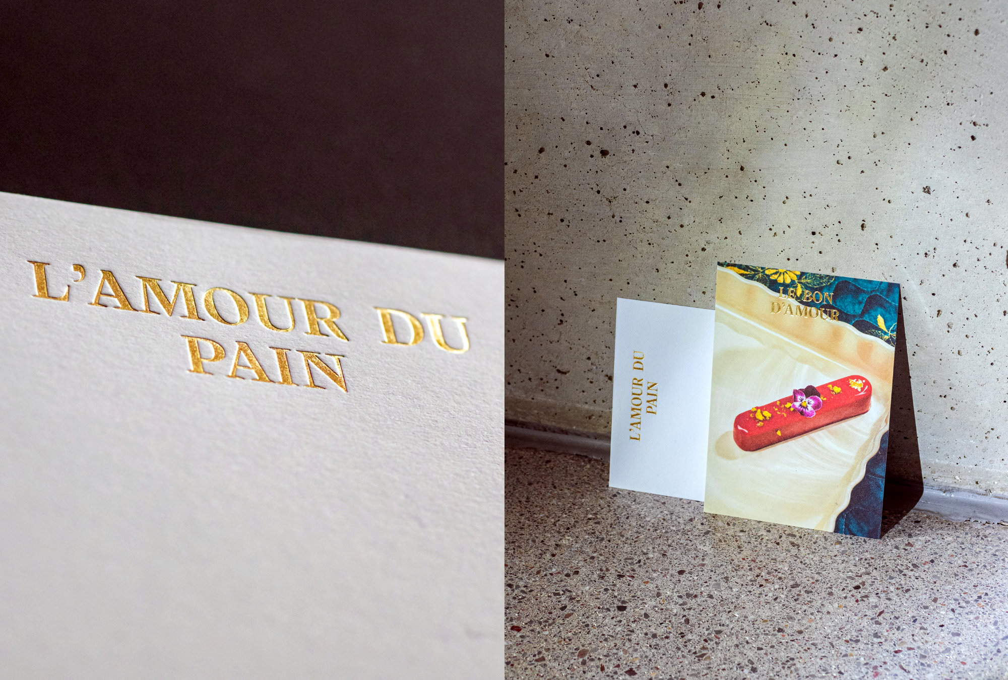
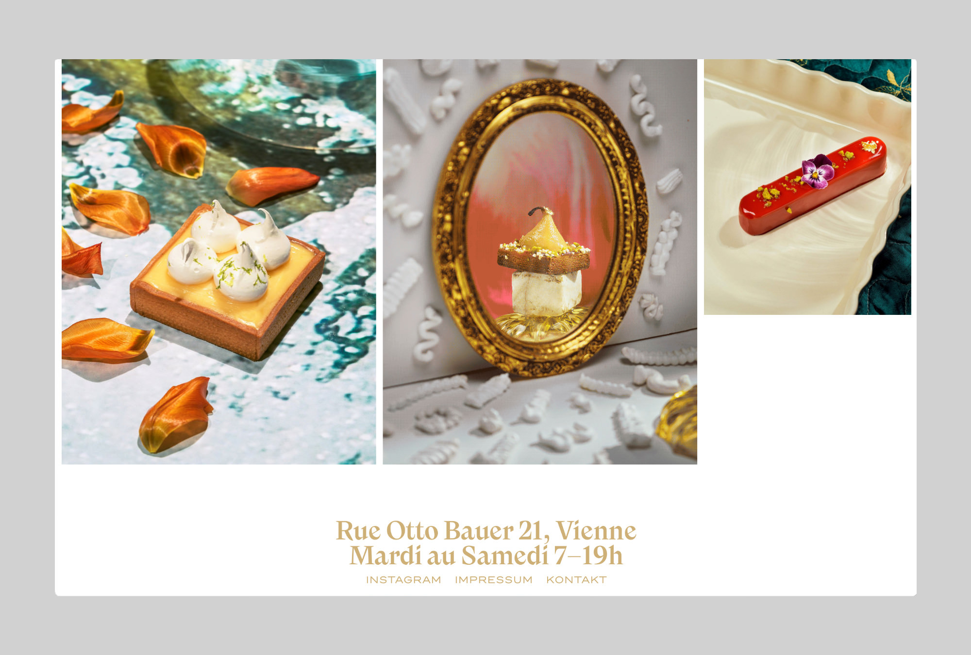
The logotype of the L’Amour du Pain brand – often combined with the food photography of Erli Grünzweil and Susanna Hofer – can be found across social media, shop signs, customized packaging, voucher cards (with gold foil embossing), Instagram posts and the now infamous carrier bags for baguettes.
The CIN CIN agency chose Nikolai as the house font for the L’Amour du Pain brand because it is both “timeless and novel”. (Photo: CIN CIN; opening hours set in Trio Grotesk by Bold Monday)
Since January 2022, the Viennese have been taking their original French baguettes home in a stylish textile bag. (Photo: CIN CIN)
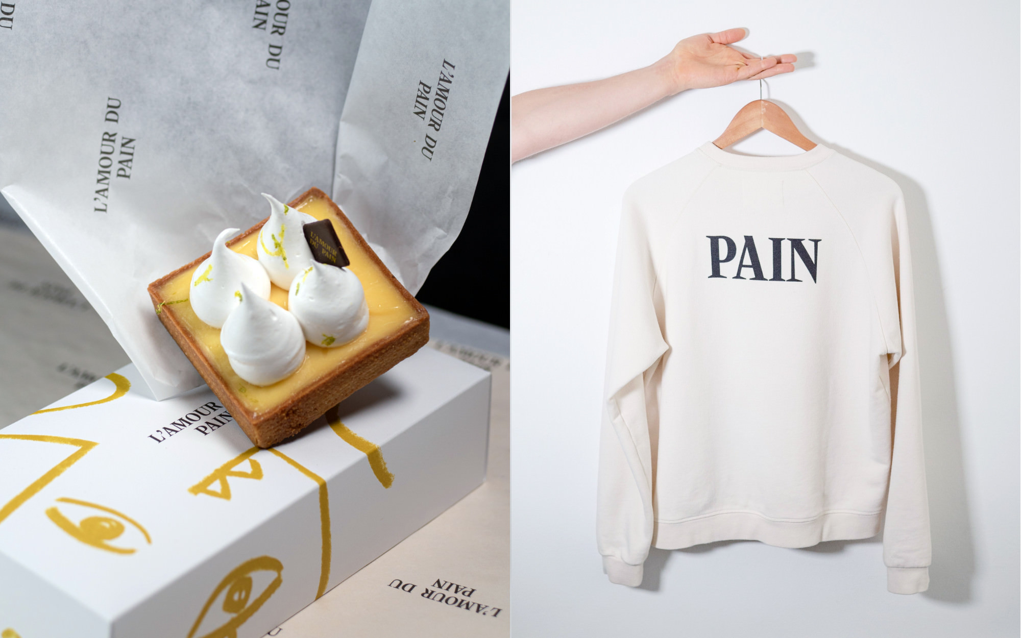
The logo of L’Amour du Pain, set in Nikolai, bears the brand, and the patisserie’s products bear the logo: on textiles, tissue paper, napkins, cardboard and chocolate (Photos: CIN CIN, Erli Grünzweil, Susanna Hofer)
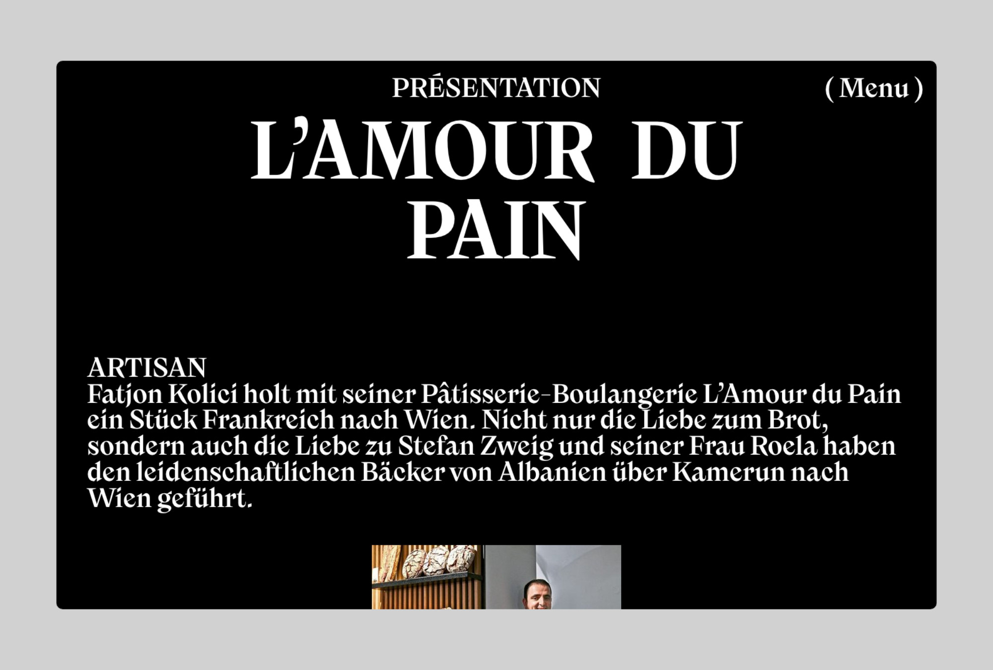
The lead texts on the L’Amour du Pain ordering website are also set in the Nikolai house font.