
Hyundai Card – Cards reshuffled
With over 9 million customers (as of 2021), Hyundai Card is South Korea’s second largest credit card company. Since 2003, the brand’s unmistakable profile has been represented by the exclusive corporate typeface Youandi (read as “You and I”, understood as “Hyundai”), designed by Aad van Dommelen at Total Identity (which is now called Total Design).
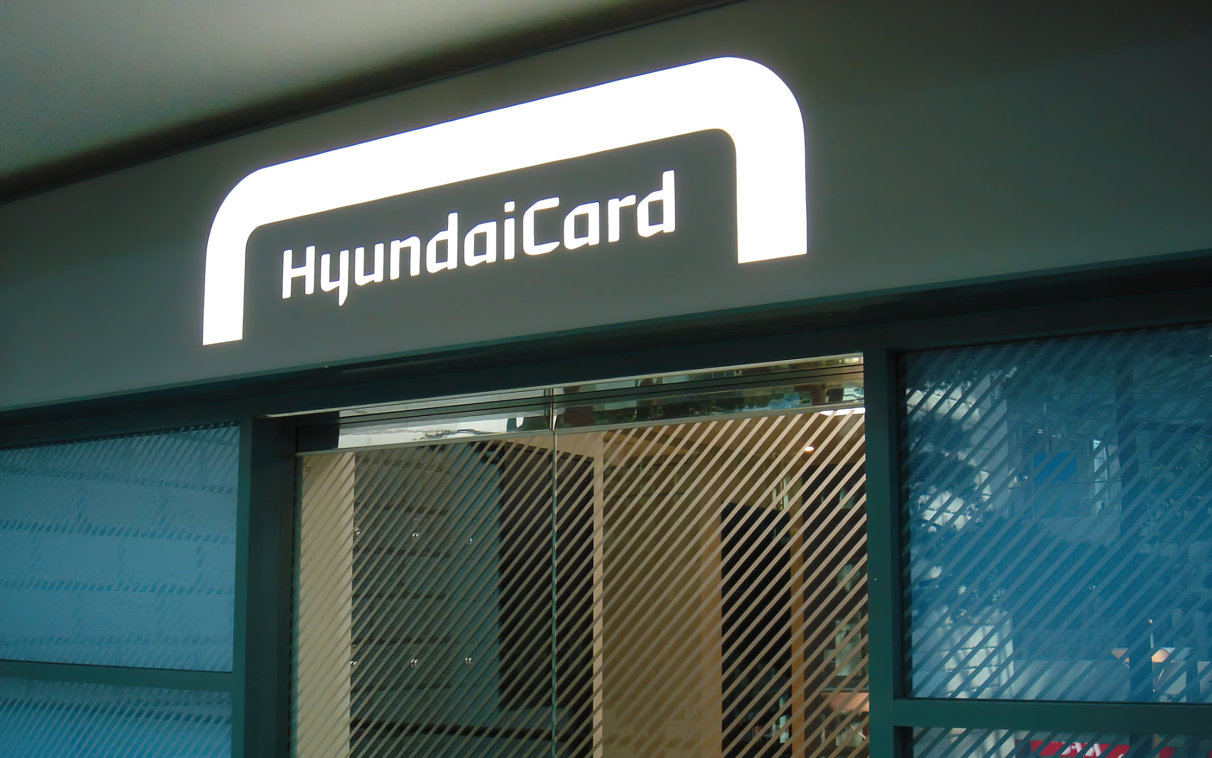
The Hyundai Card Air Lounge at Incheon International Airport
South Korea’s first corporate font
Aad van Dommelen used the proportions of a credit card as a graphic leitmotif, which was reflected in the angles, curves and interiors of the letters. A year later, the Korean extension appeared, whose characters follow the design of the Latin letters. Hyundai Card became the first company in the country to develop its own corporate font. Since then, the brand, as well as Hyundai Capital and Hyundai Commercial, have been using the typeface for product branding and all official documents issued by the company.
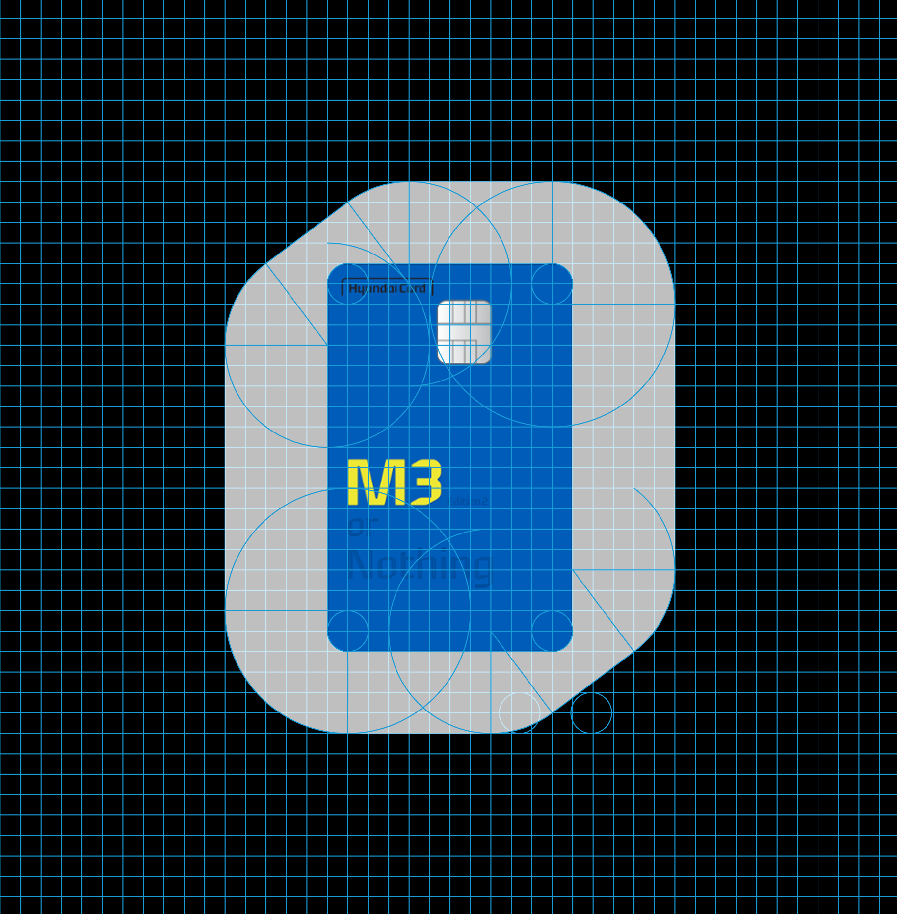
Design principle of the corporate font Youandi, based on the proportions of a credit card and the lowercase letter o (© Aad van Dommelen)
Pioneer again
Recently, Hyundai Card became a pioneer again: as the first Korean fintech brand to transform its corporate typeface into a variable font. At the same time, the newly created extensions and adaptations of “Youandi New” ensured that both the digital products (such as the digital map or the App 3.0, which won the IF Design Award 2021), as well as cultural projects, shops and exhibition spaces harmoniously found their place under the visual umbrella of the brand. The design work was overseen by the original Latin and Korean type designers, while the development of the Variable Fonts (including the hinting, mastering and production of the desktop and web fonts) was the responsibility of Fontwerk.
The original five Latin weights were expanded to 23 with the addition of italic, condensed and extended variants and adapted for use in headlines. There is a brand new Text variant, which is less static, less angular and which has an Antiqua flavor. The two variable subfamilies Title and Text are drawn up by the axes weight, width and slant.
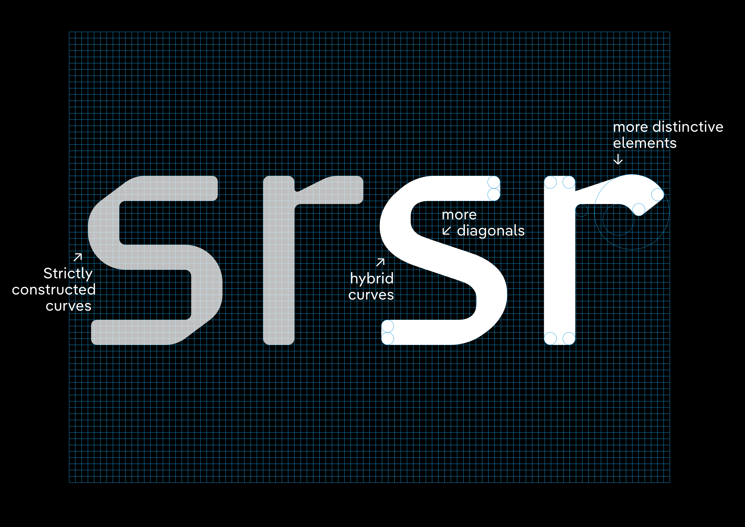
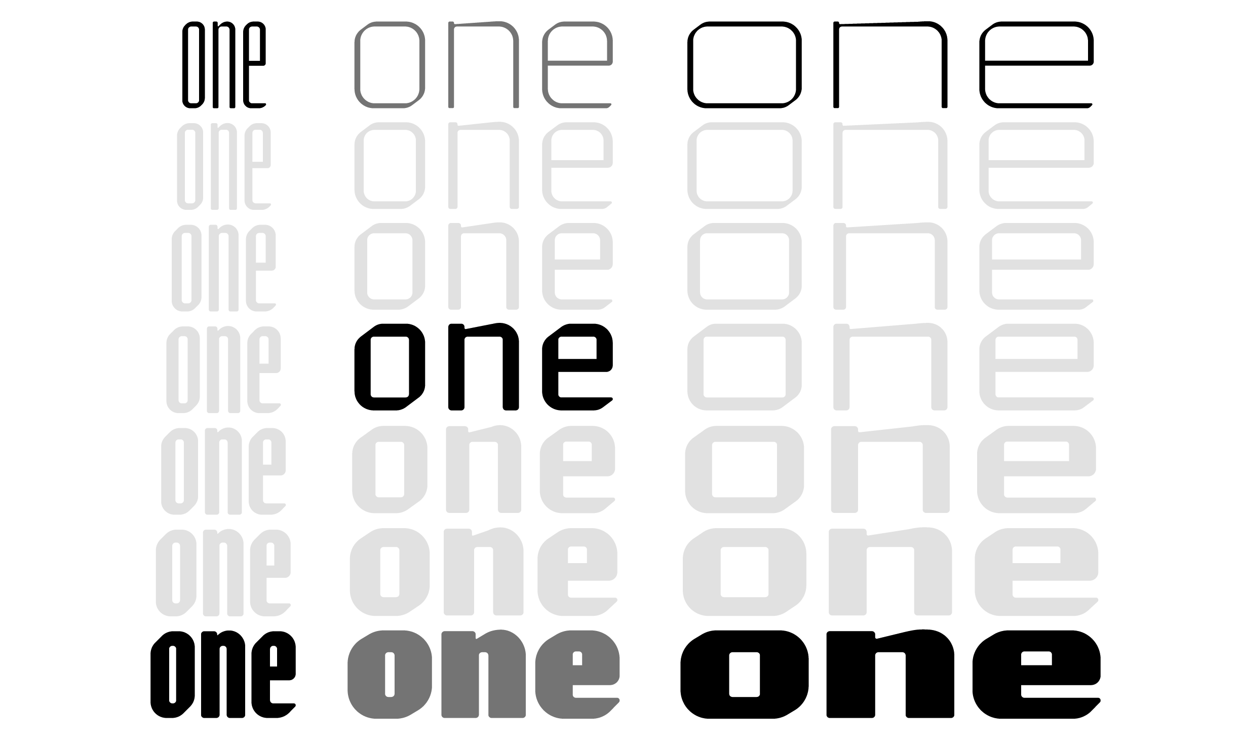
Differences in details between Youandi New Title and Youandi New Text (© Aad van Dommelen)
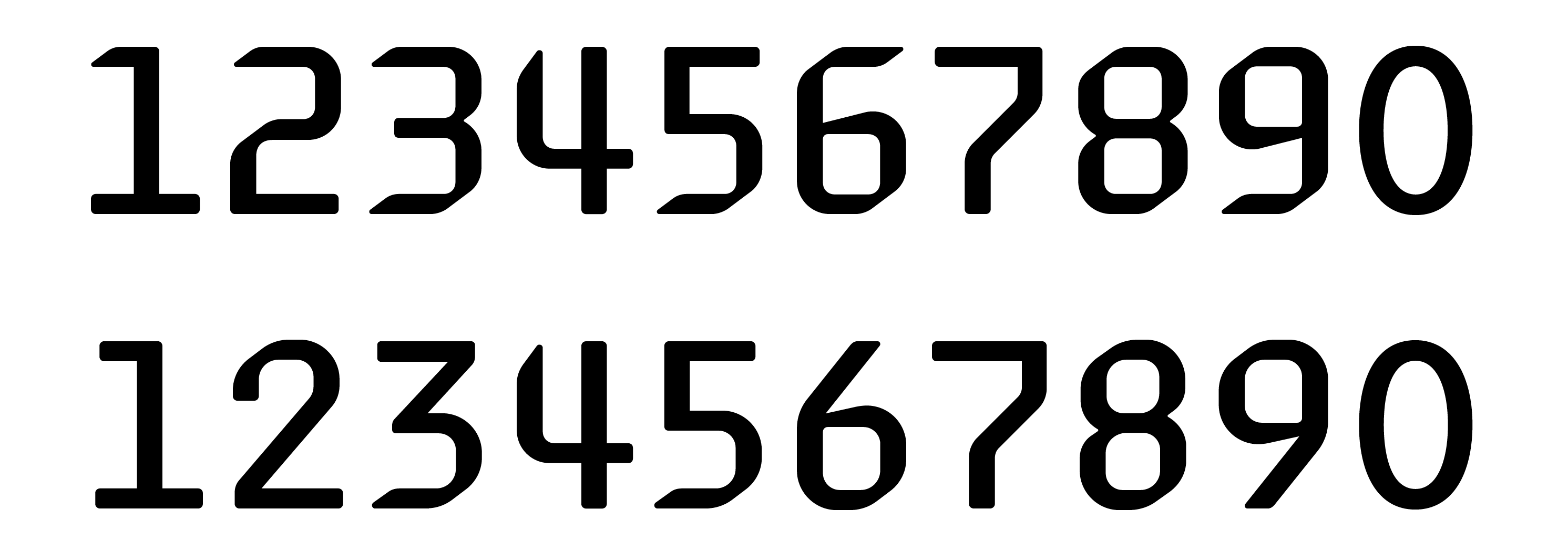
Different figures of Youandi New Title (top) and Youandi New Text (bottom), the latter are more clearly distinguishable from each other
Variable Fonts
The advantages of a variable font have become well-known among designers and developers. Providing fine tuning (the headline font, for example, has a font weight range of 850 variations) and consistent letterforms across all weights. In the case of Youandi New, there are more than five million variants in a single font file with a minimal data footprint: 755 KB compared to an estimated 230 MB for each single font. In short, variable fonts offer maximum typographic freedom in one compact and compressed font file.
High expectations for the mastering
During the engineering process, Fontwerk had to overcome a number of challenges. The first step was to define the architecture of the Youandi New family in such a way that the new font files didn’t have duplicates. It turned out that the design space was not orthogonal, so that the coordinates of the master files either had to be adjusted or new ones had to be created from variable font instances. Most of the work was caused by inconsistencies in the design space, because the number of the masters at its edges was unequal.
“We had to find a way to automate the creation of the missing intermediate masters.” recalls Fontwerk founder, Ivo Gabrowitsch, “This resulted in the end in seven different design space files per subfamily … then everything fit.”
As the old Youandi typeface did not look great on computers or smartphone screens, the team at Hyundai Card had very high expectations for the mastering of Youandi New. After many time-consuming manual corrections to the letter contours, the hinting parameters were set up for precise ClearType hinting. Checking the first exports showed: Mission accomplished. For the new design style Slant, 16 templates per subfamily were created, each with letter outlines slanting to the left and right. It was important to check that all instances were compatible with the interpolated spacing and differences and that they harmonized with the upright font at the end.
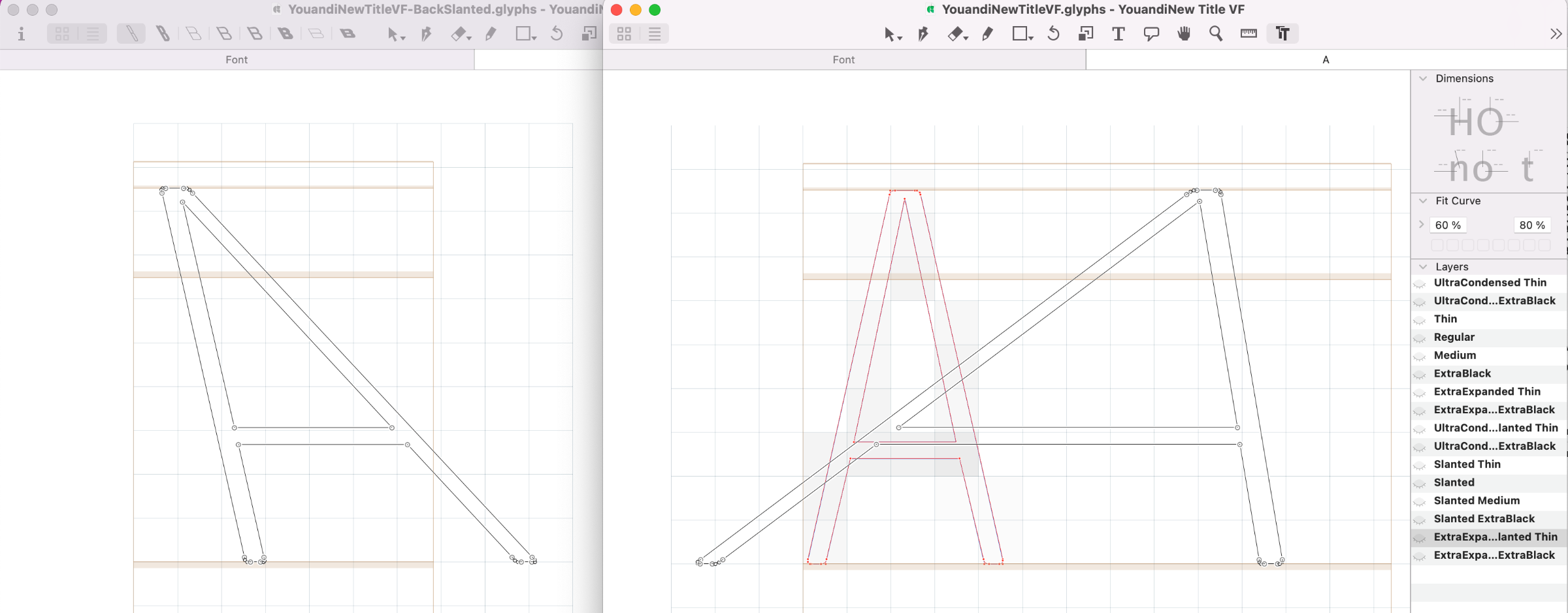
The corresponding slant extremes using the example of the letter A in the GlyphsApp
Even before the end of engineering and mastering, there were validation and correction cycles. “We created prototypes of a few masters before we generated the entire design space, which proved to be the most efficient strategy." says Gabrowitsch.
Following rigorous readability testing by Hyundai Card, the need arose for additional glyphs (especially to distinguish upper and lower case letters), new kerning pairs and metric adjustments. “For this we wrote scripts so as not to have to fiddle with 48 files.” explains Gabrowitsch.
The master files from which the intervening instances and variable font gradations can be interpolated.
Finally, the naming of the entire family was restructured so that the reformed static sections were easy to use. “All in all, Youandi New was a challenging project, with many unexpected hurdles and tight deadlines.” recalls Gabrowitsch. The reasons for this were not only outdated and sometimes inconsistent font data but also surprises in environments that should have safely supported variable fonts. This led to unexpected results in standardized office programs, as well as established professional graphics programs.
Hyundai Card now uses the new font family across their visual identity, from their website to the Card App 3.0 to the signage at the company headquarters. In addition to the variable font, static weights are used whenever the new font technology is not yet supported.
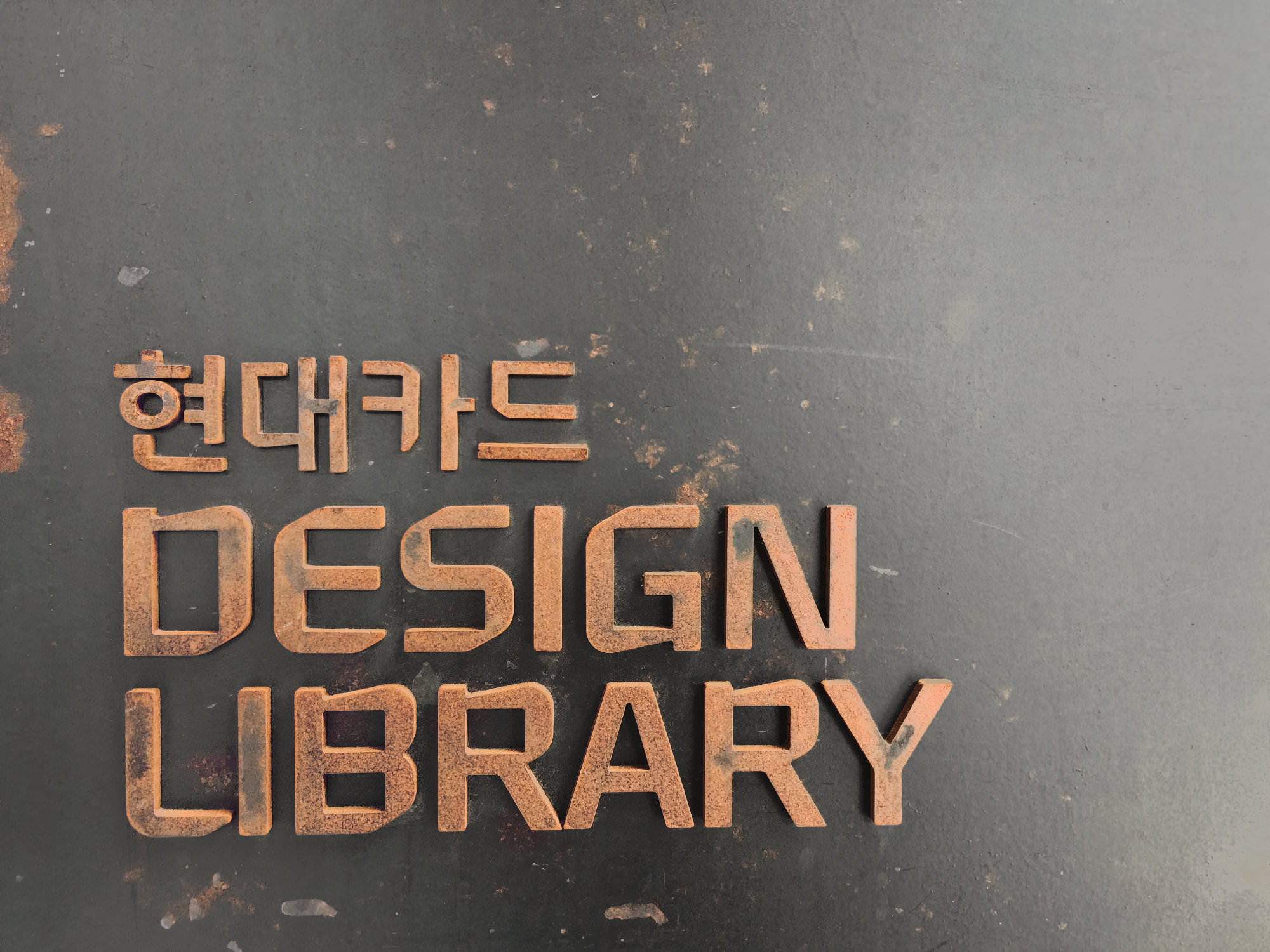
Signage at the Hyundai Card Design Library in Seoul
Aad van Dommelen
“I am very proud of the history and future of the Youandi brand typeface, which has given the Hyundai Card a distinctive visual identity. Without the passion of the marketing team and the technical support from my font engineering partners, this success story would not have been possible.” says Aad van Dommelen, who has been responsible for Hyundai Card’s corporate font for almost 20 years.