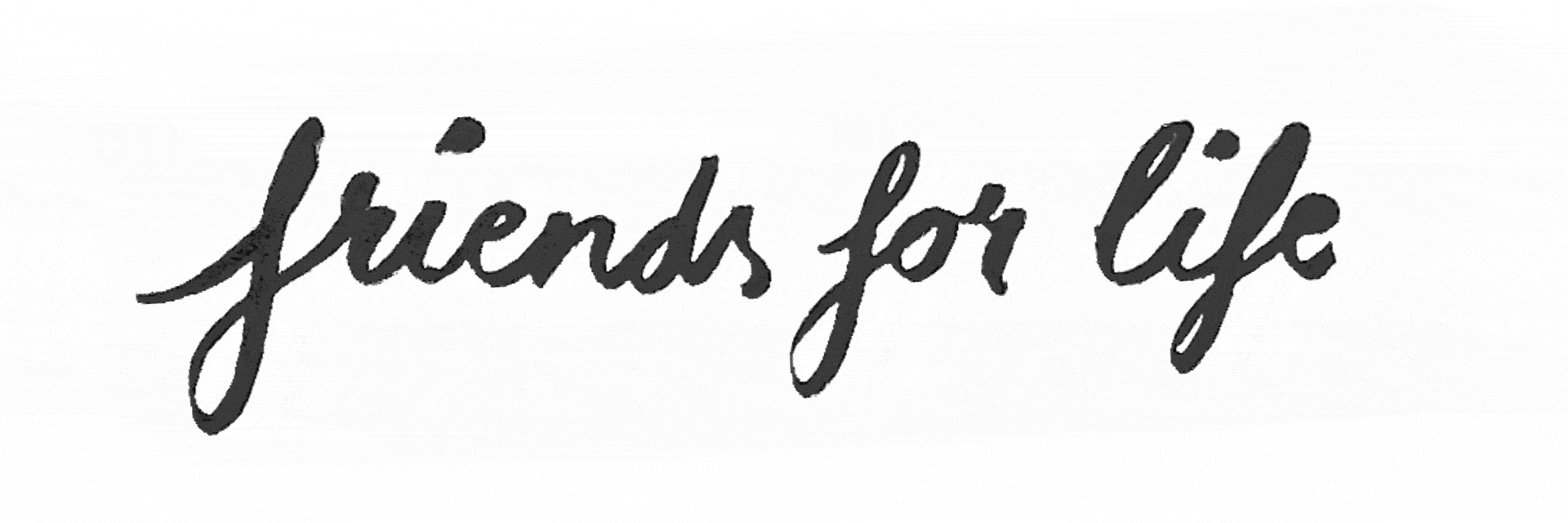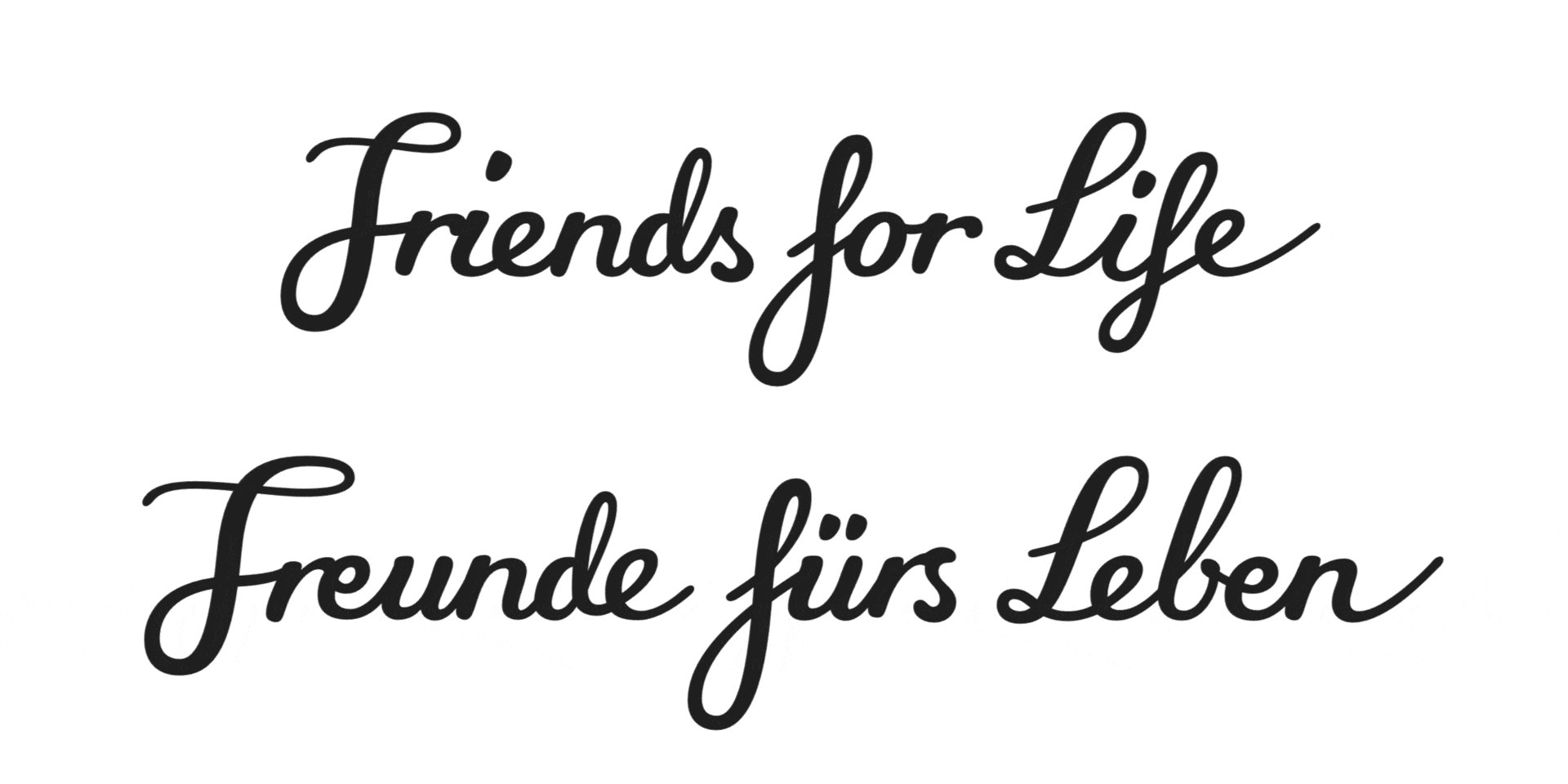
survey of customers helped develop the brand essence and a new central idea: “Friends for Life”. This tagline – previously set in a standard font – was to be made more individual, more concise and more emotional and needed to work in German and English (“Freunde fürs Leben”).
To find the right look and feel, we first tested various designs. We shortlisted a thin and a thick marker as well as a brush pen. We presented these variants to Trixie, who opted for the latter. We then tried out various written styles until we found one that we could present and from which we could start working.
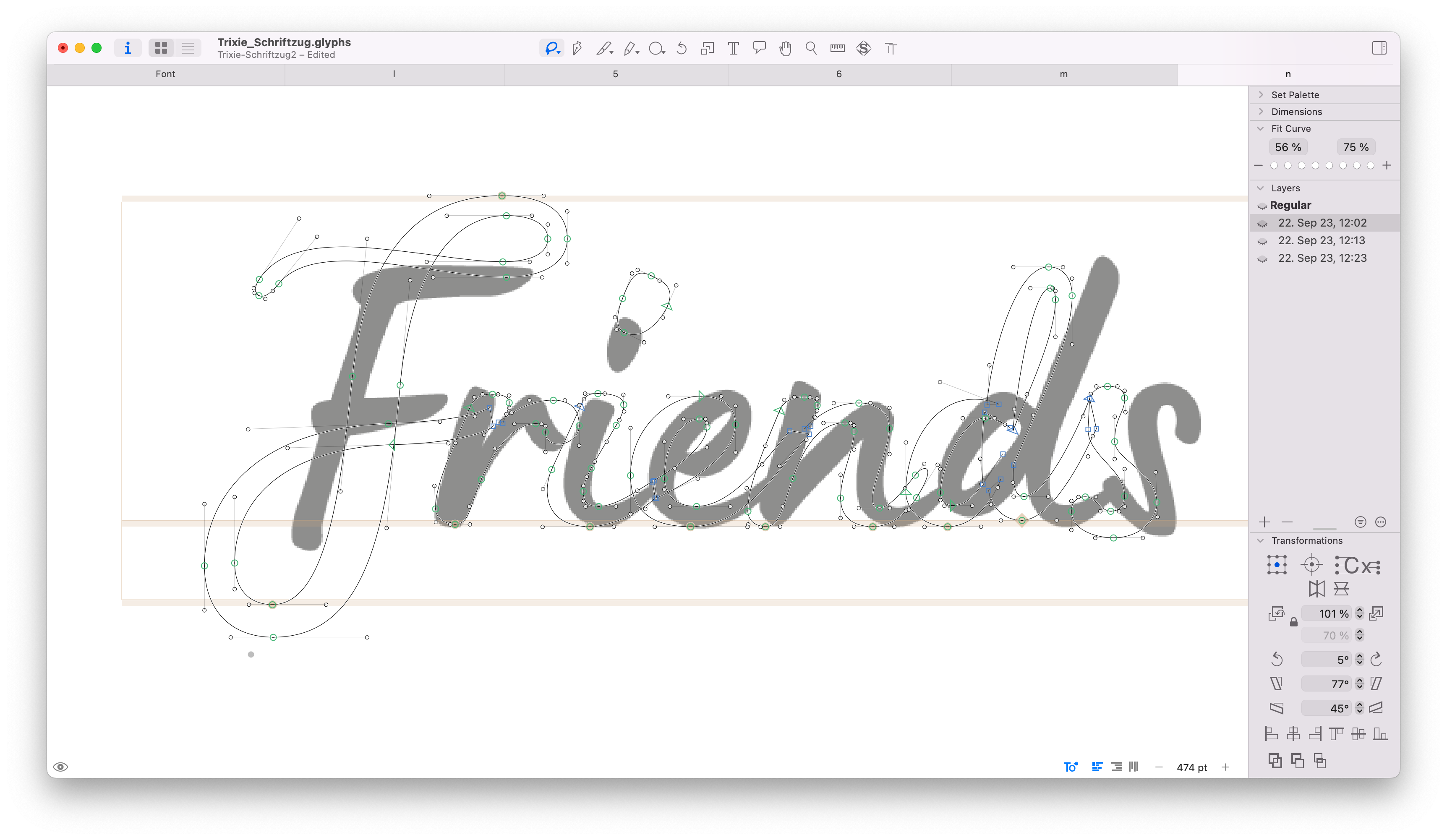
We digitized the two versions, aligned them with the baseline, made initial adjustments (e.g. to the stroke weight) and resolved the connections for better writing flow. Further visual corrections were needed, but to give our client a feel for the direction, these steps were sufficient for the time being.