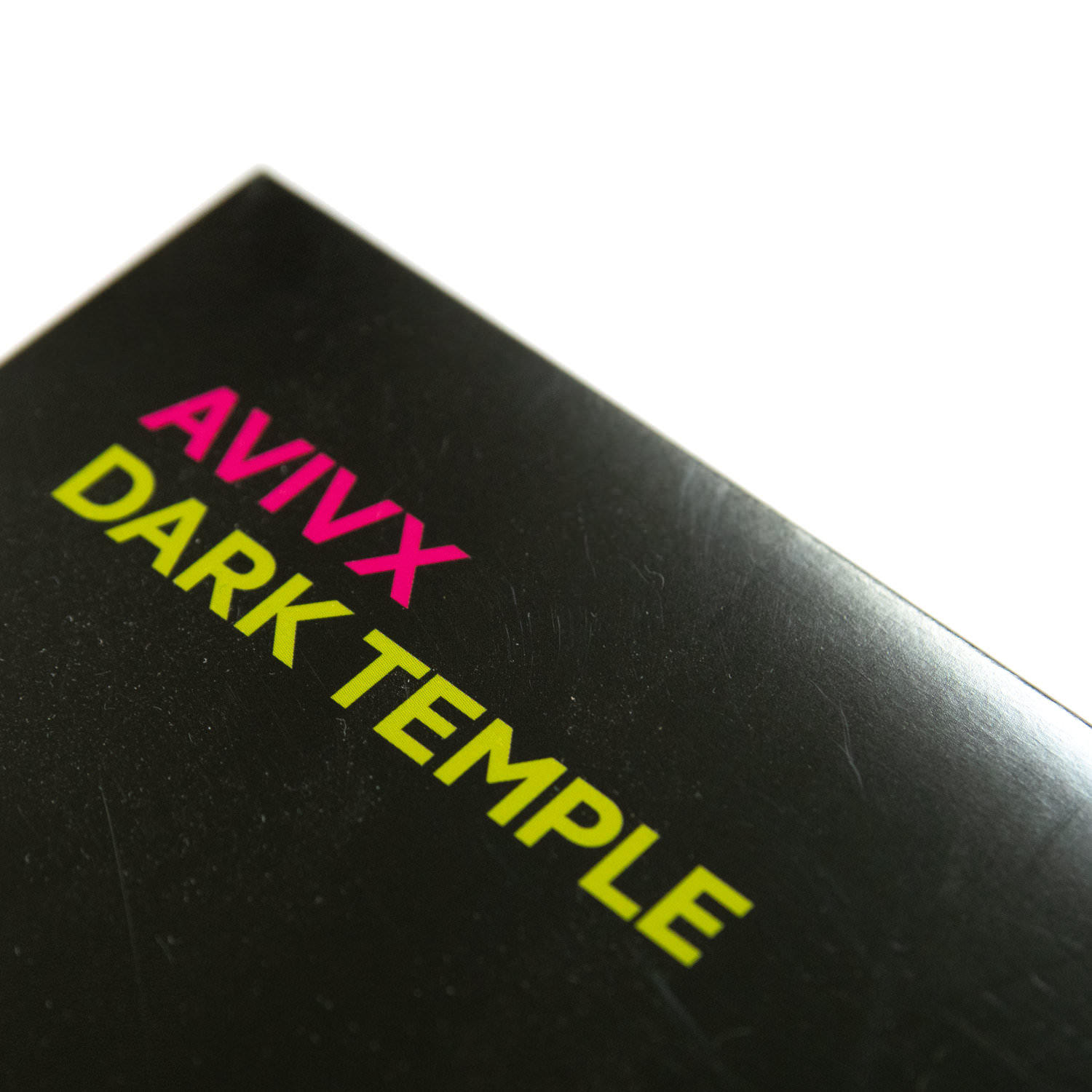
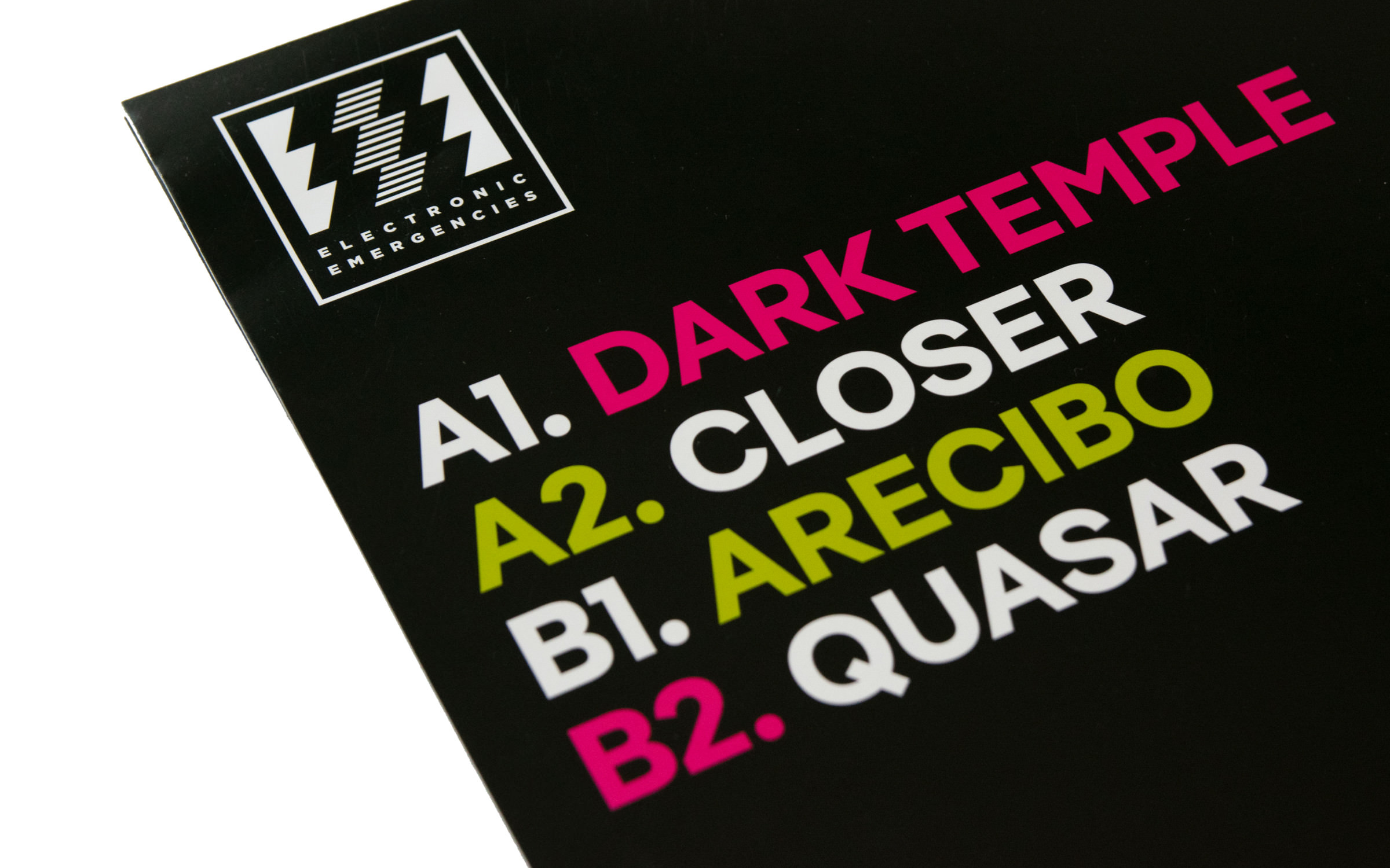
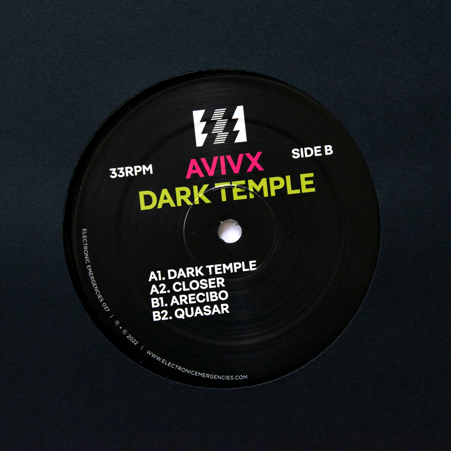
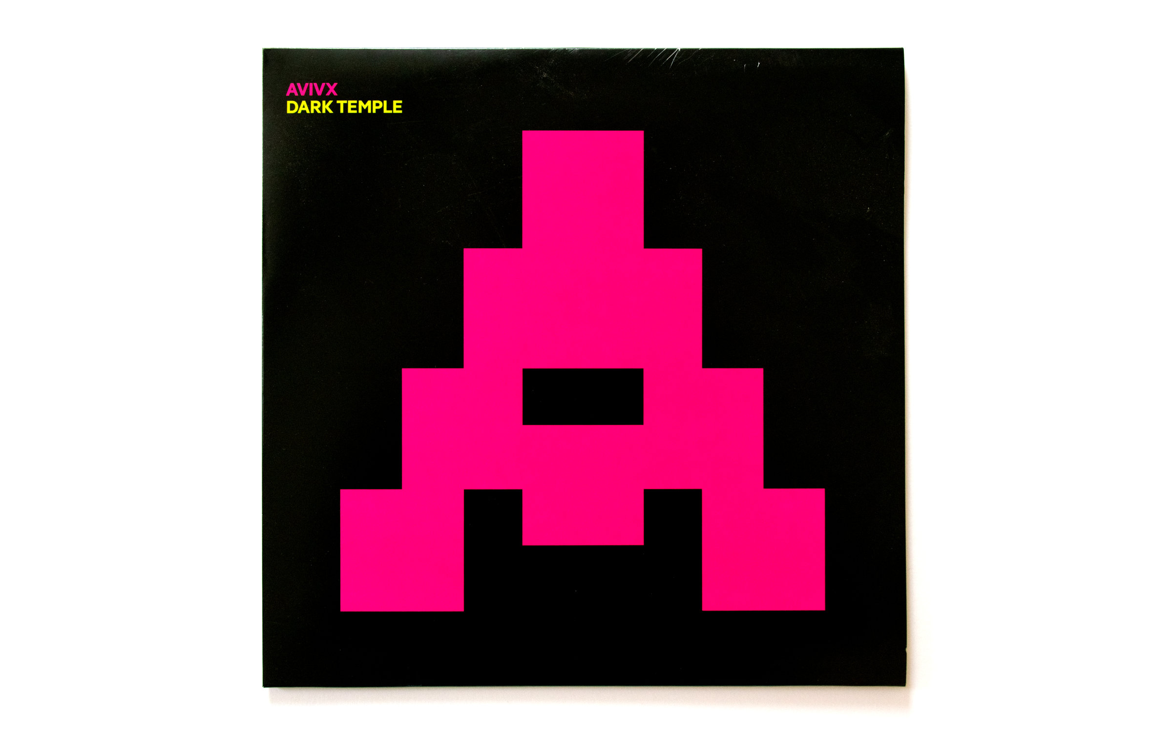
ritten in capitals on a black background, the typography for the first AVIVX release was meant to counterbalance the music,” is how the Dutch designer Niels Vrijdag describes his intention. He lives and works in Rotterdam, where AVIVX’s label is also based, Electronic Emergencies. “It’s the fifth release I’ve designed for Electronic Emergencies, an underground label that has its roots in electronic music and the queer scene.”
AVIVX ‘Dark Temple’
Big, strong, friendly
W
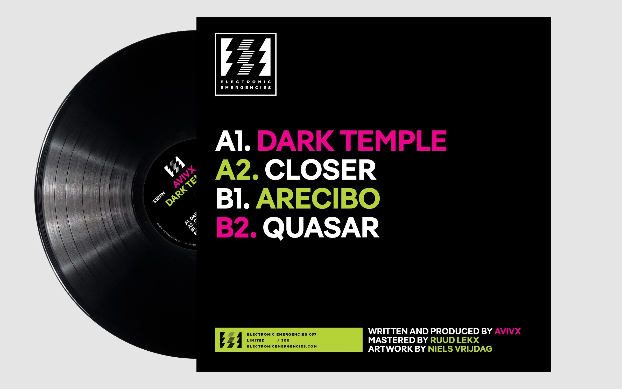
There was no real specification from the artist or the record company, so Niels Vrijdag had all the freedom to develop his own idea.
In Pangea Bold I found the perfect partner for this job. Not only does it resemble the warm and uplifting music of the album, it’s also strong enough to serve as the visual backbone in an otherwise fairly clean and minimalist layout.
He says the record company has told him more than once in recent years not to put big text on the back cover. “It always looks small on the screen, but a 12" record cover is just huge, like a billboard.” says Niels Vrijdag. He had the jitters when he sent off the first draft with the four song titles set in large letters… But, it was accepted straight away. His conclusion: “I’ve never had such a good response to a cover design before.”
