Neue Sachlichkeit

Fonts in use: West

New objectivity, new typography

Fonts in Use: The West typeface for the “New Objectivity” exhibition catalog
Cover of the exhibition catalog “New Objectivity”, designed by Verena Gerlach

It is seldom possible to define an art era with just a single term and yet the young Kunsthalle Mannheim director Gustav F. Hartlaub succeeded in doing exactly that with his exhibition “Neue Sachlichkeit” in 1925. The term became synonymous with the cultural awakening of the 1920s that reached far beyond art. He describes a clear, sober design in art, architecture and literature – a reaction to the political and social upheavals of this time.

A

century later, the Mannheim Art Hall (Kunsthalle) is once again dedicating a major exhibition to “Neue Sachlichkeit” (New Objectivity) from November 22, 2024 to March 9, 2025. It acknowledges the historical significance, but also critically questions it and adds to it—especially by showcasing the work of artists who were overlooked in 1925.

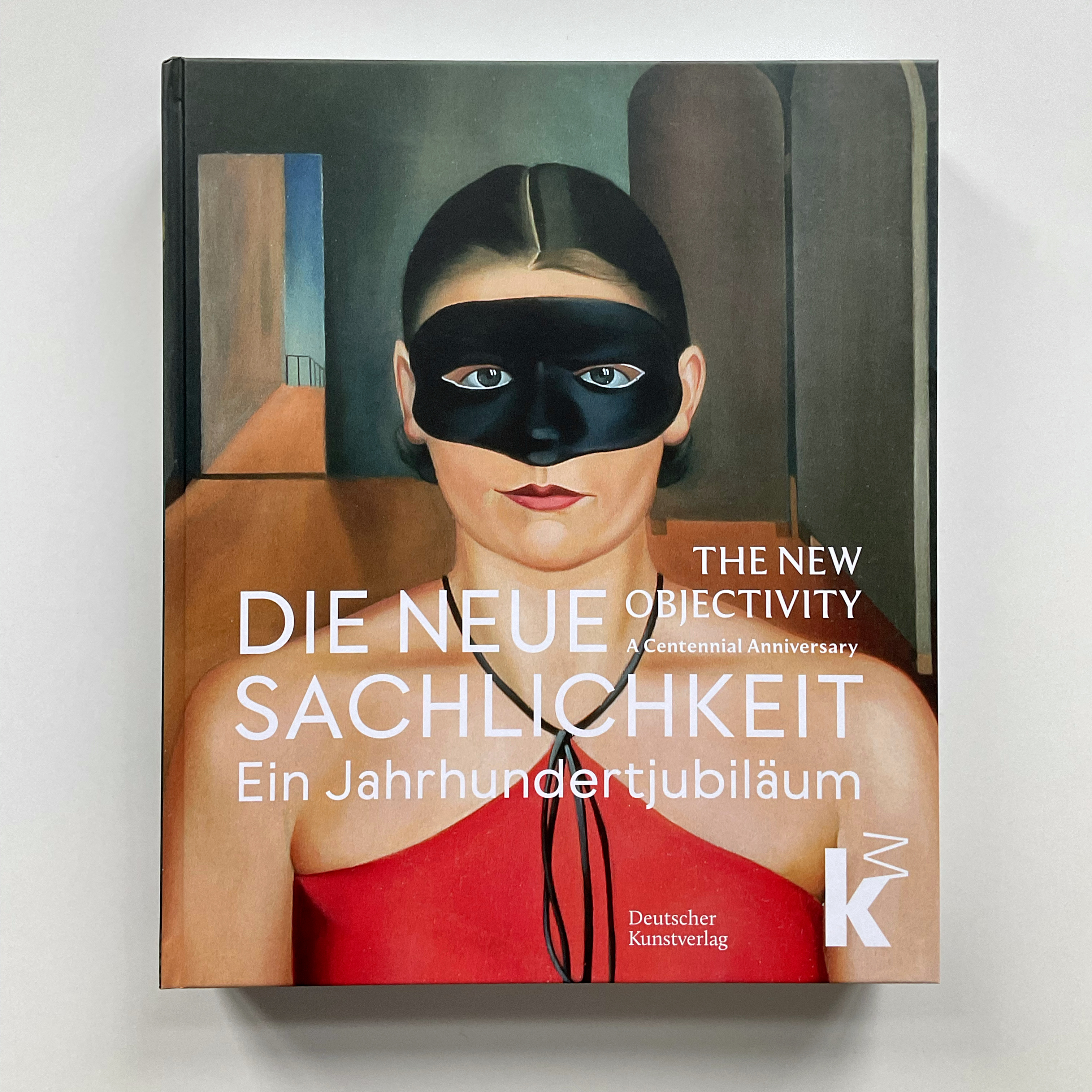
A 400-page catalog has been exclusively published for the exhibition. The catalog not only presents the most important works, but also provides an insight into the current state of research on New Objectivity.

Fonts in Use: The West typeface for the “New Objectivity” exhibition catalog
Front page of the “Objectivity” catalog: What others would call it “Light” is actually the regular style of West

It was designed by the Berlin designer and typographer Verena Gerlach. For the headlines, captions and body copy of the catalog she chose the fonts Moulin by Sandrine Nugue (Commercial Type) and West by Daniel Perraudin (Fontwerk).

Fonts in Use: The West typeface for the “New Objectivity” exhibition catalog
Thanks to the exceptionally open layout, West looks great not only in headings but also works well when used for smaller texts.
Fonts in Use: The West typeface for the “New Objectivity” exhibition catalog
West’s personality and essence sets a strong tone in a catalog about “New Objectivity” of the 1920s.

With West, Perraudin has reinterpreted the concept of geometric sans serifs in a highly original way. But the roots are unmistakable. As Verena Gerlach says: “What could be more natural when designing a catalog about the New Objectivity than using a contemporary typeface revival from the 1920s?”

Test West

Fonts in Use: The West typeface for the “New Objectivity” exhibition catalog