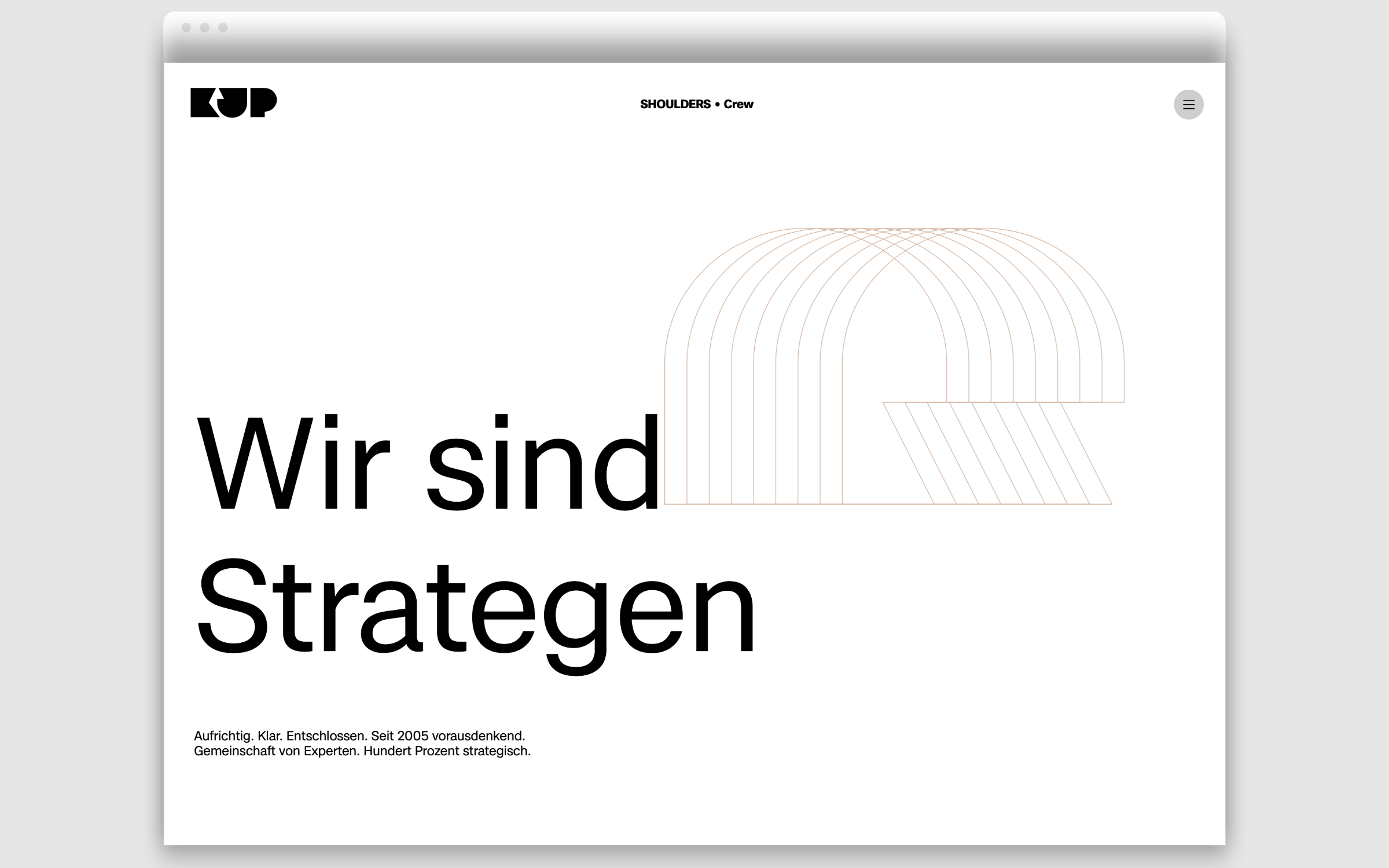
In 2005, I had the great fortune of meeting Jochen Pläcking and founded the brand consultancy kleinundpläcking with him,” recalls Arne Klein. As Global Head of Marketing for Mercedes-Benz, Pläcking introduced the typeface Corporate as a house font in 1990 and it still shapes the brand’s visual identity today. If anyone knows the power of typography and typefaces in branding, it is Jochen Pläcking, who now grows olives in Italy.
K’UP Agency
‘The Mercedes among grotesque fonts’
His DNA continues to shape the values of kleinundpläcking, which has evolved from a Brand Consultancy to a Strategic Management Consultancy and is dedicated to the urgent issues of this time: Sustainability, Trust, Authenticity. The agency’s decision to strengthen their own profile with a contemporary, neo-grotesque typeface, namely Case – which was developed in 2020 by Erik Spiekermann, Anja Meiners and Ralph du Carrois, chimes with kleinundpläcking’s core values.
In a way, Case embodies the essence of this typeface genre. The design trio left out what was dispensable and concentrated on what characterizes a static grotesque. The result is a typeface family whose character is familiar and inspires confidence, but at the same time appears soulful. A typeface that is perfect for the perfectly suited for the practice of today’s branding projects … the “Mercedes of brand fonts”, so to speak.
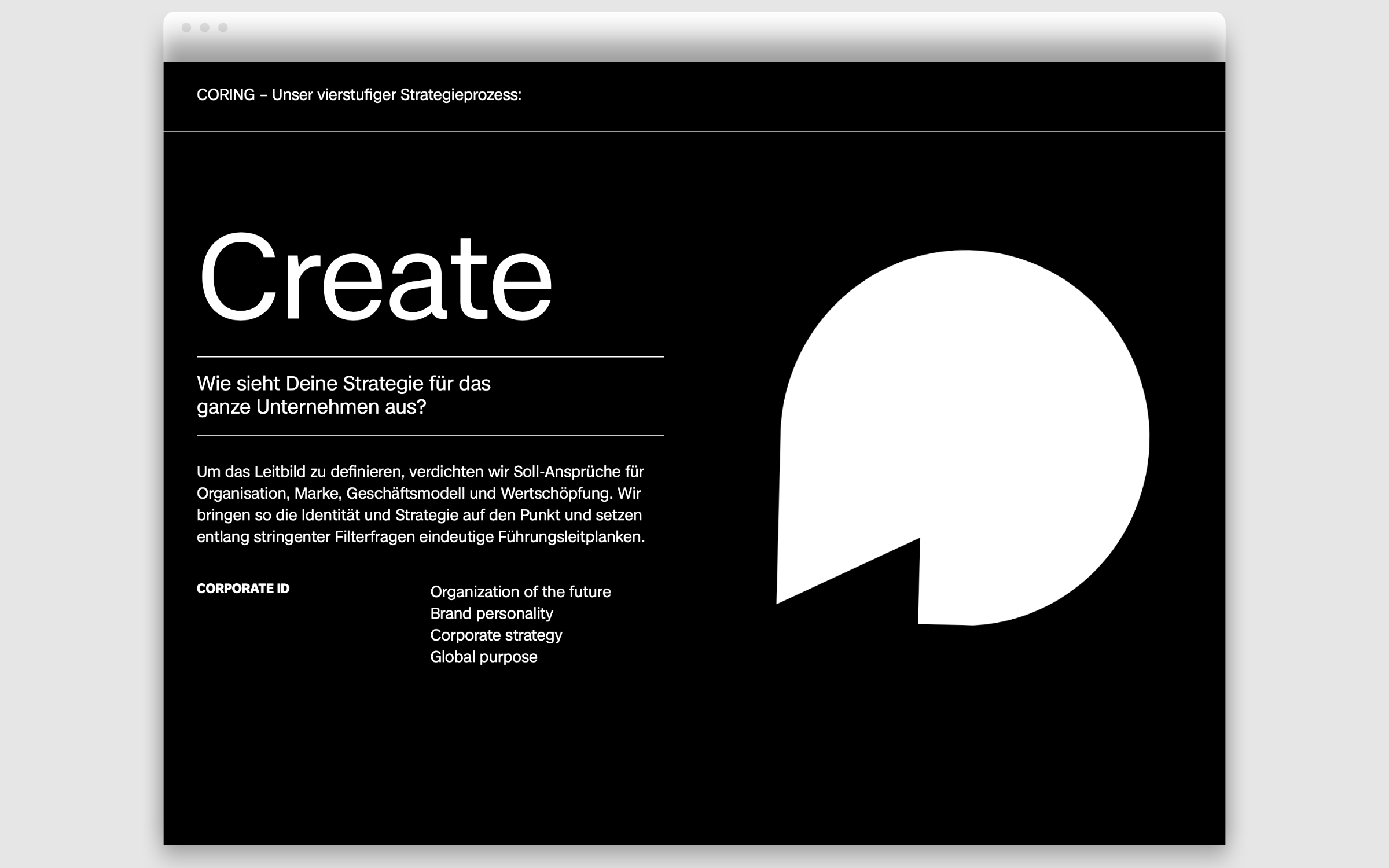
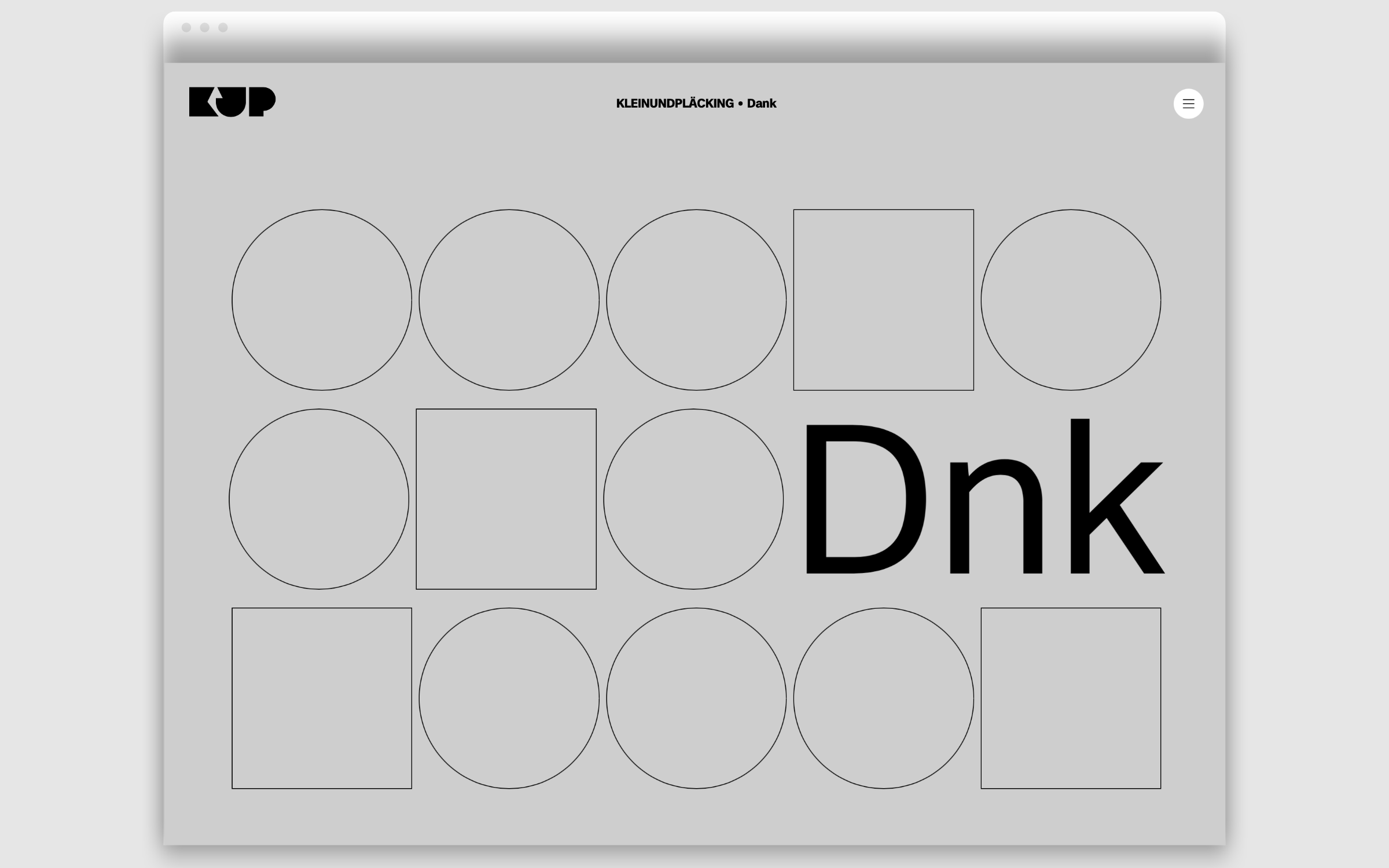
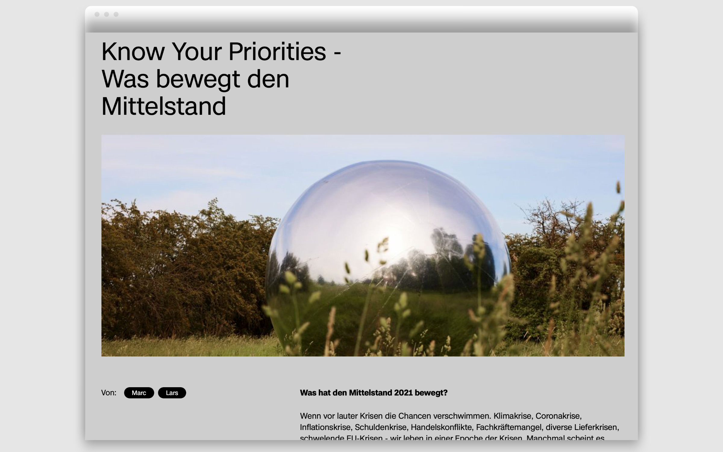
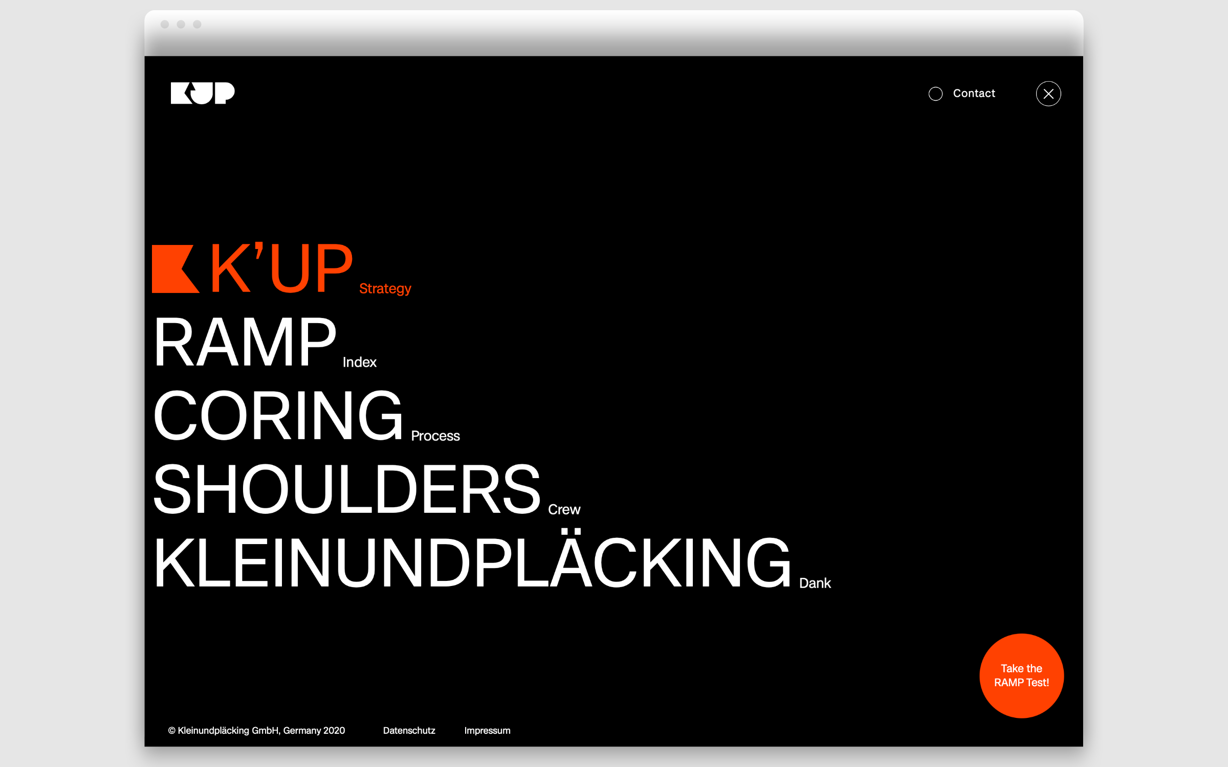
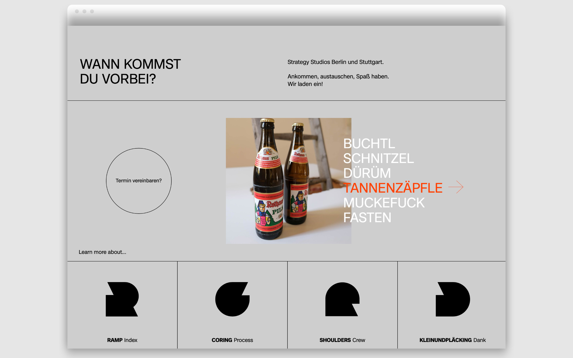
On the website of kleinundpläcking Case is used in Regular and Bold. In typographic animations and zoom effects, it shows its strength in terms of readability and clarity. The contact form, for instance under the heading “Dnk” (Th(a)nks) is remarkably consistent: here Case does a great job as a web font, multicolored and discreetly animated. There is no friendlier way to reach out to potential customers.
