We take a closer look at one of the six (!) subfamilies of the Tausend Font Collection, Tausend Shaded, through the eyes of its two designers.
Since its release earlier this year, our jack-of-all-trades font collection, Tausend, has become a firm favorite among many of you. So we thought it was high time to take a closer look at one of the six subfamilies, Tausend Shaded, through the eyes of its two designers. Also in this edition, there’s a first use case of Neue DIN and there are some super nifty (and somewhat nerdy) type tools and tips from our friends and fellows. |
|
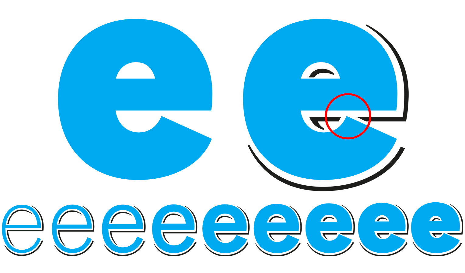 | | After several weeks of development, a look inside Tausend Shaded revealed an unparalleled feat of ingenuity: For example, it contains sophisticated shadow jumps for complex shapes, such as in the lowercase letter e from the bold weight onwards. | |
|
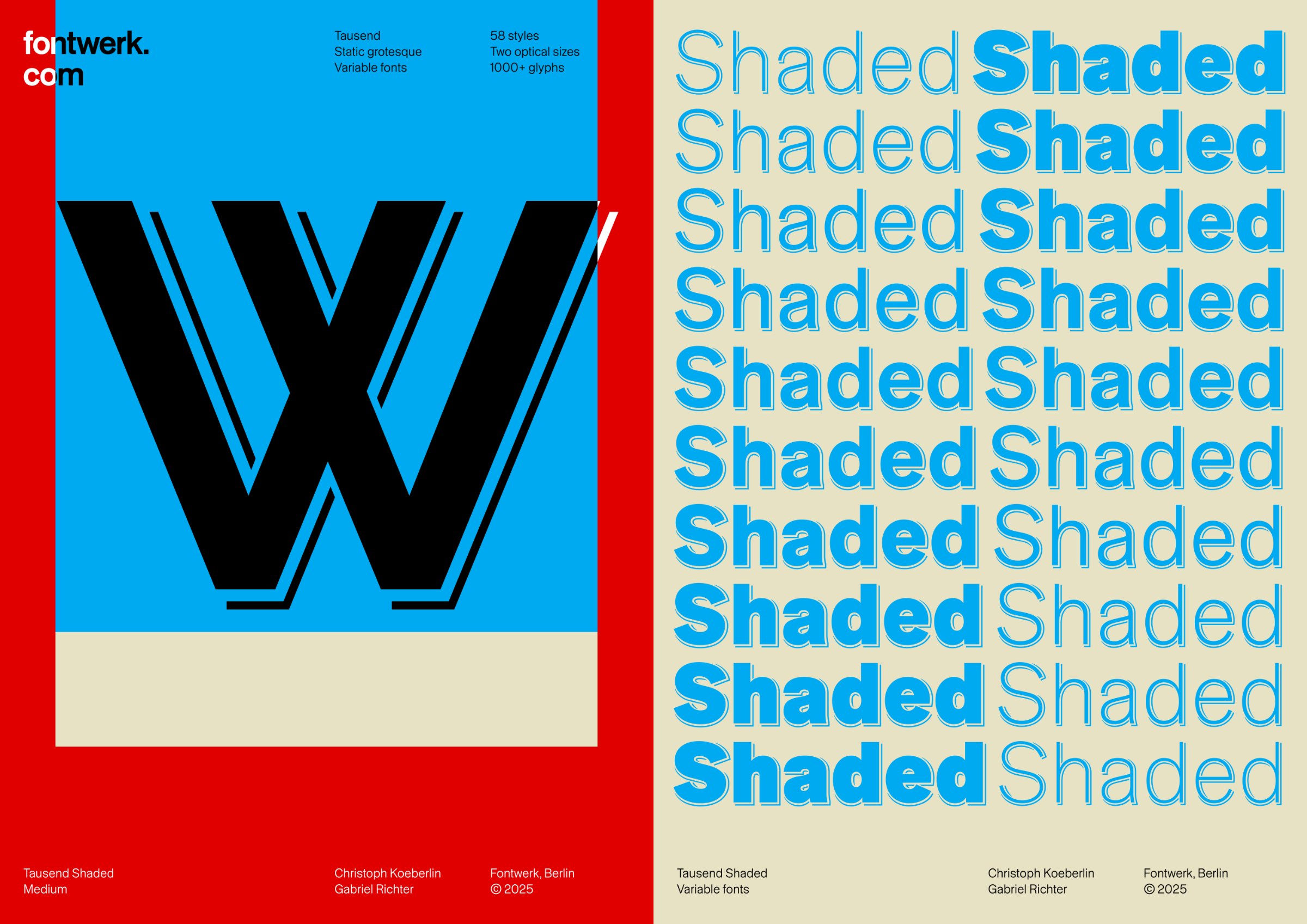
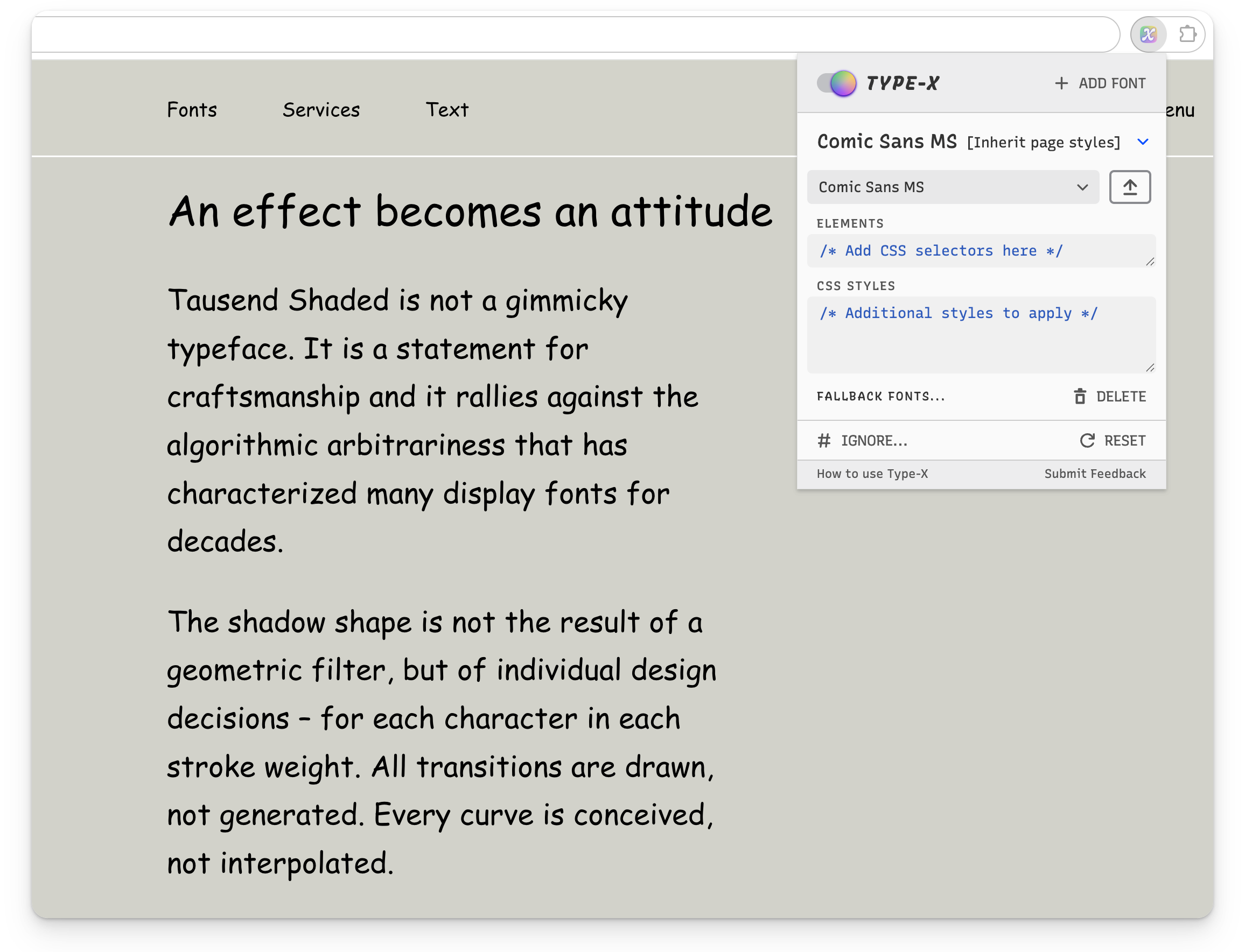
| | Tausend Shaded: The form lies in the shadowEarlier this year, we welcomed Tausend by Christoph Koeberlin and Gabriel Richter to the Fontwerk library. Today, we want to cast a spotlight on Tausend Shaded, one of the six subfamilies of the multi-talented font collection, especially since it is available free of charge when you ‘purchase’ the Base License. Tausend Shaded is a new display typeface. Inspired by ‘Schattierte Grotesk’ from the 19th century, yet designed for the 21st century, it combines systematic font engineering with intuitive design depth. It reveals what sans serif fonts often conceal: character – just like the entire Tausend Collection. Tausend Shaded is a precise and considered reinterpretation of an almost forgotten style icon from the early days of sans serif typefaces. It is also a statement for craftsmanship and a rallying call against the algorithmic arbitrariness that has characterized many display fonts for decades. The shadow shape is not the result of a geometric filter, but of individual design decisions – for each character in each stroke weight. All transitions are drawn, not generated. Every curve is conceived, not interpolated. If you want to know more about those many little decisions and details that turn this rather simple idea into a design masterpiece, we recommend reading our in-depth article. If you’d rather play around with the results yourself, you can do so for free with the full version. | |
|
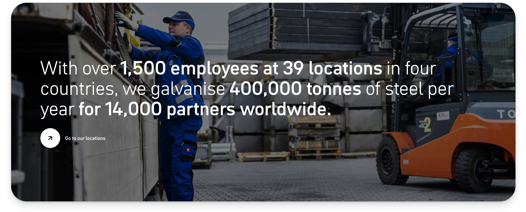 | | Hidden champion in the field of hot-dip galvanizing: Website of the Nuremberg-based family business Wiegel. Font: Neue DIN | |
|
| | Authentic, precise … Engineered in GermanyIt all began in 1948 in a forge near Nuremberg. To protect his cow irons from corrosion, Hans Wiegel dipped them in molten zinc. Two years later, he founded his first hot-dip galvanizing plant. Today, the family business WIEGEL is one of the largest hot-dip galvanizing groups in Europe with 39 locations in four countries. To mark the Wiegel Group’s 75th anniversary, the website was redesigned by the brand agency FYFF. Apart from the brand promise ‘Your steel in good hands’, no stone was left unturned. Instead of interchangeable stock images, authentic videos and factory photos now carry the brand. Wiegel also focused on clarity and character in the typography: Neue DIN (Light and Medium) became the corporate typeface. This brought together what belongs together: the art of medium-sized engineering and the number one industrial typeface. The result: an impressive digital presence. | |
|
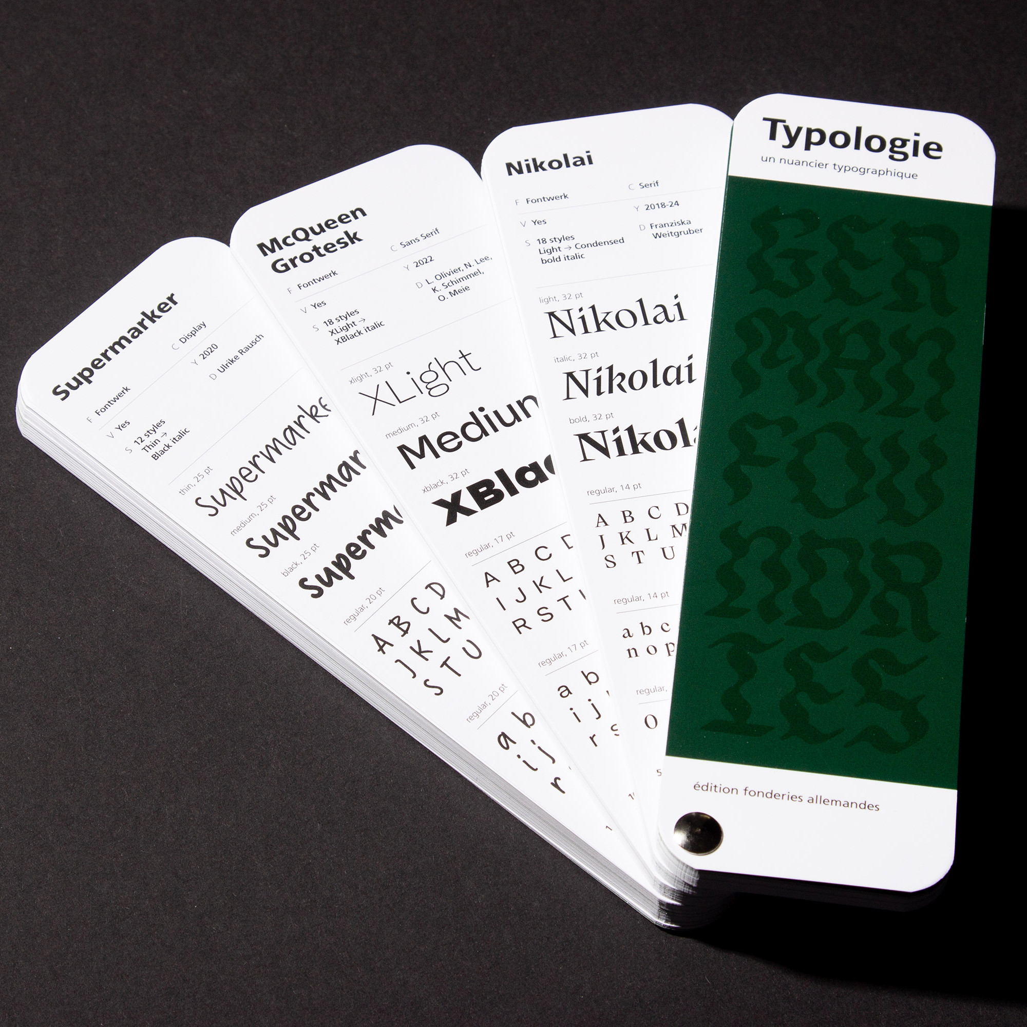 Back in June, we shared news of a crowdfunding for a fantastic Kickstarter Campaign for a very handy type-related tool called Typologie. The brainchild of Recto Verso, a Parisian graphic design studio founded by Pierre-Yann Lallaizon, Typologie is a typographic ‘color chart’ and their latest iteration Typologie Vert (Green) – which is dedicated to German type foundries – is now available. We are delighted that Supermarker, Nikolai, McQueen Grotesk and Nice have all been featured. Thanks to our friend Julien Fincker for providing us with the photo. ↗ |
|
 We love it when our font friends make something special, especially when it helps you improve your design work. Commissioned by Arrow Type, Roel Nieskens aka PixelAmbacht has created a very nifty Google Chrome extension that makes it super simple to test local fonts on any website. Type-X helps you to quickly and efficiently experience your fonts in context and the best news, it works with Fontwerk fonts! ↗ |
|
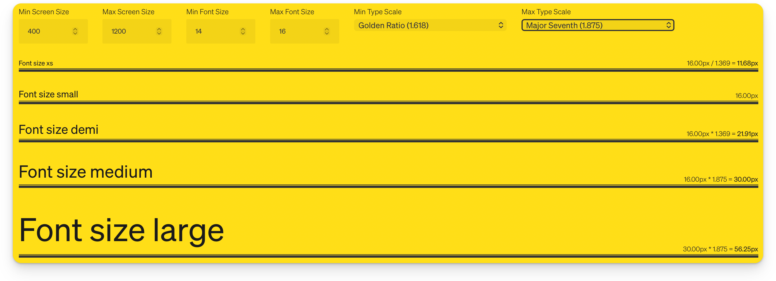 Attention, web developers, incoming useful nerd knowledge! In Piccalilli’s ‘The Index’ newsletter, we recently read about an interesting approach to so-called fluid typography. Front-end developer Jesús Olano from Coruña in Spain describes a way in CSS to adjust font size and line spacing when the screen size changes. Instead of fixed breakpoints where the font size changes abruptly, this allows for a smooth increase between different screen sizes. If you want to dive further into the topic of fluid responsive typography, Brighton-based visual designer James Gilyead from Utopia also shared some great tips about this. ↗ |
|
With our free Trial Fonts you get access to all characters and features of our fonts (except for currency symbols). So you can take all our typefaces for a spin before you buy. And for the eager beavers amongst you, you will also get exclusive access to our brand new (yet to be released) fonts from time to time (currently Sukoon by Yanone and NG by Ralph du Carrois). |
|
|
|