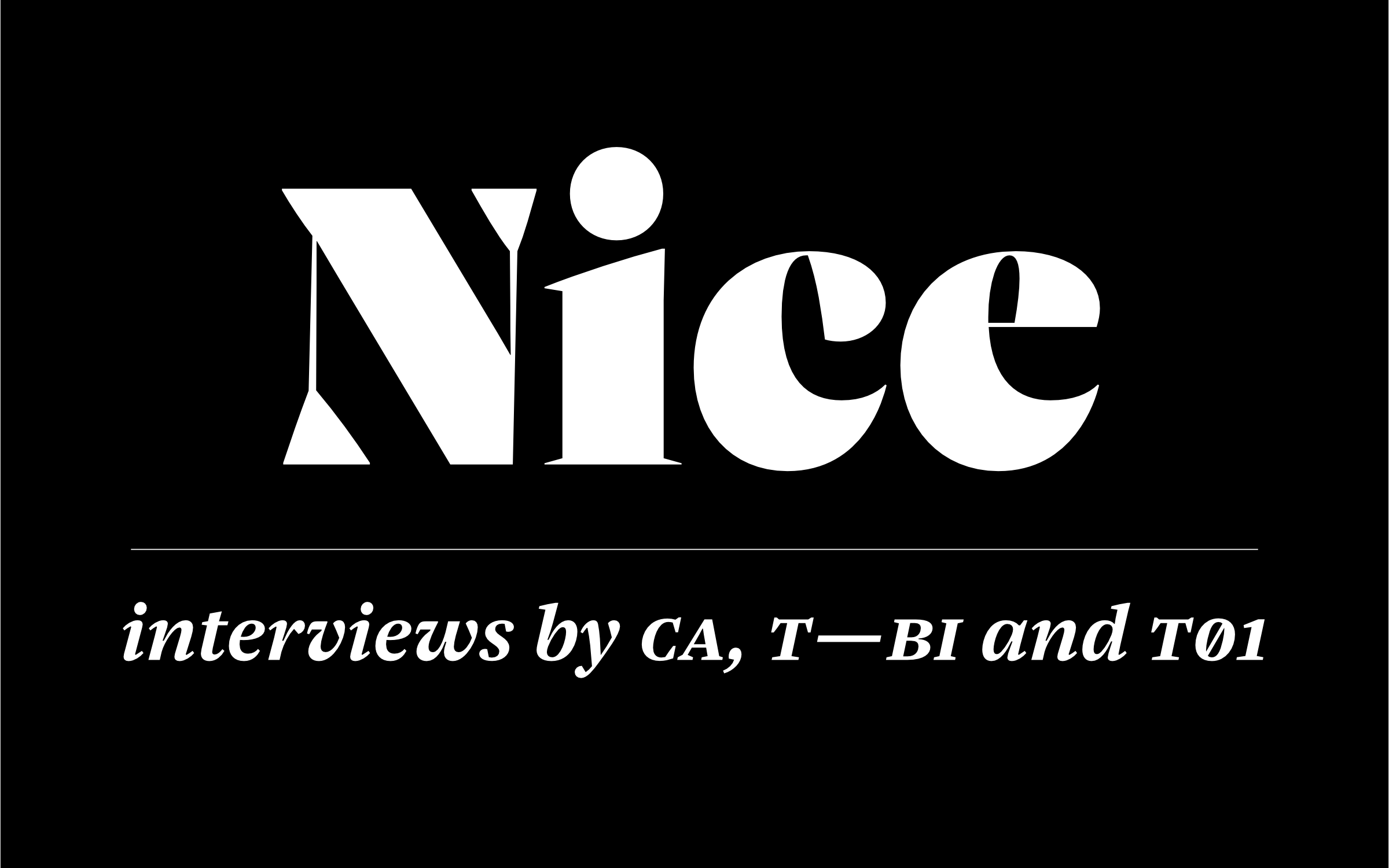
Following the recent release of Jan Fromm’s Nice, we are super excited to see this exceptional and highly versatile typeface being greeted with a very warm reception and gracing the pages of multiple publications.
Welcome to our May Newsletter! Following the recent release of Jan Fromm’s Nice, we are super excited to see this exceptional and highly versatile typeface being greeted with a very warm reception and gracing the pages of multiple publications. In this month’s roundup, we also share a match made in typographic heaven of Nikolai paired with Case and we reveal how you can become our next Designer. |
|
 | | We are super excited to see the Nice typeface being greeted with a very warm reception and gracing the pages of multiple publications. | |
|
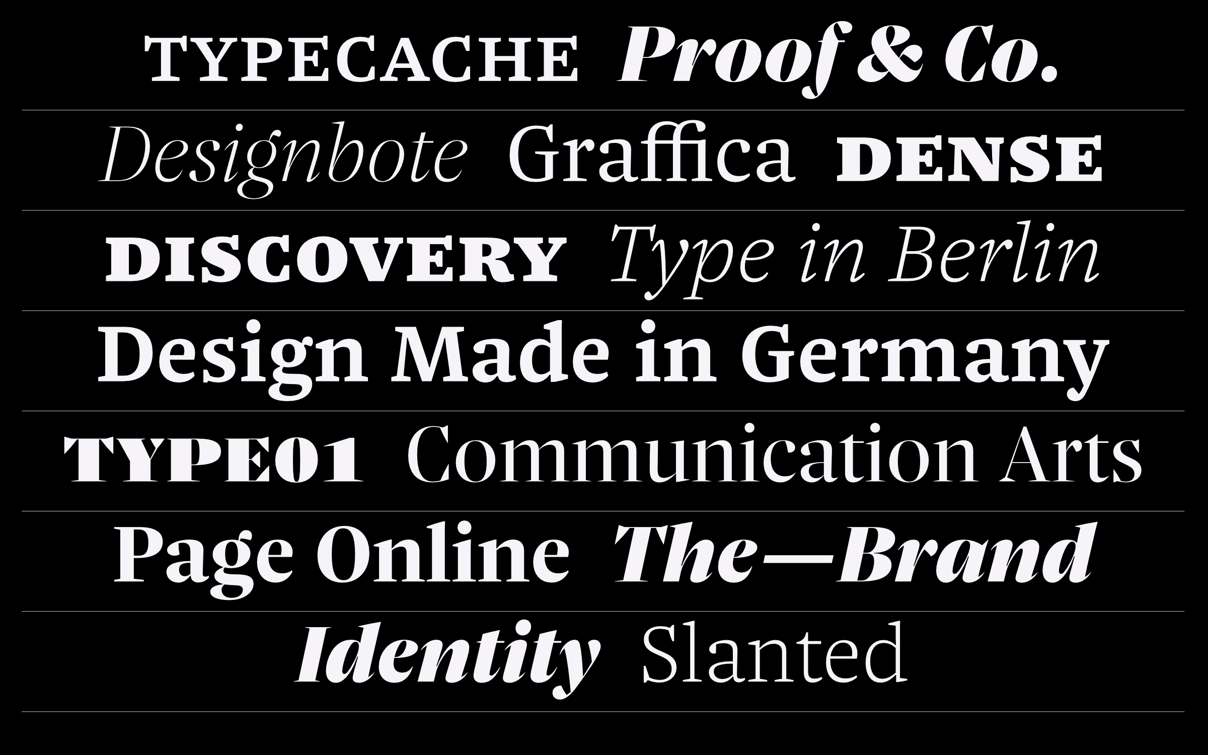
| | Nice words about NiceHot on the heels of its recent release, it’s been really fantastic to see that Jan Fromm’s beautiful typeface and the latest member of the Fontwerk family, Nice has been featured across a range of publications, including Communication Arts, The Brand Identity and TYPE01. In Communication Arts, the world-renowned trade journal of visual arts, Jan explained his thinking and guiding principles behind his design “In today’s troubled times, a dash of optimism is more important than ever. Nice is built around the core of optimism. I wanted to infuse it with positive values. The three basic principles of clarity, legibility and liveliness guided me through the design process to make the typeface kind and comfortable to use.” Over on The Brand Identity, an online platform which showcases the best projects and products in graphic design, Jan shared his favorite characteristics and features of Nice: “As a variable font, the user is given access to the entire design space which makes the already extensive font family even more flexible. The whole design space of Nice ranges from robust and open to graceful and closed shapes, and also from thin strokes to heavy stems.” While on TYPE01, which is one of the leading platforms that focuses specifically on the world of type, Jan was interviewed by Zoë Loring Murphy. During the interview he explained to her how designers can keep themselves motivated when working on a large and intensive type project: “I think it’s wise to take breaks in between and put the typeface aside for a while. This grounds your own perception and ensures a clear view when you return to the typeface a few weeks or months later … Most importantly, if you’re working alone on a comprehensive typeface, get feedback often. Not just from type designers, but from designers who could potentially use the typeface. Give them the fonts to test and try out. That will motivate you and help you keep going.” | |
|
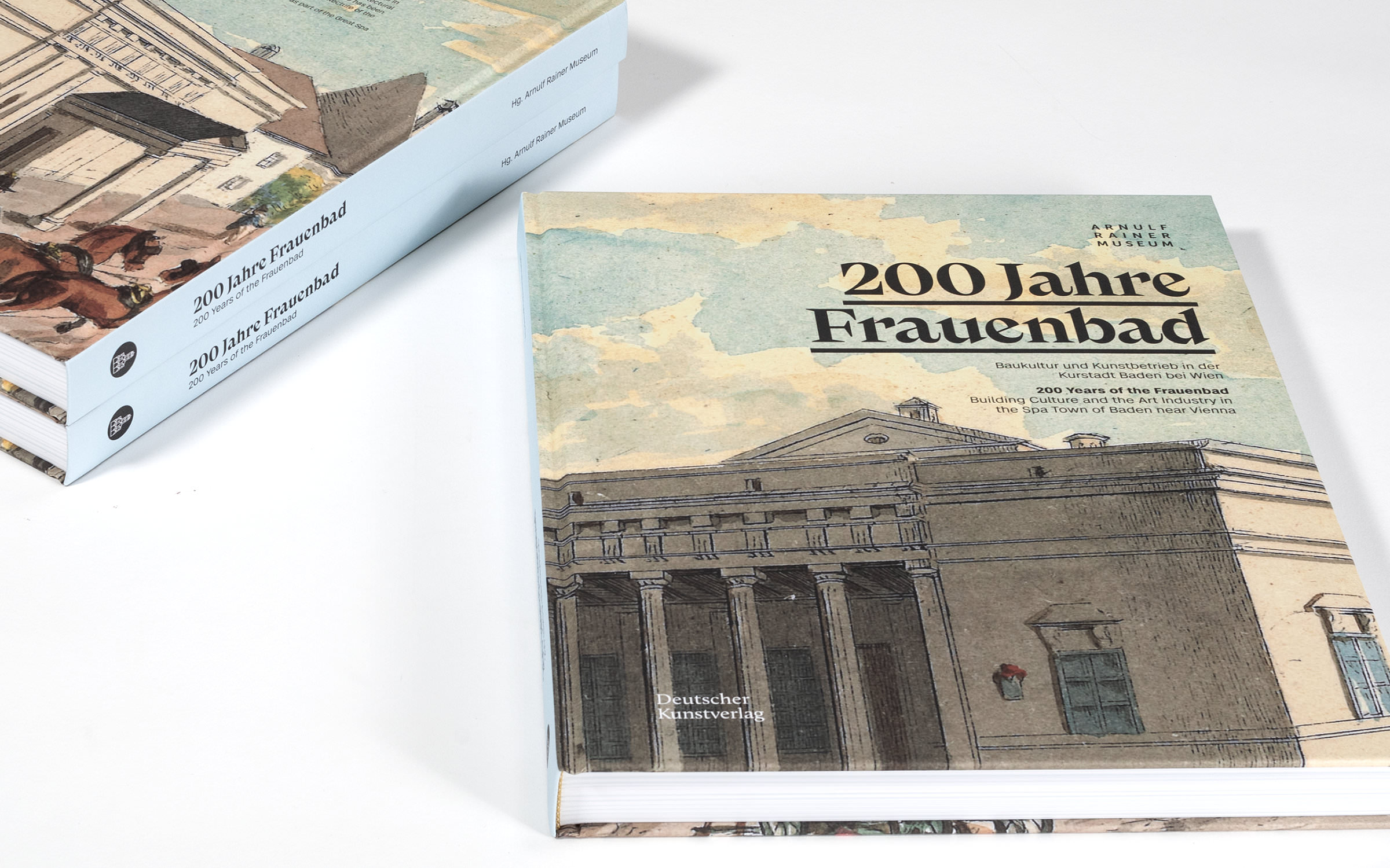 | | “200 Years of the Frauenbad – Building Culture and the Art industry in the Spa Town of Baden near Vienna”, designed by Metaphor, © Photo Wolfgang Thaler | |
|
| | 200 Years of the FrauenbadThis month’s Werkfonts In Use features the straight Case Text coupled with the showstopping Nikolai, for a catalog celebrating the 200th anniversary of the Frauen- und Carolinenbad in Baden, Austria. Designed by the Viennese Communication Design Studio Metaphor, the 224-page program beautifully documents the history of the Frauenbad and reveals not only the architectural story of the building but also the typography behind it. The designers Natalie Dietrich and Michael Jung found a match made in typographic heaven with the pairing of Nikolai and Case for their project for the Arnulf Rainer Museum. The versatile and hybrid Nikolai formed the bridge between a “refined historical look and a contemporary yet radical reinterpretation”, which in combination with the super clean Case Text, resulted in exactly the desired typographic tension. In an email to Fontwerk after completing the catalog, Natalie and Michael wrote, “We thank you for these perfectly designed typefaces, which are also useful in our everyday design work.” | |
|
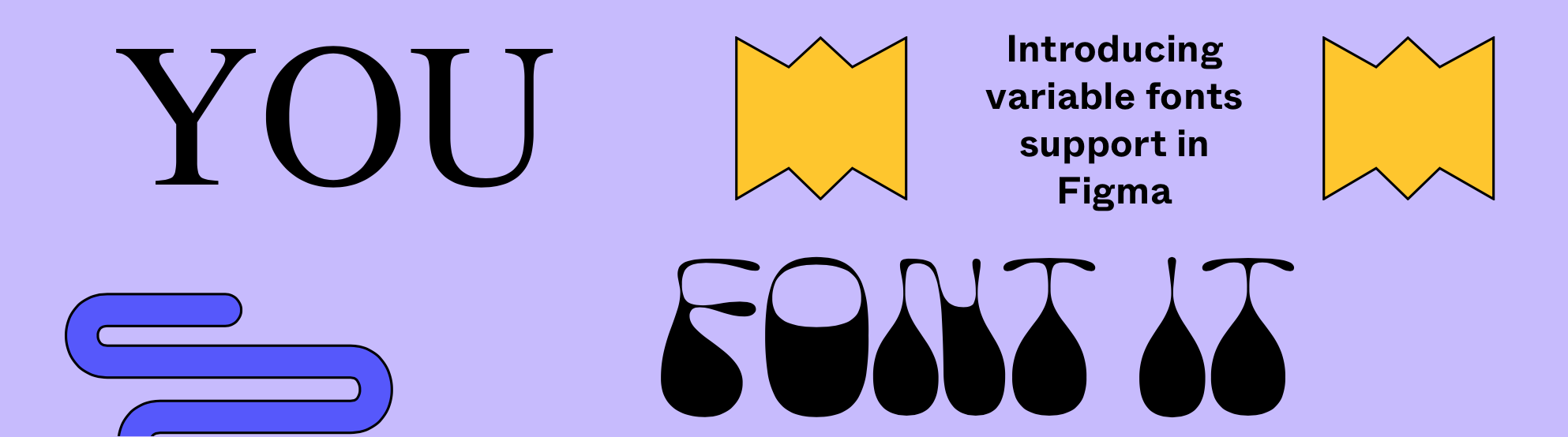 At Figma’s recent Config2022 Conference in San Francisco, we were super excited to hear that the popular design decacorn now supports Variable Fonts! As a foundry with a heavy focus on this mighty font technology, we are over the moon to see more and more platforms and companies evolving and adapting to support and enable the use of the typographic wonders that are Variable Fonts. Don’t forget that all Fontwerk typefaces are variable and all full family packages come with Variable Fonts. ↗ |
|
We are always on the lookout for new Type Talent and are interested in all kinds of designs. From sturdy and serious superfamilies to one-off, off-the-wall and experimental display fonts that grab your attention, if you have an original design we would love to hear from you. We work in close partnership with our designers, giving them the time and space to craft and perfect their work, while we take care of all the other background things such as engineering, distribution, marketing and sales. Sounds interesting? Read our Ten Reasons to Become a Fontwerk Designer and find out more about the process. |
|
|
|