hey are set in the idiosyncratic geometric sans serif font West, designed by the head of the Berlin office, Daniel Perraudin. His alter ego in Vienna is Cora Akdoğan. The two locations in the capital cities not only shape the name of the design studio, but also its web addresses: capitale.berlin and capitale.wien.
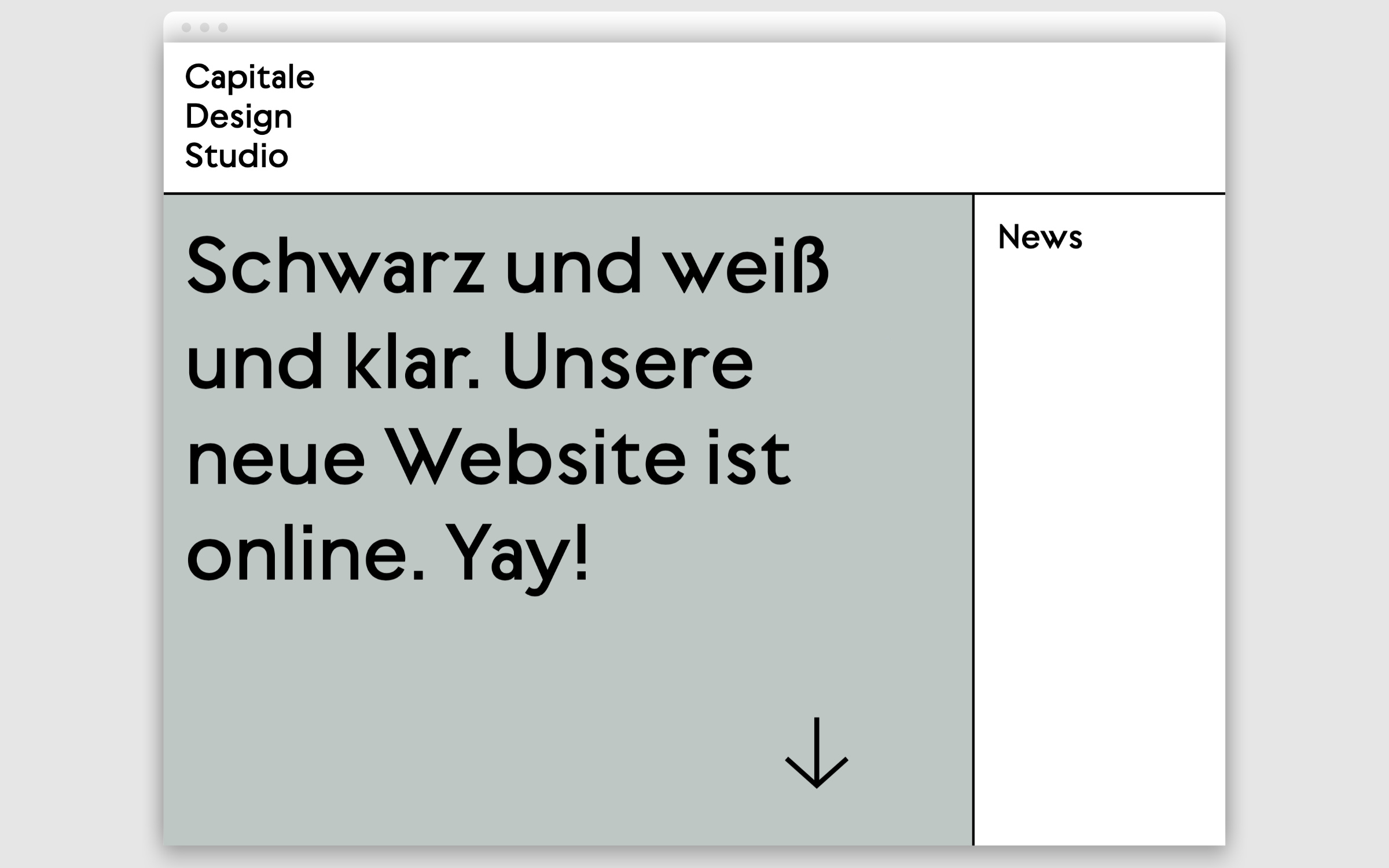
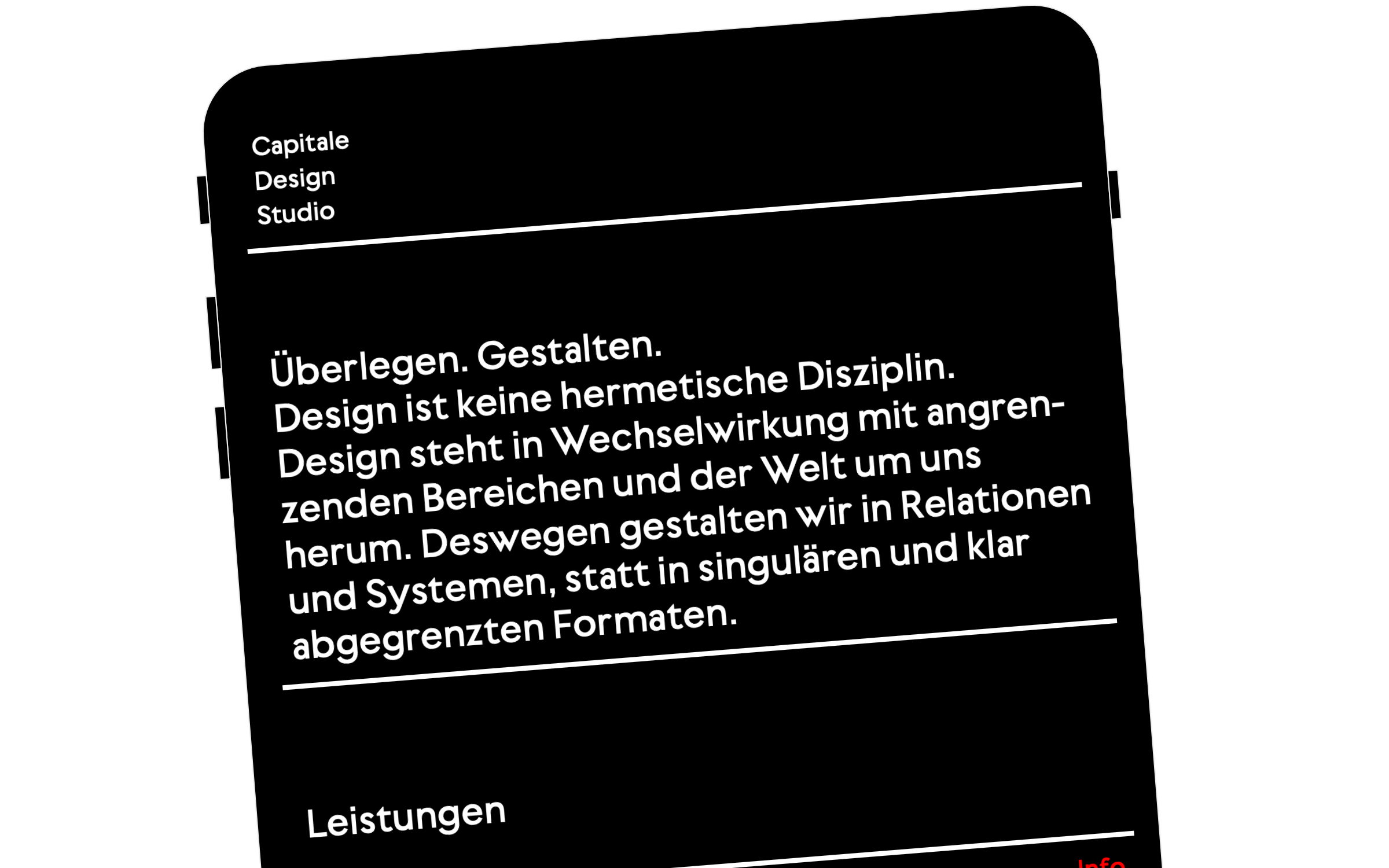
Their motto is “We design in relations and systems, rather than singular and clearly delineated formats.”. And of course, this attitude is also expressed in the house font that they developed themselves. West is a geometric sans—a type genre that usually follows a handful of rules for curves, angles and endings—all rather predictable, and thereby clear and singular.
But West, or rather its designer Daniel Perraudin, subverts the predictability of the geometric tradition by applying a construction principle that unleashes the typeface: there is no repetition of visually similar forms in the letters. The result is still a flawless geometric sans family but one whose letters take the liberty to emphasize their personality with one or another idiosyncrasy or fine detail.
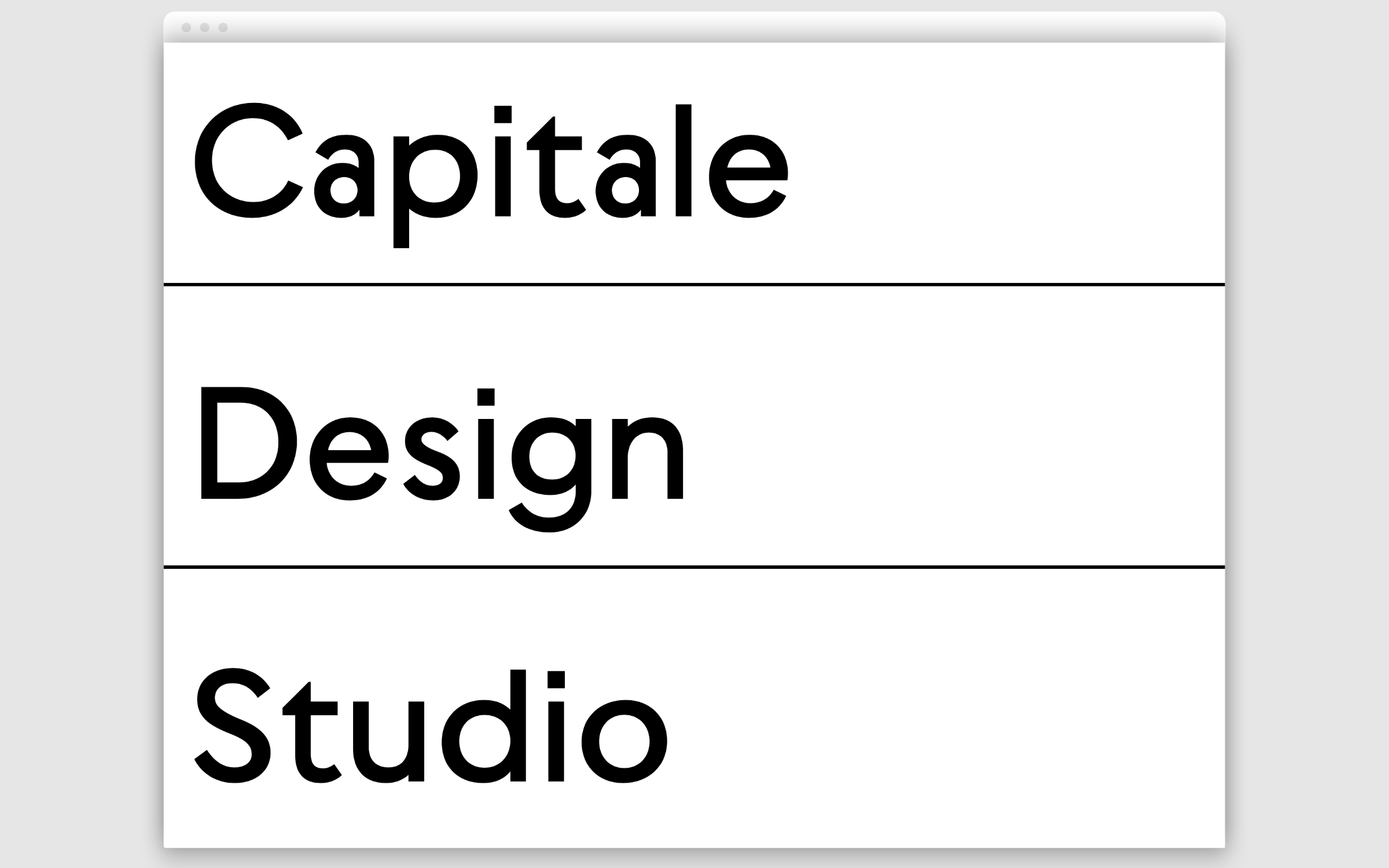
Capitale’s three main areas of work also highlight the studio’s typographic competence: branding, signage and editorial. It is precisely in these three disciplines that typeface and typography play the main role.