Love at first sight: Bike brand meets match made in font heaven

In Spring 2020, as many city dwellers emerged from the first lockdown and started to remember their rather neglected and unused bicycles, many of the bikes had to be repaired after not being ridden for so long during the pandemic. Nino Jäger and Christian Schmid, who met in Nino’s bike workshop GOrilla urban cycling, realized: “The cheaper the bike, the worse its condition. 30-year-old classics, on the other hand, were ready to ride again in half an hour.”

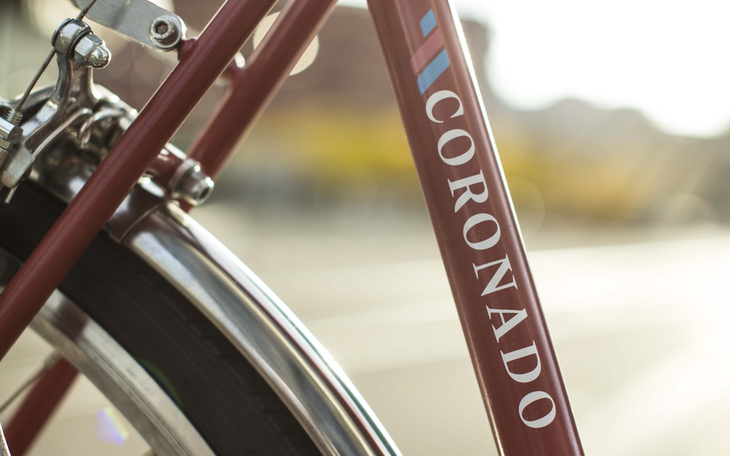
This realization gave rise to the idea of reviving the Swiss bicycle industry and manufacturing high-quality, locally produced city bikes of their own. So, together they founded Wheels & Cycles and acquired the rights to the name of the successful 1980s brand, Coronado. Following discussions with various Swiss manufacturers and distributors, in Spring 2021, they launched the Coronado shop for custom city bikes.

Homepage of the revamped Swiss cycling brand Coronado with Nikolai as the headline font (combined with Google’s Montserrat)

Locally made, quality and love for the environment

Coronado’s three brand values are: locally made, quality and love for the environment. It is important that these qualities and values are reflected in the logotype and brand itself. For example, through a font that was also designed locally, perhaps in Italy, where the Coronado steel frames are also made. By a designer with a passion for tools and materials, who loves manual printing techniques and has a soft spot for finishes such as gold leaf or enamel varnish. And, that’s exactly how it came about. The choice of the contemporary antiqua, Nikolai by the South Tyrolean designer Franziska Weitgruber was a no brainer and the background story of the font couldn’t have been a more perfect match.

Angles, curves, contrast: amazing analogies between the geometry of a Coronado steel frame and the letter construction of Nikolai

‘Fit like a glove’

The contrast of the stroke weight of Nikolai, the left-slanting counters of the letters c, C, g, G, e, o and O, and above all, the leg in the letters k, K and R mirror the shape of the Coronado velo steel frames (frame angle, fork, upright or the rolled casing of a tyre under riding load). It’s almost as if the brand font was designed specifically for the Zurich-based bicycle start-up. But we can confirm it: Nikolai was created a few months before Coronado was launched, yet both embody the zeitgeist of the early 2020s. It’s nice that they have found each other. The founders, Nino and Christian agree: “When we saw and tested Nikolai, it fit like a glove. We are super happy how the combination of the font, logo and bikes fit. Thank you very much!”

Nino and Christian’s enthusiasm for the typeface is also reflected in its use as the headline font on the website. Giving a seamless experience to the customer connecting the brand’s digital presence with it’s actual product.

Try Nikolai

The striking Coronado logo, set in Nikolai, is also emblazoned on the frames of the young Zurich city bike brand