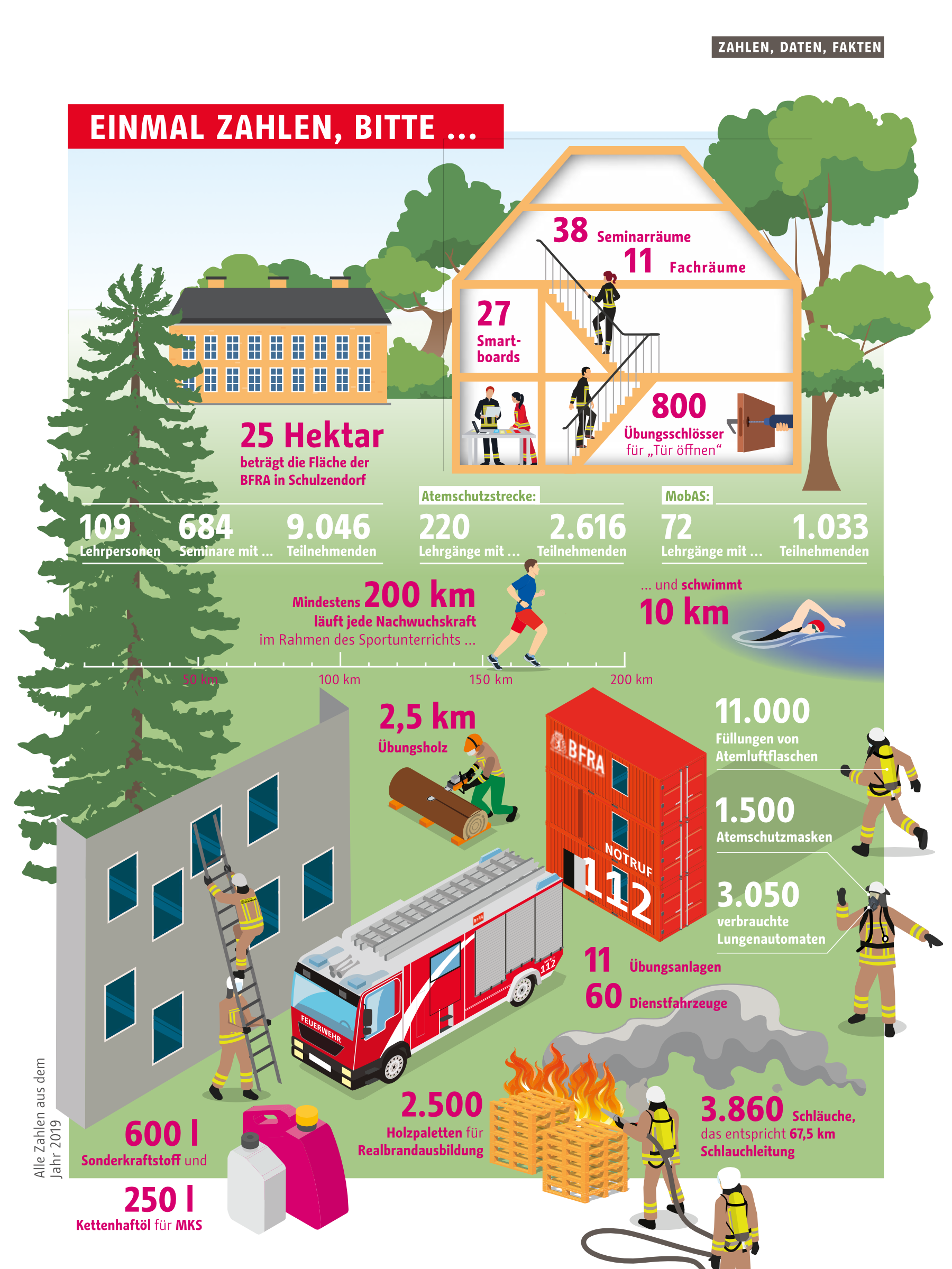
The Berlin Fire Brigade was founded in 1851 and brought unprecedented safety to the city’s citizens overnight. Today, with 35 fire and rescue stations, 1050 emergency vehicles, 5200 permanent employees, 59 volunteer fire brigades and 48 youth fire brigades, it is the largest fire brigade in Germany. Berlin also ranks 5th in the world, coming after Tokyo, New York, Paris and London.
Berlin would not function without a fire brigade. It is the city’s central crisis manager: for fire protection, rescue services and in the event of a disaster. The rescue teams have more and more work to do because the city is growing and becoming more dense. The population is also getting older and older and so isolation is increasing and to top it off, the climate crisis is also causing more extreme weather conditions.
With its “Strategy 2030”, the Berlin Fire Brigade is preparing for the challenges of the future. With a focus on expanding material and human resources, job satisfaction, more diversity and helping to shape politics and urban development, the new directive and strategy requires a lot of communication. No wonder that the fire brigade has developed into a strong brand with a stringent corporate design.
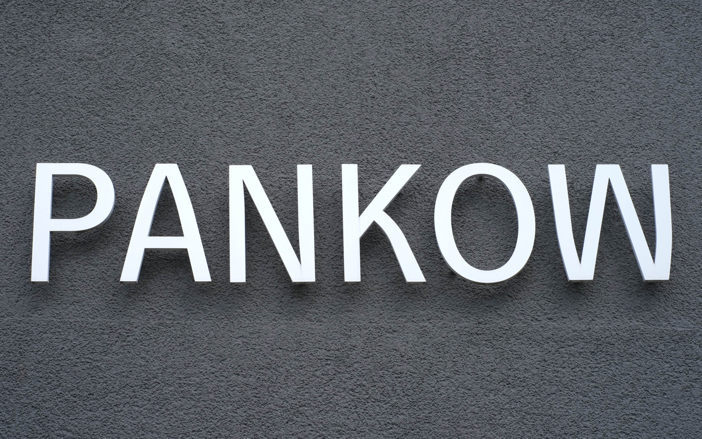
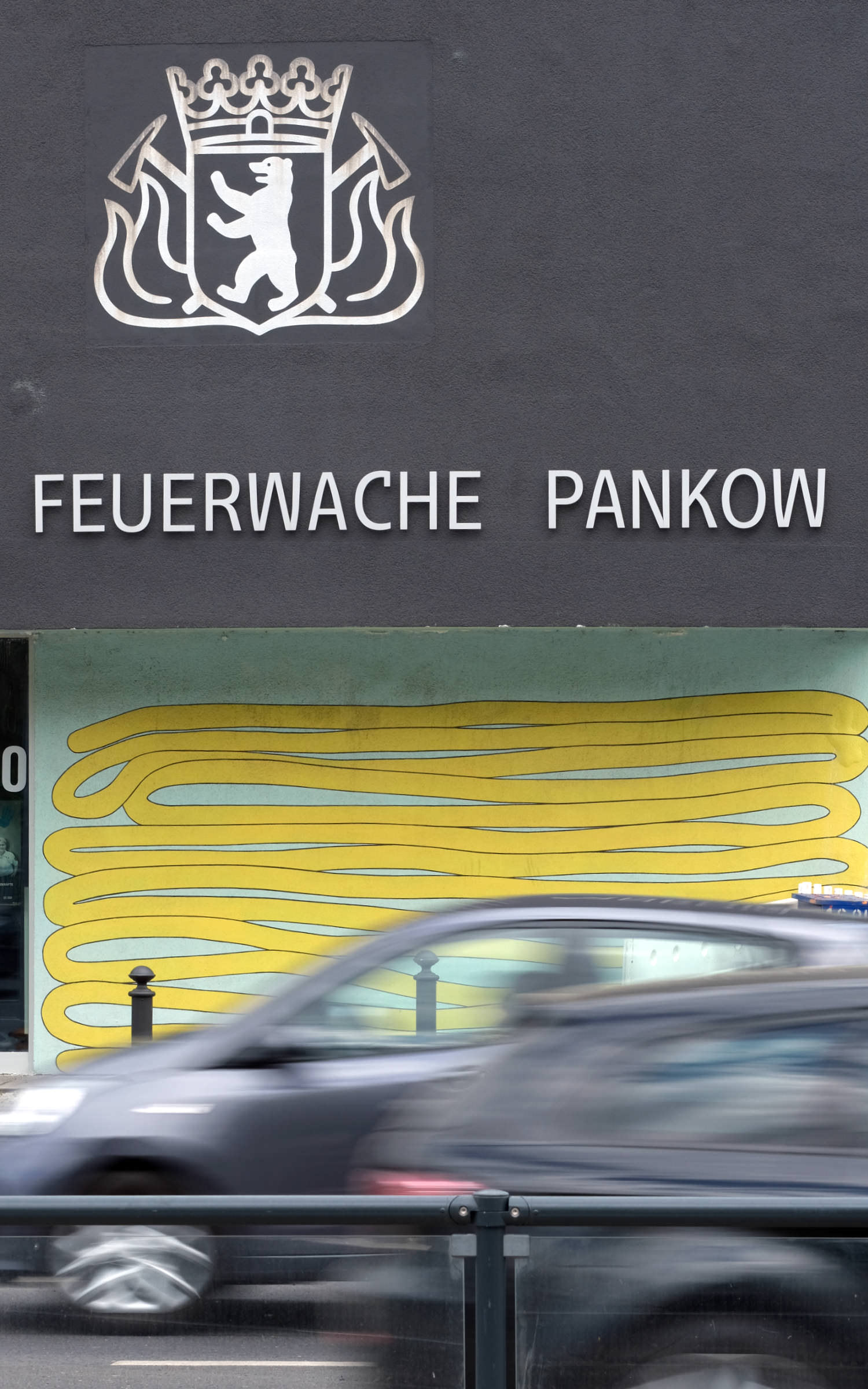
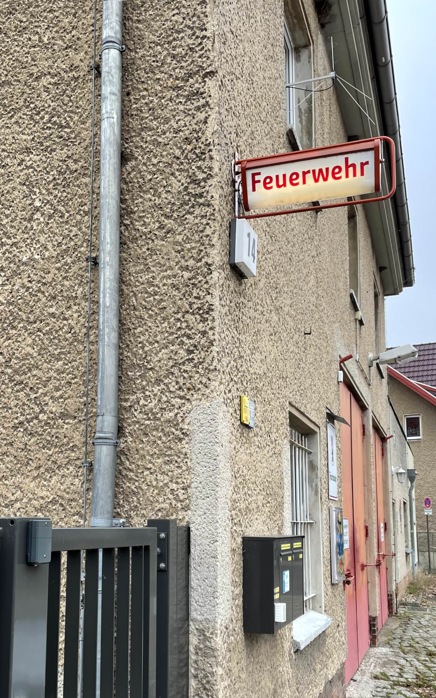
Fire station Pankow, set in Change Letter, which is no different from Change (Sans) in most capital letters.
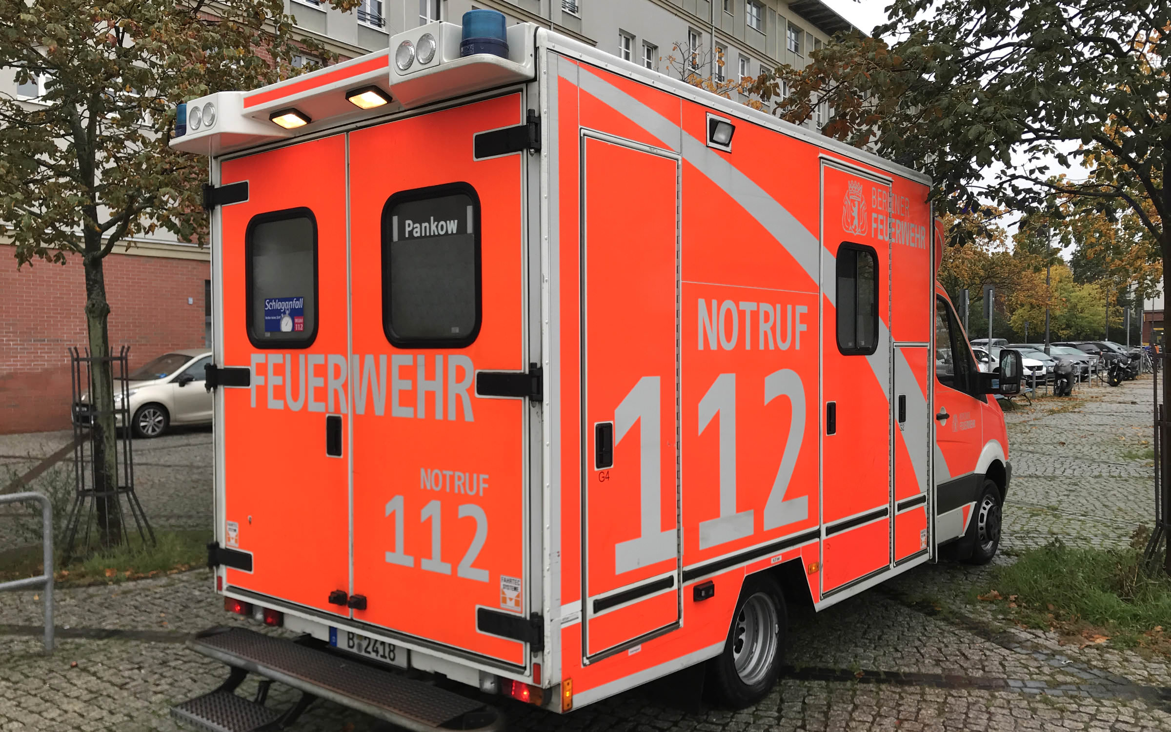
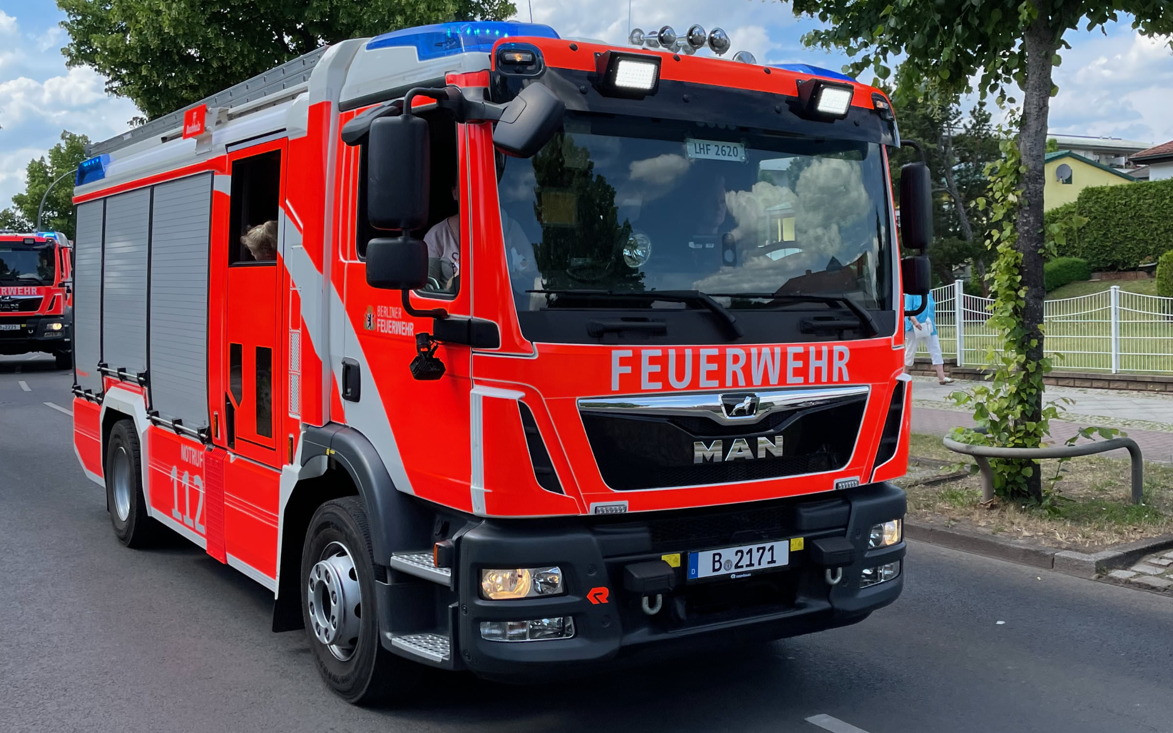
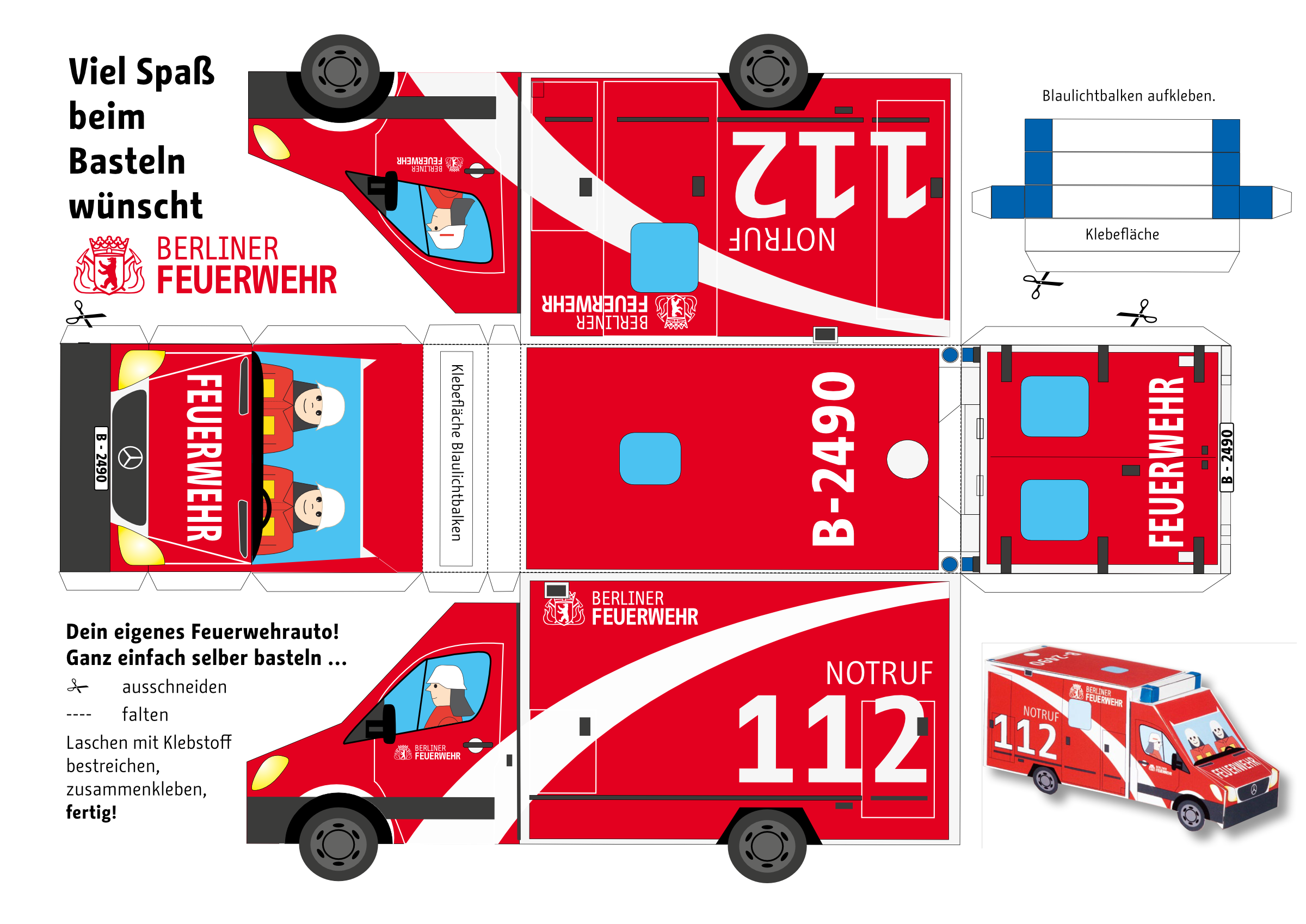
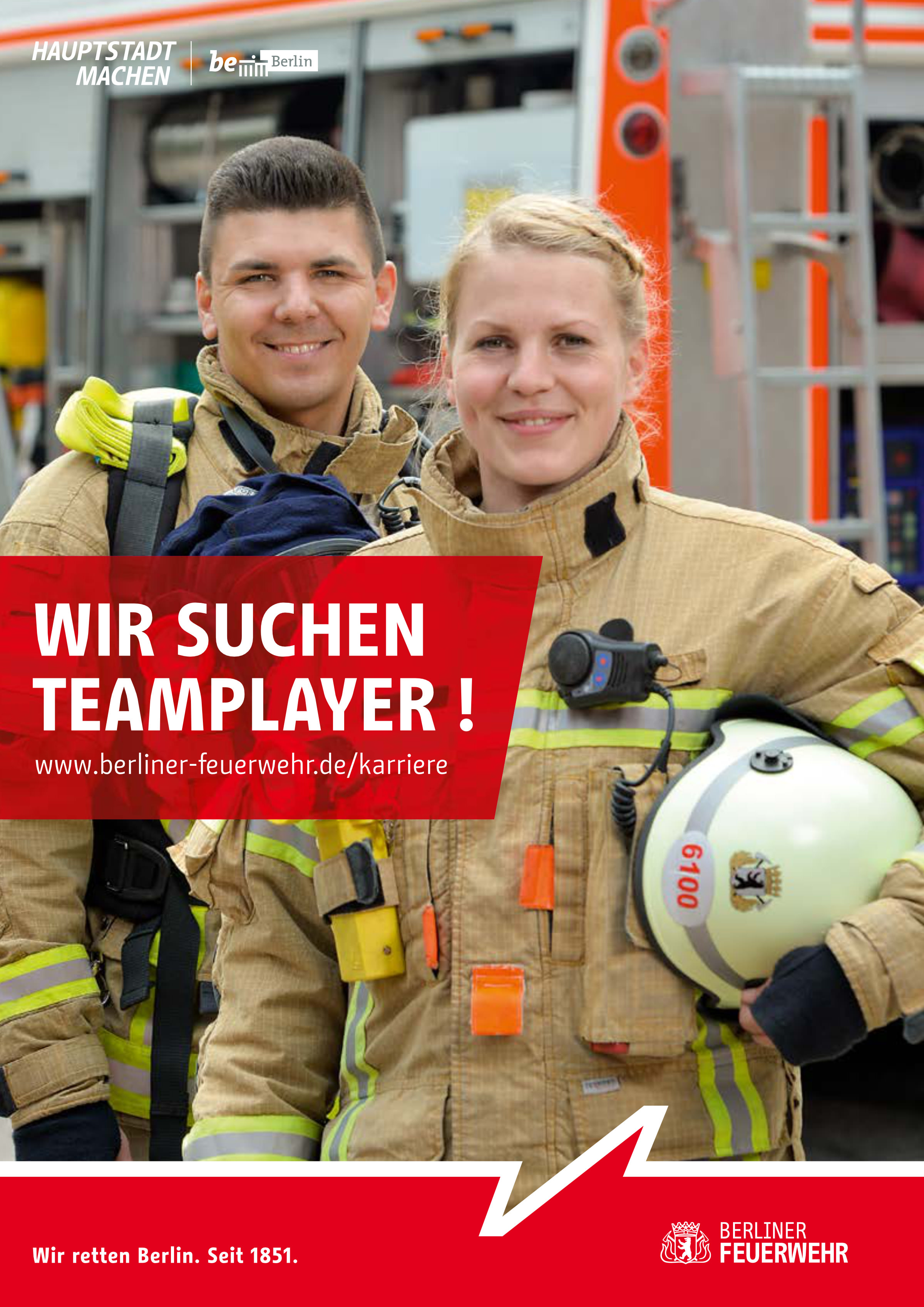
The corporate design was developed in-house by the Press and Public Relations department in cooperation with a communication scientist. The two most important goals of the CD are the positive public perception of the fire brigade and the identification of the staff with their company. The national emblem, which has been in use since 1977, has been reduced to a few clear lines and is a single color. The corporate colors are, of course, still red and white but other colors have been removed. Furthermore, a uniform logo “Berliner Feuerwehr” (Berlin Fire Brigade) was developed using the Change Letter font, which used to be the headline font of the state of Berlin. The fire brigade also uses Change Letter for headlines on their website, in printed matter and annual reports, as well as on vehicles, buildings and equipment. In capitals, Change Letter, whose release is planned for later, differs only slightly from Change, which is now available from Fontwerk as a completely reworked and revised font family.
The in-house adoption and use of the new brand identity was overwhelming. Possibly the familiarity with the typeface, which became city-famous through the Be Berlin campaign, helped. “The implementation went surprisingly smoothly. First drafts of the new logo spread furiously and were eagerly used by staff long before a binding business directive came into force,” recalls Jens-Peter Wilke from the Press and Public Relations Department.