As we return from our little summer break, we’re kicking off the rest of the year with recharged batteries and plenty of exciting news. In this bumper edition, we talk about the seventh script addition to our Pangea Collection, which is fast growing into a global font. We also have a chart-topping use case for McQueen, a story about Nikolai’s Latin American-inspired trip to California, news of the most significant award to date for Tausend and we introduce our new Georgian specialist. We also have an exclusive interview with the designer of Sukoon, Yanone, and last but by no means least, we share an update about a simplification to our licensing terms. |
|
 |
 |
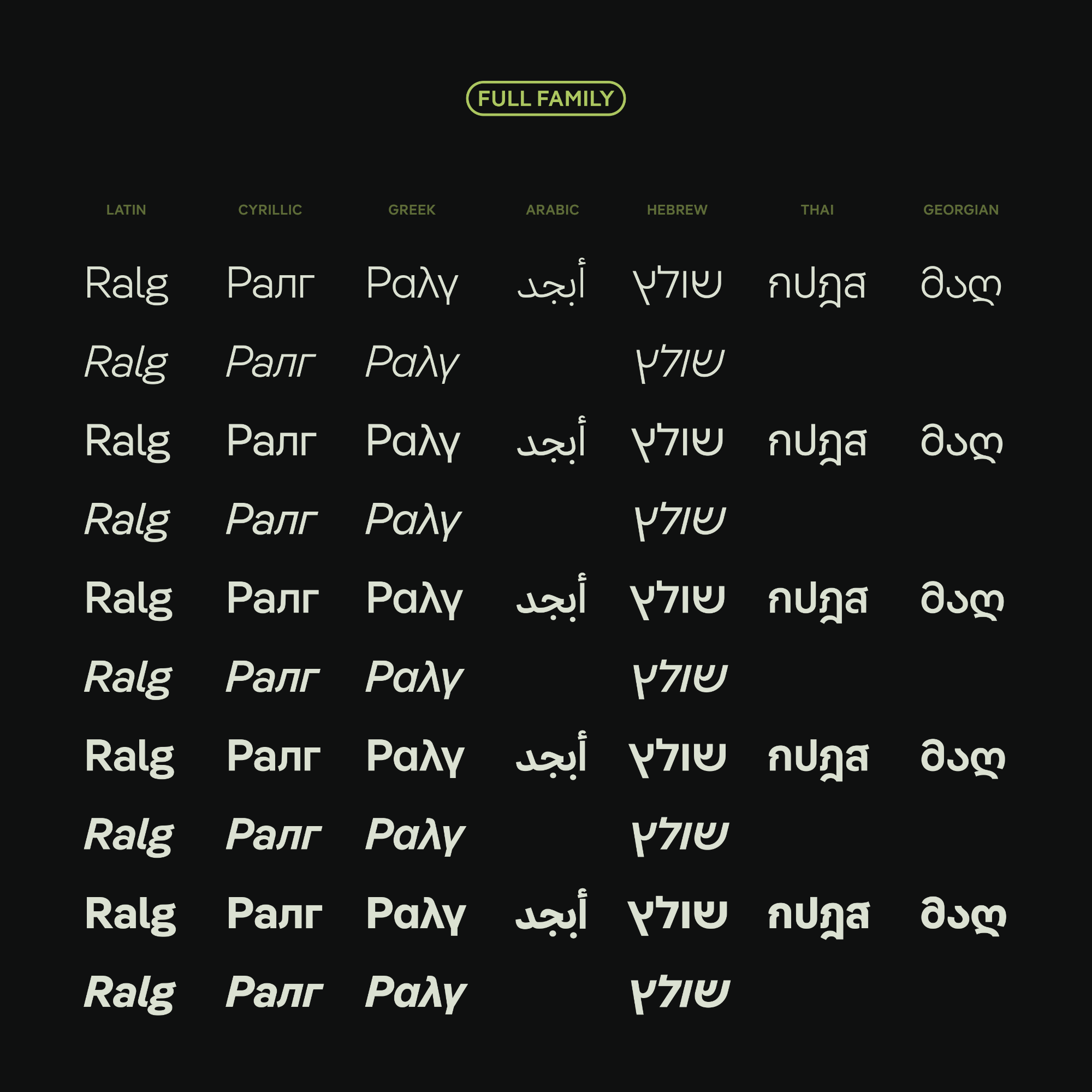 |
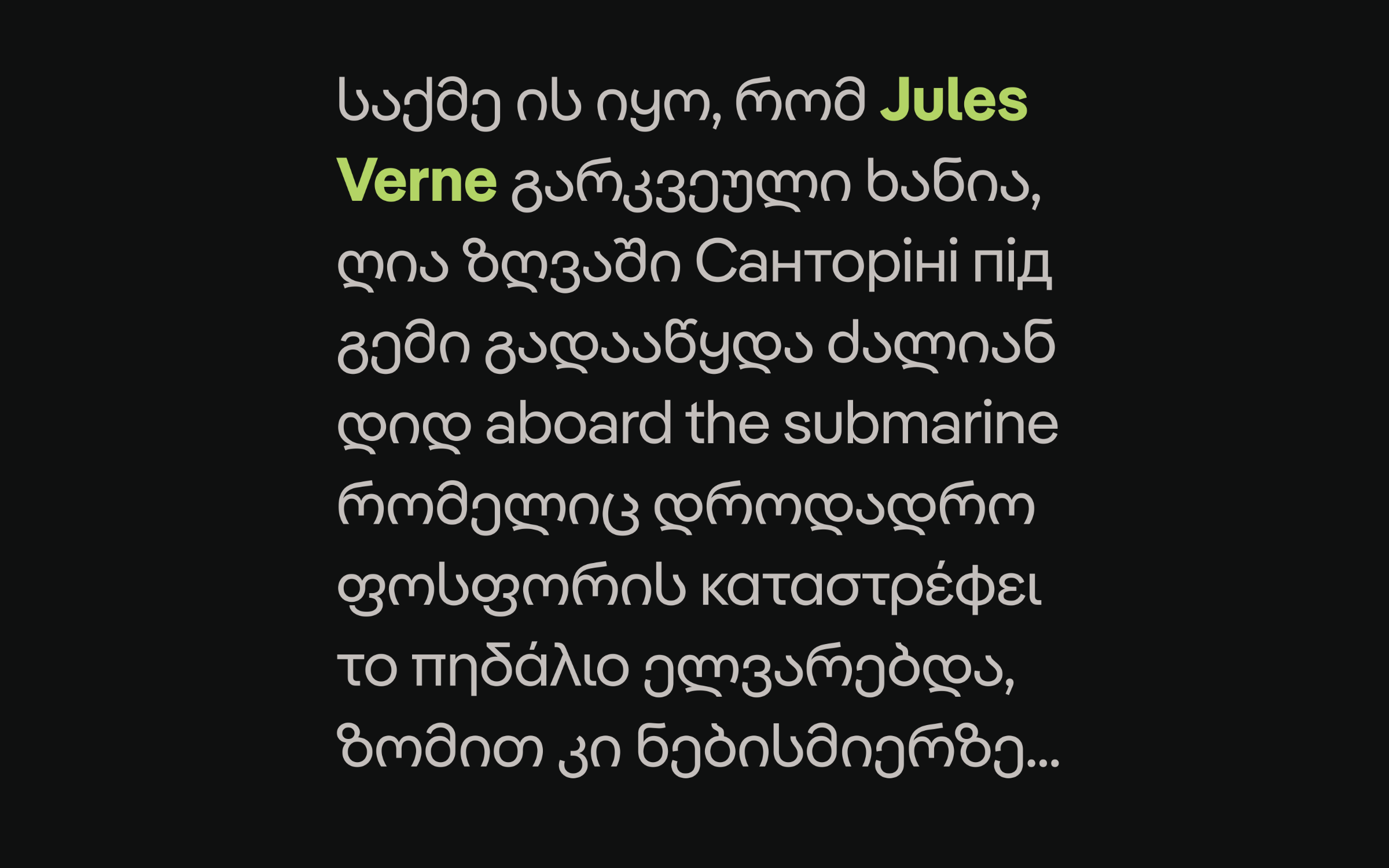
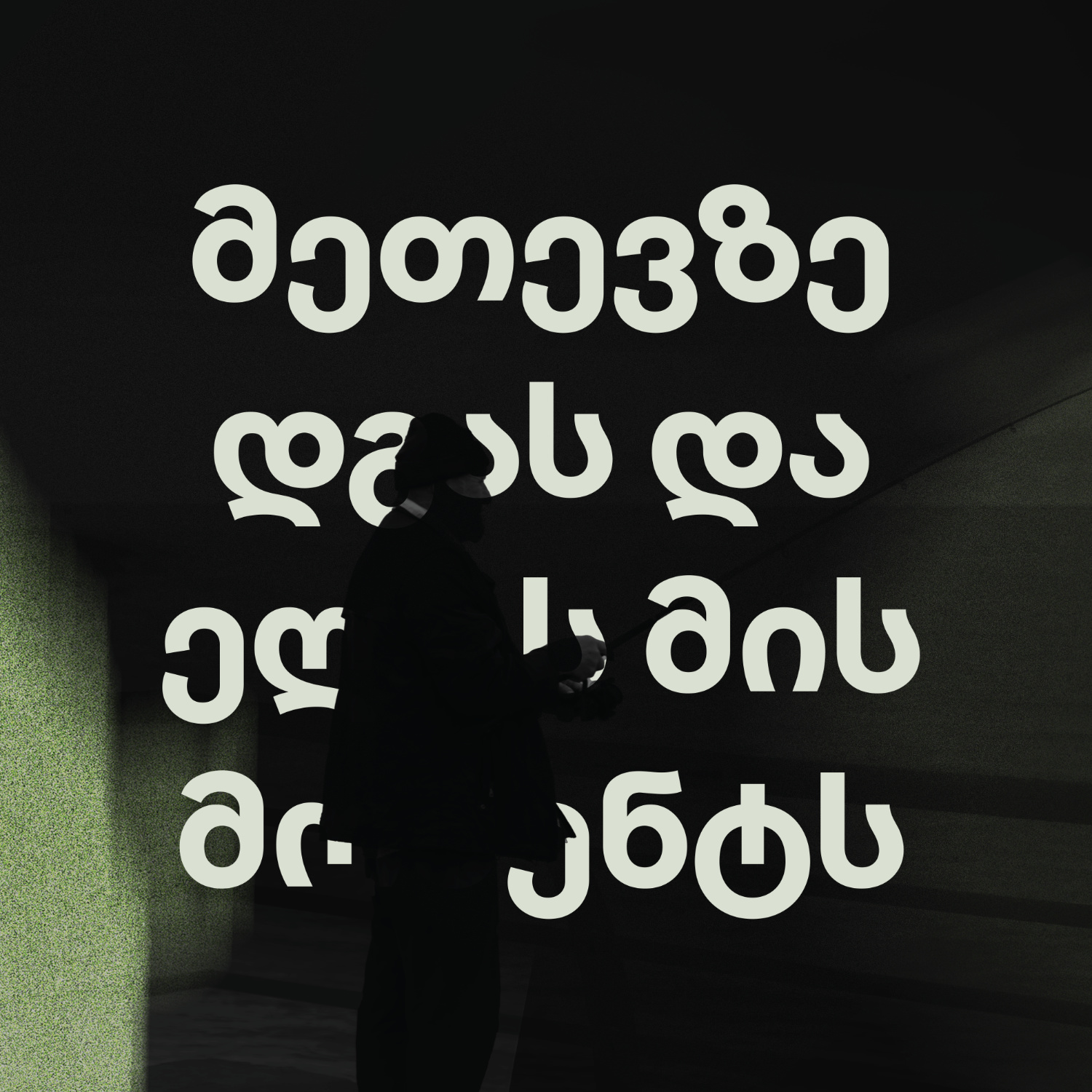
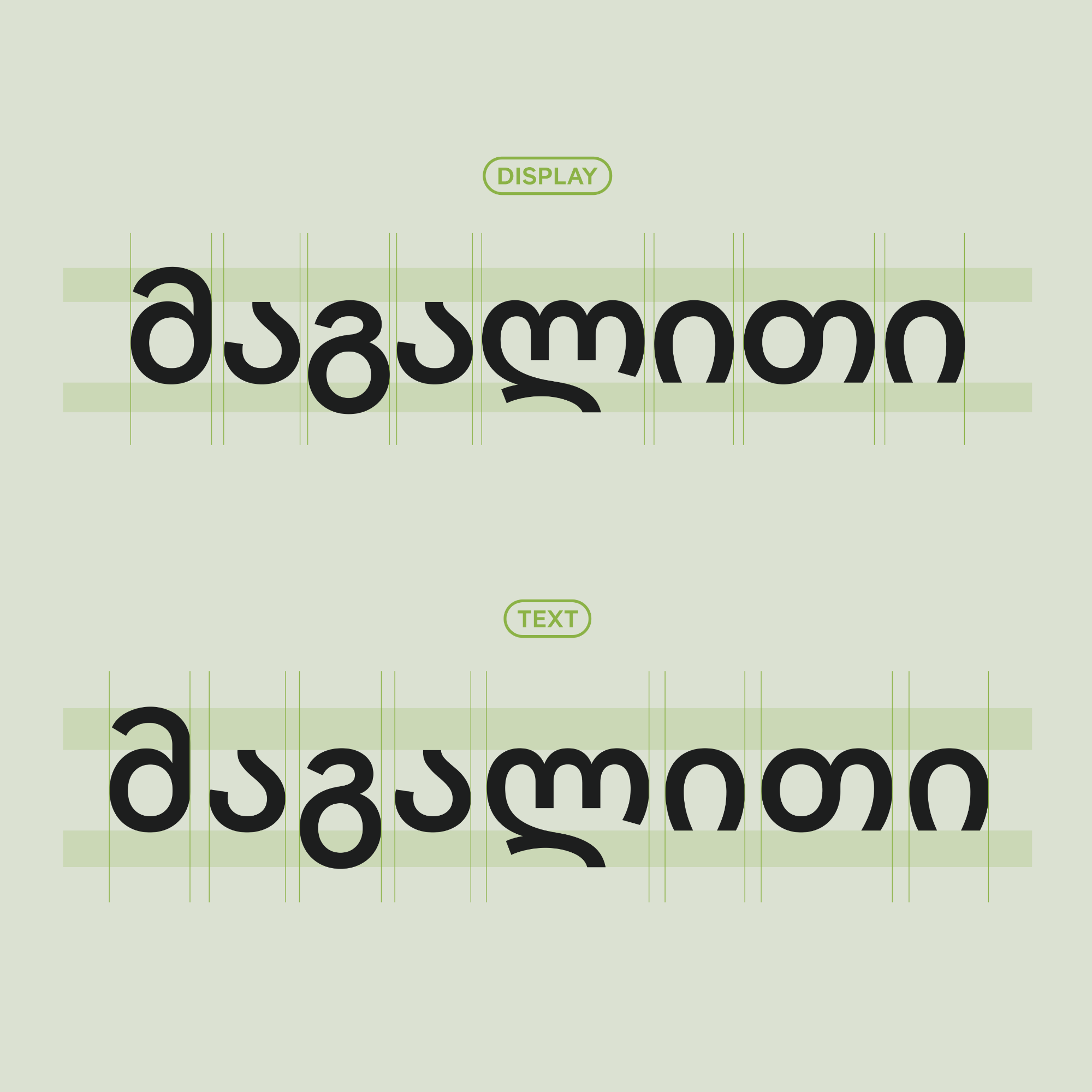
| | Introducing Pangea GeorgianPangea is special in (at least) two ways. Firstly, its designer, Christoph Koeberlin, donates a quarter of his earnings to projects dedicated to the conservation and large-scale reforestation of the rainforest. Secondly, he is continually expanding the typeface family to include additional scripts. The key to both initiatives is the involvement of the local population and expert designers with language-specific backgrounds. As a result, thousands of trees have been planted and saved, and at the same time, with the help of Azza Alameddine (Arabic), Yanek Iontef and Daniel Grumer (both Hebrew), Boom Promphan Suksumek (Thai), and in a consulting capacity, Ilya Ruderman (Cyrillic), Irene Vlachou (Greek), Donny Truong (Vietnamese), Paul Hanslow (African Latin), and Amir Mahdi Moslehi (Farsi), six alphabets have been created. With the addition of Georgian by Akaki Razmadze, the number has now increased to seven. So, Pangea now sings in seven distinct yet harmonious voices. For the Georgian variant, Akaki Razmadze drew inspiration from the well-known consistency in compactness and closeness with which Pangea successfully bridges the gap between narrow grotesque and geometric typefaces. Consequently, geometric forms, a clean design, letters with barely open forms, and diagonal terminals are also found in this new variant. In doing so, Akaki Razmadze succeeded in preserving the natural proportions and the myriad of subtle details characteristic of the Georgian script, while simultaneously creating a harmonious unity with the other alphabets. A special feature is ‘Mtavruli’ (Georgian uppercase letters for all-caps setting), which were added to the Unicode standard a few years ago. Thanks to the case feature, these letters are readily available in almost every app. Improved readability can also be achieved with this language extension using Pangea Text. With longer ascenders and descenders, more open forms, and a more generous spacing, this variant is recommended for longer texts, applications at small font sizes, and on screens. As always, all registered users can download the newly expanded fonts free of charge via their Fontwerk account. For new customers, the price remains unchanged, with one important exception: thanks to our regional pricing, customers based in Georgia can purchase Pangea at a 58% discount. This approach aims to better reflect the realities of life in different regions (read more here). But that’s not all… additional Pangea languages, serving hundreds of millions of people, will follow soon. | |
|
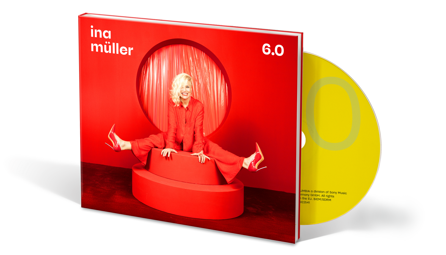 |
| | Straight to number one with McQueenOur latest use case for McQueen really tops the charts for Cabaret Artist, Singer and TV Presenter, Ina Müller. The typeface takes center stage on the artwork for her latest album bringing clarity and confidence, so to us it’s no wonder that this album went straight to number one. ;) Over the past two decades Ina Müller has become one defining personalities of German entertainment culture and is best known for her ARD late night show ‘Inas Nacht’. Last November, she released her most successful album to date, 6.0, which reached the top of the German charts. McQueen combines contradictory principles: a strong contrast with ink-trap-like cuts and geometric architecture meaning that it is exceptionally legible, even in small print. For 6.0, McQueen proved to be the ideal choice. It stands out powerfully against the reduced, visual power of the imagery and works well both in the title sentence and in the paragraph text. Together, photography and text give the album artwork a timeless presence. As the art director Sven Grot from the B—99 Agency says, ‘It was important to me to find a font that had something special and harmonized well with photography. When we realized during the process that we wanted to work exclusively with photos and text, an expressive font became more and more important.’ The final decision for the font landed on McQueen in Regular and Bold – not least because Ina Müller immediately fell in love with the design. ‘As always, she was right,’ said Grot. So, it’s no surprise that McQueen now also features on Ina’s website. | |
|
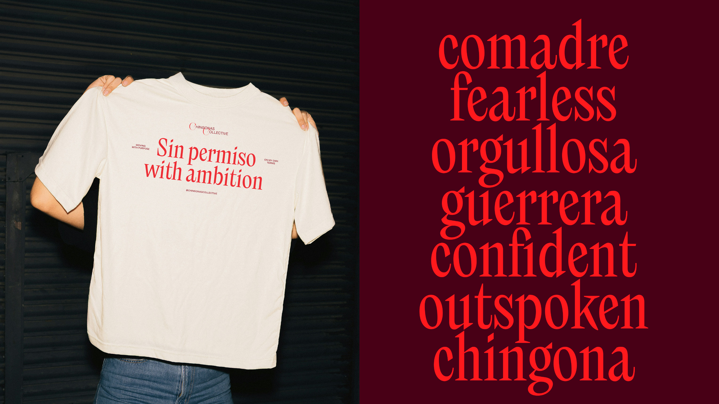 |
| | Nikolai helps Chingonas shineIn our latest use case for Nikolai, the typeface travels to the Bay Area to support a burgeoning community for entrepreneurs. Based in the Bay Area, the Chingonas Collective supports Latina Entrepreneurs to grow, shine and connect. What began as a local initiative in Oakland has evolved into a transregional community that provides a platform for Latinas in one of the world’s most dynamic economic regions. The Chingonas’ visual identity revolves around their collective strength and was designed by Sofia Llaguno, a Mexican Designer based in California. As the brand typeface, Llaguno chose Nikolai Condensed, a display typeface whose angular, striking forms embody exactly what the collective radiates: strength, aspiration and vitality. Designed by Franziska Weitgruber, Nikolai is a modern serif with distinctive architecture and maximum typographic impact. It is the perfect fit for the Chingonas’, encapsulating the power, presence and energy of its members whilst still being warm and open. Nikolai is used throughout the identity, in the logo, across printed materials and merchandise and across their social media. As Llaguno notes, ‘Through its clean, striking forms, Nikolai infuses Chingonas Collective’s visual communication with a sense of determination and ambition.’ | |
|
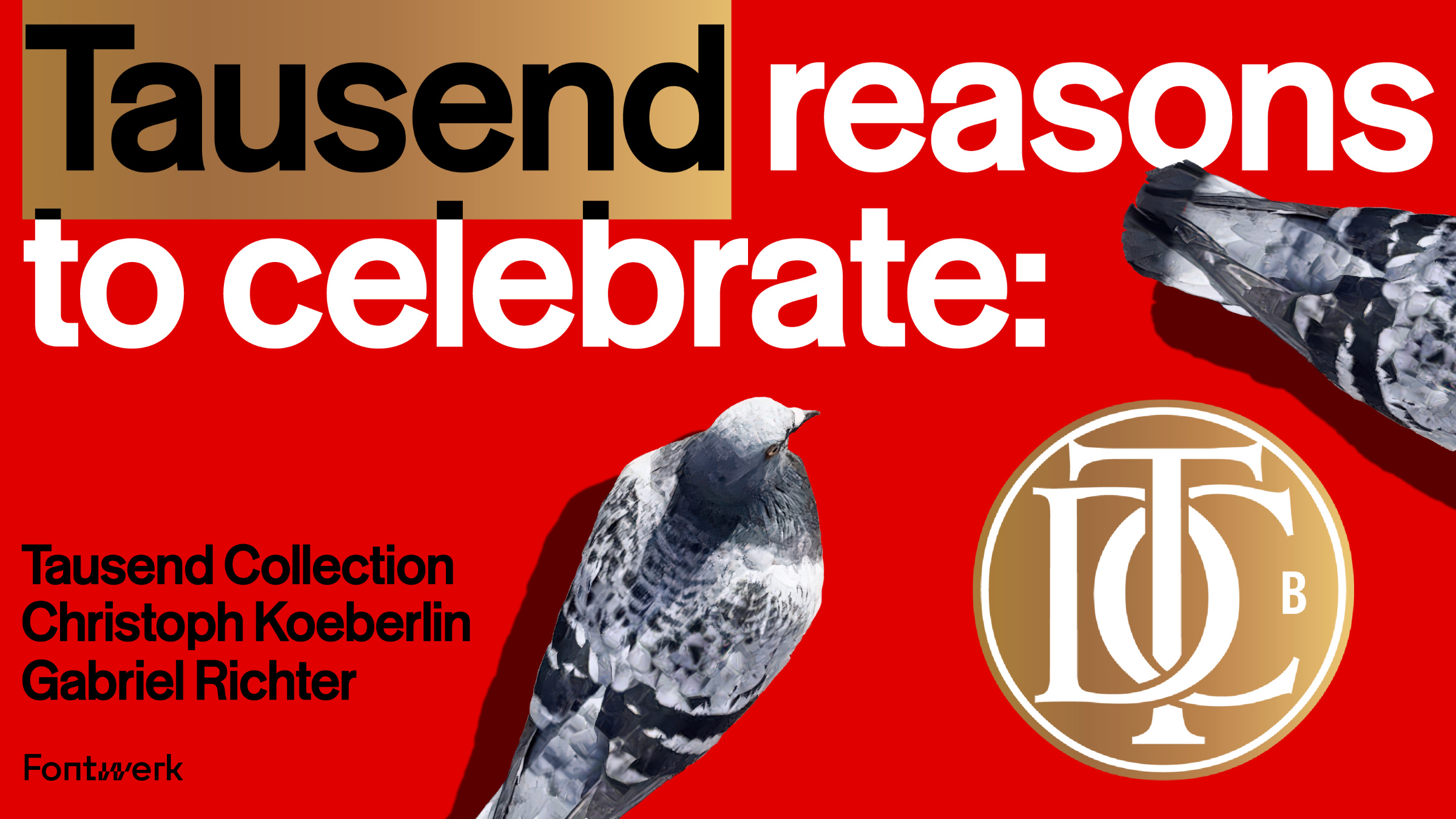 |
| | TDC Type-High Award for TausendSince 1946, the Type Directors Club has recognized outstanding achievements in type design worldwide. Their TDC Awards are among the most prestigious and coveted honors in our industry and many consider them to be the ultimate accolade. Representing the best of the best, TDC Awards are presented those who clearly stand out from the crowd. Up until now, it was simply a matter of being crowned a winner of an award. But this year, for the first time ever, there is a gold, silver, and bronze award in each category. What can we say? The Tausend Collection has won one of the first new TDC Type-High Awards in bronze, this is hot on the heels of the Hiiibrand Awards, the international ADC Awards, and the German ADC Awards. In the ‘Text + Display Typefaces’ category, Tausend was also named Judges’ Choice, which is the personal favorite entry for each competition judge. These tend to be some of the most exemplary works, but do not require unanimous approval. Even though the ‘Audience Award’ remains the most important one for us, receiving recognition from the highest authority naturally feels incredibly good. Once again, we extend our heartfelt congratulations to the two designers, Christoph Koeberlin and Gabriel Richter, for this thoroughly deserved recognition! | |
|
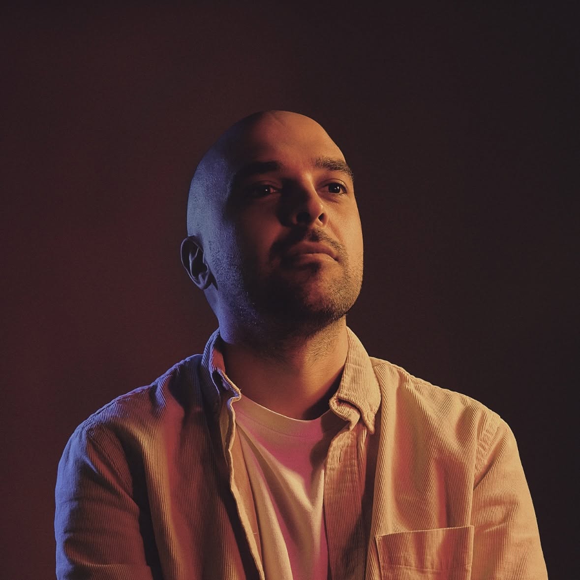 In our first seven years of running our business, we have already collaborated with over 100 agencies and freelancers. With the arrival of Pangea Georgian, we’re delighted to have expanded our team even more. Welcome aboard, Akaki Razmadze, here’s a little introduction. The 33 letters of the Georgian alphabet are among the most beautiful characters in the world. So it’s no wonder that their vibrant culture has been included on UNESCO’s List of Intangible Cultural Heritage. One designer who has made a significant contribution to the contemporary interpretation of Georgian typefaces is Akaki Razmadze, a Type Designer, Communications Design Consultant, and Lecturer in Typography based in Tbilisi. Akaki Razmadze has made a name for himself translating legendary classics and recent popular typefaces (such as Neue Helvetica, FF Meta, Noto, Neue Frutiger, November, FiraGo, and now Pangea) into his visual ‘native language’ with great care and attention. But not only that, he is also the co-creator of the Georgian currency symbol and the driving force behind the inclusion of Georgian uppercase letters in the Unicode standard. Most recently, he has worked with colleagues on a project in which they selected historical typefaces from old books and posters, digitized them, and released them as open-source fonts. The whole initiative was met with a great response within the Georgian design community and Akaki Razmadze hopes to continue dedicating himself to similar projects in the future. ↗ |
|
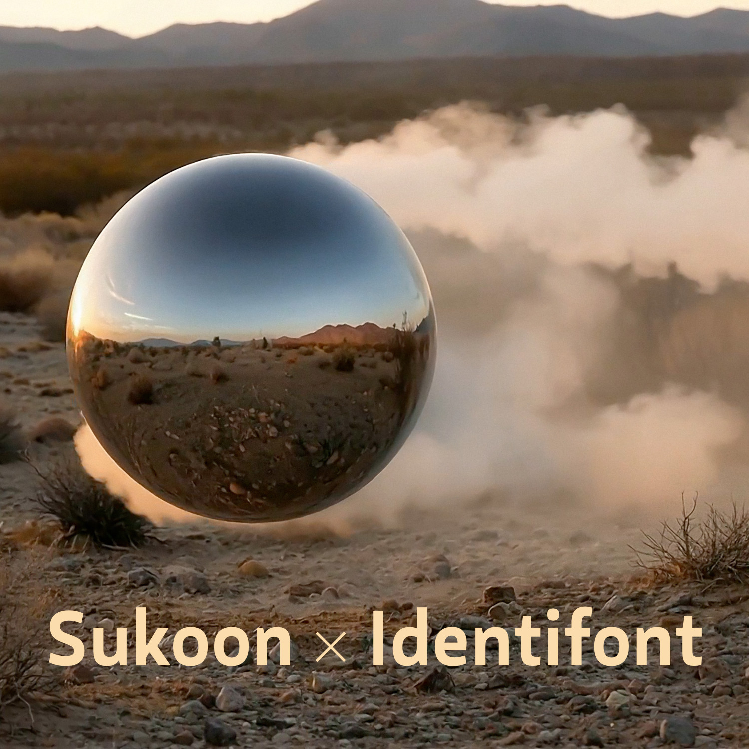 Back in May, we were delighted to welcome a brand new typeface to the Fontwerk family. The idea for Sukoon was born during a moment of deep relaxation and quiet contemplation for its designer Yanone. Over the course of a decade, that feeling of tranquility and peace evolved into a dynamic or humanistic sans serif font which supports over 400 Latin, Arabic, Cyrillic and Greek languages, with the name itself hinting at a focus on Arabic. In July, Identifont featured Sukoon as one of the new addition highlights and interviewed Yanone about his design and the story behind Sukoon. ↗ |
|
In our ongoing quest to simplify the licensing and checkout process, we have once again updated our license. The use of videos on social media is now included in the ‘Social Media’ license type and covered by the Base License for up to 10,000 followers. This change means that if you want to use one of our fonts in cinema, TV, and streaming productions (e.g., Netflix), we ask you to email us for a Broadcasting license. Also: If you want to purchase a Logo License, you don’t need to email us anymore. You can simply buy this online now and just select the option at the checkout. ↗ |
|
You’ve found the perfect font for your project, it fits like a glove and you’re super excited to share with your team. And yet you find yourself put on the spot and made to justify your decision and the cost. If you’ve ever been asked the question ‘Why license fonts at all?’ then this article is for you. |
|
|
|