Find out about our recent work for a software brand, we celebrate some Boom-ing good news and recommend an amazing free ebook.
 | MODIFIED MCQUEEN FOR SEIBERT |
|---|
|
We’re keeping it short and sweet this month (and no, that’s not because we want to go and eat more Halloween candy). In fact, we are still busy in the background working on something very exciting that we can’t wait to share with you soon! In this month’s round-up, find out about our recent work for a software brand, we celebrate some Boom-ing good news and recommend an amazing free ebook. Read on to find out more. |
|
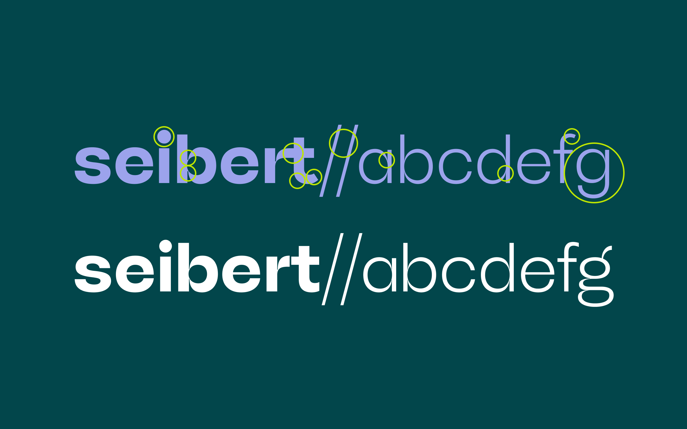 | | Original McQueen typeface (bottom) compared to modified Seibert logotype (top) | |
|
 | | The semi-custom logotype and corporate typeface work hand in hand on all digital channels of the Seibert Group. | |
|
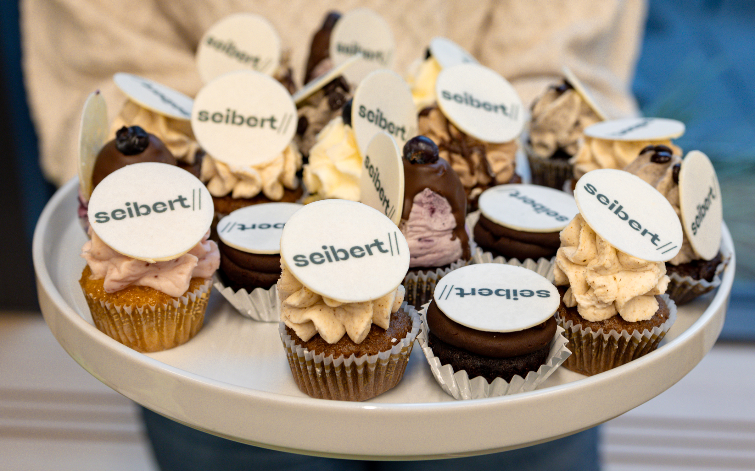
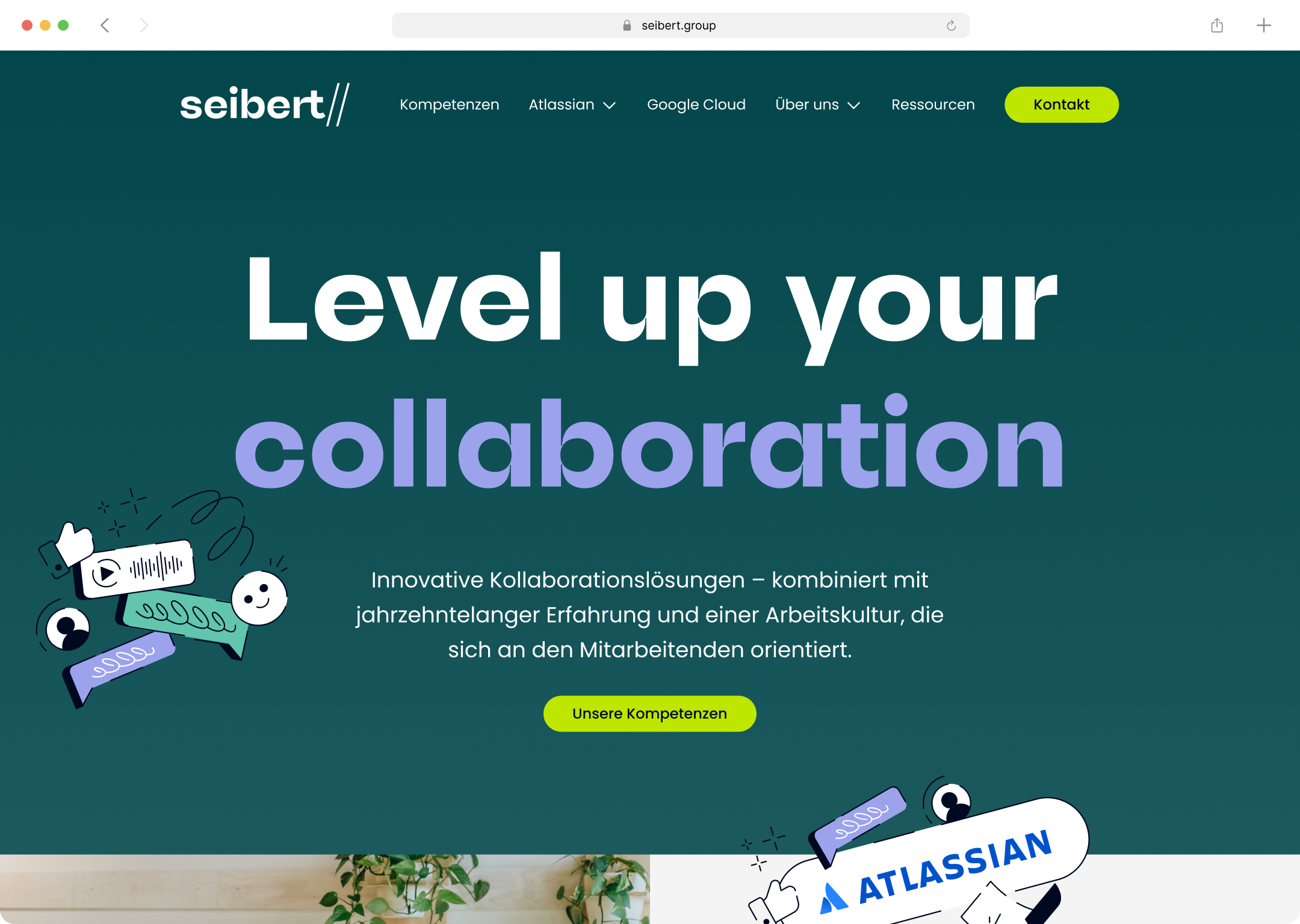
| | Semi-custom logotype for software companyWe love to help brands stand out from the crowd, so when Seibert Group approached us to help them with their own brand identity project, we jumped at the chance. For almost 30 years, the software company has supported well-known brands in their digital transformation. During 2024, it was their turn to transform and evolve as they repositioned themselves under the simplified name, Seibert. From the outset, the company had their eyes on McQueen as a new corporate typeface and we were delighted to be asked to develop an exclusive new logotype, drawing on McQueen for inspiration coupled with the brand’s aspirations and values under their leitmotif “Level up your collaboration”. We created two logo fonts for different environments in just a few weeks, ensuring that all employees can safely and comfortably use the logo by simply typing it in. It was a pleasure to work on this project with the Seibert team and great to get the following feedback from their Marketing Designer Diana Schweitzer: “We are really thrilled with the result and felt very well-advised and looked after.” | |
|
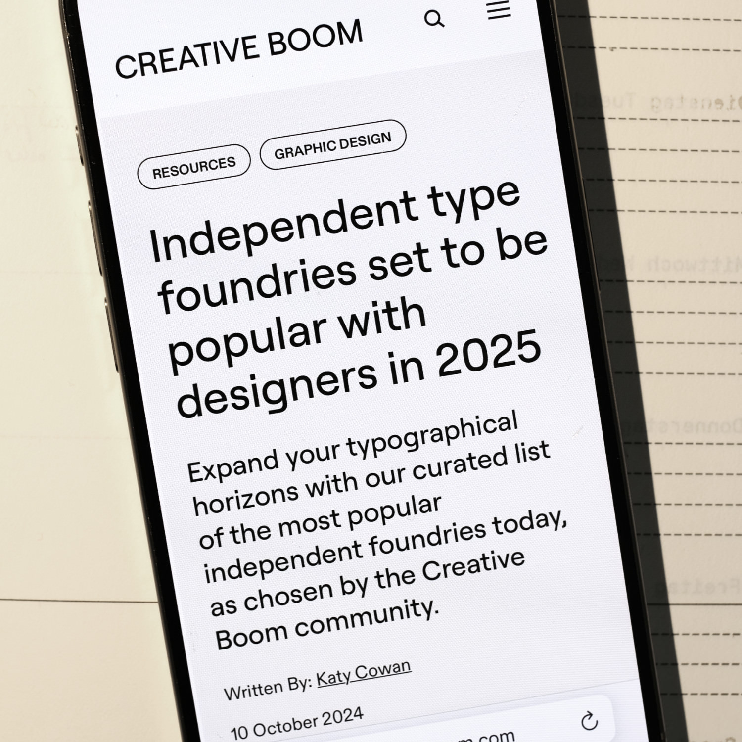 When we started Fontwerk just a few years ago, we were determined to make excellent fonts for brands and people and also set ourselves a number of goals. One of which was for Fontwerk to appear on a Top List and thanks to the Creative Boom’s community, we have been selected as one of the ‘Independent type foundries set to be popular with designers in 2025’ along with a number of well-respected colleagues. This feels very special indeed and we are over the moon to have been recognized by the creative public. We wouldn’t be where we are today without the hard work of our designers and wider team, the support of our wonderful customers and the design community. So, here’s a huge thank you to everyone who has supported us. ↗ |
|
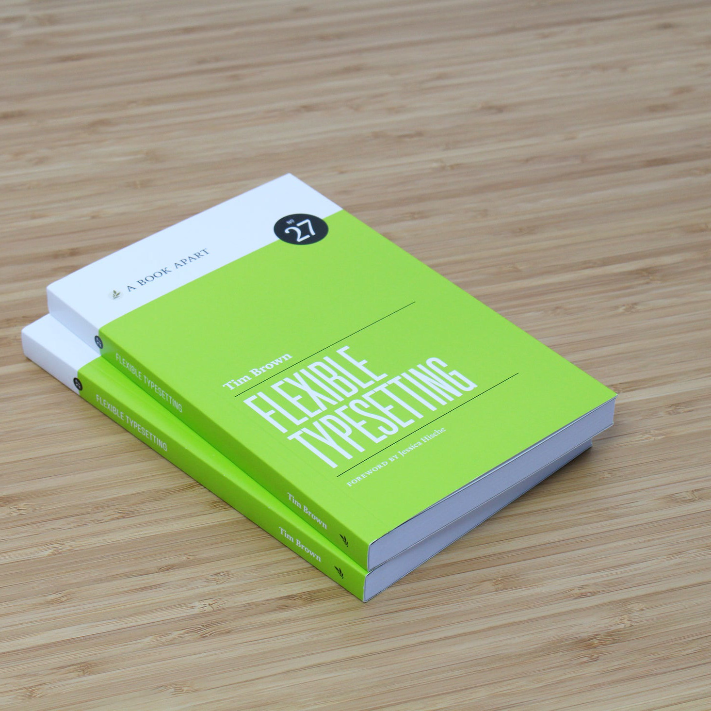 ‘The simplest, clearest and best rationale for good typesetting I’ve ever read’, said designer Khoi Vinh when A Book Apart released ‘Flexible Typesetting’ back in 2018, written by our friend Tim Brown (Head of Typography at Adobe). Design educator Frank Rausch added ‘It’s the first how-to book on contemporary typography that keeps its promise.’ These hymns of praise from respected experts should have been reason enough to buy the book six years ago. However, anyone who missed out on this now has no reason to sit idly by. Although the publisher, A Book Apart is no longer running, Tim is now offering a free version of Flexible Typesetting for free download. So don’t delay and get a copy of this must-have guide today. (© Photo: A Book Apart) ↗ |
|
If you’re keen to customize your Fontwerk typeface, we are happy to help! Whether you need a special logotype version or some extra special font engineering, whether you need an expanded character set or just need some characters replaced, we’ve got your back. If you want to stand out from the crowd with a custom font, tailor-made for you and your brand, please get in touch. |
|
|
|