We welcome the newest member to our family, Change, we also share some of its history in two extraordinary in-use cases and some exciting news about Pangea Afrikan.
In this month’s newsletter, we welcome the newest member to our family, Change, we also share some of its history in two extraordinary in-use cases and some exciting news about Pangea Afrikan. |
|
 |
| | The only constantAs the light begins to fade and the seasons start to shift, there is a palpable sense of change afoot. It seems oh-so-fitting for us to release the newest member to join the Fontwerk family at this time of seasonal transition. Change by Alessio Leonardi started life as the corporate typeface for the city of Berlin and was a mainstay for the identity across many of the city’s administrative offices. As a Berlin-based foundry, we wanted to work with Alessio Leonardi to comprehensively revise and expand this special artifact of regional type culture and finally make it available to designers worldwide. The potential of Change has never been truly reached and we are so excited to show the world just what it can do. We’ve expanded the number of weights from five to eleven (insert Spinal Tap joke here): Hairline, Thin, ExtraLight, Light, Regular, Medium, SemiBold, Bold, ExtraBold, Black, ExtraBlack. With the brand new Variable Font, all nuances of additional stroke widths between the extremes of Hairline and ExtraBlack can be set. As part of its revamp and rebirth, we’ve also enlarged the character set of Change. This also applies to the glyphs for non-Latin languages, which were checked and tested by Amélie Bonet (Cyrillic and Greek) and Donny Truong (Vietnamese). Finally, we’ve included small caps across all weights to extend the typographic variety. We are exceptionally excited to see how this Berlin plant will bloom in other parts of the world. | |
|
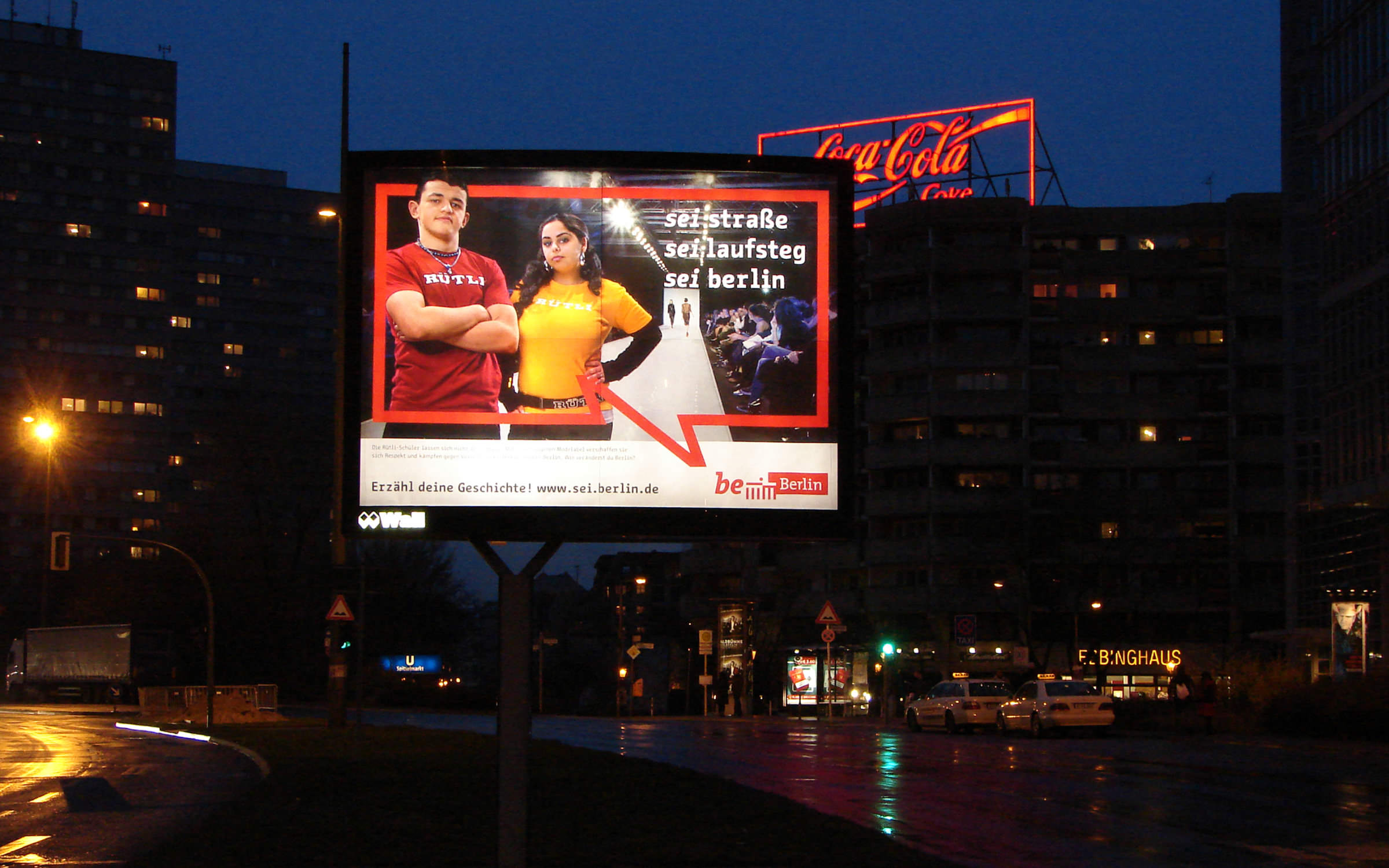 | | Billboard campaign on Leipziger Straße (© EMBASSY Berlin) | |
|
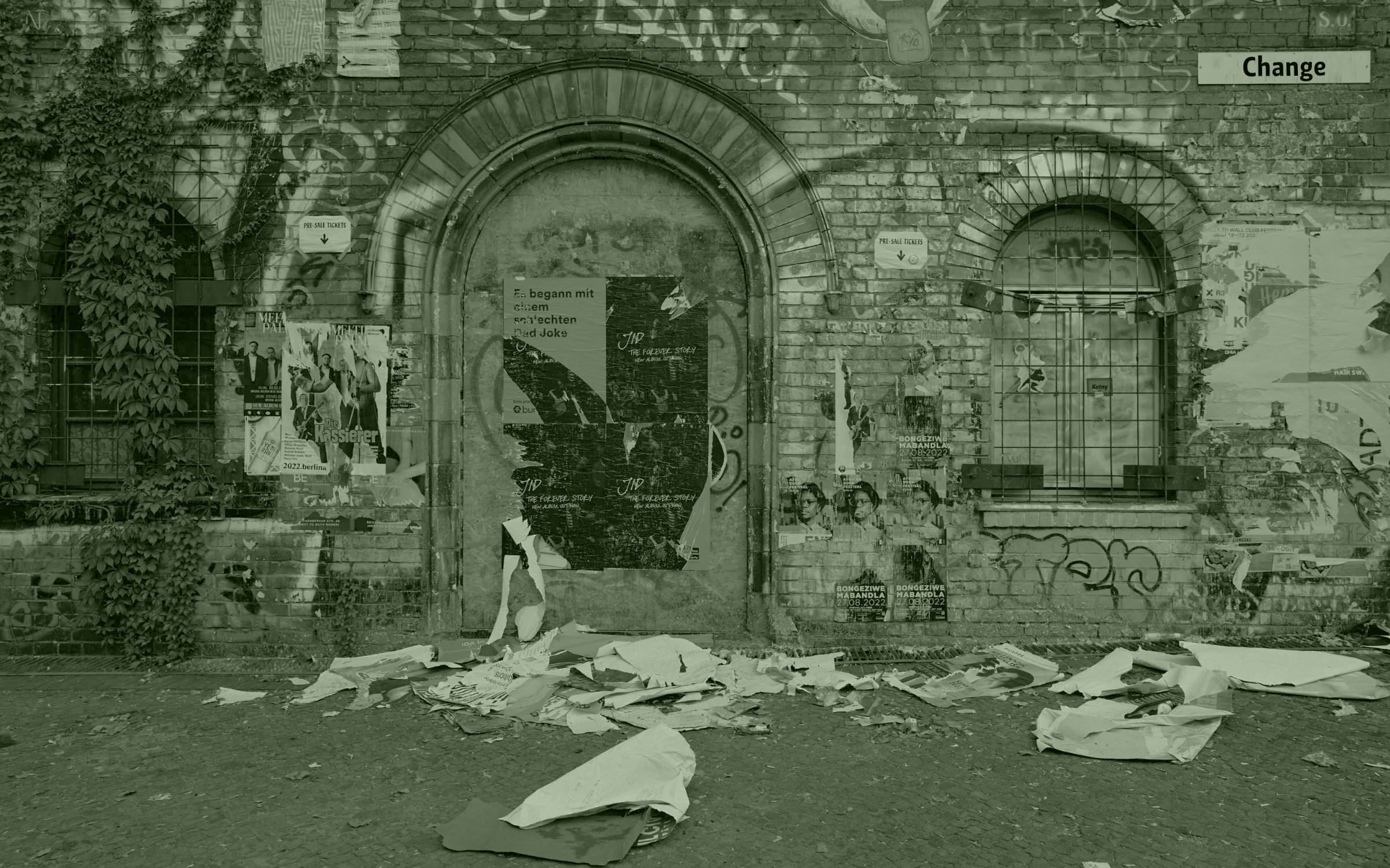
| | Change for a city in motionAs mentioned, our new typeface Change has an interesting history. Change started life as the corporate font of our hometown. Following hot on the heels of the success of the Be Berlin marketing campaign, in 2012 the Berlin Senate decided to introduce a new corporate identity across their administrative offices. Part of the new visual identity included the typeface Change Letter, which was Change’s original slab serif version. (Keep your eyes peeled for our own slab version of Change, which we plan to release at a later date.) The aim of the new design was to create a uniform appearance for all Berlin administrations and their subordinate authorities in order to improve recognition and strengthen their external image. The eye-catching typeface carried the advertising messages in the first phase of the campaign and became a set piece for all Berliners, who wrote three-line declarations of love for their city in the Be Berlin speech bubble. The Governing Mayor wanted to extend the use of the campaign typography across the city’s communication and this led to the development of the more neutral Change (Sans) subfamily. It was optimized for longer texts and small print, with proportional widths, simpler letters, narrow running and a slightly lighter base cut to enhance the contrast between Regular and Bold. | |
|
 | | The Berlin ambulances adorned with Change (© Shutterstock) | |
|
| | The Changing Face of the Berlin Fire Brigade The Berlin Fire Brigade is the city’s crisis manager, responsible for keeping the city and its citizens safe. With a growing population and unprecedented challenges ahead, the fire brigade have developed “Strategy 2030” to help them prepare for the future. As part of this process, their corporate design and visual identity has been completely overhauled. The two most important goals of the new corporate identity were to influence the public perception of the fire brigade and also reinforce the identification of the staff with their company. A uniform logo “Berliner Feuerwehr” (Berlin Fire Brigade) was developed using the Change typeface, which was already in use very successfully as the corporate font for Berlin and is the newest addition to the Fontwerk family. The fire brigade uses Change for headlines on their website, in printed matter and annual reports, as well as on vehicles, buildings and equipment. | |
|
 We have a confession to make: We briefly broke our 100% Variable promise when we released Pangea Afrikan. It seemed too important to us to release a font family that is relevant for 430 million people and which is available free of charge in the Standard License. The overwhelming reaction of our new customers from across the respective regions proved us right with our pragmatic approach, but of course we also want them to also enjoy Variable Fonts. So, we are happy to say that our library is now 100% variable again. For anyone who has already licensed Pangea Afrikan (for free!) make sure you download the font again to access the Variable Fonts for desktop (.ttf) and web (.woff2). ↗ |
|
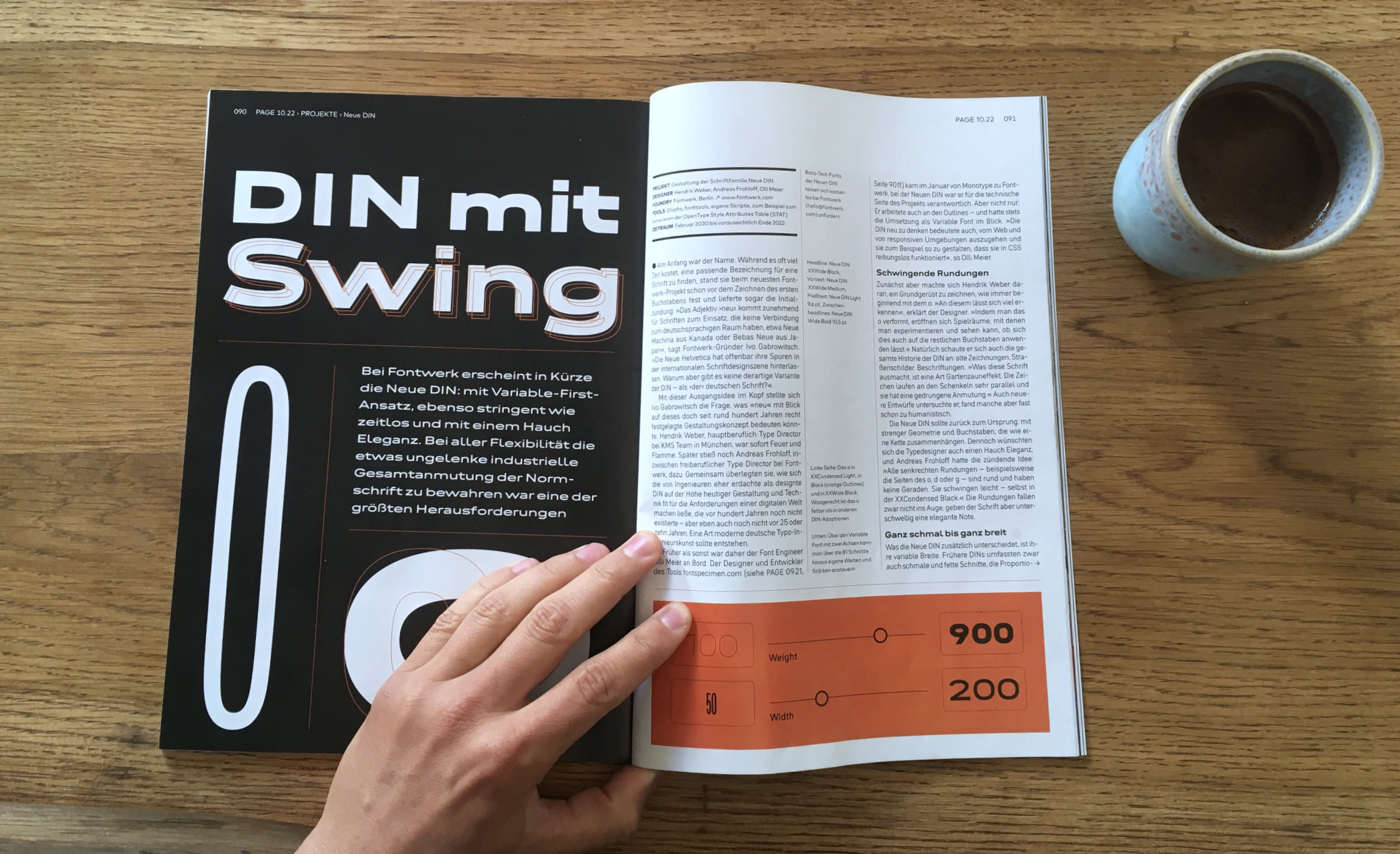 Following in the footsteps of the typographic legend that is DIN, we have completely reimagined and revamped the design and will be soon releasing our very own version, Neue DIN. The design was developed by the formidable type dream team of Hendrik Weber, Andreas Frohloff and Olli Meier. Throughout the process we led with the question of how would a DIN typeface be designed today and how can it remain the first choice of brands, agencies and designers for many years to come. We were determined to create a variable-first typeface that would be both industrial yet elegant and would stand the test of time, and be able to evolve and adapt to its use case. To find out about the full story behind our Neue DIN, pick up the latest copy of PAGE (10.2022) where there is a full in-depth five-page feature. ↗ |
|
Want to discover exclusive new font previews, get a first glimpse at our latest in-use cases and much more behind the scenes action? Head over to our LinkedIn profile now. |
|
|
|