Over these past months, we have been super busy behind the scenes working on our upcoming new releases that will come out later this year. So, as the days are still long and light, we thought we would share our top picks for reading over the summer holidays and you can also check out a lovely in-use case of Nikolai over on our in-use gallery.
Over the past two months, we have been super busy behind the scenes working on our upcoming three (that’s right, three!) new releases that will come out later this year. So, as the days are still long and light, we thought we would share our top picks for reading over the summer holidays and you can also check out a lovely in-use case of Nikolai. Read on to find out more. |
|
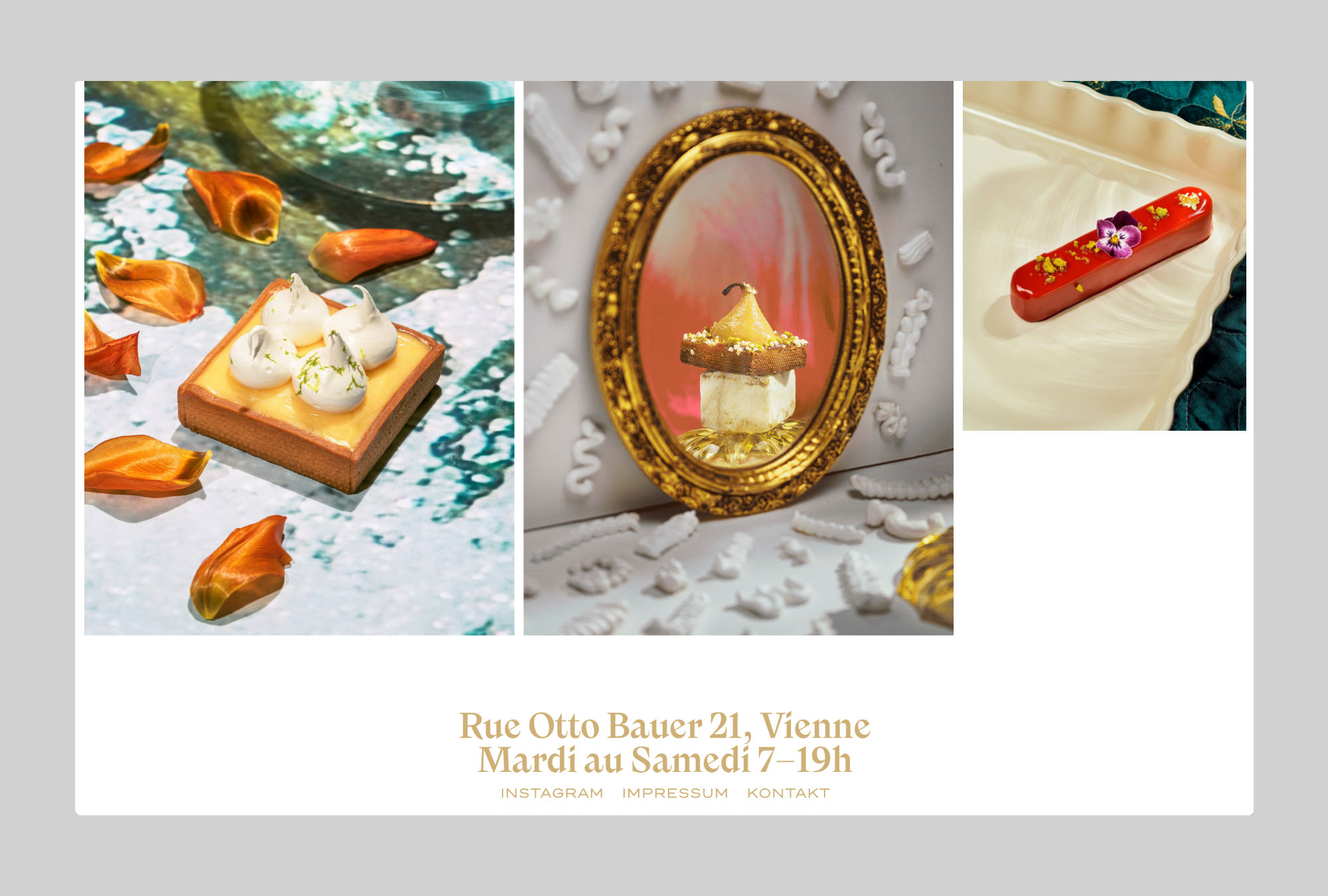
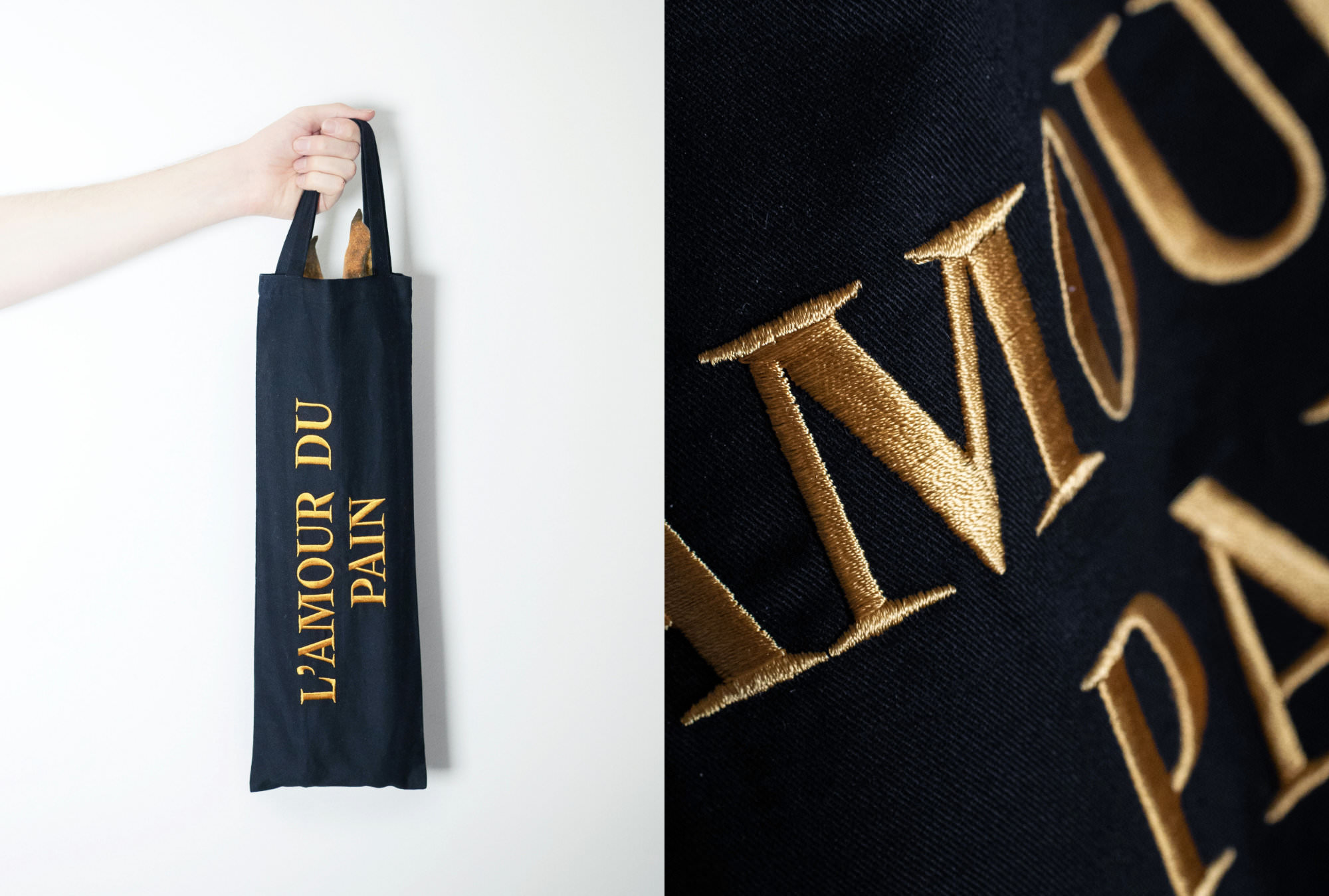
| | For the love of BreadEschewing the traditional creamy design clichés of boulangerie-patisseries outside of France, the branding for Viennese L’Amour du Pain is timeless yet individual. This is thanks to the expert rebrand by the creative agency CIN CIN and the clever use of our very own Nikolai. Feast your eyes over on our in-use gallery on the beautiful logotype that is frequently combined with the food photography by Erli Grünzweil and Susanna Hofer. We are very much in love with L’Amour du Pain’s now infamous baguette carrier bags which are adorned with Nikolai. A very stylish way to transport bread. | |
|
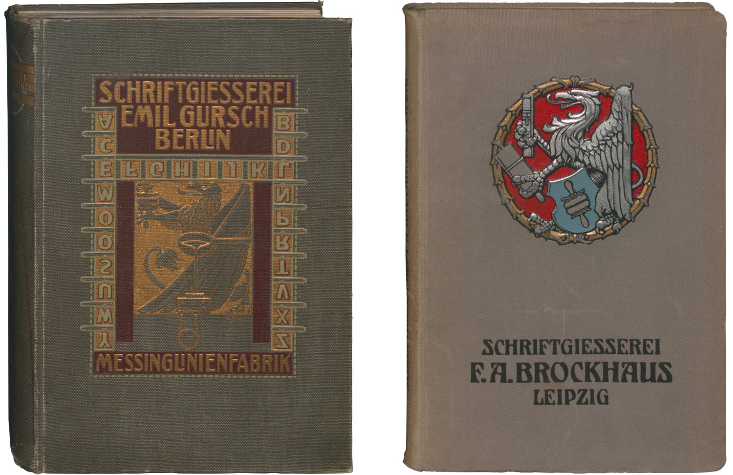 Berlin’s typographic legacy
We are fans of the Fontstand concept and avid readers of their news section. Thanks to Christian Mathieu for highlighting this fantastic project to digitize Berlin’s Typographic Legacy. From inventing colours to designing the Olympic Games – a look at the extraordinary work of Otl Aicher
This year, Otl Aicher, one of our favorite German design icons, would have celebrated his 100th birthday. His legendary design for the 1972 Olympic Games in Munich will also turn 50 years old in 2022. Many retrospectives have been written for the occasion but one that we particularly enjoyed reading was an essay by Christopher Haaf and Hannes Gumpp’s featured on Its Nice That. The essay is an extract from Winfried Nerdinger’s brand-new book ‘Otl Aicher: Design. Type. Thinking.’, which has just been published by Prestel. Today’s design is shaped by likes. And that’s a problem.
Design has become intertwined with the most harmful dynamics of the social web. Something to think about by Sahadeva Hammari over on AIGA's Eye on Design. How to proof a typeface
Since selling his foundry Hoefler&Co., Jonathan Hoefler has been sharing his expert knowledge on his website. Never a fan of the Pangram, his alternative suggestions for how to proof a typeface are hugely helpful for anyone in both type and graphic design. Apple fonts, a typographic timeline
Last but not least for now: an interesting history and story behind Apple Fonts from the Typeroom-Team. [Photos: CC0 1.0 @ Stiftung Deutsches Technikmuseum Berlin] |
|
 | Want to know what a Superfamily is? Or what font is used in our logo? Or what file formats we support? Then head to our FAQs section to find the answer to your question. Got a burning question that you can’t find the answer to there? Contact us, we’d be happy to help! |
|
|
|