Welcome to our first newsletter of 2022! The new year has started with a flurry of exciting news for us at Fontwerk.
 | LIMITED EDITION POSTERS FOR NIKOLAI LOVERS |
|---|
|
From a super new Color Font release coming soon to a new Fontwerker joining the family, from an in depth profile on Pangea Afrikan to West being picked as a Font Friday feature, this year has already been very busy for us and we are really looking forward to a jam packed few months ahead. For Nikolai fans, you’re also in for a real treat! So why not grab a cuppa and settle down to read on what’s in store and meet the new faces who are joining our family. |
|
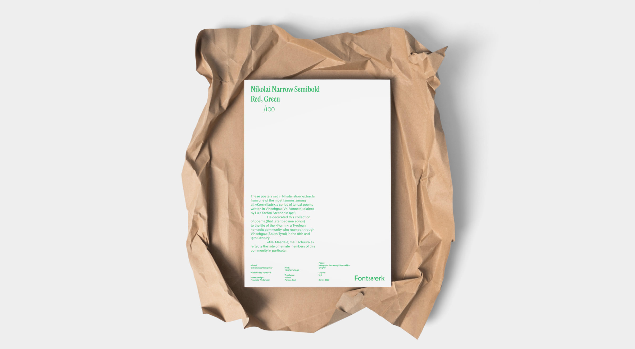
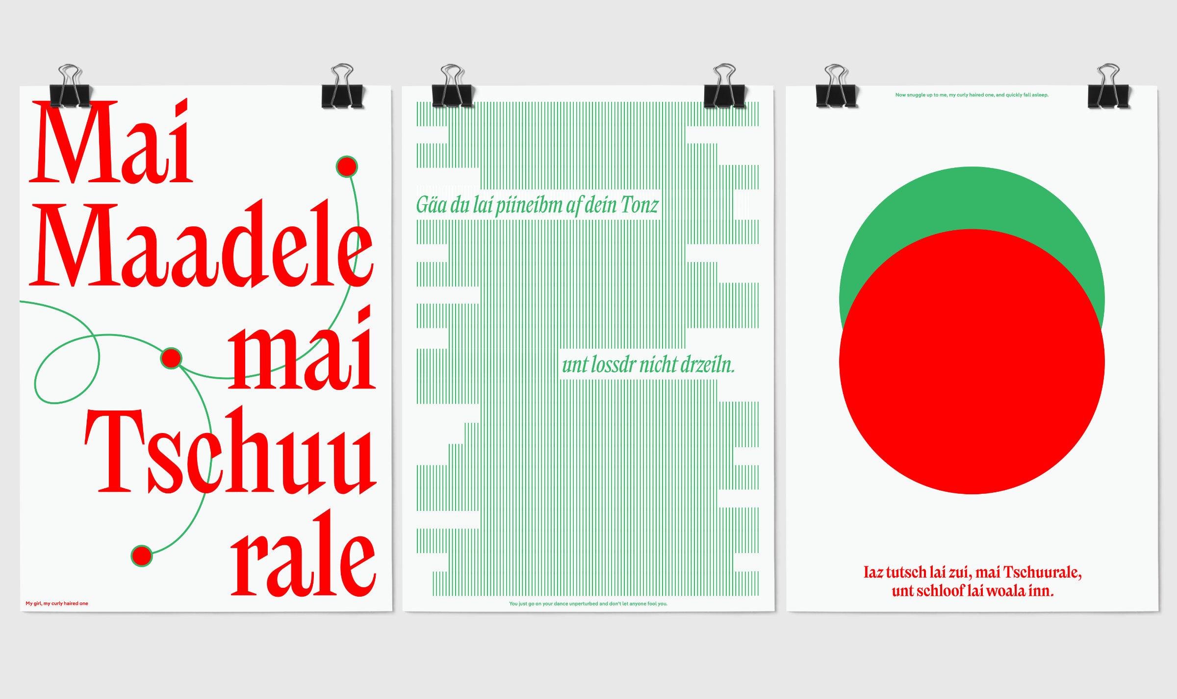 | | These posters set in Nikolai show extracts from one of the most famous among all ‘Korrnrliadr’ a series of lyrical poems written in Vinschgau (Val Venosta) dialect by Luis Stefan Stecher in 1978. He dedicated this collection of poems (that later became songs) to the life of the ‘Korrnr’, a Tyrolean nomad community who roamed through Vinschgau (South Tyrol) in the 18th and 19th Century. ‘Mai Madele, mai Tschuurale’ reflects the role of female members of this community in particular. | |
|
| | FREE Nikolai risograph postersFor a limited time only, we are giving away some beautiful risograph posters with every purchase of the complete Nikolai family! Simply order the entire package of all 24 styles of Nikolai until February 24th, 2022 and receive the very limited triptychon within a few weeks time. Designed by Franziska Weitgruber, these beautiful posters show extracts from one of the most famous lyrical poems of ‘Korrnrliadr’ by Luis Stefan Stecher. | |
|
 | | Neue DIN is coming later this year | |
|
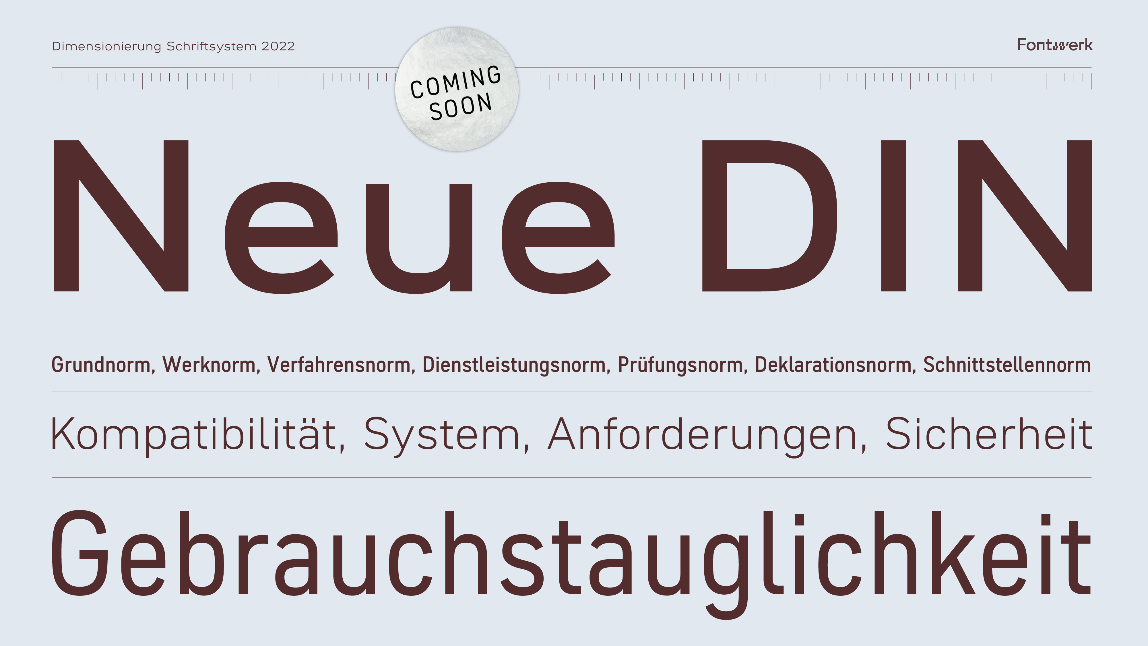
| | Coming soon: Neue DINThis year marks the 100th anniversary of the typeface standards for technical drawings, DIN 16 (Oblique) and 17 (Upright); they were considered to be the forerunners of the German standard typeface DIN 1451. Like Fontwerk, the German Institute for Standardization DIN is based in Berlin. It’s not just the strong emotional proximity to the typographic icon, which has shaped the face of graphic design for the last three decades, it was also our local proximity that prompted us to completely rethink the concept of the DIN typeface on the occasion of its anniversary. We asked ourselves not only how DIN would be designed today, but above all, how it could remain the first choice of brands, agencies and designers for many years to come. In the design process, we went back to its roots and combined modern type design demands with world-renowned German engineering. In fact, we have perhaps celebrated the latter more than we ever did before. What does that mean exactly? Well, we will introduce our Neue DIN shortly. But for the moment you’ll have to have a little patience, as true to our German roots and virtues, we like to be extra thorough. | |
|
 | | Pangea and Pangea Text in use for Magnitude | |
|
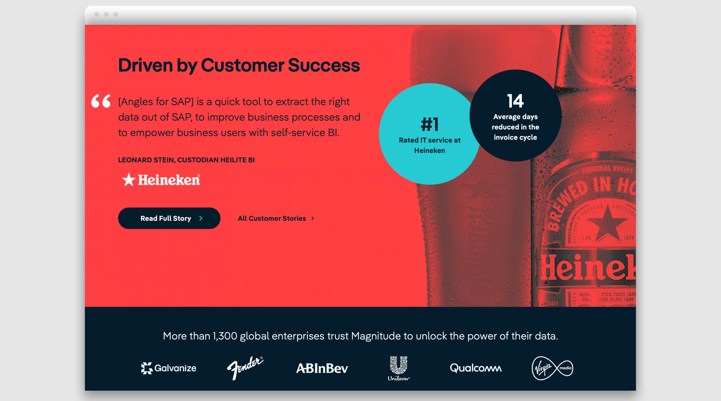
| | Type, the data amplifierWe love spotting our fonts out in the wild and the latest case study to join our gallery is a beauty! Based in the US, Magnitude is a leading service provider for digital transformation and data. For a brand that evaluates and communicates with data, Pangea, with its unusual geometric-humanistic balancing act, is the perfect partner. It conveys security, contributes to understanding and creates emotional access to the world of data. At Magnitude, Pangea is the bridge between the number crunchers (aka the data people) and the clients who need to be motivated. Watch their video “Everything is data” to see Pangea in its full glory and find out more about what Magnitude do. Brand new to our website, our in use gallery is ever-growing. If you have used one of our fonts in a project then we’d love to hear from you. | |
|
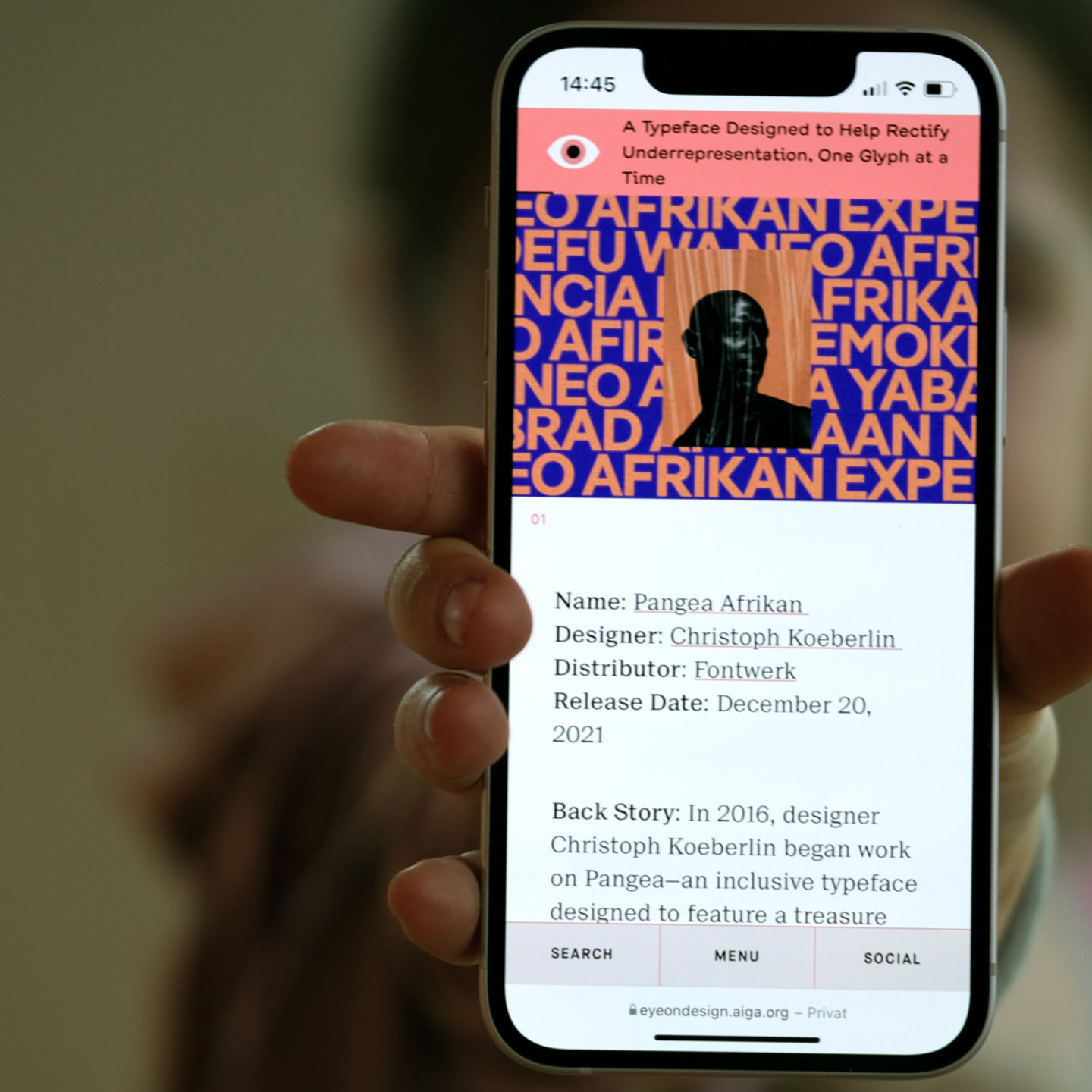 Eye on Design is one of the leading editorial platforms for design and is published by the AIGA, the largest and oldest not-for-profit design association in the US. We are über grateful that they have shone a spotlight on Pangea Afrikan (which is permanently free of charge and included in the Standard License, btw). ↗ |
|
 Olli Meier is one of the best Font Engineers out there and we are over to moon to welcome him to the Fontwerk family! He started his career as a Communications Designer for MetaDesign and Stan Hema. Olli later joined Monotype’s production team and found his calling in font technology, most recently as a Senior Software Engineer. During his time there, he was responsible for internal font tools, he worked on the Quality Engineering for Helvetica Now and Neue Frutiger World and created the FontSpecimen.com website. A committed member of the Unicode consortium, Olli is involved in the development of one of the most important tools in our industry. You can read all about him over on our Team page. ↗ |
|
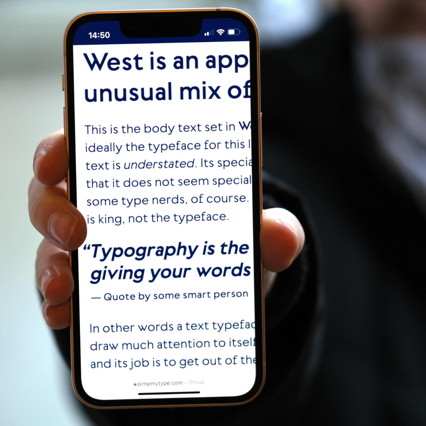 ‘Distinct, attention grabbing, and unusual, but still calm and stylish in its own way.’ We were super happy to see that Daniel Perraudin’s beautiful typeface, West has been featured as a Font Friday pick over on Oliver Schöndorfer’s blog Pimp My Type. According to Schöndorfer one of the standout features of West are the numbers, ‘[they] are just so beautiful, that it almost makes me weep for joy’. Head to his blog to read the review in full and you can download a trial version exclusively on Fontwerk.com. ↗ |
|
 | New Year, New Fonts? We’re here to help! As Font Enginneering and Typeface Design specialists, we pride ourselves on years of experience and expertise to meet whatever type design challenge you present to us. |
|
|
|