Welcome to our November Newsletter. This month, we’re doing a little happy dance as we celebrate an Award for our website, we share a sneak peek of Lawson, Ruth, Tony and Danny the newest members to join the Fontwerk family and you can read all the bike brand that fell in logo love with the irresistible Nikolai.
 | UPCOMING FONTS, AWARDS AND LOGO LOVE AT FIRST SIGHT |
|---|
|
Welcome to our November Newsletter. This time, we’re doing a little happy dance as we celebrate an Award for our website, we share a sneak peek of Lawson, Ruth, Tony and Danny, the newest members to join the Fontwerk family and you can read all about the bike brand that fell in logo love with the irresistible Nikolai. |
|
 | | Work in progress: Manuel von Gebhardi’s Dialogue Superfamily – Contact us for beta fonts | |
|
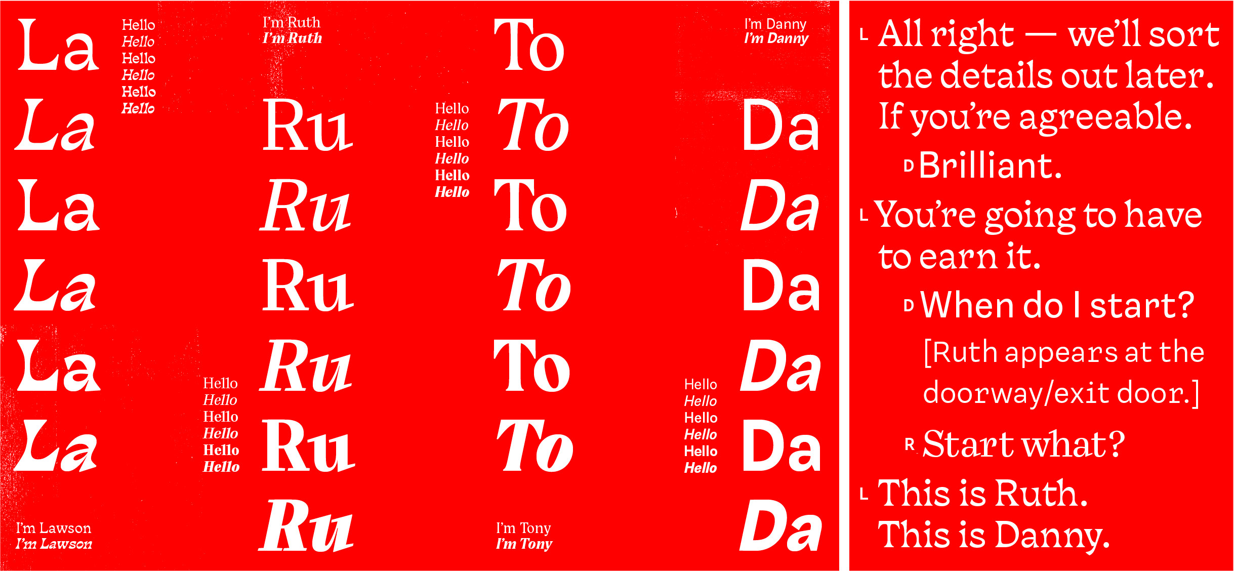
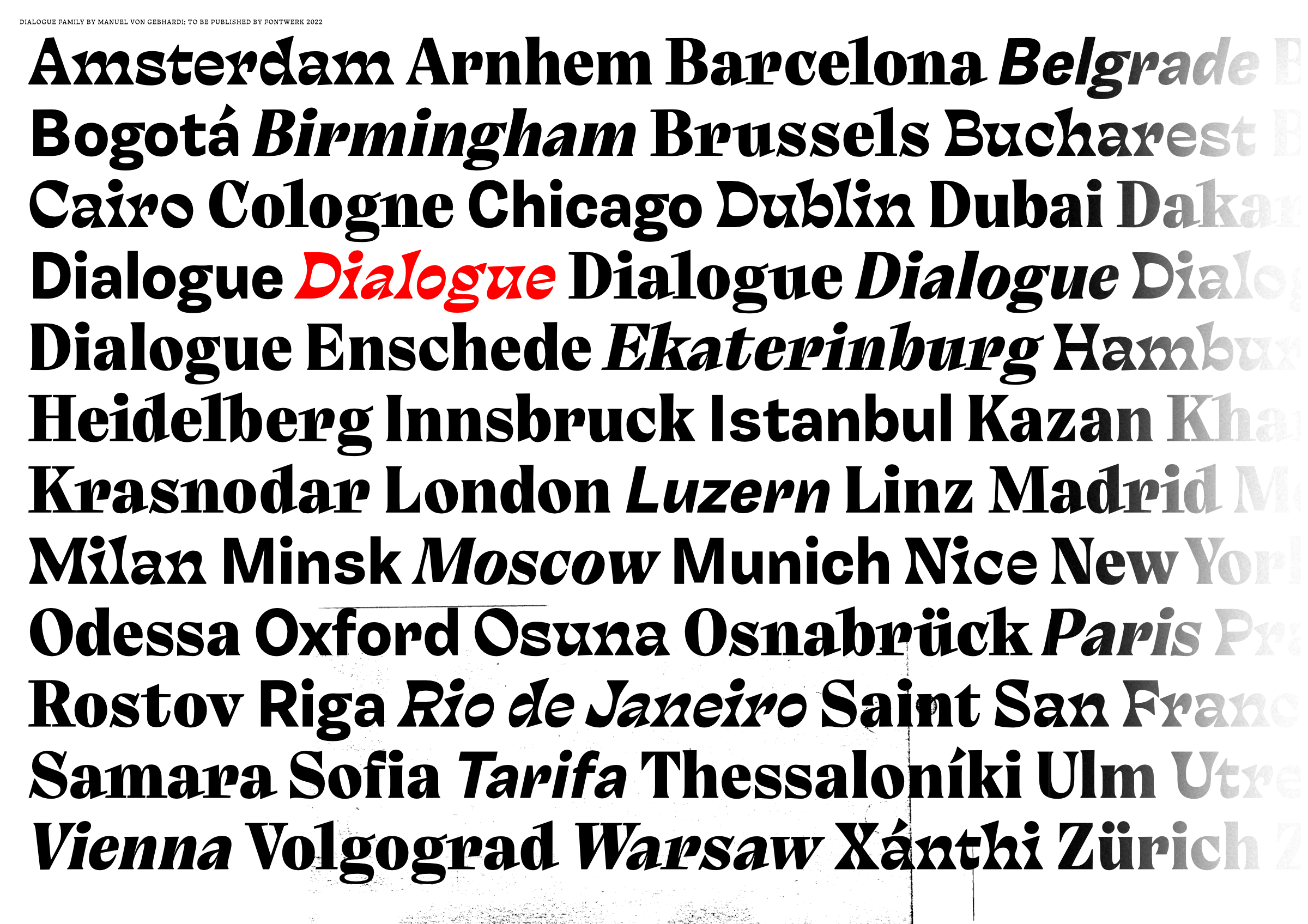
| | Sneak peek: collectively unconventional Meet Lawson, Ruth, Tony and Danny. A beautifully unconventional collection of typefaces created by the newest Fontwerk Designer to join our family, Manuel von Gebhardi. The four distinct designs shine individually yet intertwine beautiful together as the superfamily, Dialogue (working title). Mixed, matched or simply standalone, we are super excited to share a sneak peek at one of quite a few upcoming releases. Coming out in late 2022, we can’t wait to show you Dialogue (or however it will be called eventually) in full soon. In the meantime, if you fancy trying some of the Beta fonts, get in touch. | |
|
 | | Embossed type, who wouldn’t love that? | |
|
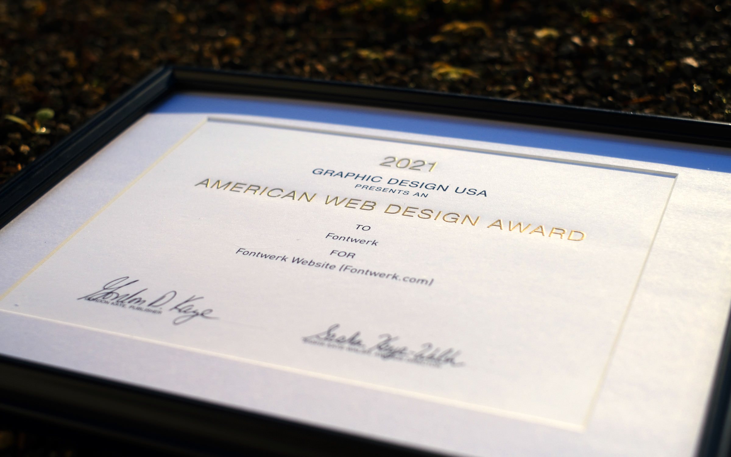
| | Fontwerk.com wins an American Web Design AwardWe are over the moon that we have been awarded an American Web Design Award in their 21st awards showcase. The American Web Design Awards are run annually by Graphic Design USA (better known as GDUSA) and shine a spotlight on outstanding examples of web design that enhances online experience. From over 2,300 entries this year, we are so pleased that our website has been named a winner! GDUSA has been running since 1963 and is a magazine for creative professionals. You can see all of the winners in their October edition, which is free to access. Kudos to our designer Jana Kühl and developer Rob Meek! We are already planning for some inspiring updates in 2022. | |
|
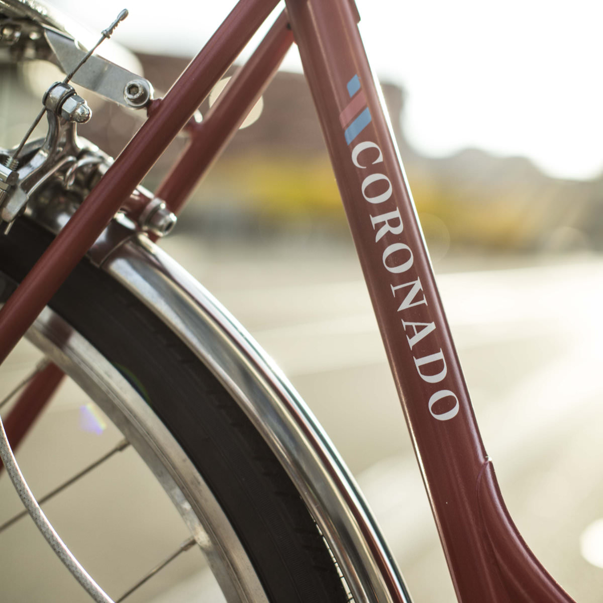 As the first lockdown lifted in Spring 2020, many city dwellers were raring to jump back on their unridden bicycles, but soon realized they were desperately in need of repair. So, when Christian Schmid met the owner of the bike workshop GOrilla urban cycling, Nino Jäger, they both came to the conclusion that: “The cheaper the bike, the worse its condition. 30-year-old classics, on the other hand, were ready to ride again in half an hour.” This led them on a journey to revive the Swiss bicycle industry and begin manufacturing high-quality, locally produced city bikes of their own. Together they founded Wheels & Cycles and acquired the rights to the name of the successful 1980s brand, Coronado. In Spring 2021, they launched the Coronado shop for custom city bikes. When designing the visual identity, they wanted a typeface that would reflect their three brand values: locally made, quality and love for the environment. In their search, they came across a font that happened to be made where the Coronado steel frames were produced, by a designer who also has a passion for tools, loves manual printing techniques and has a soft spot for finishes such as gold leaf or enamel varnish. And, that’s exactly how it came about. The choice of the contemporary antiqua, Nikolai by the South Tyrolean designer Franziska Weitgruber was a no-brainer and the background story of the font couldn’t have been a more perfect match. ↗ |
|
 | You’re missing out! Head over to our LinkedIn profile now, to discover behind the scenes, exclusive previews of things we’re working on, in-use cases, to easily connect with us and much more. (Image by Souvik Banerjee via Unsplash) |
|
|
|