Welcome to our October Newsletter. This month, we share one of our latest font engineering projects – a corporate typeface that brings cohesion and clarity to Germany’s most popular television broadcaster, we shine a spotlight on a beautifully crafted visual identity using Case and we lift the lid on the story behind our name.
 | FONT ENGINEERING FOR GERMANY’S LARGEST TV CHANNEL |
|---|
|
Welcome to our October Newsletter. This month, we share one of our latest font engineering projects – a corporate typeface that brings cohesion and clarity to Germany’s most popular television broadcaster, we shine a spotlight on a beautifully crafted visual identity using Case and we lift the lid on the story behind our name. |
|
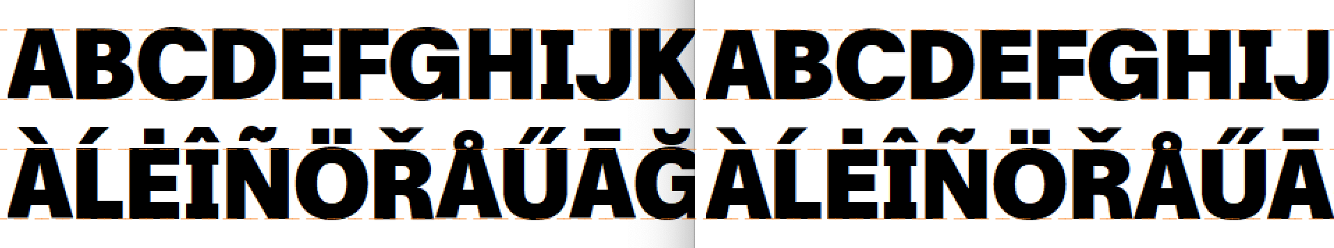 | | One of the many tasks we have done during the mastering process: balancing out cap heights and ascenders. | |
|
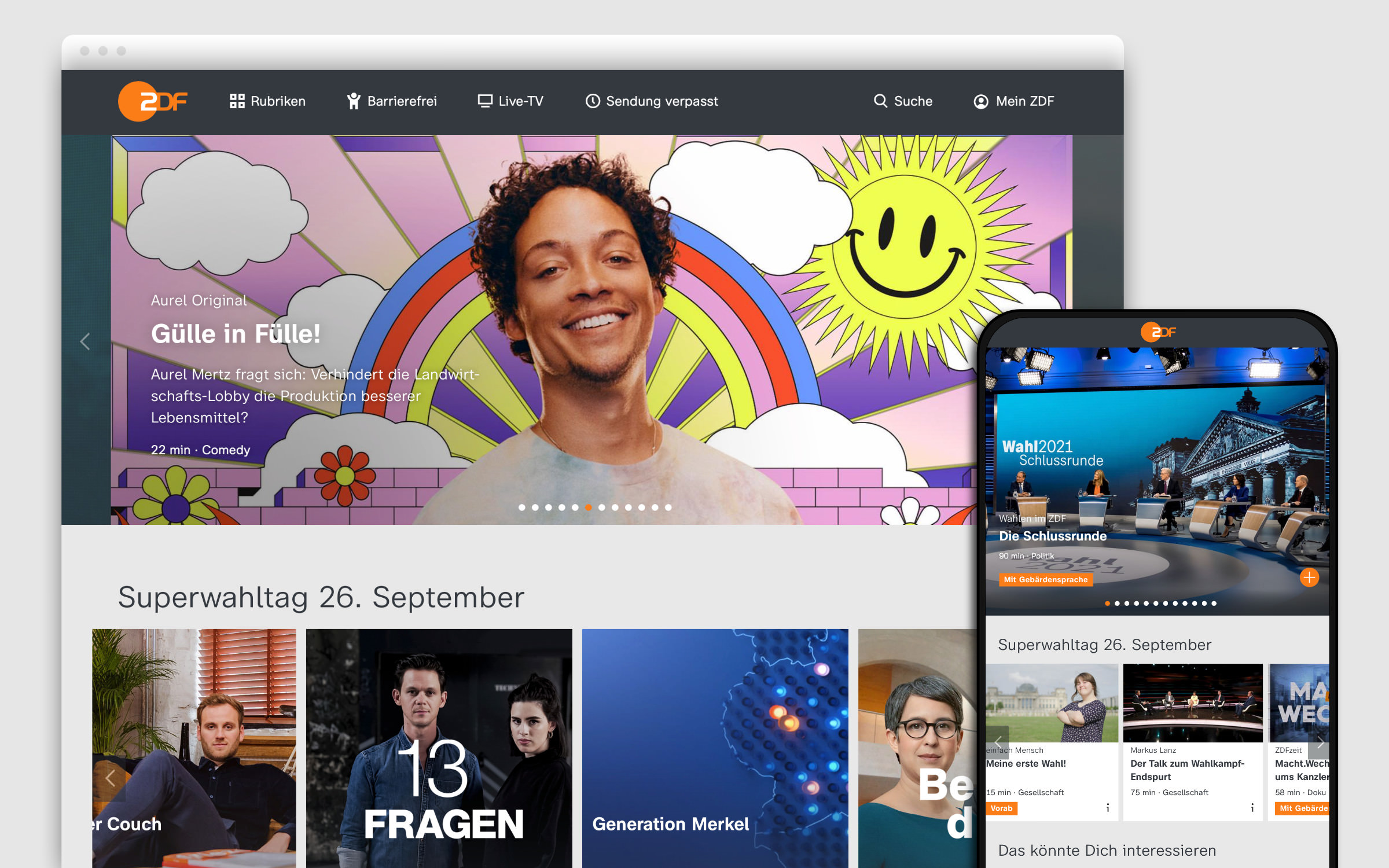
| | Making of: The ZDF Corporate FontTo bring uniformity and cohesion to Germany’s undisputed TV market leader, ZDF employed Design Studio bBox Type to completely revamp and redesign the corporate ZDF typeface. The guiding goal was to have better legibility, more flexibility and a stronger identity without leaving the type genre and thus the viewing habits of the audience. The result is an extremely comprehensive corporate type system: 116 fonts with three widths and three styles as well as corresponding italics. Fontwerk was responsible for the production and mastering. After a comprehensive test by our engineers, type designers Anja Meiners and Ralph du Carrois made corrections and adjustments and eliminated any final inconsistencies. Font name entries, font metrics and other font info parameters were adjusted to guarantee maximum functionality across a wide variety of operating system program combinations. Special attention was then paid to screen display and special TV production tools. | |
|
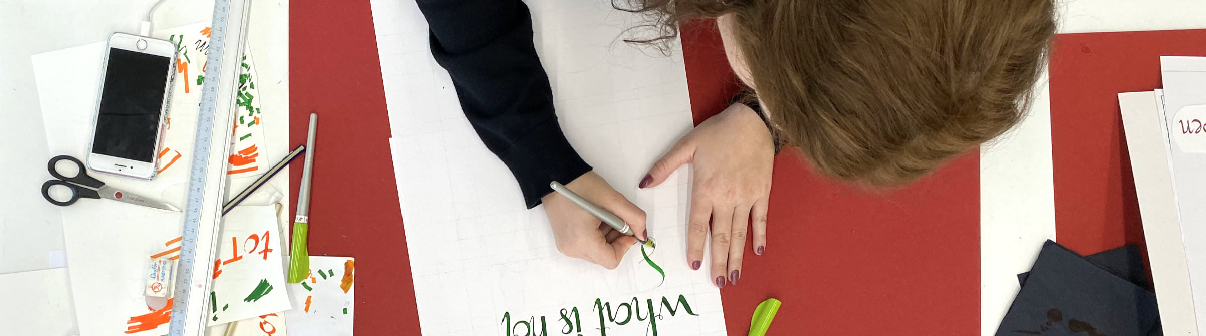
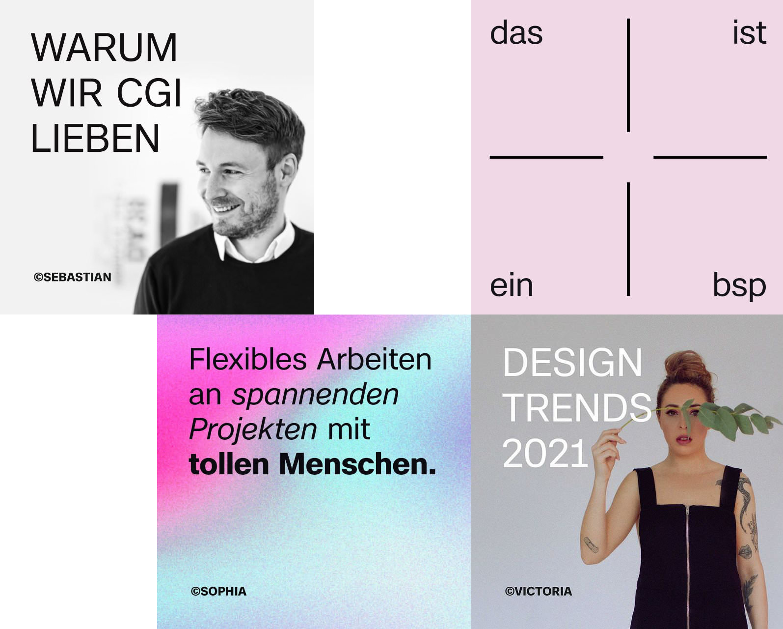 With years of branding and design experience for companies big and small, the Berlin-based studio KRAVT certainly knows their stuff when it comes to creating a long-lasting impression. From their work for the German lovemark, Ahoj (a sherbet and candy manufacturer) to their designs for global brands such as Dior or Armani, they know that good branding can only stand the test of time when it has a strong and solid foundation, one that is designed with care and consideration. When it comes to their own branding, they have recently completely revamped and reinvigorated their own visual identity and have used Case. Just like KRAVT’s brand DNA, Case exudes an authenticity and confidence and leaves an indelible impression, one that is future-proofed and self-assured. ↗ |
|
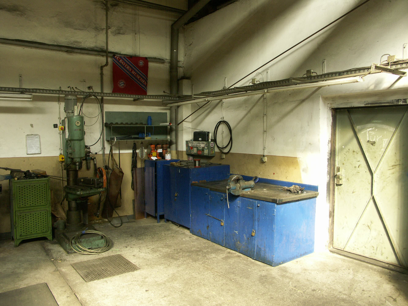 It’s a good question! When deciding on what to call our company, we took a great deal of time and care (you could call it German precision) to come up with a name that not only looked great on the page but also sounded good too. We wanted something that combined the craft and technical care that it takes to create fonts with the creativity that also comes into play when designing type. No other word combines hard and creative work such as the German expression ‘Werk’. And in Fontwerk it is exactly that special combination of work that goes into both our Fonts and Services. (Believe it or not, but the very place shown in the picture was another major inspiration.) ↗ |
|
 | We want to make type as accessible as possible, so we have made it super simple for students to enrich and expand their own collections with Fontwerk fonts. All eligible students can purchase a Fontwerk Family for the price of a single weight (e.g. buy the whole McQueen Display or West family for just €50). Even after graduation, the license remains valid. |
|
|
|